
- Best for
- kitchen island seating styling
- Cost
- $600 max
- Time
- 1–2 weekends
- Renter-safe
- yes (no-drill, no fixture swaps)
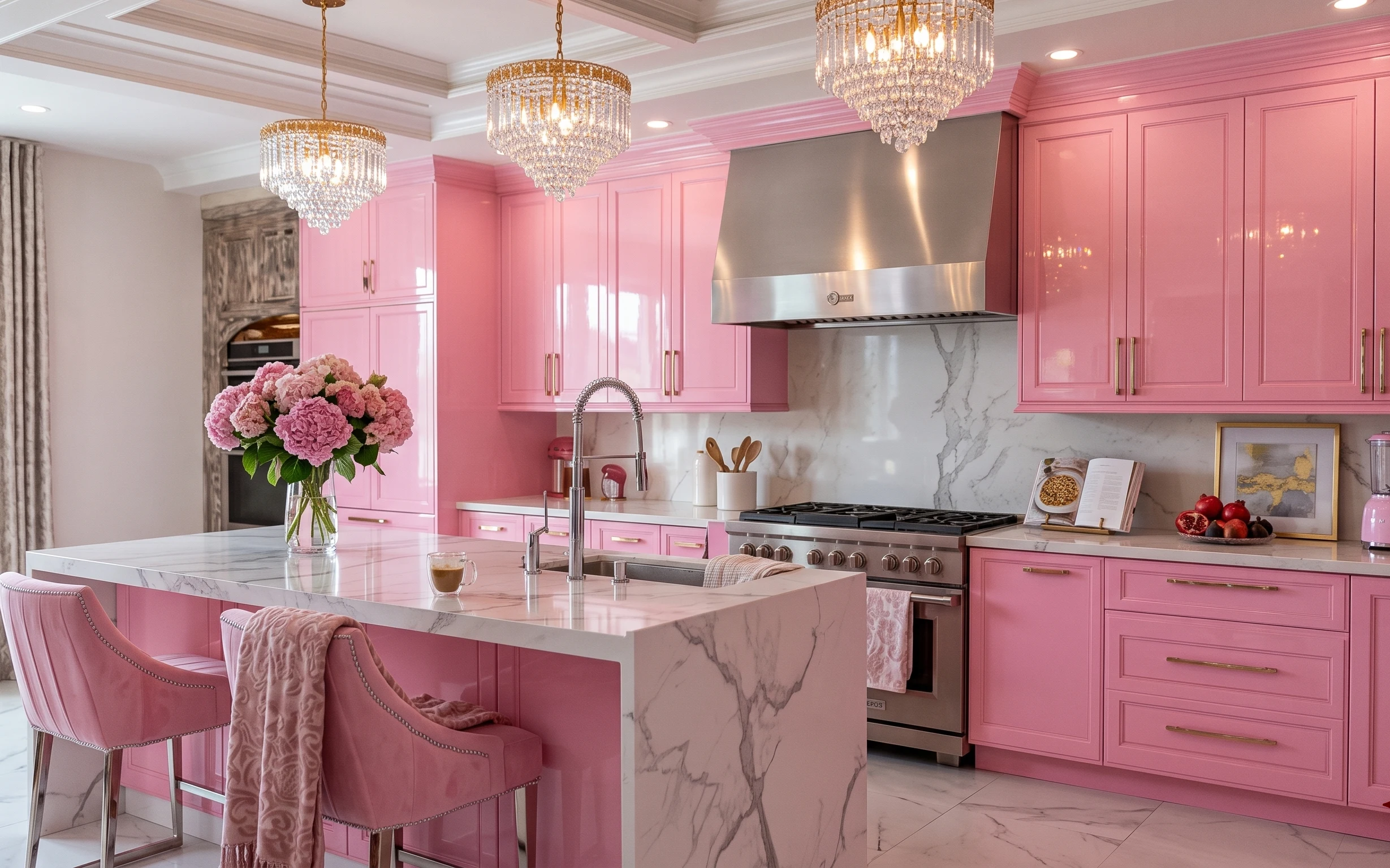
Why warm gold-and-marble seating setup is the kitchen island of 2026
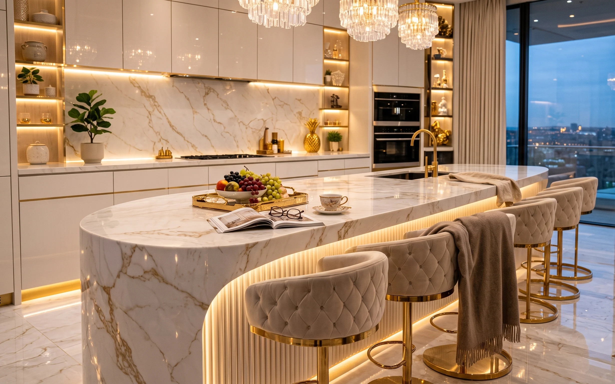
This kitchen island reads like a glossy magazine spread, but it’s built from everyday materials: tufted upholstery, a marble-look countertop surface, and warm metallic accents. The fruit bowl-on-tray styling gives you a focal point at counter height, while the potted tree adds movement and scale against the white cabinetry. I’ve done a similar “rented-home version” in my own place—my first attempt was too random, like I was decorating a shelf instead of a working kitchen. The trick here is choosing fewer hero objects and keeping their shapes consistent.
My mistake, the first time I tried this look, was leaning on too many small items. The island ended up looking busy instead of composed. What changed my mind was realizing this style isn’t about buying more—it’s about repeating a few textures: tufted fabric, glossy ceramics, and greenery with a clean pot. Once those pieces “talk” to each other, even a limited budget feels cohesive.
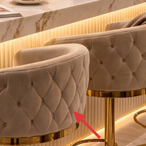
Layer 1 — tufted bar stools (pair) ($320) Buttons-and-brass seating for instant height
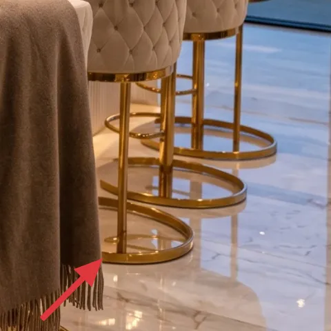
These tufted bar stools bring structure to the island by repeating the buttoned silhouette and adding soft texture near the floor. In the photo, they sit right where the eye lands after you scan the marble-look counter, so they matter more than a random extra chair ever would. Buying a matched pair is usually the obvious move, but the trade-off is cost: you’ll spend more up front. I’d rather pay for two high-utility pieces than add multiple smaller decor items that only look good from one angle. Look for durable fabric and easy-to-wipe legs so the “dressed” look survives real meals.
Match the metal finish
If your countertops already feel warm (gold cues in this photo), keeping the stool hardware in that same family makes the whole island look intentional.
Layer 2 — gray draped fabric on bar stool ($40) Softens the hardest surfaces
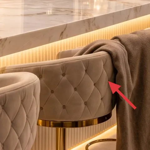
The gray draped fabric adds a calmer note against the high-contrast white and gold palette, and it also makes the seating feel styled rather than “just functional.” This works especially well on renters’ timelines because you can swap textiles seasonally without dealing with landlord restrictions. The obvious alternative is to skip it and let the stools be the only softness; that tends to look showroom-clean but a little too stiff. Here, the fabric breaks up the visual line along the seat and backrest. Choose a heavier throw or upholstery-weight fabric so it falls with body, not like a light scarf that bunches.
Let it look lived-in
Light wrinkles and gentle folds read more natural than perfectly ironed drapes.
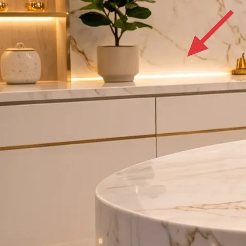
Layer 3 — marble-look kitchen island countertop styling ($25) Gives the counters a “styled, not crowded” base
Instead of trying to fill every inch of the marble-look countertop, this layer is about creating a clear base zone where the rest of the styling can land. The photo’s surface reads bright and continuous, which makes the fruit-and-tray moment feel premium rather than cluttered. For renters, the easiest way to mimic that is with a single cohesive counter accessory: a small, neutral paper stack, a tray liner, or a wipeable organizer that doesn’t fight the stone. The trade-off versus full-on decorating is that you’ll use fewer objects, but the room will look cleaner and more intentional from every viewing angle. Keep it to one “anchor” area.
Don’t scatter small items
If you add too many tiny pieces, the island stops looking composed and starts looking like countertop storage.
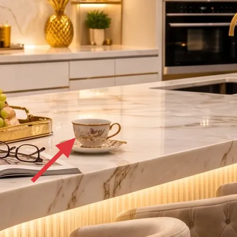
Layer 4 — decorative fruit bowl on gold tray ($35) A high-contrast centerpiece you can swap weekly
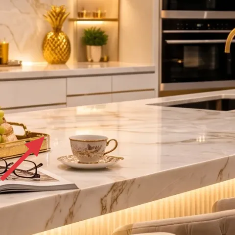
The fruit bowl on a gold tray is doing two jobs: it creates a color gradient (berries to grapes to green) and it turns a daily item into decor. The bowl sits near the center of the island styling area, so it reads as the focal point, not as leftover kitchen clutter. The trade-off is that fruit doesn’t last forever—so you’re choosing a “temporary but beautiful” centerpiece. That’s actually the advantage for a renter refresh: you can change it with the seasons and keep the look feeling current without repainting or drilling. Pick ceramic with a slightly glossy finish so it matches the warm, reflective cues in the photo.
Keep the tray color intentional
Gold cues repeat in the room, so a gold-toned tray helps the centerpiece feel like part of a set.
Layer 5 — potted tree in white pot ($60) Adds scale and a clean vertical line
The potted tree in a white pot brings height and a natural “breathing” element against the sleek cabinetry. In this photo, it’s placed on the shelf unit area, where it interrupts the horizontals and gives the kitchen a softer rhythm. Buying real greenery is usually the obvious move, but the pitfall is choosing a plant that’s too small—then it looks like a random accent. Aim for a plant with enough leaf mass to hold its shape at distance. A white pot is the easy styling win because it blends with the cabinetry and doesn’t compete with the gold accents.
Choose leaves over blooms
In bright kitchens, foliage stays attractive longer than flowers.
Layer 6 — decorative tray ($20) One object, many looks
A decorative tray works like a styling platform: you can group a couple of small ceramics, a candle, or a cup so the countertop feels curated instead of accidental. In the hero image, the tray helps the fruit moment look intentional and elevates the small scale of objects on the island. The alternative is buying a larger centerpiece, but that can overwhelm the work surface and get in the way. A tray is flexible—swap contents for breakfast, dinner prep, or hosting without changing the furniture layout. When choosing one, prioritize a finish that plays nicely with gold tones and doesn’t look overly cool against warm lighting.
Use it as a “reset tool”
After you eat, clear the counter by moving the small items back onto the tray.
Layer 7 — DIY apothecary jar labels (for decorative jar) ($45) Custom labels make built-in jars look planned
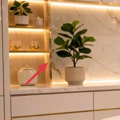
The decorative jars along the shelf already read like the right architectural detail, but labels are the part you can personalize. A quick label refresh makes those jars look styled on purpose instead of “mystery containers,” and it’s completely renter-safe because it doesn’t change the jars themselves. The trade-off is that you won’t get instant depth like you would with a new shelf—you get clarity and cohesion instead. That said, it’s the kind of upgrade that looks expensive because your eye reads it as a coordinated set. Keep your label typeface simple so it matches the room’s modern glam energy.
Make it instead of buying it
This DIY prints custom apothecary-style labels for the decorative jars so they match the room’s warm, modern look.
Materials
- Printable label sheets (8.5×11) — 1 pack — $12
- Gold or warm-cream cardstock (backing) — 1 sheet pack — $6
- Clear label tape (for sealing edges) — 1 roll — $8
- Fine-tip black marker (optional for touch-ups) — 1 — $10
- Scissors (or craft blade) — 1 — $4
Steps
- Measure the jar label area with a paper test strip so the text fits.
- Pick an apothecary label layout in a design app or template (keep it simple).
- Print on label sheets, then trim to a clean rectangle or rounded corners.
- Adhere the label to the jar-facing surface according to the sheet instructions.
- Optional: add tiny handwritten details with a fine-tip marker for authenticity.
- Seal the edges with clear label tape so labels survive kitchen humidity.
Total DIY cost: $40 — saves about $5 over buying.
The cost, layer by layer
| Layer | Item | Cost |
|---|---|---|
| 1 | Tufted bar stools (pair) | $320 |
| 2 | Gray draped fabric on bar stool | $40 |
| 3 | Counter styling base accessory | $25 |
| 4 | Decorative fruit bowl on gold tray | $35 |
| 5 | Potted tree in white pot | $60 |
| 6 | Decorative tray | $20 |
| 7 | DIY apothecary jar labels (decorative jar) | $45 |
| Total | $545 | |
If you want a cheaper version, focus on one hero: get the bar stools secondhand (or only one textile swap) and keep the rest to one tray and one fruit bowl. The plant can be a smaller live tabletop size until your next budget window opens.
What worked, what didn't (across the whole room)
The island looks designer because the softness (tufted seating and draped fabric) balances the hard surfaces (stone-look counter and bright cabinetry). A single focal centerpiece—fruit on a gold tray—keeps the counters from feeling like storage. The only place it can slip is when too many small objects try to compete for attention at the same height.
What worked
- Two matching tufted stools create a clean line and frame the island seating area.
- Gray draped fabric adds softness without changing any landlord-installed finishes.
- A fruit bowl-on-tray moment turns everyday food into a planned centerpiece.
- Greenery in a white pot breaks up the monotone cabinetry and adds vertical movement.
- A decorative tray keeps small objects grouped, so counters read intentional.
- Custom apothecary jar labels make existing shelf jars feel coordinated and styled.
What didn't
- Overfilling the island with small decor pieces makes the surface feel cluttered fast.
- Choosing a plant that’s too small reads “cute” instead of scaled to the shelf.
- Skipping a counter styling base makes the centerpiece float without support.
- Using labels that are too busy can fight the modern, glam palette.
What we'd skip if we did it again
Skip adding multiple centerpiece “mini moments.” If the island already has a fruit bowl and tray, another candle plus two cups usually turns into visual noise instead of polish.
Skip buying oversized decor first. Start with one properly scaled focal point (stools and the fruit-tray), then add only one supporting element like greenery or a tray so the island stays usable.
Skip trendy label styles with tiny print. In bright kitchens, bold, simple apothecary lettering reads cleaner and looks better from across the room.
Frequently asked
How long does this kitchen island refresh take?
Plan for about 3–6 hours for staging (clearing the counter, setting up stools, arranging the tray and plant), plus another hour for the jar label DIY. If you need to shop for the stools and a tray, that adds a couple of extra days of browsing. The decorating itself is mostly hands-on styling, not construction.
Is this renter-friendly if the kitchen has limited storage?
Yes—this approach focuses on objects that you can move: stools, textiles, trays, and a plant that can live on a shelf or counter. There’s no painting and no drilling, so you won’t need the landlord’s approval. For small storage, keep the “display” set compact: one tray, one centerpiece, and one plant.
What if my kitchen island is narrower than in the photo?
Choose a smaller tray and keep the centerpiece slightly off-center so you still have room for prep. Instead of matching the island footprint, match the visual proportions: keep the fruit bowl as the focal item, and let the plant be the background vertical element. The goal is spacing, not filling.
What if I don’t have shelves for the plant?
You can place the potted tree on the countertop or on a freestanding plant stand near the island. If the counter already has styling, go smaller with a tabletop plant and keep the same white-pot look. The style is really about the clean pot + natural leaves contrast.
Where’s the best place to shop for the stools and tray?
For the tufted bar stools, look at marketplaces with good return policies so fabric choices are risk-free. For the tray and fruit bowl, kitchen decor retailers and home stores usually have lots of gold-finished options. The labels can be made at home with printable label sheets.
Biggest mistake people make with kitchen island styling?
Using too many small objects at the same height. When everything is “decor,” nothing becomes a focal point. Pick one centerpiece moment (fruit on a gold tray) and support it with only one additional category (plant or labels). The rest should be functional or cleared between meals.
More in Kitchen & Dining
Glam kitchen island styling that feels designer for $600
A renter-friendly glam refresh for a kitchen island with $600 worth of swaps: a tufted bar-stool pair, styling pieces, and move-ready shelf…
A golden-light kitchen island corner for $700
A golden-light update for a pink kitchen island corner with 7 budget-friendly upgrades. Swap curtains and styling details, refresh the hydr…
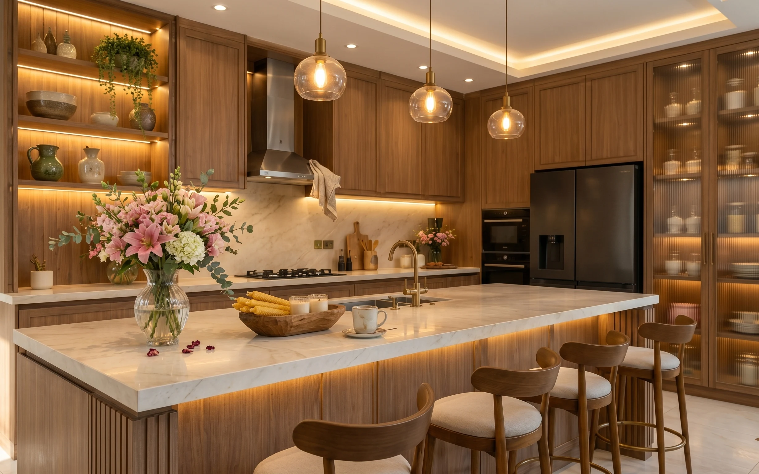
7 kitchen island upgrades for a $800 weekend
A warm, wood-and-marble kitchen island look usually comes from small, visible choices. Here are 7 upgrades—flowers in a glass vase, a refre…