
- Best for
- Shared housing kitchen island upgrades
- Time
- 1–2 afternoons
- Total cost
- $300
- Renter-safe
- No-drill, packs up easily
Why olive-and-beige styling is the kitchen island of 2026
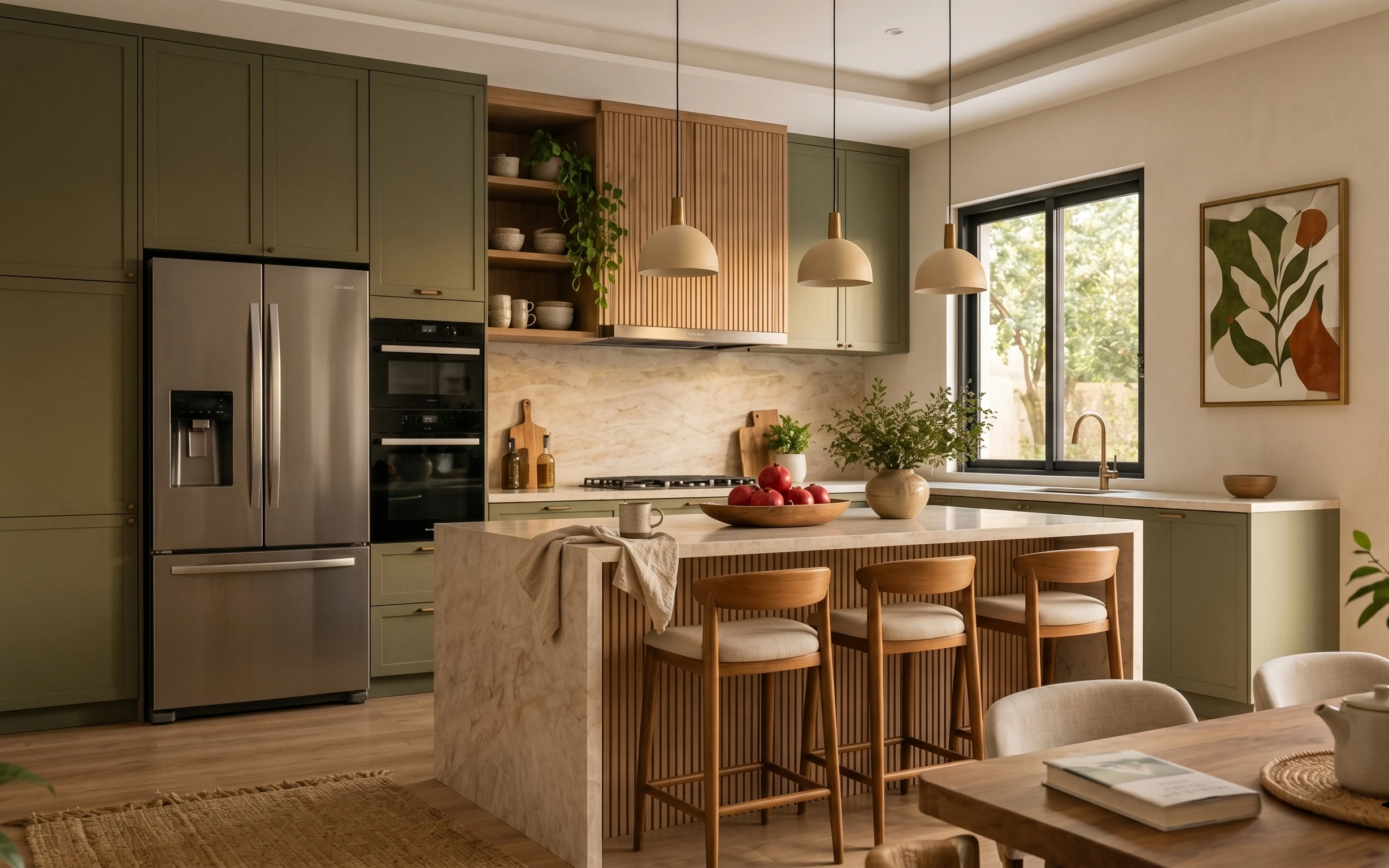
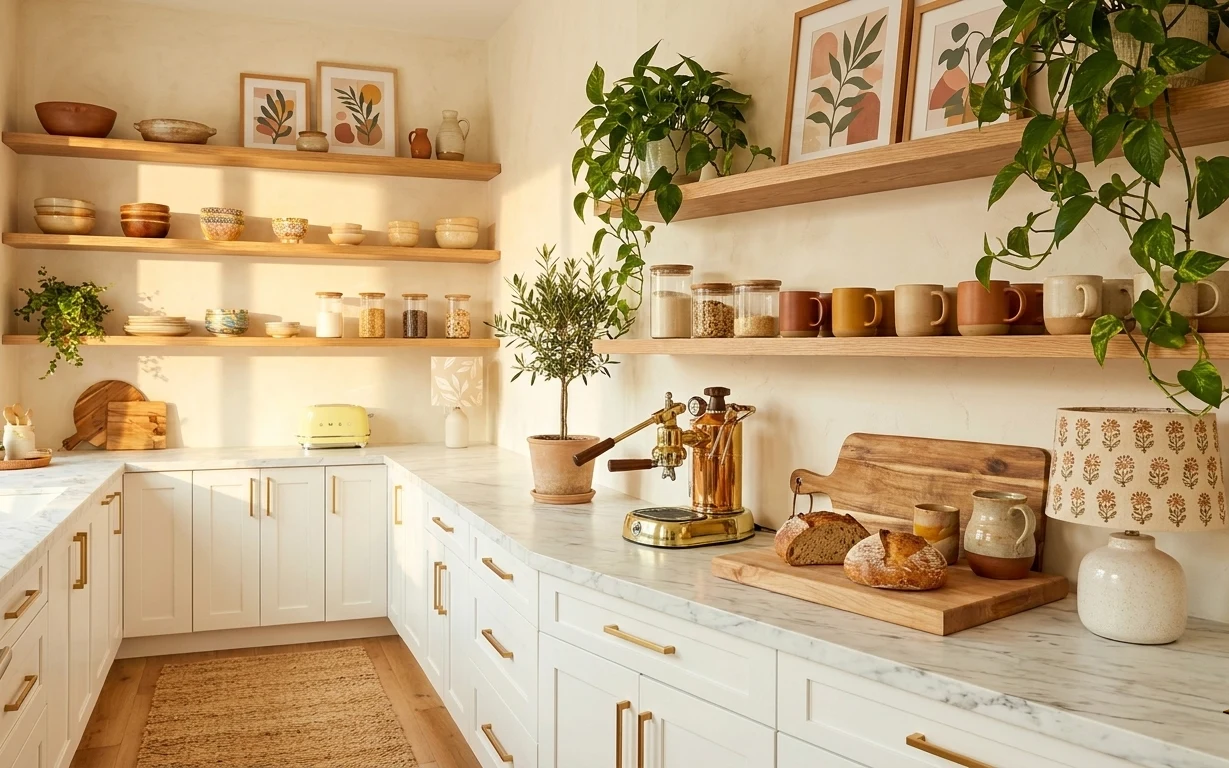
That light, botanical palette works because it repeats across surfaces: rug fibers underfoot, warm ceramic tones on the counter, and earthy greens in the plants. In this photo, the textures do most of the talking—wool rug loops, matte throw fabric, and the quiet sheen of ceramic. I’m borrowing the same “warm minimal” principle you see in japandi spreads: fewer objects, but each one has a job. For shared housing, the win is that you can make this look with soft goods and freestanding decor instead of touching fixed fixtures.
The first time I tried to copy this kind of kitchen, I over-styled the island and it looked like I was hosting a photoshoot, not living there. The change I made was simple: one anchor rug, one main vessel (the fruit bowl), and one plant cluster—no extra clutter. After that, the whole bar area felt calm even when my schedule was not. This is that version: curated, packable, and easy to reset when you move.
Layer 1 — 5×7 wool area rug ($80) Soft underfoot, with quiet texture
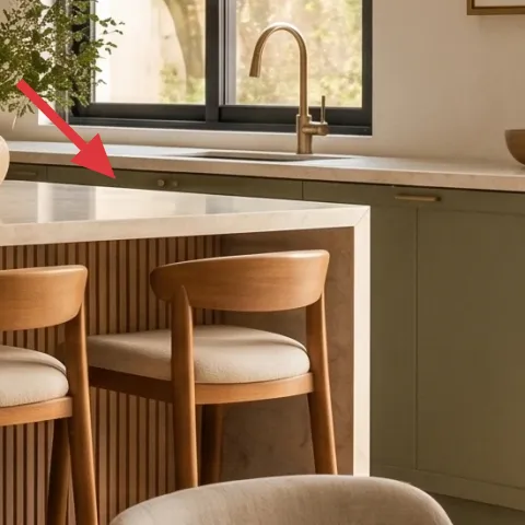
A 5×7 wool rug in a warm neutral is the fastest way to “separate” the island zone from the rest of the kitchen floor. In the hero image, the rug sits low and broad, so it frames the stools without competing with the sage cabinetry. Wool’s advantage over synthetic rugs is the slightly thicker pile that hides everyday scuffs and makes the space feel anchored. The trade-off is price: this is a place to buy once, then roll it up carefully. If a full 5×7 feels big for your apartment, the look still works with a runner that reaches under at least one stool.
Pick a rug that’s wider than the stool footprint
Coverage matters more than pattern—most kitchens look “finished” once the front stool legs land on the same surface.
Layer 2 — wood-framed botanical wall art print ($25) A removable nature moment
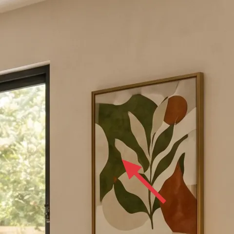
This wood-framed botanical print gives the island area a focal point that isn’t dependent on overhead lighting. The drawing-style plant shapes repeat the same green family as the potted plant on the counter, which is why it feels intentional rather than random. If you’re in shared housing, this is also one of the easiest “swap” wins: art can come with you and gets replaced in minutes. The trade-off is scale—if you choose something too small, it looks like an afterthought. Aim for a medium frame size that reads from the bar stools and window line.
Make it instead of buying it
Make a hand-painted botanical abstract on cardstock that you can slide into the same frame size, so you get a fresh look without buying another framed print.
Materials
- Cardstock, 8.5×11 or cut to size — 1 sheet — craft store — $8
- Acrylic paint set (small) — 1 set — craft store — $4
- Round brush + small detail brush — 1 kit — craft store — $3
- Matte clear spray (optional) — 1 small can — craft store — $2
Steps
- Cut cardstock to the exact artwork opening size.
- Lightly sketch a simple leaf silhouette with pencil.
- Paint in two greens plus warm beige for the negative space.
- Layer details with a smaller brush to suggest veins and stems.
- Let the paint dry fully, then add a tiny number of abstract stems for balance.
- Optional: spray matte clear for easier wipe-down, then let it dry.
Total DIY cost: $17 — saves about $8 over buying.
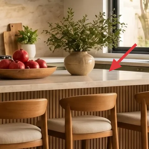
Layer 3 — ceramic bowl filled with red apples ($15) The island’s edible centerpiece
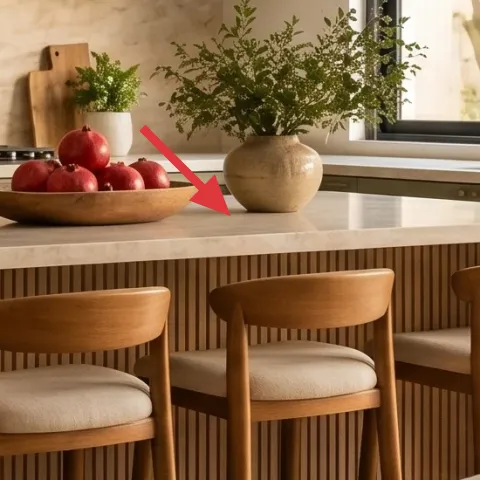
A ceramic bowl filled with red apples (or any fruit you actually eat) creates a clean, sculptural center without needing extra decor pieces. In the photo, the bowl anchors the middle of the island so the counter styling doesn’t drift into “tray collection” territory. Ceramic also plays nicely with the matte textiles nearby—the throw reads soft, while the bowl reads grounded. The trade-off is that fruit styling is temporary: after a few days, it becomes compost or a snack, not permanent decor. That’s okay in shared housing because you can restyle quickly and your “look” is always current.
Keep the bowl low and centered
If the bowl sits too close to the edge, it feels like clutter instead of design.
Layer 4 — wood bar stool with beige seat cushion ($100) Warm seating that belongs in the frame
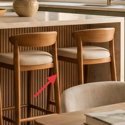
These wooden bar stools with beige seat cushions are what make the island feel like a real hangout spot, not just a counter. The honey-wood tone ties directly into the warm wood panels in the backsplash, so the seating feels integrated rather than dropped in. I’d never rely on a single chair in a kitchen—this look works because the stool rhythm repeats, even if you’re only buying one to start. The trade-off is choosing something sturdy enough to move with you; lighter stools are easier to carry but can feel wobbly. Aim for a simple profile you won’t get bored with after a few moves.
Avoid super-slick finishes on rental floors
If your stools slide, add felt pads; otherwise the “zen” setup turns into constant readjusting.
Layer 5 — beige throw blanket draped over the island front ($25) Softens the hard lines
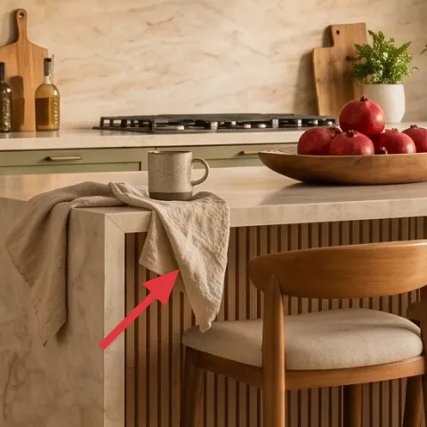
That draped beige throw turns the island front into a texture moment, which is why the palette feels layered instead of flat. In a kitchen, the “hard surfaces” are endless—countertop, cabinetry, and window lines—so adding a linen or wool-looking fabric breaks the geometry. The throw also reads like intentional styling, not a stray blanket, because it’s placed across the front edge in a loose fold. The trade-off is practicality: you’ll need to shake it out occasionally so it doesn’t gather crumbs. For shared housing, this is worth it because it rolls up easily and disappears into storage when you move.
Fold it wide, then let one corner hang
That asymmetry keeps the drape from looking “tucked for the photo.”
Layer 6 — small potted green plant on the kitchen counter ($30) A living color note
A small potted plant on the counter gives you the green that ties the wall art to the island styling. The leaves in the hero image are airy, so the plant adds softness without blocking sightlines from the bar stools to the window. Pick a plant that can handle bright indirect light, because kitchens get more sun than people expect. The trade-off is maintenance time: weekly watering beats monthly “plant rescue” shopping. If you’re in shared housing, choose something forgiving—one plant you can care for consistently will always look better than three that you forget.
Match leaf volume to counter clutter level
One fuller plant often looks cleaner than multiple mini pots.
Layer 7 — ceramic vase on the kitchen counter ($15) Shapes the spacing between objects
A single ceramic vase keeps the counter from feeling like a random assortment of items. In the photo, the vase’s warm tone bridges the gap between the wood elements and the neutral textiles, while the shape adds vertical structure so the styling doesn’t look too “horizontal.” If you choose a vase that’s too tall, it can crowd the workspace; too small and it disappears into the counter. The sweet spot is a medium vessel that can hold a short stem or simply stand with empty negative space. This is also a great rental-friendly buy: it’s lightweight, packing-safe, and easy to re-style in your next place.
Use negative space as part of the design
Leave a clear stretch of countertop around the vase so it reads on its own.
The cost, layer by layer
| Layer | Item | Cost |
|---|---|---|
| 1 | 5×7 wool area rug | $80 |
| 2 | wood-framed botanical wall art print | $25 |
| 3 | ceramic bowl filled with red apples | $15 |
| 4 | wood bar stool with beige seat cushion | $100 |
| 5 | beige throw blanket draped over the island front | $25 |
| 6 | small potted green plant on the kitchen counter | $30 |
| 7 | ceramic vase on the kitchen counter | $15 |
| Total | $290 | |
If you want a cheaper version, swap the wool rug for a flatweave in the same warm neutral and choose a smaller plant pot (or one plant instead of two). Keep the counter anchors (fruit bowl, ceramic vase, draped throw), since those do most of the visual work.
What worked, what didn't (across the whole room)
Most of this setup works because it repeats warm beige, ceramic, and green notes without adding visual noise. The rug and draped throw are the “quiet structure,” while the fruit bowl and vase act like punctuation. The only miss is when counter objects get added beyond the few anchors—then the island stops looking composed.
What worked
- The 5×7 wool rug keeps the island zone grounded and hides daily scuffs from chair legs.
- The botanical wall art mirrors the counter plant color so the kitchen feels intentional, not random.
- The ceramic fruit bowl creates a central focal point without adding extra decor pieces.
- Wood stools plus beige cushions echo the warm wood paneling and keep seating looking cohesive.
- The draped throw adds soft texture that balances the stone-look countertop’s shine.
- A single ceramic vase helps spacing so the counter reads curated, not crowded.
What didn't
- When the fruit bowl sits too close to the edge, the island looks cramped instead of designed.
- Too many small items on the counter compete with the plant and the framed art.
- If the rug is narrower than the stool footprint, the seating area looks disconnected.
- A plant with heavy, dense foliage can block sightlines between the stools and window.
- Choosing a very glossy ceramic vase can fight the matte throw and look visually loud.
What we'd skip if we did it again
Skip a “whole new kitchen” mindset. In shared housing, fixed upgrades are expensive and stressful, and the look in the photo mainly comes from texture, art placement, and a few freestanding anchors.
Skip swapping multiple plants and ceramics at once. Pick one plant and one ceramic vessel, then restyle the fruit bowl—too many changes at once usually creates a cluttered counter.
Skip art that’s either too small or too off-theme. A medium botanical print in warm tones reads cleanly from the bar stools; anything with a loud background makes the island feel busy.
Frequently asked
How long does this kitchen island refresh take?
Plan for about 1–2 afternoons. The rug and stool setup are the quick parts; the wall art placement and counter styling take longer because it’s mostly about getting spacing right from the bar stools. The DIY art swap can be done the same day if your paint dries quickly, but give yourself a little buffer.
Will this work in a small shared apartment kitchen?
Yes, if you scale the rug and keep the island styling minimal. A smaller rug that still reaches under at least one stool leg helps. For the counter, stick to three anchors max: the ceramic bowl, a ceramic vase, and one potted plant. The draped throw should stay light and not block leg space.
What if my kitchen island is bigger or I have more stools?
If your island has more seating, repeat the same stool tone and add one additional “anchor” item rather than filling every surface. For example, you can keep the fruit bowl but use the ceramic vase on the opposite side and let the plant stay centralized. The goal is rhythm, not symmetry for symmetry’s sake.
Where should I shop for the rug and decor on a budget?
Look for wool or wool-blend rugs at outlet stores, off-price retailers, and during rug sales; then use color-matched ceramic and plants from home stores or local plant shops. For the botanical print, thrift shops can be great—then do the DIY cardstock artwork to swap in a fresh image.
What’s the biggest mistake people make with this look?
Over-adding. The hero photo works because it uses a small set of repeated tones—warm beige, ceramic, and green—across a few textures. When counters get too many small items, the island stops feeling calm and starts feeling crowded. Choose fewer objects, then make them look intentional by keeping spacing.
Can I do this without buying new wall art?
Absolutely. If you already have a frame, the DIY cardstock artwork is the easiest route: paint a botanical-style abstract and insert it. That keeps the wall story consistent with the plant and the ceramic tones, but it doesn’t require another framed purchase. If you don’t have a frame, thrift a simple frame that matches your existing interior hardware tone.
More in Kitchen & Dining
Under $300: no-drill kitchen island refresh with 7 move-ready swaps
A kitchen island refresh for shared housing that stays renter-friendly: add a 5×7 rug, swap in move-ready counter styling, and upgrade the …
Under $300: no-drill kitchen peninsula refresh with warm neutrals
A move-friendly kitchen peninsula refresh for shared housing, built around textiles, countertop styling, and one no-drill plant moment. The…
Under $700: A Warm Terracotta Kitchen Counter and Shelf Reset
A one-weekend kitchen counter-and-shelf corner in warm terracotta and light wood. It leans on a jute runner, a brass faucet, and styled ope…