- Best for
- Roommates who need everything to pack
- Cost
- $330 total project pieces (target $350)
- Difficulty
- Easy—mostly textiles plus one paper DIY
- Time
- About 2–3 hours
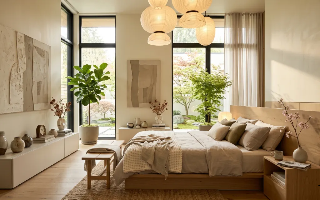
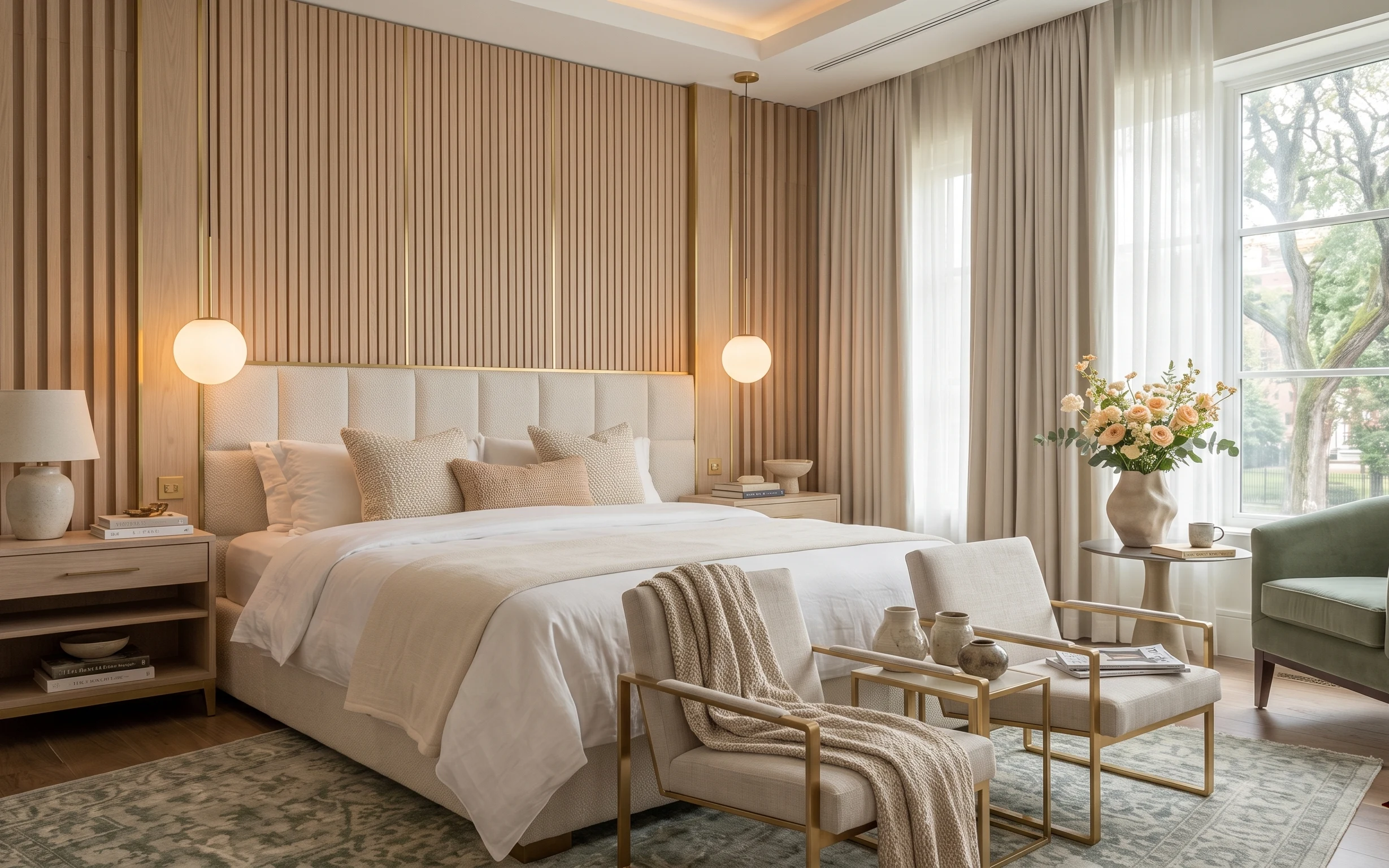
Why warm beige-and-oak styling is the bedroom of 2026
In this photo, the whole mood comes from how the light hits pale cream surfaces and how the textures stay quiet: a low wood bed, a chunky rug underfoot, and linen-look curtains softening the windows. The pendant cluster adds a “bundle of glow” overhead, but the real work is done by color restraint—beige on beige—with occasional ceramic warmth from the vases on the left. This is achievable for shared housing because every layer is something you can pack: textiles fold, rugs roll, and wall art swaps without affecting fixed fixtures.
I used to overthink wall decor in rentals and end up buying frames that were too precious to move. The turning point for me was realizing the wall art doesn’t need to be a permanent investment—it just needs to match the room’s palette and scale. Now I buy (or DIY) one statement piece and keep everything else behind it: pillows, throws, and a few ceramics that look good from the bed. It’s the difference between “decorated once” and “decorated for moving.”
Layer 1 — large area rug ($80) grounds the bed like a soft boundary
A large area rug in a natural tan tone is what makes this bedroom feel settled instead of floating. It visually anchors the low bed and foot bench, and it also absorbs the little daily knocks that happen in shared spaces—coffee spills, muddy shoes, and the occasional dropped book. I’d choose a 5×7 size for the same reason you see here: it can cover the area in front of the bed without swallowing the room. The trade-off is practical: you’ll vacuum regularly so the fibers keep that clean, matte look.
Pick a rug color one step warmer than the wall
That slight warmth keeps beige from turning gray once indoor lighting kicks in.
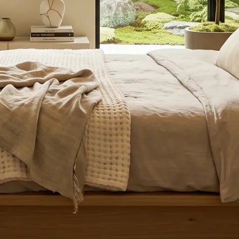
Layer 2 — beige throw blanket over bed ($25) adds one crease-friendly layer of texture
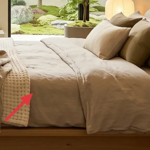
This throw blanket sits draped across the bed in a way that reads “casual, not messy,” and it’s doing more than warming up the look. The waffle/knit texture catches light differently than the smooth pillow covers, so the whole palette feels dimensional. For a move-friendly refresh, choose a medium-weight blanket that folds into a flat stack—no complicated wrangling. The obvious alternative is buying a third pillow, but blanket texture shows up from farther away and photographs better when you’re styling quickly.
Texture matters more than pattern
Staying mostly monochrome is what lets the ceramics and abstract art stay the star.
Layer 3 — bed pillows (mix of beige tones) ($30) keeps the bed looking styled for daily life
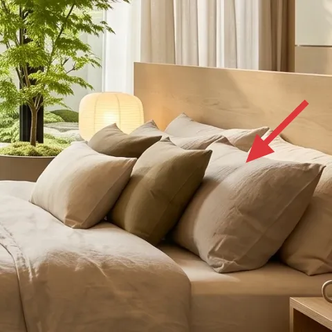
The pillow mix in the photo isn’t a complicated set—it’s different shades of beige plus a couple textures that create depth when you glance from the doorway. That’s the practical advantage for shared housing: you don’t need a “perfect” bed, because the variation disguises the everyday squish that happens after classes. Choose removable covers in cream, sand, and oat tones and keep one cover with a visible knit or weave. Compared to changing the bed itself, this is the easiest thing to pack and the easiest to redo when your next room has different light.
Let the color family lead
Beige-on-beige looks intentional, even when you’re re-styling in ten minutes.
Layer 4 — large framed abstract artwork near the center wall ($80) makes the whole palette feel designed
This framed abstract is placed where your eye lands when you’re lying down, so it works like an anchor for the entire bedroom color story. The shapes are muted, which means it won’t fight the pendants’ warm glow or the curtain softness. For renters and shared housing, the smart move is to treat this as the one “replaceable” piece you can swap or DIY at the start of each lease. The trade-off: because art is the focal point, you want to match the tone (cream, oat, and light brown) rather than add a bright accent you’ll get tired of fast.
Make it instead of buying it
DIY a similar abstract artwork by painting shapes on cardstock, then placing it into the same frame style you already own or can buy secondhand.
Materials
- Cardstock (thick, ~11×14) — 1 sheet — craft store — $12
- Acrylic paint (cream/oat/light brown tones) — small set — craft store — $8
- Small flat paintbrushes — 2 sizes — craft store — $7
- Painter’s tape — 1 roll — hardware store — $3
- Matte sealer spray (optional for durability) — 1 can — craft store — $2
Steps
- Sketch 3–5 blocky shapes lightly on the cardstock with a pencil.
- Tape off one shape area to keep edges crisp.
- Paint the lightest shape tone first, then let it dry fully.
- Remove tape and paint the mid-tone shapes, working from largest to smallest.
- Clean the brush, then add a couple darker accents for contrast.
- Let the whole piece dry until it no longer feels tacky.
- Optional: lightly spray a matte sealer from a distance and allow it to dry.
- Test-fit into the frame (or measure your mat opening) before moving on.
- Check for any smudges with a dry cloth and touch up tiny spots.
- Slide the finished paper into the frame backing and secure.
Total DIY cost: $32 — saves about $48 over buying.
Layer 5 — ceramic vases (various shapes) on the left dresser ($20) adds “collected” warmth without bulk
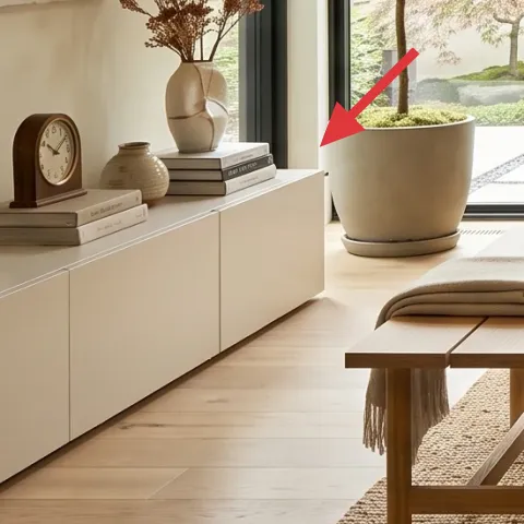
Ceramic vases on the left dresser do two jobs at once: they echo the pale neutrals and they give the eye a place to rest between wall art and bed textiles. Because you can choose lightweight shapes (and often thrift them), they’re a great shared-housing buy. Stick to one material family—matte ceramic in warm tones—so they feel cohesive even when you mix heights. The alternative is buying one large decorative object, but small ceramics are easier to wrap, transport, and rearrange when you’re living in a new layout a year from now.
Avoid glossy finishes in this palette
Gloss catches pendant reflections and can look harsher than the warm, matte ceramics in the photo.
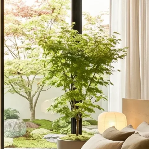
Layer 6 — tall potted plant with broad leaves on the window ledge ($15) brings the bright green that keeps beige from feeling flat
That broad-leaf plant is the color interruption that stops all the cream tones from blending together. It’s also placed near the window, where daylight makes it feel fresh instead of decorative-lifeless. For a move-ready refresh, a medium plant is worth it because it adds life without adding furniture volume—just lift, wrap, and pack. The trade-off is maintenance: plants want light and occasional watering, so if your schedule is hectic, choose something hardy and forgiving in low-key windows. In the meantime, dried stems can tide you over stylistically.
Match plant height to your sightline
A tall plant near the window reads “intentional background,” not clutter.
Layer 7 — linen-look curtain panels ($80) softens the windows and frames the bed view
Long, linen-look curtain panels are what make this bedroom feel calm rather than bright-and-bare. They soften the edges of the glass and keep the pendant glow from looking too sharp overhead. For shared housing, this is mostly a textile swap: choose panels that can be folded, moved, and re-hung without drilling. The best strategy is to aim for a similar color depth—cream with a hint of warmth—so the curtains look like part of the palette, not a separate “theme.” If your landlord won’t change hardware, stick to clip-on rings or existing curtain rods where allowed.
Hang for a touch of puddle
Even a small amount of extra length adds that relaxed, spa-like fall.
The cost, layer by layer
| Layer | Item | Cost |
|---|---|---|
| 1 | Area rug 5×7 in natural tone | $80 |
| 2 | Throw blanket in beige knit | $25 |
| 3 | Throw pillow covers in beige mix | $30 |
| 4 | Framed abstract artwork near the center wall | $80 |
| 5 | Ceramic vase group for styling | $20 |
| 6 | Tall potted plant with broad leaves | $15 |
| 7 | Linen-look curtain panel pair | $80 |
| Total | $330 | |
If the budget needs to dip, swap the framed abstract for a gallery-style print you can roll up in packaging, and choose a smaller plant or one statement vase instead of a vase group.
What worked, what didn't (across the whole room)
This bedroom’s calm energy comes from beige-on-beige layering plus one clear focal point: the abstract art. The result feels designed without being precious, which is exactly what a shared space needs.
What worked
- The natural-toned rug keeps the low bed area visually “finished” even with minimal furniture.
- Layering a throw blanket with mixed beige pillows adds depth without needing new furniture.
- The framed abstract near the center wall gives the eye a focal point from bed height.
- Warm ceramic vases on the dresser make the palette feel collected, not staged.
- The broad-leaf plant adds green energy that prevents beige from turning flat.
- Linen-look curtain panels soften glare and help the pendant lights feel cozy.
What didn't
- If pillow covers are too mismatched (different undertones), the bed reads scattered instead of intentional.
- Trying to rely on only wall art—without texture in textiles—can make the room feel one-note.
- Glossy ceramics can clash with pendant reflections and look harsher than matte pieces.
- If a plant dries out or fades, it stops doing its color job and looks accidental.
- Using curtains that are too sheer or too short makes the windows feel unfinished behind the bed.
What we'd skip if we did it again
Skip buying a full matching bedroom set. In shared housing, the “theme” doesn’t survive your next move, but your textiles and one wall focal point do.
Skip thick, heavy wall decor that feels like it needs perfect anchoring. The framed abstract (or a DIY paper replacement) is enough impact without turning moving day into a project.
Skip adding more color just to “break up beige.” In this palette, texture and placement (rug, blanket, pillows, curtains) do the work—so the room stays calm even when life gets busy.
Frequently asked
How long does this bedroom refresh take?
Most of the time goes into styling: laying the rug where it feels centered, arranging pillow heights, and setting the ceramic cluster so it looks “collected” instead of random. The DIY abstract paper is the only step that adds waiting time for drying. Plan on about 2–3 hours total if you already have a frame, and closer to half a day if you’re shopping for pieces in one run.
What if my room doesn’t get this much daylight?
Use the same beige family, but lean slightly warmer in the rug and pillows so the room doesn’t turn cool-gray at night. If your windows are dim, curtains become even more important: choose linen-look panels that let some light through while still softening glare. The pendants already read warm in the photo, so matching your textiles to that warmth is the easiest fix without changing fixed fixtures.
Is this renter-friendly if I can’t change hardware for curtains?
Yes. The goal is long, soft fabric that hangs close to the window look. If you can’t change curtain rods, consider clip-on methods that work with existing rods where allowed, or swap to panels that fit your current hardware. The refresh doesn’t require drilling because the key impact is coming from textile texture and length, not from new mounting.
Where should I shop if I want the same palette quickly?
For fast matches, start with stores that specialize in home textiles and neutral bedding accessories, then move to a secondhand route for ceramics and frames. The abstract artwork is the best place to spend time hunting because scale matters—look for art that sits well at bed height. If you can’t find it, the DIY cardstock abstract keeps you on palette without the “shopping fatigue” spiral.
What’s the biggest mistake people make in a beige bedroom?
Overdoing perfectly matching fabrics. Beige needs variation in texture and tone—knit throw, woven-looking pillow covers, and matte ceramics—to avoid looking flat. Another common miss is adding bright color as a shortcut; in this style, the “pop” comes from plant green and subtle contrast in the abstract, not neon accents.
More in Bedroom

What $350 buys: a move-ready bedroom refresh
A warm japandi-style bedroom refresh that packs into boxes: rug, soft beige textiles, simple styling ceramics, and one statement abstract. …
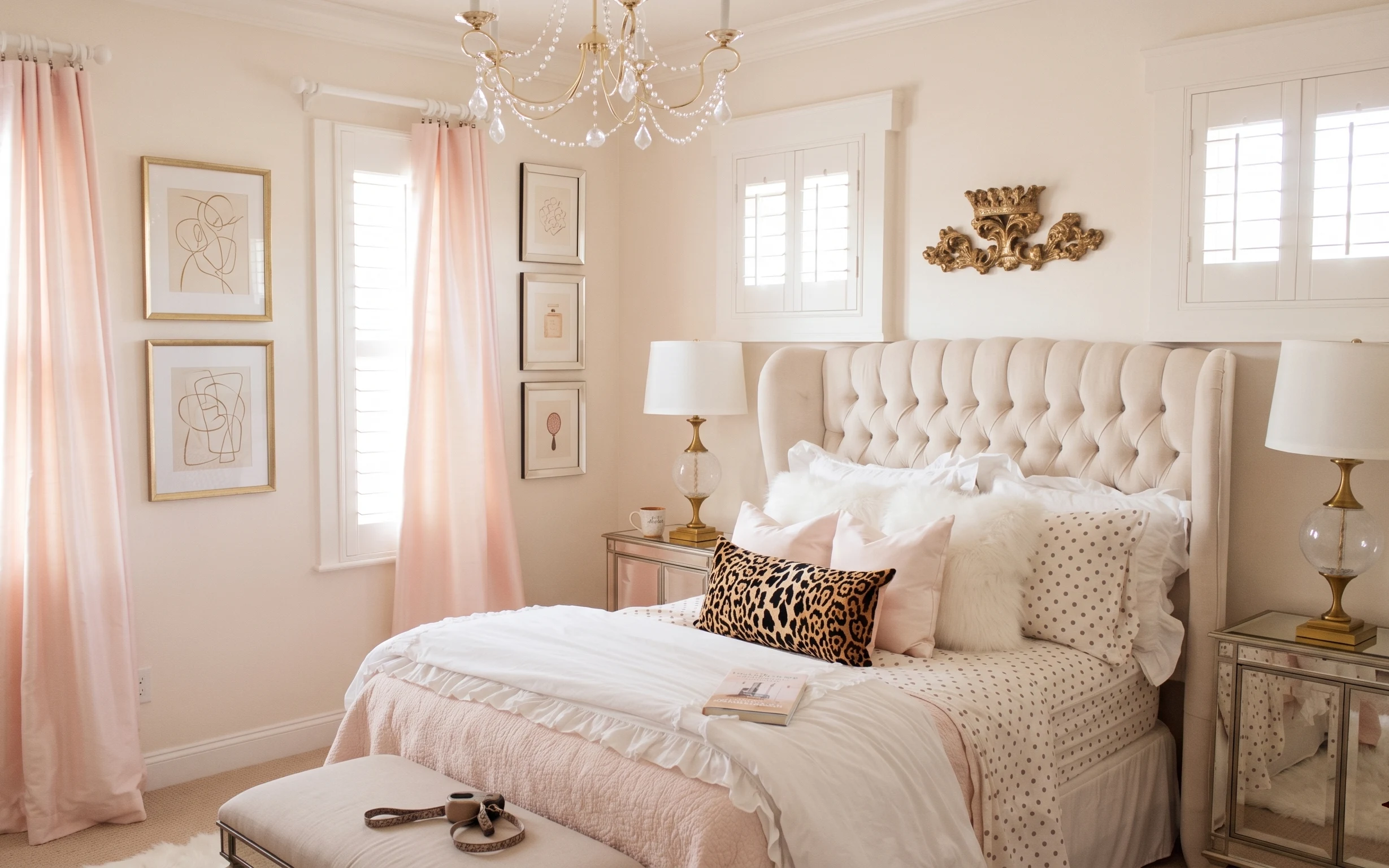
Warm blush-and-gold bedroom refresh, $1000
A blush-pink curtain, a crystal ceiling light, and a tufted bed make the bedroom feel polished fast. This $1000 weekend refresh focuses on …
How to update an upholstered bed room for $400 (7 move-ready swaps)
A $400 bedroom refresh that leans japandi: swap in a warmer rug, add curtain drape, and restyle the bed with move-friendly soft goods. Each…