- Best for
- weekend focal-point refresh
- Cost
- $700 total budget
- Difficulty
- Easy DIY wallpaper + styling
- Time
- about 1 weekend
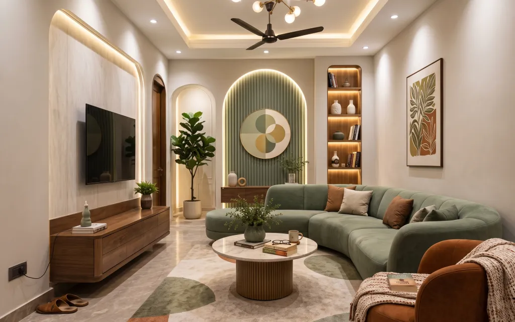
Why sage-and-warm wood is the sofa lounge of 2026
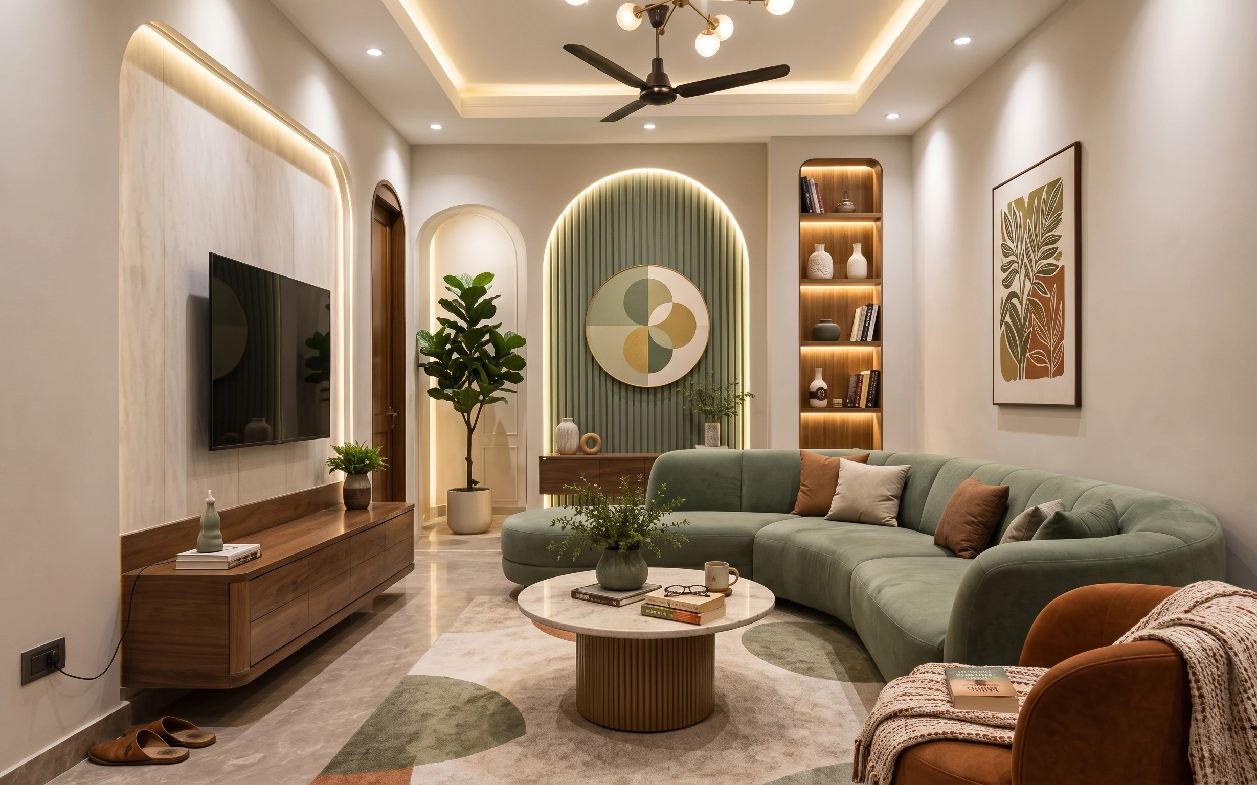
In this bright sofa lounge, the off-white walls and the warm wood flooring give you a clean starting point, then the sage sofa and the cream knit throw do the “soft” work. The room’s textures do most of the heavy lifting: knit throw + patterned rug underfoot, a smooth ceramic vase on the coffee table, and the crisp vertical lines in that arched niche. It’s a look that reads intentionally styled, but it’s achievable for homeowners who can paint, install shelves and wallpaper, and swap textiles without waiting on a contractor.
I used to overthink “feature walls,” like I could get the same effect just by adding one big frame. What changed my mind was seeing how vertical stripe wallpaper in an arched space makes the whole room feel taller—even when the furniture stays exactly the same. Now I shop for geometry first, then layer in the textiles that make it comfortable.
Layer 1 — area rug 8×10 (sage stripe pattern) ($200) Grounded underfoot, with a built-in color bridge
A rug is what makes a sofa lounge feel like one complete “room,” not just furniture arranged in the open. In the photo, the rug’s pale base keeps everything light, while the sage stripes echo the sofa’s color so the palette doesn’t rely on one throw pillow to do the convincing. This is the easiest option to do on a weekend because it’s basically placement and smoothing, not demolition. The trade-off is you have to measure once and commit—rugs look smaller online than they do on your floor.
Anchor the sofa with a ruler
Before you open the rug, mark the front legs of the sofa location so the rug edges land evenly on both sides.
Layer 2 — throw blanket (cream knit, draped) ($60) Softens the green sofa without changing it
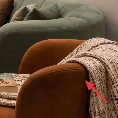
The cream knit throw draped over the right side reads warm against the sage upholstery, which is exactly why it works here. Knit texture does something smooth walls can’t: it breaks up the room’s sleek lines from the TV wall and the arched niche. If you swap a throw blanket for a thinner fabric, you’ll lose that cozy contrast and the sofa can start to feel too “clean” or flat. The trade-off with a thicker knit is storage—keep it folded in a basket or on a chair when it isn’t in use.
Match undertones, not just color
Cream knit works because it’s not bright white—it blends with the warm wood tones.
Layer 3 — throw pillows (sage + camel mix) ($30) Adds depth with two warm neutrals
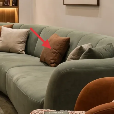
These throw pillows do the math for you: the sage keeps the color story consistent, and the camel/brown tones add contrast without fighting the wood. Look at how the pillows sit where you’d actually rest—centered, visible, and different sizes—so the sofa reads styled instead of bare. Choosing pillow covers (rather than stuffing everything with brand-new inserts) is usually the faster path to a layered look. The trade-off is that too many pillows can visually crowd a lounge; stick to two to four and vary the textures.
Use one “solid” and one “warmer”
If both pillows are similar in pattern, add contrast by keeping one more neutral in tone.
Layer 4 — peel-and-stick wallpaper for the arched niche (vertical stripes) ($150) Makes the niche read intentional
That arched niche is the room’s architectural moment, and the vertical stripe wallpaper turns it from “blank space” into a focal feature. The stripe direction matters: it pulls the eye up and makes the alcove feel more dimensional, which is especially helpful in a sofa lounge with a low visual clutter level. Peel-and-stick is the weekend-friendly route because you’re building impact without calling in trades. Trade-off: even premium wallpaper shows seams if the wall isn’t smooth—take time to clean and dry the surface before you start.
Don’t rush the first strip
If the initial alignment is off, the stripes won’t meet correctly and the arch will look “wavy” instead of crisp.
Layer 5 — framed botanical print (right wall) ($80) Pulls the palette into the “garden” zone
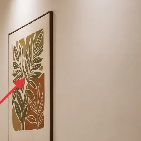
The framed botanical print on the right wall is your color punctuation—leafy tones echo the greenery and soften the room’s geometry. It also balances the darker circular wall art so your eyes don’t feel pulled in only one direction. A framed print is one of the most practical weekend buys because hanging is fast, and swapping a print is simpler than changing paint or built-ins. The trade-off is sizing: if it’s too small, it’ll look like décor; if it’s too large, it competes with the niche.
Hang it at art-eye height
Center the print so the middle sits around 57–60 inches from the floor for most people.
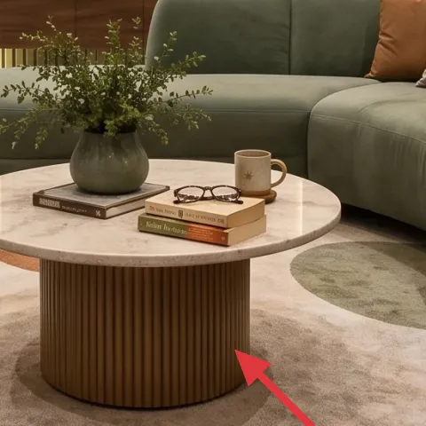
Layer 6 — decorative ceramic vase on coffee table ($25) A small centerpiece with big color payoff
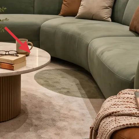
The decorative ceramic vase gives the coffee table a reason to exist beyond “place books here.” In the photo it’s a soft neutral shape that carries the room’s warm palette, and the greenery inside adds a second layer of texture—tiny leaves against smooth ceramic. This is an easy place to spend a little and look intentional because the silhouette stays visible all day. The trade-off is that a vase with short stems can look empty; give it enough volume so it reads from the sofa, not just up close.
Keep the opening filled
When in doubt, add a second handful of stems so the vase looks full from couch height.
Layer 7 — floor potted plant in white pot (4–6 ft) ($60) Adds life where the lounge feels biggest
The tall floor potted plant in the white pot is what keeps the lounge from feeling like it’s only “designed.” It softens the straight lines of the TV wall and the arched niche, and it ties the greenery theme back to the botanical print and the vase on the coffee table. Choosing a plant that’s tall enough matters—short plants can disappear in the visual scale of a sofa lounge. The trade-off is maintenance: plan for occasional trimming and rotate the pot so growth stays even toward the light.
Rotate for even growth
Turn the pot a quarter turn each week so the plant doesn’t lean.
The cost, layer by layer
| Layer | Item | Cost |
|---|---|---|
| 1 | Area rug 8×10 (sage stripe pattern) | $200 |
| 2 | Throw blanket (cream knit, draped) | $60 |
| 3 | Throw pillows (sage + camel mix) | $30 |
| 4 | Peel-and-stick wallpaper for arched niche (vertical stripes) | $150 |
| 5 | Framed botanical print (right wall) | $80 |
| 6 | Decorative ceramic vase on coffee table | $25 |
| 7 | Floor potted plant in white pot (4–6 ft) | $60 |
| Total | $605 | |
If you want a cheaper version, swap the rug for a smaller size or a less-patterned neutral, and choose a single large framed print instead of adding multiple small accents. You can still keep the arched niche wallpaper as the anchor for the whole look.
What worked, what didn't (across the whole room)
The biggest win was using pattern and geometry in one place: the arched niche with vertical stripes makes the lounge feel designed even before you add décor. The second win is how the sage palette is repeated in three materials—sofa upholstery, rug pattern, and greenery—so it stays cohesive.
What worked
- The rug’s pale base keeps the room bright while the sage stripe pattern links to the sofa.
- The cream knit throw adds visible texture contrast against the smooth upholstery.
- Two warm-toned pillows stop the sage from feeling monochrome.
- The vertical striped wallpaper inside the arched niche makes the space feel taller.
- The framed botanical print softens the TV-and-wood “hard” visual lines.
- The ceramic vase and greenery bring a daily-use centerpiece to the coffee table.
What didn't
- If the first strip of niche wallpaper isn’t aligned, stripes look crooked even after smoothing.
- Over-stuffing the sofa with extra pillows makes the layout feel busy and less intentional.
- A vase with too few stems reads empty from the sofa, even if it looks fine up close.
- A small plant disappears next to the arched feature, leaving the lounge feeling top-heavy.
What we'd skip if we did it again
Skip adding more wall décor on top of the niche and the two existing focal pieces. When the arch already has vertical stripes and there’s a circular print plus a framed botanical, the “best looking” rooms usually stop at fewer layers.
Skip buying a throw blanket that’s too thin. With a sage sofa, the contrast has to show—knit texture reads as warmth; a flat woven can look decorative but not soft.
Skip choosing a rug that’s the right width but the wrong placement. If you get the sofa-leg coverage uneven, everything else looks off, even when the colors are perfect.
Frequently asked
How long does this kind of living room refresh take?
Expect the rug and styling to take a few hours, and the wallpaper to take most of the “project time” depending on the arch shape. Most homeowners can do it in a single weekend if the surface is clean and dry before you start and you do a careful first alignment. Framing and hanging art usually adds another hour or two.
If I rent, what’s the easiest version of this look?
The rug, pillows, throw blanket, and plant are fully removable and usually the safest renter bets. For the arched niche, choose peel-and-stick wallpaper rated for renters or skip it entirely and use a framed print with a similar vertical pattern. The goal is to keep the “geometry cue” without taking long-term risks.
What if my sofa lounge is smaller than this one?
Use the same palette cues, but scale down what crowds. Go smaller on the rug (or choose a less busy pattern) and keep pillow count to two to three. The arch niche wallpaper can still work in a smaller room—just make sure the first strip is aligned so the vertical lines look sharp, not wavering.
What if my room is larger—should I go bigger on the rug and art?
Yes, scale helps in a larger room. Increase rug size so the sofa front legs sit on the rug, and choose a framed print width that balances the niche. For greenery, size up the plant so it doesn’t visually shrink against the tall open shelving and the arched detail.
Where should I shop for these pieces without blowing the budget?
For rugs and throw textiles, start with big-box home retailers or marketplaces with easy returns. Peel-and-stick wallpaper is usually best ordered directly from the brand or from a retailer that clearly lists coverage area. For framed botanical art, look for 16×20 or similar standard print sizes so framing isn’t a surprise cost.
What’s the most common mistake in this room type?
The mistake I see most is misalignment on the wallpaper first strip. Because the arch is curved, the eye catches crooked stripes quickly once you step back. The second mistake is using too many pillows or décor—this layout looks best when color repeats are intentional and spacing stays calm.
More in Living Room
What $700 buys: a sofa lounge refresh with arched-niche style
A bright sofa lounge refresh that leans sage, warm wood, and an arched vertical-stripe niche. With 7 buys (plus one DIY) totaling $700, you…
A calmer sofa-and-TV seating area for $700
A weekend refresh for your sofa-and-TV seating area with a natural woven rug, beige curtains, a knit throw, leafy plants, and shelf vases. …
How to style a living room for under $500
Warm modern living room refresh for shared housing: one rug, two curtain layers, and small coffee-table styling to make everything feel pul…