- Best for
- moving-friendly living room glow
- Time
- 3–5 hours total
- Total cost
- $550 for 7 swaps
- Renter-safe
- yes (no drilling/permanent installs)
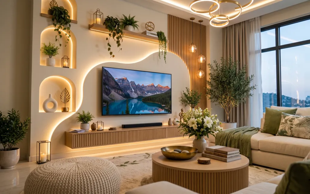
Why warm wood-and-gold glow is the living room of 2026
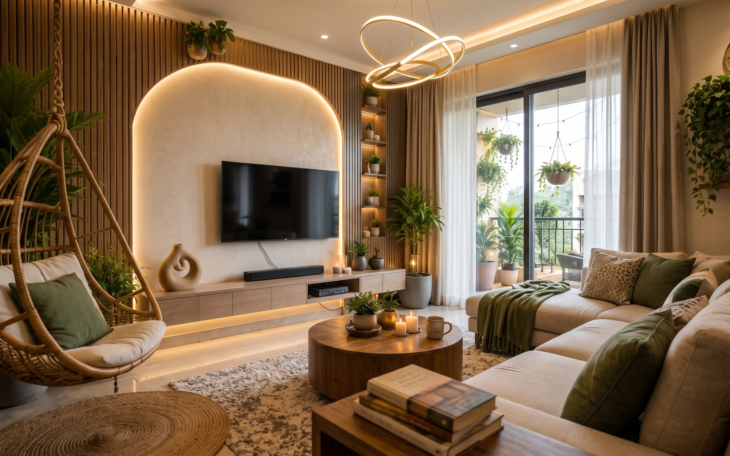
The fastest way to get this look in shared housing is to copy the feeling, not the fixtures: warm light in niches, a botanical green accent, and natural materials that don’t mind being packed. The rug’s beige tone, the ribbed wood coffee table, and the green knit throw all pull the palette together without demanding “wall changes.” For the art, the framed landscape adds depth the same way magazines style mountain views—calm, scenic, and easy to move. It’s achievable for renters because every swap below either clips, rests, or packs into a box.
I almost overdid it the way I did in my last place—buying matching “sets” and calling it design. Then I realized the room didn’t need more furniture; it needed a few repeatable textures: knit + framed print + candlelight. Once I stopped chasing symmetry and leaned into warm neutrals and one green pattern, the whole corner looked intentional in photos, and just as good in real life.
Layer 1 — green botanical pattern throw pillow ($30) dyed pillow color you can pack
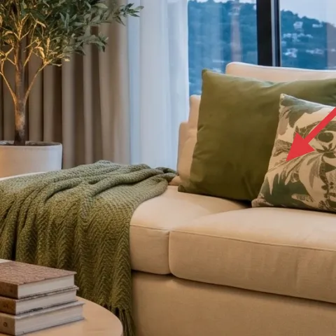
Start with the pillow because it’s the easiest “color anchor” to transport. This one’s green botanical pattern reads like a plant silhouette against the sofa’s light upholstery, which makes the whole palette feel cohesive with the bouquet and the indoor greenery. Buying a ready-made cover gives you the exact look, but the move-friendly version is to dye a plain cover toward this deep sage tone—so you’re not stuck if the next apartment’s lighting is different. The trade-off: dye won’t look identical to a printed design, but it will stay aligned with the room’s warm, nature-first mood.
Make it instead of buying it
DIY-dye a plain green pillow cover so the shade matches the room’s botanical green accents without buying a pre-printed cover you can’t reuse.
Materials
- Plain light pillow cover — 1 — craft store — $10
- Fabric dye (sage/green family) — 1 kit — craft store — $10
- Table salt (for dye set) — small box — grocery store — $3
- Gloves — 1 pair — pharmacy — $2
Steps
- Pre-wash the pillow cover so it dyes evenly and doesn’t fight residues.
- Mix dye according to the kit, then wet the cover so color spreads consistently.
- Submerge and stir steadily for the time needed for a deep sage result.
- Rinse in cool water until runoff is clear.
- Set the color using the kit’s salt/setting guidance, then rinse again.
- Dry completely before stuffing back into place on the sofa.
Total DIY cost: $25 — saves about $5 over buying.
Match the lighting, not the internet
In warm rooms, greens skew softer. Dye slightly deeper than you think, and you’ll still get that calm botanical vibe after the sun goes down.
Layer 2 — glass lantern candle ($35) adds a second light source without wall installs
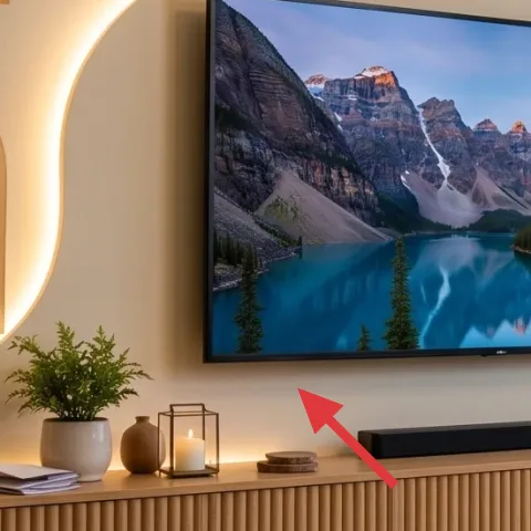
This glass lantern candle is the small-scale lighting that makes the whole room feel edited. In the photo it sits near the console styling, and that placement matters: light at tabletop height makes the glow feel intentional, not dim background. Choose a lantern that’s glass-fronted so the flame reads as a soft core, then keep the candle unscented if you’re sensitive. The trade-off is that candlelight is seasonal—some nights you’ll want it off—but that impermanence is exactly what makes it renter-friendly. Pack it in a padded box, set it on a surface, and let it do the work.
Place it where the eye already travels
If your console is the room’s “line,” keep the lantern near the front edge so the warm light lands on textures (wood, glass, leaves).
Layer 3 — flower bouquet in a glass vase ($40) brings the palette to life
A real bouquet in a glass vase is how you get the “biophilic” part of this style without changing anything structural. The flowers in the image lean pale and creamy, which keeps them compatible with the beige rug and warm wood, and the clear vase adds a reflective highlight that pairs nicely with lantern light. Go for stems that you can trim, because shared houses are temporary and you don’t want a tall vase you can’t rebuild. The trade-off is maintenance: you’ll top up water, and blooms won’t last forever—but you’re buying freshness, not permanence.
Trim like you’re styling
Shorter, denser stems look fuller in small spaces, and they travel better when you move.
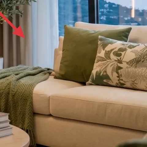
Layer 4 — green knit throw blanket ($45) texture that reads cozy on camera
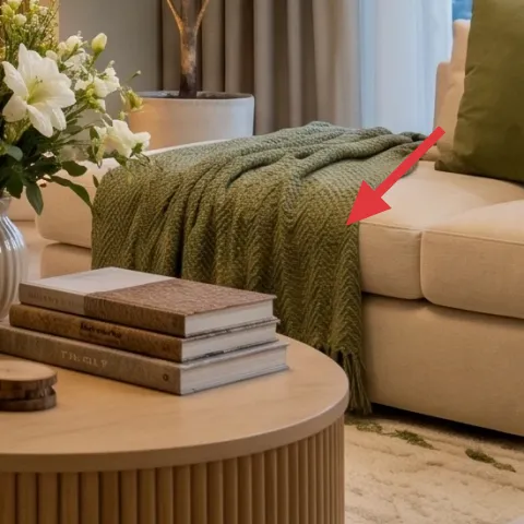
The green knit throw is the texture bridge between the botanical pillow, the bouquet, and the living-room glow. Knit matters here: compared to a silky throw, it diffuses light and keeps the room from looking too polished. Drape it over the sofa arm or along the seat cushion like the photo so it creates a soft diagonal—instant depth without any wall work. The trade-off is that knit can shed a little at first, so give it a quick brush or lint-roll before guests arrive. It also packs flat, which is a big deal in shared housing.
Fold it for box space
Roll the throw with the knit surface facing inward, then slide it into a flat moving box to avoid permanent creases.
Layer 5 — framed landscape wall art print ($80) a portable “deep space” moment
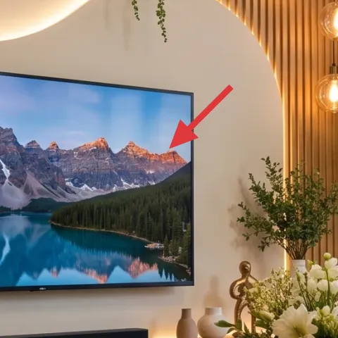
That framed landscape print pulls the whole room toward nature by adding horizon lines and cool blue-green contrast against warm walls. It’s also one of the easiest “non-negotiables” to carry between apartments: pop-out frames and poster board backs pack quickly, and you don’t need to rely on landlord approval for permanent installs. The trade-off is size planning—this kind of statement art needs to land at eye level, so measure before you buy. If the next place has a different layout, you can move it to a different wall because the print itself stays the same. That’s the definition of impermanent-friendly design.
Don’t count on a “perfect” wall
If your next place has blank, slick, or textured walls, test where the frame rests or clips first—otherwise it may sit crooked.
Layer 6 — round ribbed wood coffee table ($120) anchors the warm, modern base
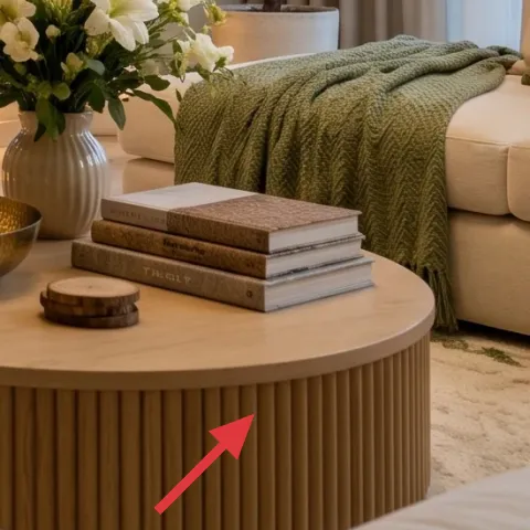
The ribbed wood coffee table gives you that tactile, modern-japandi feeling without being visually heavy. In a room with warm LED glow and lots of organic shapes, the ribbing adds subtle pattern so the palette doesn’t become one smooth beige mass. If you’re shopping move-friendly, look for a table with straightforward assembly and lightweight construction; the goal is to break it down and pack it without a crew. The trade-off is stability—some lightweight knock-down frames wobble—so choose a model with snug joinery or extra leveling feet. This piece is doing “architecture” work in the center, so it’s worth spending a little more than on decor.
Keep the top styling low
For photos and everyday use, style a shallow cluster (vase + books + candle tray) and leave space for hands to set things down.
Layer 7 — beige area rug ($200) soft underfoot that unifies everything
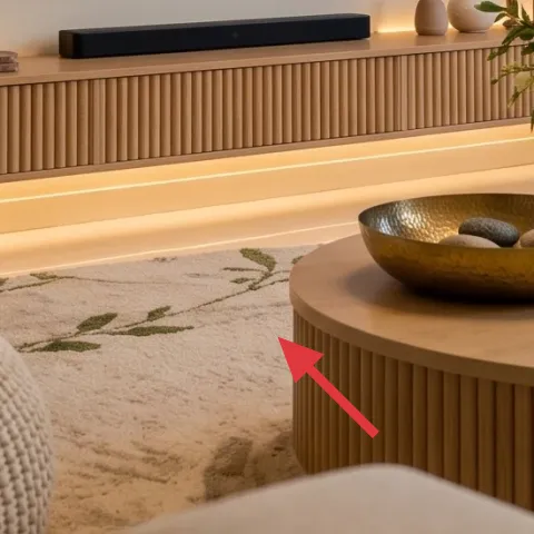
A beige area rug is the quiet foundation in this room: it buffers the warm wood and cream walls, and it makes the green accents feel intentional instead of loud. The pattern in the rug reads organic, which fits the landscape art and plant styling. Choose a size that reaches under the sofa front edge if possible—coverage makes rooms look bigger and keeps the visual “noise” from floor details. The trade-off is cost, because rug quality affects texture and shedding, but this is one item you’ll likely keep across multiple leases. Roll it carefully with a rug pad if you can, and it should travel without drama.
Use a pad for less slipping
A rug pad also makes the rug feel thicker, which is how it stays luxurious without a furniture swap.
The cost, layer by layer
| Layer | Item | Cost |
|---|---|---|
| 1 | Dyed pillow cover (DIY equivalent) | $30 |
| 2 | Glass lantern candle | $35 |
| 3 | Flower bouquet in a glass vase | $40 |
| 4 | Green knit throw blanket | $45 |
| 5 | Framed landscape wall art print | $80 |
| 6 | Round ribbed wood coffee table | $120 |
| 7 | Beige area rug (5×7 or similar) | $200 |
| Total | $550 | |
If you need it cheaper, swap the framed print for a smaller framed size ($40–$60) and choose a thinner rug in the same beige family. Keep the dyed pillow cover + knit throw + lantern, because that’s the “feel” core of this room.
What worked, what didn't (across the whole room)
This room’s formula works because the glow, the botanicals, and the warm wood all repeat through textures—so nothing looks accidental. The downside is that it can feel “styling-forward,” meaning a single missing texture makes it read unfinished.
What worked
- The dyed green pillow ties the bouquet and plant life together without needing new wall color.
- Lantern candlelight adds depth at tabletop height, which keeps the room soft after dark.
- The knit throw introduces a second texture layer that balances smooth wood and glass.
- The landscape print provides horizon contrast, so warm neutrals don’t flatten the space.
- The ribbed coffee table anchors the center with subtle pattern that still packs well.
- The beige rug unifies the palette and visually holds the sofa + coffee table in one zone.
What didn't
- When you skip one textured layer (knit or rug), the room reads too beige and less intentional.
- Overfilling the coffee table makes the warm lighting feel cluttered instead of calm.
- If the framed print placement is off-center, the whole wall looks unbalanced even with plants.
What we'd skip if we did it again
Skip copying the exact “niche glow” layout. The LED glow is built-in in this photo, and shared-housing upgrades should be portable—use lanterns and warm bulbs in plug-in fixtures instead.
Skip buying a full matching furniture set. One anchor piece (coffee table) plus a rug and textiles gives the same look with far more flexibility when you move.
Skip over-sized wall art if the next apartment wall is unknown. A statement print is great, but choose a size you can comfortably rehang or switch to another wall without rethinking the whole room.
Frequently asked
How long does this kind of refresh take in shared housing?
Most people can do the textile and decor swaps in one afternoon: rug placement, throw and pillow swaps, lantern and vase styling, and framing the print. The dye step is the only time-sensitive part—plan on extra hours for rinsing and drying. If you’re using a prepared pillow cover instead of dye, you can likely finish in 2–3 hours.
What if I can’t change wall positions for the framed art?
No problem—framed landscape art is the easiest item to adapt. If your ideal wall isn’t available, restyle the print on the closest blank wall and shift the anchor pieces: keep the rug edge consistent and put the coffee table and throw in the same “zone” as in the photo. The goal is repeatable spacing, not a specific wall.
Can I make this work in a smaller living room?
Yes. In smaller rooms, prioritize the dyed pillow, the knit throw, and the rug first; skip adding extra decor height beyond the lantern and vase. Keep the bouquet stems trimmed so the vase doesn’t crowd the window. If you choose a rug, go as large as the room allows so the sofa reads grounded instead of floating.
What if my living room gets cooler light (more blue than warm)?
Cooler light makes sage green look sharper, which can either be great or too stark. Dye slightly deeper toward moss, and choose a throw that has visible knit texture so it still feels warm. For the framed landscape, make sure the print has greens in it—not just gray—so the color relationship stays consistent under different bulbs.
Where should I shop if I want the same vibe but cheaper?
Look for the rug and the coffee table at places with frequent inventory changes: marketplaces, discount home stores, and local thrift when available. For the pillow cover dye, any craft store dye kit and a plain cover will get close in tone. The lantern and framed print are easiest to match at home decor retailers, but you can also thrift frames and swap the print.
What’s the biggest mistake people make in living-room styling like this?
The most common mistake is treating it like a set. When every item matches the same material finish, you lose the layered effect that comes from knit, glass, and wood together. Aim for one strong color anchor (green), one nature reference (landscape print), and two textures (rug + throw). That’s what makes it look designed.
More in Living Room

5 no-drill living room updates for $600
A warm, plant-heavy living room refresh with $550 in move-ready swaps and one no-drill DIY. Focus: a dyed green pillow, layered textiles, a…
7 move-ready swaps for a $400 living room sofa corner
A warm walnut-and-olive sofa corner refresh built from 7 no-drill swaps, totaling $378 (under $400). This plan focuses on rug grounding, la…
A plant-forward living room for $600
A plant-forward living room refresh built for $600, focused on a soft cream rug, layered sofa textiles, removable wall art, and move-friend…