- Best for
- Texture + removable wall art
- Cost
- $540 total estimate
- Difficulty
- Easy swaps
- Time
- 2–4 hours
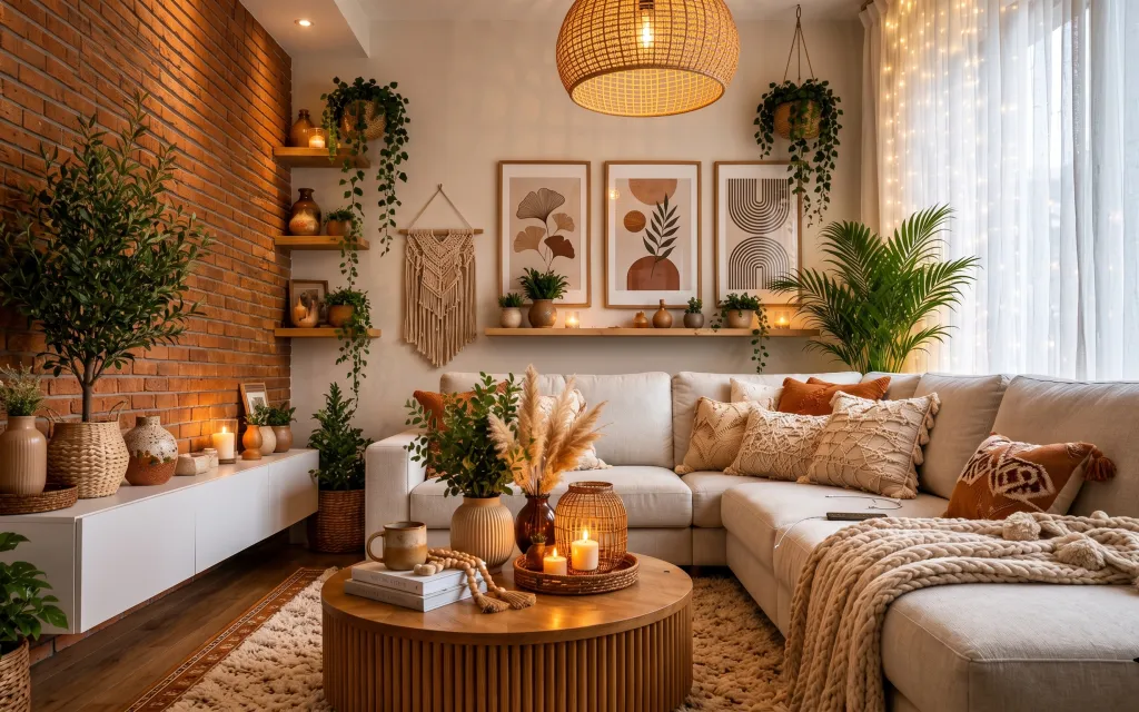
Why terracotta-and-cream is the living room of 2026
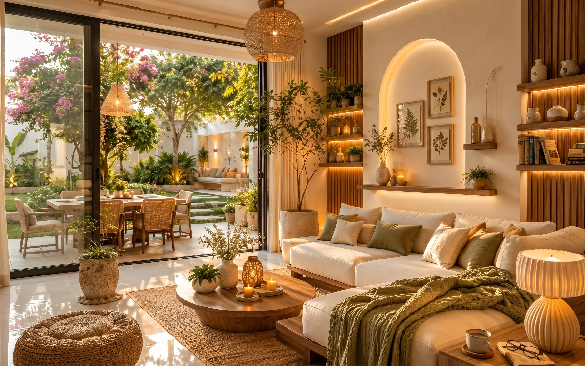
The fastest way to get this look is to start on the floor: the cream rug softens a brick wall and keeps all the warm plant tones from feeling too intense. Then layer the sofa with a tan throw and a cream textured pillow—same palette, different weave. The wall does the rest with framed botanical prints that read like one cohesive set, plus the macramé hanging for that knotted, handmade rhythm. This is totally achievable for shared housing because every piece here is either freestanding or hangs with removable hardware.
I used to underestimate how much a rug changes the whole “temperature” of a room. In my first apartment, I tried to match paint colors with decor, and it looked flat because my floor was doing nothing. The shift for me was leaning into texture instead—pile height, knit, and woven surfaces—so the brick stays bold but the room still feels soft.
Layer 1 — Cream rug with short pile ($200) Underfoot softness that grounds the brick
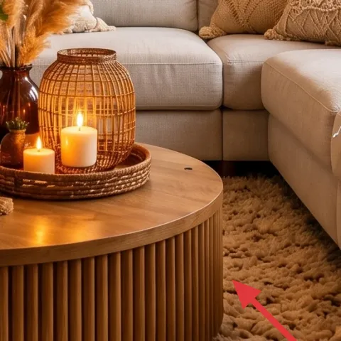
A cream rug with a short pile is what makes the whole living room read calm, even with all that brick and plant green. The color keeps the space bright, while the pile adds a gentle texture that works with both the tan throw and the cream pillows. Buying a rug is the biggest single-ticket item in this setup, but it’s also the most “universal” move-friendly upgrade—roll it up, tape the edges, and it goes in a rental van. Skip the ultra-thick shag here; short pile looks cleaner against the woven lamp and doesn’t fight the wall details.
Rug placement for best effect
Center the rug so the coffee table sits firmly on it, and keep at least a few inches of rug visible beyond the sofa legs.
Layer 2 — Tan throw blanket ($45) A woven layer that reads warm, not heavy
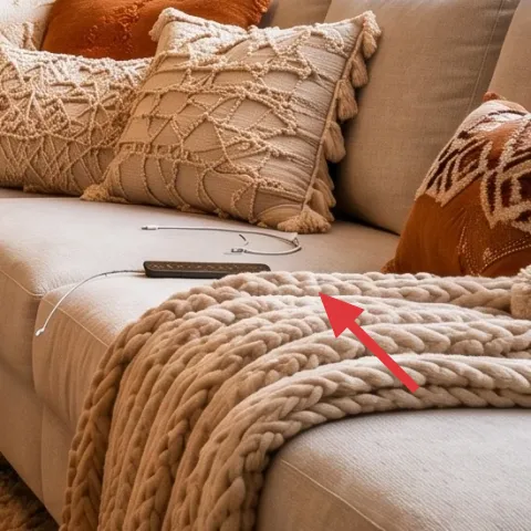
The tan throw blanket works because it repeats the room’s warm neutral without turning into “one more beige.” In the photo, it drapes across the sofa and adds that slightly rough, natural fiber look that echoes the brick and the woven lighting. If you choose something too silky, it can look out of place next to the textured pillows and the macramé. The trade-off is that a throw is visual texture, not storage—so plan to tuck it to one side when you’re packing for a move. It’s an easy item to swap later if the next place has different light.
Texture beats exact color matching
Stay in the same temperature (warm), then let weave and weight do the matching.
Layer 3 — Cream textured throw pillow ($30) Knit-and-twill contrast against smooth cushions
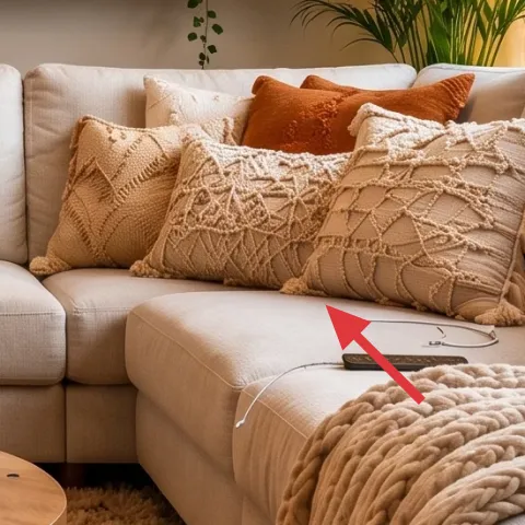
This cream textured throw pillow adds dimension because it interrupts the smooth, uniform sofa upholstery with a visible stitch pattern. The color keeps the room light, and the texture makes the boho styling feel intentional rather than random. A solid pillow cover is tempting, but it tends to blend into the sofa—especially in warm lamp light—while a textured cover catches highlights. The good part for shared housing: pillow covers compress flat, and you can keep a small “swap kit” for future rooms. In this layout, one statement texture looks better than five similar ones.
Make one pillow “the texture”
Pick one pillow cover with the most texture and keep the rest quieter.
Layer 4 — Framed botanical prints ($5) ($120) A removable wall story in matching frames
The framed botanical prints bring structure to the wall, and they’re the easiest way to make brick feel curated instead of just permanent. In the hero, the prints sit as a neat line, which is why the wall doesn’t look busy even with plants hanging from shelves. If you try to do this with random single prints, it usually ends up mismatched or crooked—so this layer assumes a coordinated set with similar frame tones. The trade-off: frames take a little more packing space than textiles, but they still dismantle quickly and store in flat boxes. Mount them with removable methods suitable for your wall type.
Don’t use removable strips that pull plaster
If your walls are plaster or delicate, choose foam-core mounting strips instead of strong adhesive hooks.
Layer 5 — Macramé wall hanging ($70) Handmade texture that replaces “empty brick”
The macramé wall hanging adds that soft, knotted movement you see in the center-left of the wall. It works here because it balances the straight lines of frames and shelves with a totally different visual language—cord loops, fringe, and natural variation. A simple alternative would be another small print, but macramé is what makes the room feel handmade without changing the palette. For shared housing, the best part is that this type of décor is easy to box and reuse in a future living room. If you’re sourcing one, look for light-weight cord and sturdy dowel ends.
Hang height matters
Keep the macramé high enough that it doesn’t compete with the frames, then let it “float” between shelf and art.
Layer 6 — Candle cluster on the shelf ($35) Warm light that mimics late-evening glow
The candle cluster on the shelf adds the warm, intimate feeling that you can’t fake with decor alone. In the photo, the candles sit among small plants and ceramics, so the light feels layered—literal glow on top of textures. The choice that matters: pick candles that burn steady and look good even unlit, because shared spaces often use the same corners in daytime. A single candle can look tiny next to large wall pieces, while a cluster reads intentional. The trade-off is maintenance (you’ll swap them), but they pack easily and don’t require any mounting hardware.
Use clusters for scale
Group candles with small plants so the shelf corner looks styled from multiple distances.
Layer 7 — String lights along the curtain ($40) A soft vertical sparkle on the brightest wall
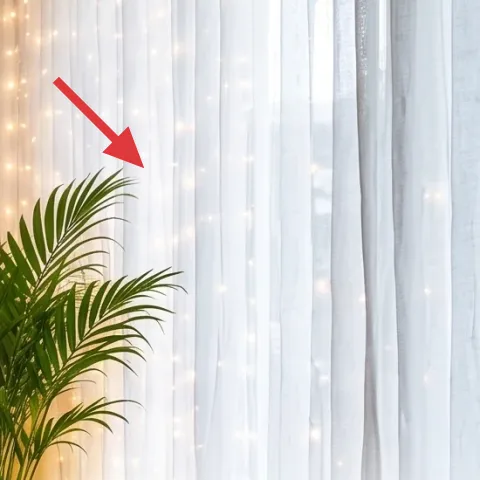
String lights along the curtain make the right side of the room feel festive without adding another furniture piece. The vertical placement is important: it draws your eye upward and makes the sheers look more dimensional in warm lamp light. A common mistake is putting fairy lights too low, where they can look like they’re “hiding” the curtain rod area rather than enhancing it. This layer works for shared housing because string lights can be removed in minutes and stored as compact coils. The trade-off is that placement needs a little tinkering to avoid showing cords—route them behind or along the curtain folds.
Hide the cord line
Guide the wire where the curtain overlap covers it, so only the warm points of light show.
The cost, layer by layer
| Layer | Item | Cost |
|---|---|---|
| 1 | Cream rug with short pile | $200 |
| 2 | Tan throw blanket | $45 |
| 3 | Cream textured throw pillow | $30 |
| 4 | Framed botanical prints (5) | $120 |
| 5 | Macramé wall hanging | $70 |
| 6 | Candle cluster | $35 |
| 7 | String lights along the curtain | $40 |
| Total | $540 | |
If the budget has to go smaller, keep the rug and the frames, then swap the candle cluster for unscented pillar candles and choose one string-light set instead of additional warm décor. The look stays cohesive because the palette and texture plan do most of the work.
What worked, what didn't (across the whole room)
The winning formula is texture-first: rug pile, woven throw, and corded wall hanging make the brick backdrop feel soft. The second win is grouping—frames read as a set, and plants repeat across shelves and corners so nothing feels random. The only repeated issue with this style is scale: small décor can disappear against big wall textures if it’s not clustered.
What worked
- The cream rug grounds the sofa area and stops the brick wall from dominating the whole room.
- Layering a tan throw and a cream textured pillow adds depth without changing the palette.
- Framed botanical prints create a clean, intentional wall rhythm that reads “designed.”
- The macramé hanging introduces movement and softness between shelves and frames.
- Warm candle light makes evening styling feel finished, even with minimal furniture changes.
- String lights add gentle sparkle on the brightest wall, keeping the room lively.
What didn't
- Single scattered wall pieces look unfinished against brick; grouping prints fixes that fast.
- Too many similar pillows can flatten the sofa into one texture instead of layered depth.
- Fairy lights placed too low can look like clutter rather than a lighting accent.
- Small candles alone often read like “leftovers,” while clusters look styled.
- Choosing a too-pale rug can wash out the warm terracotta tones in lamp light.
What we'd skip if we did it again
Skip replacing fixed wall items or doing anything that requires drilling. With brick and shelves doing so much, the smartest move is to keep everything removable: rug, textiles, framed prints, and cord-based wall décor.
Skip buying an over-sized rug in the wrong pile height. A shaggy rug can fight the crisp geometry of frames, while short pile keeps the room looking tidy in both daylight and warm lamp light.
Skip mixing too many “neutral undertones” at once. Keep the temperature consistent—cream, tan, and terracotta—then vary only texture (knit, woven, cord) so the look stays cohesive through multiple moves.
Frequently asked
How long does this kind of living room refresh take?
Most of the work is styling time: laying down the rug, arranging pillows and throws, then setting framed prints in a straight row. If the frames already have the right removable mounting hardware, the wall step is fast. Budget about 2–4 hours total for a shared space, plus a little extra time if you’re careful about centering the print lineup.
Is this renter-friendly if my walls are plaster or drywall?
Yes, as long as the wall art and macramé use removable methods that won’t rip paint or damage plaster. For delicate plaster, choose foam-core removable mounts rather than strong adhesive hooks. For sturdier drywall, follow the product directions and test a small patch first. The rest of the plan—rug, textiles, candles, and string lights—doesn’t require wall hardware at all.
What if my living room is smaller than the photo?
In a smaller space, keep the rug but scale the “extras” down: fewer candles, fewer plants on the shelves, and one strong pillow texture instead of multiple. Maintain the same warm palette so it doesn’t feel cluttered. For the wall, choose the same framed-print style but use fewer frames if needed—aim for a tidy row rather than a spread-out collage.
What if my living room is bigger—how do I avoid it looking empty?
Go bigger with either the rug or the grouping scale, not with random single items. A larger rug makes the sofa area feel properly defined, and a coordinated set of framed botanical prints helps the brick wall look intentionally styled. If the shelves feel sparse, add one additional plant or ceramic cluster rather than scattering many small objects.
Where should I shop for these specific pieces without overspending?
For the rug and textiles, look for easy-to-return options in online marketplaces or local consignment stores. For the framed prints, search for matching botanical sets in similar frame colors, then buy one kit instead of hunting individual prints. For macramé and string lights, specialty décor shops and craft aisles are good, especially if you want lightweight, move-friendly pieces.
What’s the biggest mistake people make with boho living rooms?
The most common mistake is mixing too many patterns without a texture plan. You end up with visual noise against a bold brick background. Fix it by repeating a palette (cream, tan, terracotta), then varying only texture—rug pile, knit throw, corded macramé—so everything looks related even when it’s different.
More in Living Room

A plant-forward living room for $600
A plant-forward living room refresh built for $600, focused on a soft cream rug, layered sofa textiles, removable wall art, and move-friend…
What $700 buys: a garden-facing living room update with warm texture
A garden-facing living room refresh built for renters using no-drill upgrades and renter-safe decor. With a $700 budget ceiling, this setup…
5 renter-friendly swaps for a green sofa corner for $600
A green sofa corner gets calm, japandi energy with no-drill swaps. For about $600, this refresh adds a textured rug, taupe drapes, framed b…