
- Best for
- Textiles + wall art that pack
- Time
- 2–4 hours
- Total cost
- $400
- Renter-safe
- No-drill, move-ready
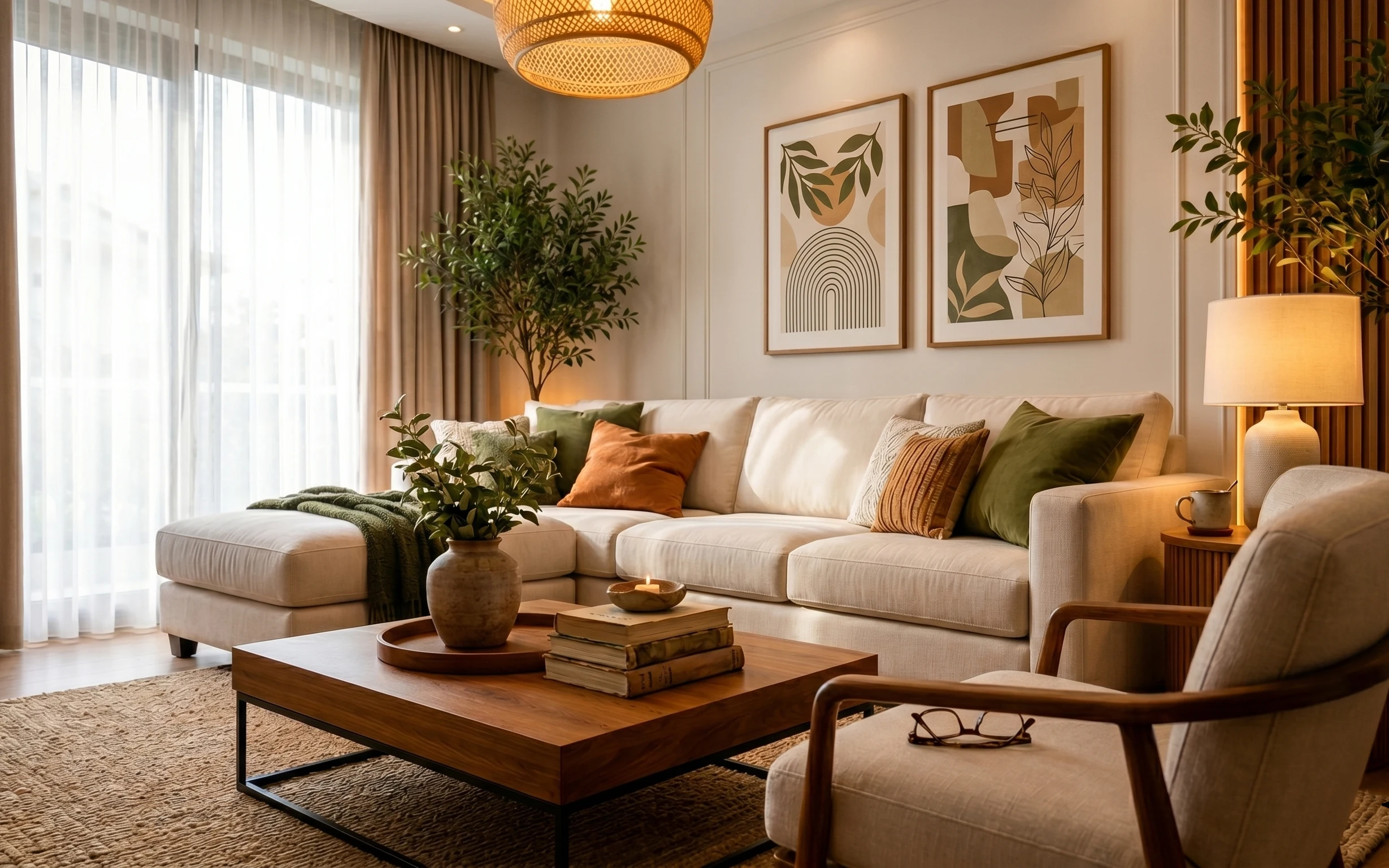
Why this warm olive-and-cream living room corner is the living room corner of 2026
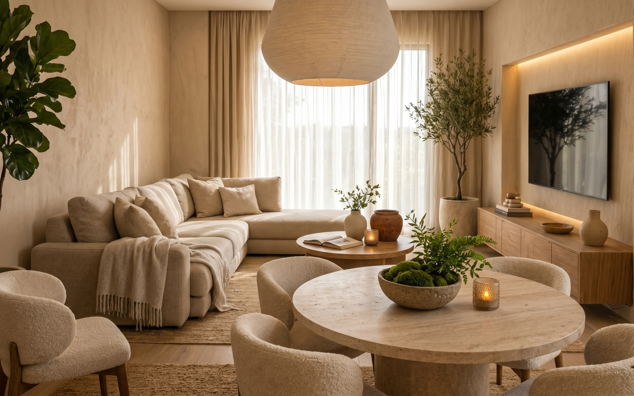
The photo starts with warm neutrals (that light sofa and beige area rug) and then stacks texture: an olive knit throw, a cream blanket, and cushion covers in green and orange. The framed botanical prints on the wall give structure, while the plug-in lamp adds a steady amber glow when daylight drops. I’ve seen this exact “soft layers + botanical art” formula in Scandinavian interiors—where comfort is the first priority. For shared housing, this works because the pieces are lightweight, pack flat, and don’t require drilling or swaps of fixed fixtures.
I used to overthink wall decor in my own shared house, and I ended up with a stack of frames I couldn’t hang without drama. This time I let the textiles do the heavy lifting first—throws and pillow covers change the room faster than wall hardware ever will. Once that base looked right, the prints felt intentional instead of like an afterthought. That shift is what keeps the whole thing move-ready.
Layer 1 — large textured area rug in beige ($80) Grounds the room without committing to hard flooring
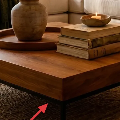
A large textured area rug in beige makes the entire seating zone feel finished, especially over that light hardwood floor. In the photo, it softens the straight lines from the coffee table legs and gives you an “anchored” look even when the room is mostly neutral. The trade-off is that a textured surface shows less fine dust than a flat weave, but it also hides everyday wear better than a super-smooth rug. The upside for renters and shared housing: rugs roll up, slide into a van, and don’t depend on wall changes.
Roll, don’t fold
For move days, roll the rug from both ends toward the center so the texture stays crisp instead of creasing.
Layer 2 — olive knit throw blanket draped on sofa left ($30) Adds the earthy layer that reads “styled”
The olive knit throw draped over the left side of the sofa is the color anchor here: it ties the plant greens and the botanical prints together without fighting the cream upholstery. Knits also photograph well because they create micro-shadowing across folds, which makes a neutral sofa feel dressed even with minimal accessories. The trade-off vs. a smoother throw is that knit fibers can shed a little at first, but it settles quickly with a careful shake-out. If the next apartment has a different layout, you can re-drape the same throw and get the same effect.
Use it like “edge styling”
A throw that drapes from one arm or corner reads intentional and avoids the “random blanket pile” look.
Layer 3 — orange throw pillow ($30) Brings warmth in a color you can dye again
The orange throw pillow is small, but it’s doing a lot: it adds warmth against the cream cushions and keeps the whole palette from going too green-and-sand. It’s also the easiest move-friendly way to update a room because you can swap covers without touching fixed furniture. The trade-off is that bright colors can feel “trend-y,” so the best strategy for shared housing is making it reusable. That’s why dyed pillow covers are the smarter play—same shape, different color as leases change.
Make it instead of buying it
DIY dyed pillow covers so you can start with a basic cover and land on that warm orange tone without buying a whole new set.
Materials
- Fabric dye powder or liquid — enough for one cover — 10
- Large plastic bin or tub — for dyeing — 4
- Salt or dye-fixative (as directed by dye brand) — small container — 4
- Gloves — 3
- Old towels/newspaper — to protect surfaces — 3
Steps
- Protect your surface: spread towels and set up the bin where you can dye without drips.
- Pre-wet the pillow cover so the fabric absorbs the dye evenly.
- Mix the dye with water according to the package, then stir until fully dissolved.
- Submerge the cover and stir occasionally to prevent striping.
- Rinse in cool water until it runs clearer, then follow the brand’s fixative instructions.
- Dry completely before inserting the pillow form back in.
Total DIY cost: $24 — saves about $6 over buying.
Layer 4 — green throw pillow on right sofa cushion ($80) Echoes the plant palette without matching it exactly
That green throw pillow on the right sofa cushion works because it’s a shade shift, not a clone of the tall plant’s leaves. It pulls the botanical theme forward while still letting the cream upholstery stay the calm base. Compared with adding another olive throw, a pillow is more controlled: you can keep the color concentrated where the eye lands. The trade-off is that if the pillow is too close to the plant green, the room can feel visually flat. Here, the balance is why the space looks “designed” instead of randomly decorated, and it’s just textile swaps from one move to the next.
Don’t pick a green that’s the same as the plant
Aim for a slightly different undertone (cooler or warmer) so the layers read separately.
Layer 5 — framed botanical print (left, arched lines) ($80) Creates vertical movement that keeps the wall from feeling empty
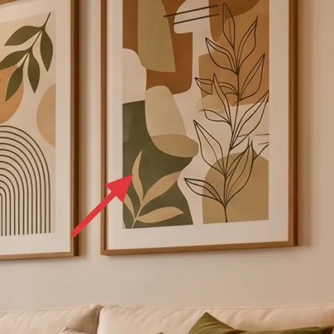
The left framed botanical print with arched lines adds a graphic rhythm that contrasts the organic leaf shapes elsewhere in the room. Because it’s framed, it’s also an easy renter-friendly swap: you can pack it in a frame box and carry it to the next place. The trade-off is that you need a wall-safe mounting option (no-drill), but the print itself is what gives the wall purpose. In this palette, the thin linework helps the green and cream stay balanced instead of competing. If you only buy one print, make it the one with the arches.
Pick line art, not solid blocks
Line-heavy prints add dimension without covering light walls.
Layer 6 — plug-in table lamp with beige shade on right ($60) Makes the neutrals look warm after dark
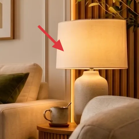
That plug-in table lamp with a beige shade is the room’s “soft focus” tool: it makes cream look creamy rather than gray and it deepens the olive tones when you’re not in daylight. The shade shape matters here because it diffuses light and keeps shadows gentle across the sofa cushions and the coffee table. The trade-off is that you won’t get the same punch as a brighter, whiter bulb, but the mood is the point. Since it’s plug-in and the lamp isn’t fixed to the wall, you can move it with zero installation stress and keep the warmth consistent in any shared living room.
Choose an amber-friendly bulb
A warmer bulb tone makes the beige shade read richer, not yellow.
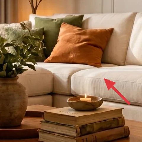
Layer 7 — small decorative bowl candle on coffee table ($20) Adds a low, flickering focal point
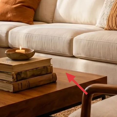
The small decorative bowl candle on the coffee table is one of those details that changes the “finished” feeling instantly. It sits low, so it doesn’t block views across the sofa, and the warm flame echoes the lamp’s glow—basically doubling down on cozy without extra furniture. The trade-off is upkeep: candles need regular trimming and you’ll want to keep the wick under control for a clean burn. For shared-housing moves, though, it’s a perfect swap item because you can pack it carefully and replace it cheaply in the next place without changing the whole room.
Style it beside books, not alone
When a candle shares space with a small stack or tray, it reads like intentional styling.
The cost, layer by layer
| Layer | Item | Cost |
|---|---|---|
| 1 | large textured area rug in beige | $80 |
| 2 | olive knit throw blanket | $30 |
| 3 | orange throw pillow cover (DIY equivalent) | $30 |
| 4 | green throw pillow | $80 |
| 5 | framed botanical print (left, arched lines) | $80 |
| 6 | plug-in table lamp with beige shade | $60 |
| 7 | small decorative bowl candle | $20 |
| Total | $400 | |
If you want it cheaper, swap the framed botanical print for a second small art print you already own in a similar color family, and keep the lamp + textiles as the main drivers of the look.
What worked, what didn't (across the whole room)
The overall win is how the palette stays calm (cream) while getting depth from texture (knit, rug pile, layered cushions). The botanical prints feel cohesive because the line art and leaf motifs don’t fight each other. The weakest spot, visually, would be going too matchy-matchy with the greens—this room only works because the undertones differ.
What worked
- The beige textured rug visually anchors the coffee table and makes the sofa feel “set” even in a shared rental.
- The olive knit throw adds depth through texture, not just color, so the neutral furniture looks styled.
- The orange pillow warms the cream cushions and prevents the room from reading flat or overly botanical.
- The green pillow echoes the plants without matching leaf color exactly, so the layers stay distinct.
- The arched-line framed print creates vertical movement that balances the sofa’s horizontal spread.
- The plug-in lamp keeps the room warm after dark while staying move-ready for short leases.
What didn't
- Replacing the lamp with a cooler white bulb would flatten the beige and make the olive look harsher.
- If the orange pillow is too small, it loses impact; if too large, it overwhelms the botanical theme.
- A green pillow that matches the plant’s exact undertone can make the whole palette blend together.
- Skipping the throw blanket often leaves the sofa looking “unmade,” even with pretty wall art.
What we'd skip if we did it again
Skip buying more framed wall art sets all at once. In shared housing, scale down the wall purchases and let cushions plus throws carry the seasonal changes.
Skip the “matchy” approach where every green is the same tone. It reads muddy in photos and feels less intentional in person; pick one warm green and one cooler green.
Skip oversized floor lighting as the first fix. A plug-in table lamp with a beige shade is easier to move, cheaper to replace, and it protects the warm, layered look.
Frequently asked
How long does this living room refresh take?
Plan for about 2–4 hours total. The rug and throws are instant wins, and pillow swapping is quick once you decide on the color balance (olive + orange against cream). Hanging framed prints is the only time variable—if your building allows no-drill hooks, budget extra time just to get them level and centered.
Is this truly renter-friendly for shared housing moves?
Yes because the changes are mostly textiles and portable lighting. Rugs roll up, pillow covers and throws pack flat, and a candle plus small decor items go in boxes without special hardware. The framed prints are also removable—use wall-safe mounting that won’t leave residue, and keep each print protected in a frame box.
What if my room is smaller than this photo?
In a smaller living room, use the same palette but reduce the number of large items. Keep one main framed print instead of two, choose a rug that covers most of the seating area, and let the lamp do the “cozy glow” work. The trick is still layering—just scale down the surface area.
What if my room is bigger or has different wall color?
Go bigger with textiles before you buy more furniture. Add a wider throw across the sofa arm, choose a taller plant in the corner, and consider a larger framed print if the wall has the space. If your walls are darker, keep the cushion colors lighter so the botanical theme stays bright.
Where should I shop for these exact pieces without overspending?
Start with fabric-first retailers for throws and pillow covers, and look for plug-in table lamps at home stores or marketplace listings with intact shades. For framed botanical prints, search for line-art botanical prints with arched motifs—then buy just one or two to match the scale. A lot of the look is achieved with layering, not expensive furniture.
What’s the biggest mistake people make with this style?
The most common mistake is matching every green and neutral exactly. When all the greens share the same undertone, the room reads flat and a little “catalog bland.” Another frequent miss is skipping the texture layer—if the sofa lacks a knit throw and a textured rug, the palette won’t feel finished.
More in Living Room
5 renter-friendly ways to refresh a living room corner for $400
A warm modern living room corner with olive, cream, and botanical art—refreshed with move-friendly swaps for $400. Focus: add texture, keep…
6 no-drill ways to copy a calm living room seating area for $400
A calm living room seating area refresh for $400, built with 7 renter-friendly upgrades. Get the neutral rug-and-plant look using move-frie…
What $800 buys: a living room refresh with warm neutrals
A warm neutrals living room refresh built around a beige rug, round coffee table, and one bold framed artwork. This plan lands around $800 …