
- Best for
- Renters who want a soft, plant-forward living room look
- Cost
- About $390 (DIY candle pour)
- Difficulty
- Easy to medium (mostly styling)
- Time
- 1 weekend afternoon
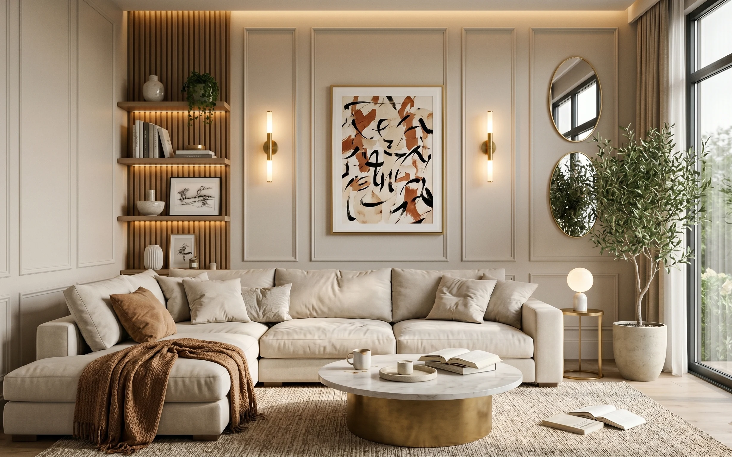
Why neutral ceramic-and-boucle styling is the living room seating area of 2026
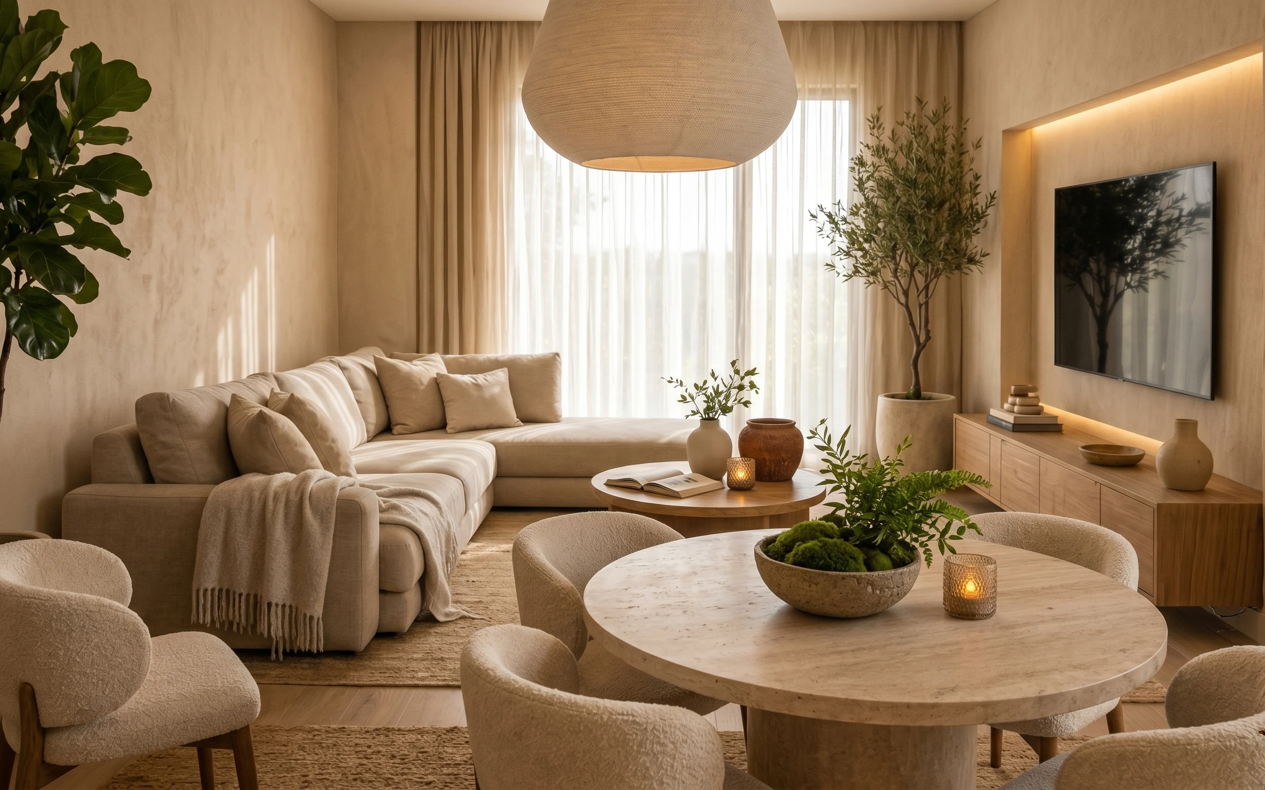
The starting point here is the warm plaster tone on the walls and that beige, linen-like curtain backdrop. Then the textures do the real work: a jute-look rug, a chunky beige throw, and layered throw pillows that read soft up close. The framed tree print on the console wall adds contrast against all that cream, and the plants bring in the olive note that stops everything from feeling flat. This is renter-friendly because every refresh piece is removable and packs away cleanly at move-out.
I used to overthink plant styling—like, “Should the vase be taller?”—and I’d end up with a cluttered tabletop. What changed my mind was noticing how the photo keeps one main plant height, then repeats smaller greenery in a single direction. That’s why the candle glow and stems feel intentional instead of random.
Layer 1 — Area rug (5×7, neutral jute-look) ($80) Anchors the seating zone under the coffee table
A neutral rug is what makes this room feel “finished” even before you add wall art. In the photo, the rug’s low-contrast, jute-look texture gives the whole seating area a grounded base and softens the hard wood floor. I’d choose a 5×7 scale because it sits under the coffee table and reaches into the front of the armchairs without swallowing the room. The trade-off is that you’ll want to vacuum regularly and spot-clean quickly, but that’s still easier than replacing anything built-in at the end of a lease.
Pick a rug with visible texture, not just a flat weave.
Texture reads warmer in photos and looks better in daylight, especially with beige walls.
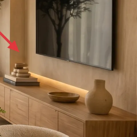
Layer 2 — Framed wall art (tree print, dark frame) ($80) Creates contrast over the console wall
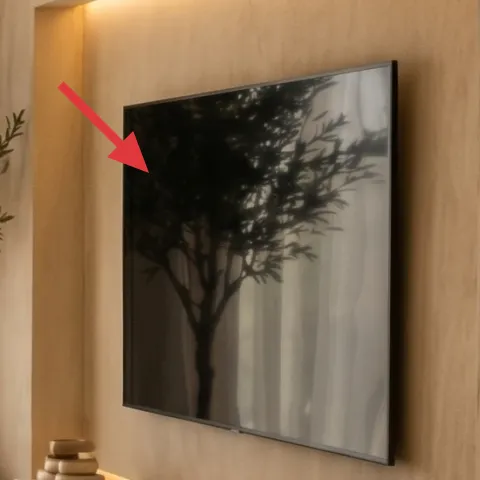
The framed tree print is the room’s clearest focal point because it adds dark value against the warm, light wall. A mid-size frame also keeps the scale feeling calm—large enough to matter over the console, but not so big that it overwhelms the plants. If a renter-only option is needed, a framed print still works with picture-rail hooks (or removable hanging hardware you already own) and removes easily at move-out. The trade-off is you’re choosing “one strong print,” not a busy gallery, which is exactly why the room feels composed.
Stay with one theme (nature/trees) in this palette.
It prevents the wall from fighting the greenery on the credenza and coffee table.
Layer 3 — Throw blanket (beige, draped over sofa arm) ($60) Adds that relaxed fold you can see from across the room
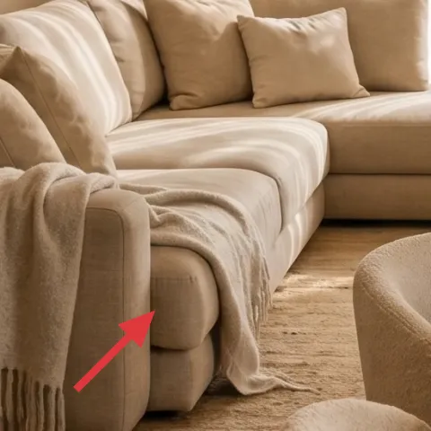
This beige throw blanket draped over the sofa arm adds softness without introducing a new color story. The key detail is the “intentional mess” of the fold—extra fabric pooled near the seat rather than perfectly tucked along a seam. Over plain upholstery, that texture does a lot: it keeps the sofa from looking too smooth and it makes the couch feel lived-in. I’d pick a heavier throw (not a thin summer one) so it holds shape. The trade-off is weight: thicker throws can be warmer and take up a bit more storage, but they’re easy to swap when seasons change.
Drape width matters more than blanket size.
A wider throw that reaches into the seat reads fuller on camera.
Layer 4 — Throw pillows (mix of light beige tones) ($30) Builds softness with tonal variety, not new colors
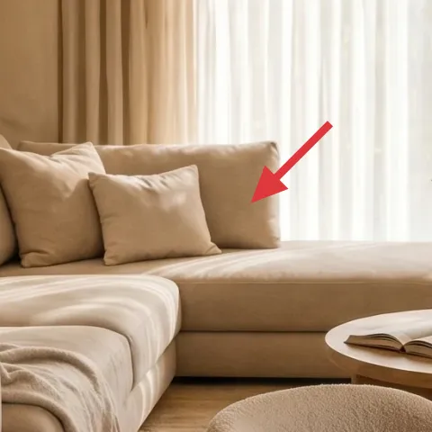
The pillow styling in the photo isn’t about bold pattern—it’s about tone-on-tone. You can see several light beige shades layered together, which keeps the sofa looking lush while staying within the warm neutrals family. Choose a mix of textures (linen-like cover, slightly brushed fabric, or a knit) so the pillows don’t all blur into one beige blob. The alternative—matching everything perfectly—usually looks flatter in real life. The trade-off is you’ll need to “style by touch”: fluff, then rotate covers until you see a few different highlights instead of just one smooth sheen.
Avoid pillows that are all the same fabric sheen.
If they reflect light the same way, the sofa reads flat instead of dimensional.
Layer 5 — Glass jar candle (warm amber glow) ($35) Makes the coffee table feel warm even in daytime photos
This jar candle brings the only obvious “golden” note in the room, which makes the beige tones feel intentional instead of washed out. In the photo it’s placed near the front edge of the round coffee table, so it’s visible from both armchairs and adds a small focal point among the ceramics and stems. For renters, candles also have the biggest payoff per dollar because you can reuse the jar for refills or swap scents with the seasons. The trade-off is that it requires a little maintenance—trim the wick and keep it away from curtains—so the glow stays steady and clean.
Make it instead of buying it
This is a candle pour in a glass jar so you can match the warm amber glow for less than a ready-made candle.
Materials
- Candle wax — ~12 oz — craft store — $12
- Wick + wick stickers — 1 set — craft store — $6
- Glass jars — 1 jar — thrift store or craft store — $10
Steps
- Set the jar on a protected surface and center the wick using wick stickers.
- Measure wax by weight so you pour enough for a one-inch base.
- Melt wax slowly in a heat-safe pot until fully liquefied.
- Turn off heat, then pour into the jar while keeping the wick centered.
- Allow the candle to cool until the surface looks fully set.
- Trim the wick to about 1/4 inch.
- Let the candle cure until it has a smooth, even top.
- Test-burn for the first hour, then adjust wick length if needed.
- Repeat trimming if the melt pool looks uneven.
Total DIY cost: $28 — saves about $7 over buying.
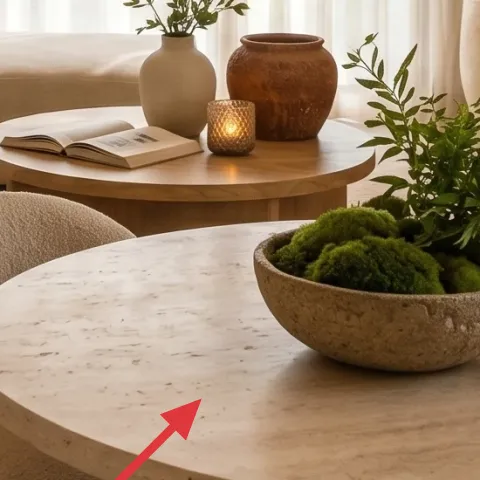
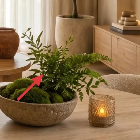
Layer 6 — Ceramic vase with stems (cream/stoneware) ($25) Gives the coffee table a “designed” center point
A ceramic vase is the bridge between the living room’s soft textiles and its natural plant palette. The cream/stoneware tone keeps the look cohesive with the rug and pillows, while the stems add movement right where your eye lands between the coffee table and the sofa. I’d choose a vase with a matte or subtly speckled finish so it doesn’t compete with the candle glow. The obvious alternative is using a clear glass container, but in this warm color scheme it can look too stark and “temporary.” The trade-off with ceramics is weight—handle carefully when moving—but it’s still easy to pack and protect for the next place.
Keep stems simple—one small bouquet style.
Too many textures can make the coffee table feel busy next to the tall plant.
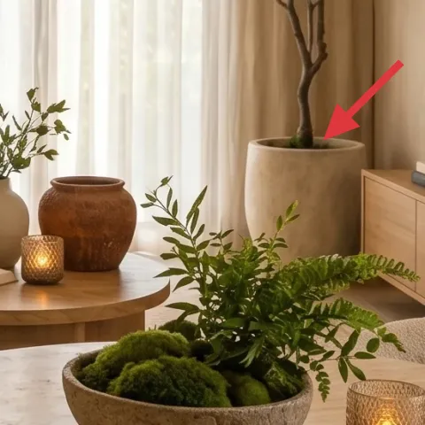
Layer 7 — Tall potted plant (olive-green tree form) ($80) Brings height so the room feels balanced
The tall potted tree gives the room its vertical rhythm, which is why the plant reads “intentional decor” instead of a last-minute addition. Positioned near the console, it also echoes the olive green note from the smaller greenery on the coffee table. A plant with a branching silhouette works best with soft beige walls because it adds fine detail without turning the room into a color circus. If you use a shorter plant, the wall can feel empty above the console, especially with that framed tree print. The trade-off is space: make sure you can still move around the seating area comfortably.
Rotate the plant weekly for even leaf shape.
That keeps the silhouette looking full rather than one-sided.
The cost, layer by layer
| Layer | Item | Cost |
|---|---|---|
| 1 | Area rug (neutral jute-look, 5×7) | $80 |
| 2 | Framed wall art (tree print, dark frame) | $80 |
| 3 | Throw blanket (beige) | $60 |
| 4 | Throw pillows (light beige mix) | $30 |
| 5 | Glass jar candle (warm amber glow) | $35 |
| 6 | Ceramic vase with stems (cream) | $25 |
| 7 | Tall potted plant (olive-green tree form) | $80 |
| Total | $390 | |
If you want it cheaper, swap the framed tree print for a 16×20 art print at a lower price point and choose a smaller 5×7 rug in a similar jute-look weave. You can also pick one plant instead of two small green pops, keeping the same warm palette.
What worked, what didn't (across the whole room)
The room works because the palette stays tight (beige, cream, olive) while texture adds the interest: rug fibers, pillow fabrics, and a draped throw. The second win is the height layering—tall plant + framed art + table objects—so the view has structure from every seat. The main miss to watch for is when people copy only the colors and forget the contrast and scale decisions.
What worked
- The neutral rug makes the seating area feel deliberate instead of floating on bare floors.
- Dark framed tree art anchors the wall, giving the plants a place to “rest.”
- Beige throw texture adds softness without introducing a new color conflict.
- Tonal pillows create depth while keeping the overall look calm and cohesive.
- A warm candle glow adds a small focal point on the round table.
- The tall plant supplies vertical balance next to the console and wall art.
What didn't
- If the pillow covers are all the same sheen, the sofa reads flat and less “styled.”
- Overdoing the number of candles or stems can make the coffee table crowded.
- Using a very light, low-contrast frame can disappear against warm beige walls.
- Skipping the rug swap usually makes armchairs feel disconnected from the coffee table.
- A plant with a tiny footprint can leave the upper half of the console wall feeling empty.
What we'd skip if we did it again
Skip matching everything exactly. In a warm beige room, “all the same” reads flat, so mixing pillow covers by texture and keeping the color family consistent works better than perfect sameness.
Skip swapping in bright colors just to add personality. A few olive notes plus one warm light source do more than random accents, especially when curtains and walls are already warm-toned.
Skip oversized wall art that crowds the console area. Keep the framed print in a medium scale so your tall plant can stay the second focal point instead of competing for attention.
Frequently asked
How long does this living room refresh take?
Plan on about 3–5 hours if the shopping is already done. Styling the rug and console takes the longest because it’s about centering and visual balance—especially with the tall plant height. The only time-sensitive part is the DIY candle pour; that’s a separate block you can do while you’re waiting on everything else to dry and set.
Is this renter-friendly if I can’t change the lighting?
Yes. The photo uses a warm overhead pendant, but this refresh doesn’t depend on changing it. The budget-friendly warmth comes from small, movable pieces: the neutral rug, the candle glow, and the layered textiles on the sofa. Even if your ceiling light is different, these movable items keep the same “soft glow” effect.
What if my space is smaller than this?
Go smaller on the rug first and simplify the table styling. A 5×7 rug is the lowest workable size for a seating zone; anything smaller tends to feel disconnected. Keep only one candle and a minimal stem bundle, and choose a plant that’s tall but narrow so it doesn’t block walkways.
What if my room is larger?
In a larger living room, the rug can shift up a size and the framed print can be slightly larger, as long as the tall plant still has breathing room. Add one extra pillow layer using tonal covers (not new colors). The goal is to keep the same palette, but scale up the “anchors” so nothing looks lost.
Where should I shop for the neutral rug and beige textiles?
Look for neutral, textured basics at home goods stores and big-box retailers, then upgrade one hero piece if needed: the framed art or the throw blanket. For the plants, choose a shape that matches the silhouette you want (a tree form reads best with this warm-beige wall palette).
What’s the biggest mistake people make copying this look?
They copy the colors but not the texture-and-scale decisions. Beige walls don’t automatically make a space feel warm; you need contrast from a darker framed print and a tactile rug. Also, avoid too many different plant containers—choose one main vase/plant style so the room stays cohesive.
More in Living Room
6 no-drill ways to copy a calm living room seating area for $400
A calm living room seating area refresh for $400, built with 7 renter-friendly upgrades. Get the neutral rug-and-plant look using move-frie…
What $800 buys: a living room refresh with warm neutrals
A warm neutrals living room refresh built around a beige rug, round coffee table, and one bold framed artwork. This plan lands around $800 …
Wood-and-rattan dining refresh, $500
A rented-dining-style refresh with warm wood, rattan lamps, and stone-gray accents—built with seven no-drill swaps. For about $500 total, i…