
- Best for
- Weekend refresh with warm neutrals
- Cost
- About $720 for the full look
- Difficulty
- Moderate
- Time
- 1–2 weekends
Why warm beige-and-bronze seating is the living room of 2026
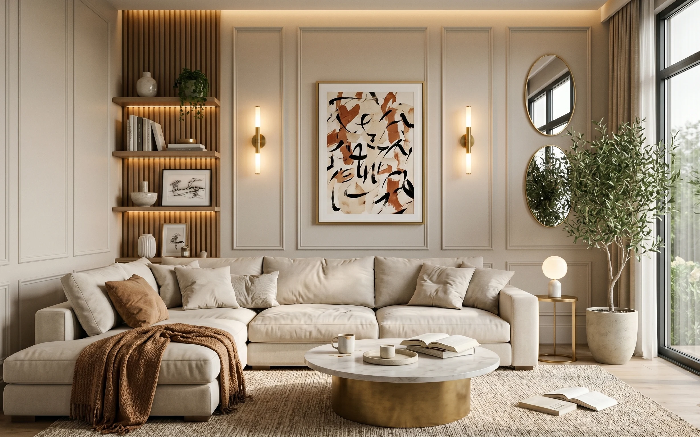
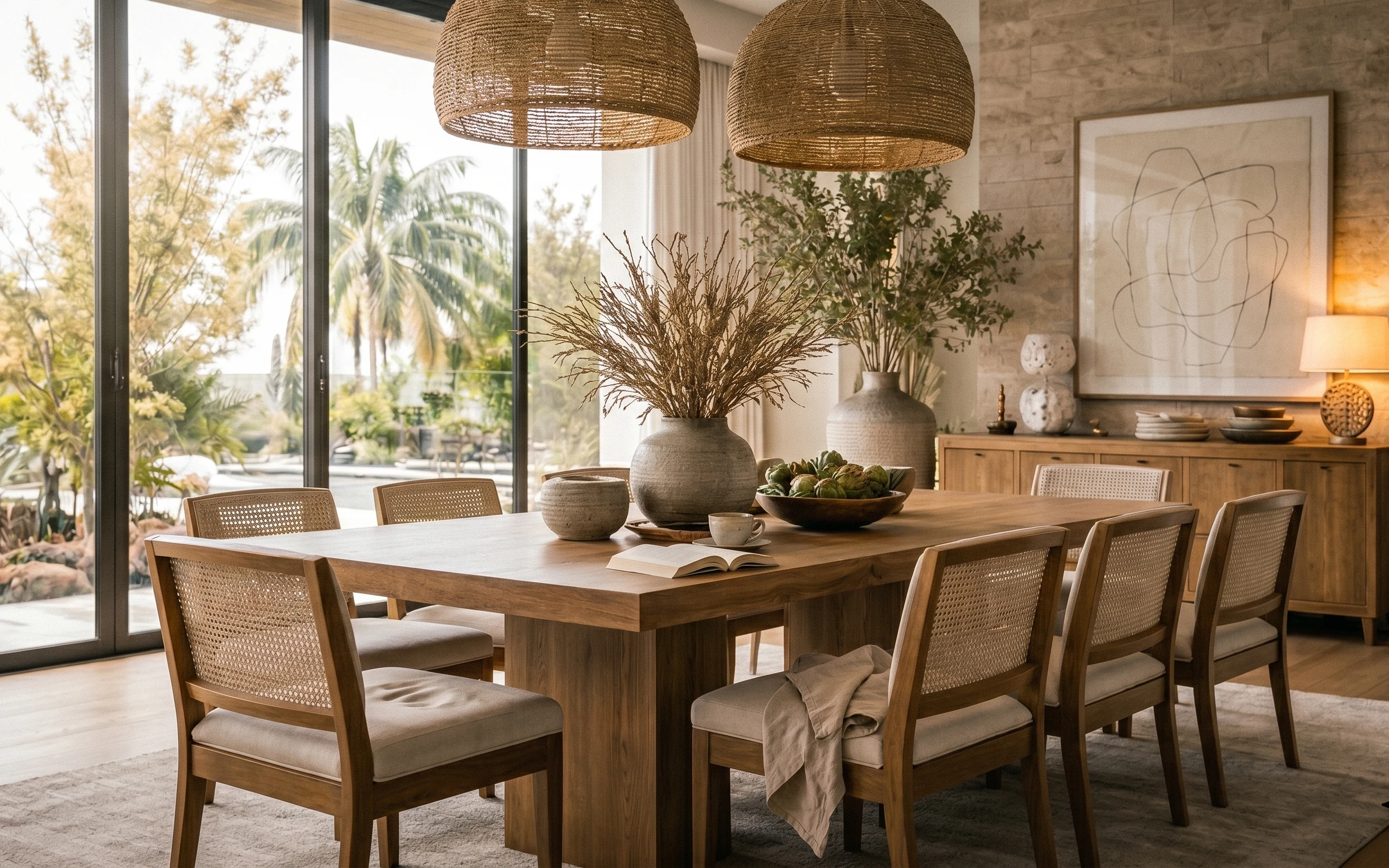
Start with the rug, then pull everything else into the same color story: cream upholstery, warm brown accents, and brass-toned details. In this photo, the beige area rug softens the floor, the round coffee table adds gentler curves, and the framed abstract artwork brings movement without adding clutter. You can see the textures doing the heavy lifting—chunky knit throws, smooth ceramic, and matte wall paneling under warm sconce light. For US homeowners, it’s a weekend-friendly plan because you can swap the biggest visual pieces without touching anything structural.
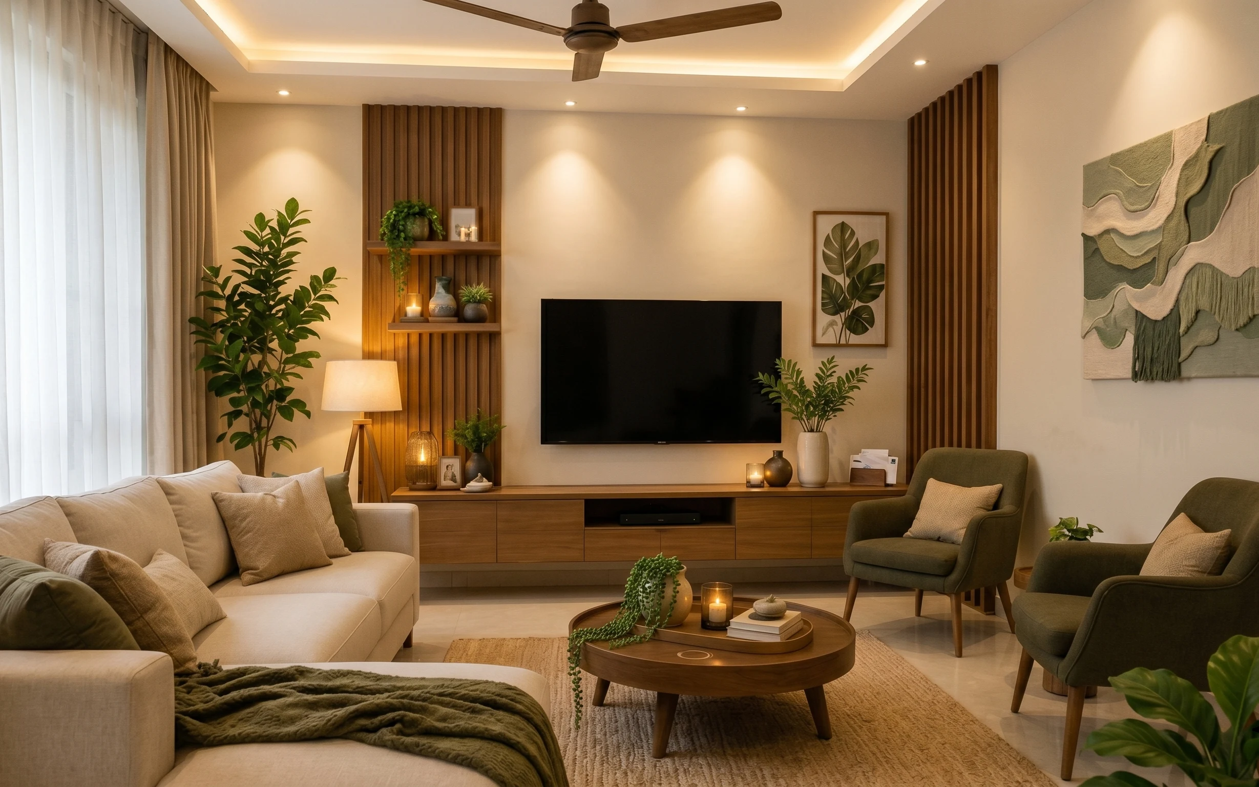
I used to think the “right lighting” meant buying new fixtures. Then I realized half the problem was that I kept everything at one height, so my rooms felt flat—like the décor was stuck to the walls. In this layout, the tall table lamp and the wall sconces create vertical rhythm, and the mirror makes the warm light travel farther. The result is calmer than a straight-line, everything-on-a-matching-shelf look.
Layer 1 — Beige area rug ($200) defines the warm neutrals underfoot
A beige area rug is the anchor here because it visually lowers the contrast between the cream sofa and the lighter walls. Choose a 5×7 with a tight weave or subtle texture so it can handle a living-room life (shoes, a thrown blanket, and the occasional mug ring). The trade-off: beige shows lint more than a charcoal rug, but it also makes brass and warm brown tones look richer instead of muddy. If the rug ends up slightly off-balance, trim your “landing zones” by centering the coffee table and letting the sofa legs stay consistent over the pile.
Pick the rug first, not “later”
Once the rug’s warm tone is in place, the cream sofa and brown accents stop fighting for attention.
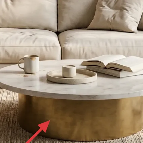
Layer 2 — Round coffee table with brass base ($180) keeps the silhouette soft and reachable
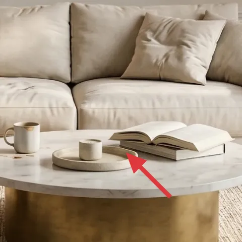
This round coffee table works because it mirrors the rounded shapes you get from pillows and throw folds, so the room reads relaxed instead of boxy. A brass base also ties directly into the warm color already happening in the wall lighting, which helps the whole scheme feel intentional. The trade-off is practical: round tables can tempt you to over-style—keep the surface limited to a small tray and two mugs, like the photo, so you don’t create clutter around a seating zone. Compared with a sharp-edged rectangular table, the curve makes the center feel more open, especially in a living room.
Center it to the rug, not the couch
Aligning the table to the rug’s visual center keeps the seating area looking deliberate.
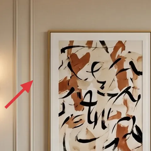
Layer 3 — Large framed abstract artwork above the sofa ($80) adds movement without changing the layout
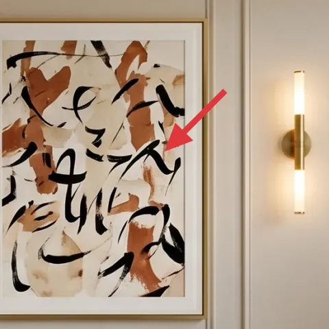
The abstract print is doing more than “decoration”—it’s introducing irregular shapes in warm brown against cream, which harmonizes with the sofa and wall paneling. In a living room like this, it’s the one large-scale element that can handle negative space around it, so don’t feel pressured to add more art. The framed look also gives you a built-in border for color (instead of the chaos of floating small prints). For homeowners, the best part is you can replace the artwork in minutes and still keep the overall wall plan intact.
Make it instead of buying it
DIY a warm abstract print to drop into the existing framed artwork so you get the same scale and color story for less.
Materials
- Matte cardstock / watercolor paper pack (size to match your frame opening) — 1 pack — Michael’s — $18
- Acrylic paint set (warm browns + cream/off-white) — 1 set — Blick/Target — $12
- Small craft brush set — 1 set — craft store — $9
- Pencil + eraser (for light sketching) — 1 kit — art aisle — $6
- Clear acrylic sealer (matte) — 1 small bottle — craft store — $8
Steps
- Sketch loose shapes directly on the paper with light pencil, keeping 60% negative space.
- Block in the biggest warm brown forms first, letting them dry fully.
- Add cream/off-white interruptions and thin black-brown accents with smaller brushes.
- Let the whole piece dry completely, then apply a thin matte acrylic sealer coat.
- Allow the sealer to cure fully before handling.
- Slide the finished print into the frame insert and check alignment.
Total DIY cost: $53 — saves about $27 over buying.
Don’t over-fill the canvas
If the abstract is too busy, the wall paneling and mirror start to compete instead of feeling curated.
Layer 4 — Oval wall mirror on the right ($120) bounces daylight and makes the corner feel bigger
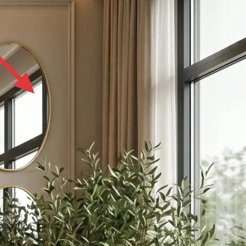
An oval mirror is a smart move here because it softens the rectilinear feel of the recessed wall panels while also reflecting the window light. That reflection keeps the living room from going dim even with warm sconces on. Choose a frame in a warm metal or a neutral that reads “brass-adjacent,” since it needs to echo the table lamp base and coffee table finish. The trade-off is placement: mirrors can show glare if they face direct sun, so angle it so it reflects the bright area rather than the glass edge. The payoff is a corner that looks styled but not staged.
Hang mirror at eye level
Even in a tall room, an eye-level center keeps the reflection useful instead of random.
Layer 5 — Wall sconce in the left vertical niche ($40) adds warmth at eye height
Wall sconces are doing double duty: they add a warm pool of light and they reinforce the vertical lines already carved into the wall. If your space doesn’t already have niches, you can still use the same idea—choose a sconce with a slim stem and place it to “stack” visually with the mirror and art. The trade-off with wall lighting is wiring or outlet planning; if you’re not comfortable, it’s worth swapping to a plug-in version rather than forcing a hardwired route. In this layout, one sconce is enough to prove the concept, but two is what makes the rhythm feel intentional.
Match the bulb temperature
Warm bulbs (around 2700K) keep the brass tones from turning yellow-green.
Layer 6 — Tall table lamp on the side table ($60) completes the lighting ladder
The tall table lamp matters because it prevents the room from reading “all low.” With a lamp at side-table height, you get light that touches the artwork edges and the upper wall paneling, which makes the whole living room feel finished after dark. The base reads warm and architectural, so pair it with a neutral shade that doesn’t compete with the abstract print. The trade-off: lamps are a magnet for clutter, so keep the side table styling to one ceramic piece or two mugs, then stop. This is one of the easiest swaps to make even if you leave most of the room alone.
Style the table in a triangle
One lamp plus two small items (like a book and a mug) reads intentional instead of random.
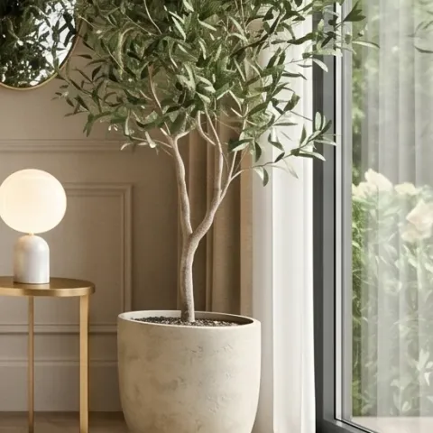
Layer 7 — Indoor plant in a large pot near the window ($40) brings a breathable green note
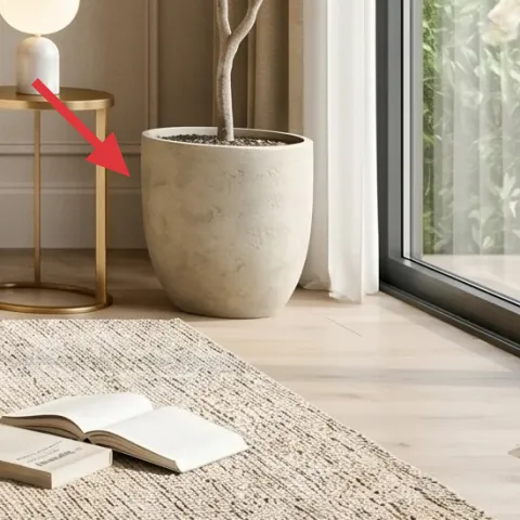
The plant in the large pot makes the warm neutrals feel lived-in, not staged. You don’t need a giant statement tree—just a full, leafy silhouette that echoes the vertical lines of the sconces and the height of the mirror. Pick a pot in a neutral finish that looks stone-like or matte ceramic so it blends into the beige-and-cream story instead of turning into the focal point. The trade-off is maintenance: leafy plants need light from the window and occasional rotation, but it’s the easiest way to keep the room feeling fresh. A plant like this also softens the hard edges of the window framing.
Rotate for even growth
Turn the pot every couple of weeks so the foliage stays balanced toward the room.
The cost, layer by layer
| Layer | Item | Cost |
|---|---|---|
| 1 | Area rug 5×7 | $200 |
| 2 | Round coffee table with brass base | $180 |
| 3 | Large framed abstract artwork | $80 |
| 4 | Oval wall mirror | $120 |
| 5 | Wall sconce | $40 |
| 6 | Tall table lamp | $60 |
| 7 | Indoor plant in a large pot | $40 |
| Total | $720 | |
If you want a cheaper variant, swap the 5×7 rug for a smaller size you can center tightly, choose a budget mirror frame, and use one warm lamp plus just one wall sconce. Keep the abstract artwork large so the wall doesn’t feel empty, and don’t cut the coffee table shape (round is key).
What worked, what didn't (across the whole room)
The overall look succeeds because the big shapes are consistent: one round table, one large framed artwork, and one mirror that softens the paneling. Warm lighting at two heights keeps the room from feeling flat. The main misstep to watch for is over-styling the center surfaces and side table.
What worked
- The beige rug anchors the cream sofa and makes warm brown accents read intentional.
- The round coffee table softens the sightlines created by rectangular wall paneling.
- The framed abstract artwork adds movement while still holding its own against negative space.
- The oval mirror increases perceived brightness and visually “widens” the window side.
- Sconces plus a tall lamp create a real lighting ladder across heights.
- The indoor plant brings relief from the neutrals and adds a believable natural texture.
What didn't
- Too many small decorative objects on the coffee table makes the center feel crowded.
- A mirror hung too high turns reflections into decoration instead of lighting help.
- Using cool bulbs with warm metals can shift the brass tones in a noticeable way.
- Choosing a low-contrast rug (too similar to the sofa) reduces the room’s definition.
What we'd skip if we did it again
Skip replacing multiple small items at once. In a room like this, the faster win is one anchor rug, one main artwork size, and then lighting at two heights—everything else can be added later without losing the cohesive look.
Skip a low-contrast “beige on beige” rug. If the rug is almost the same color as the sofa, you lose the boundary that makes the seating area feel grounded and styled.
Skip hardwired lighting upgrades unless the wiring plan is already clear. A plug-in or existing-outlet-friendly sconce approach keeps the weekend-decorating pace without risking delays.
Frequently asked
How long does this living room refresh take?
If the rug and coffee table are delivered on time, most of the work is placement and styling. Expect about 2–4 hours for rug positioning and table centering, plus another 1–2 hours for hanging the mirror and leveling the framed artwork. Lighting adds a little time if you swap bulbs or move lamps, but it should still fit into 1–2 weekends for a typical homeowner.
What if I rent and can’t place new anchors or hardwire anything?
Start with the pieces that don’t require wall work: the rug, the coffee table, and the tall table lamp. For the oval mirror and framed abstract artwork, use a rental-safe hanging method if your lease allows, like appropriate wall anchors or a stud-based mount you can remove cleanly. If you want sconces but can’t install wiring, use a plug-in sconce option or lean into the table lamp plus ceiling light for daytime.
My living room is smaller. Should I still use a 5×7 rug?
In a smaller living room, scale down the rug to what still allows the coffee table to sit with at least the front legs on the rug. The goal is the same: define a seating zone so the sofa doesn’t feel like it’s floating. Keep the coffee table round if possible, because that shape visually opens space even when dimensions tighten.
Where should I shop if I want this warm, japandi-like look?
Look for the rug and lighting in home basics retailers, then shop artwork and mirrors where you can sort quickly by frame color and scale. For the abstract print, choose warm brown plus cream rather than heavy black-only palettes. For lamps, prioritize a neutral shade and a base that reads warm-metal or wood-like in photos.
What’s the biggest mistake with this style palette?
The most common mistake is going too uniform—everything the same creamy beige with no contrast. The second mistake is over-styling the coffee table because the room’s surfaces are so neutral that small objects suddenly look “loud.” Use fewer items, and keep contrast coming from shape (round), scale (large framed art), and one warm brown accent.
More in Living Room
What $800 buys: a living room refresh with warm neutrals
A warm neutrals living room refresh built around a beige rug, round coffee table, and one bold framed artwork. This plan lands around $800 …
Wood-and-rattan dining refresh, $500
A rented-dining-style refresh with warm wood, rattan lamps, and stone-gray accents—built with seven no-drill swaps. For about $500 total, i…
A calmer sofa seating area for $600
This sofa seating area refresh shows a renter-friendly japandi look with soft neutrals, olive accents, and plants. For about $600, you can …