- Best for
- renter-friendly living room refresh
- Cost
- about $400 total
- Difficulty
- easy, mostly swaps + no-drill hanging
- Time
- 2–4 hours plus drying time for DIY art
Why warm brass-and-cream details are the sofa corner of 2026
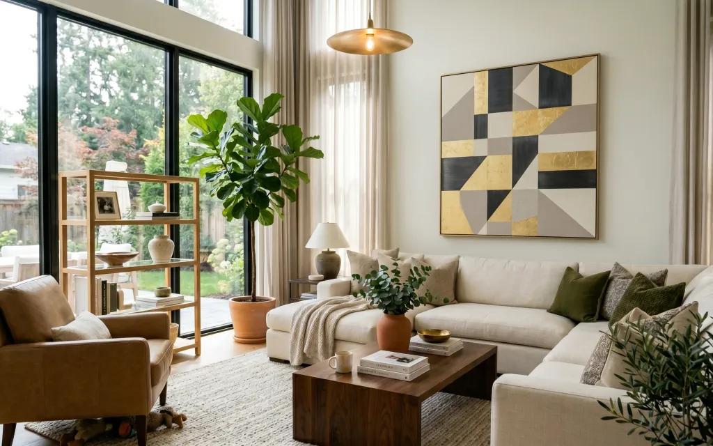
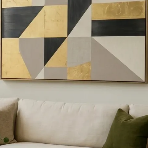
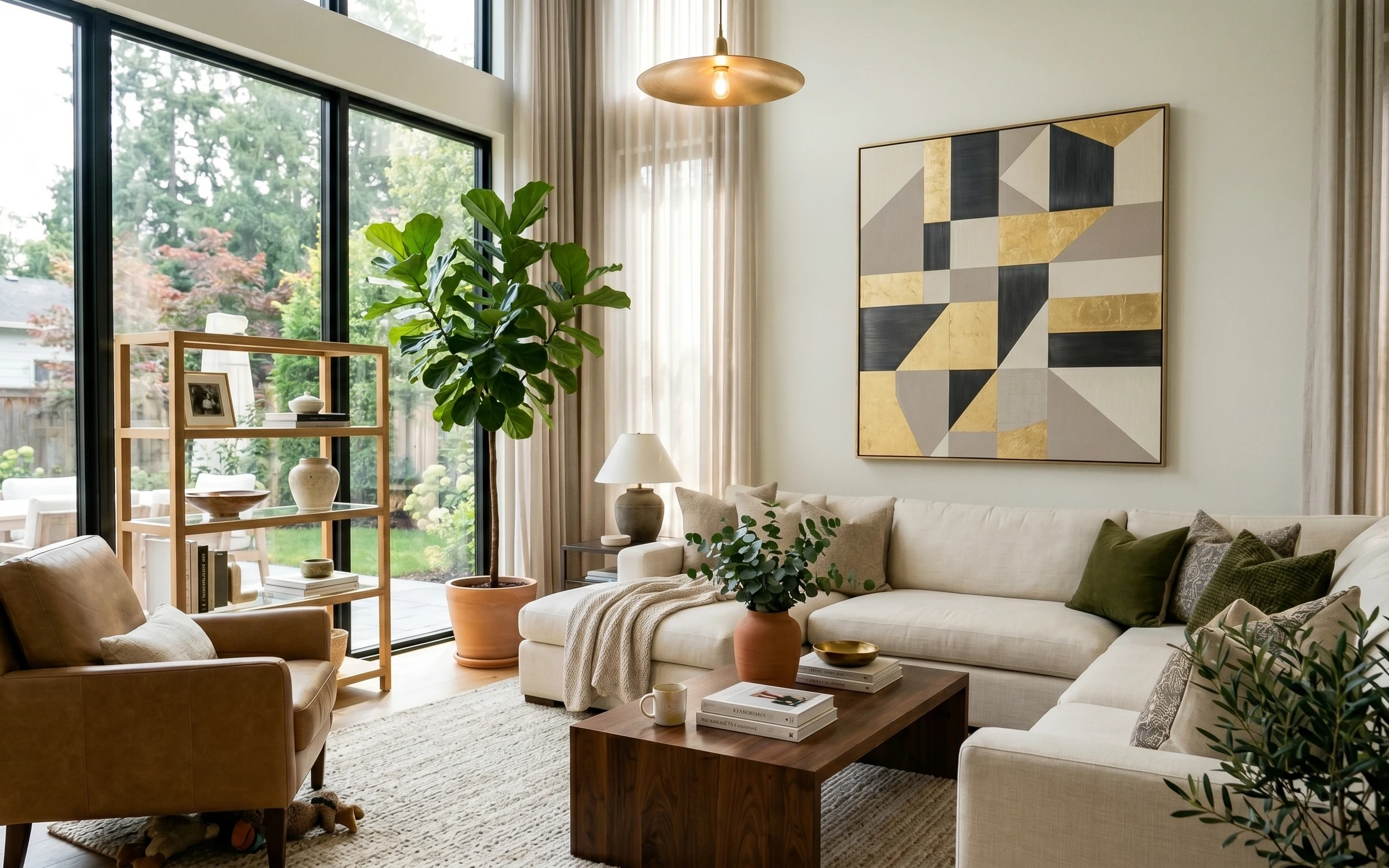
Start with the textures already in play: a cream throw and green-and-neutral pillows set the tone, then a neutral rug anchors the seating. The warm brass pendant and the matte, light-toned lamp shade bring the space into focus without needing any wall work. On top of that, a framed abstract with geometric blocks gives the “designed” feeling you’d normally associate with a bigger renovation. For renters, the key is choosing items you can lift out, rehang with Command hooks, and store in boxes when the lease ends.
I used to overdo “matchy” curtains and end up with a room that looked flat in photos. Here, the sheer beige panels soften the harsh daylight and make the sofa look taller, even in a bright window situation. I also learned the hard way that one standout pillow color (olive) beats trying to add five new colors at once—so the rest stays in cream, tan, and warm wood tones.
Layer 1 — green throw pillow cover ($18) Pillow that adds olive depth
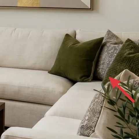
A green throw pillow cover is an easy way to echo the plant tones and keep the sofa from reading like plain “off-white.” In the photo, the olive pillow sits right against the cream cushion, so it becomes the color anchor while the patterned pillow stays quieter. This choice beats buying an entirely new set of cushions because the fabric scale and placement matter more than adding another large object. The trade-off: the cover is the most “budget” element here, so it should look intentional—choose a similar olive (not yellow-olive) and a textured weave if you can.
Match undertones, not just the color name
Olive can swing yellow or gray—pick one that feels close to the plant’s leaf tone for a calmer read.
Layer 2 — decorative tray on coffee table ($30) Styling surface in one move
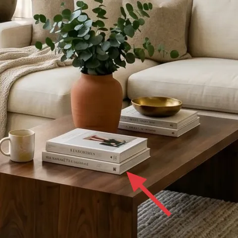
A decorative tray gives the coffee table a “collected” layout instead of scattered small items. In this scene, the warm-toned tray and nearby book stack create a simple still-life: one metal/glow element, one paper texture from the books, and the greenery from the vase. It works because a tray defines where objects belong, so you don’t need lots of decor to look layered. The trade-off is that trays are a little fussy—when the set-up looks messy, you’ll see it faster—so keep the tray to 2–4 objects maximum.
Use height tricks that stay renter-safe
Stack books under a small vase or candle holder so items read at three levels without touching walls.
Layer 3 — cream throw blanket ($35) Softens the sofa edge
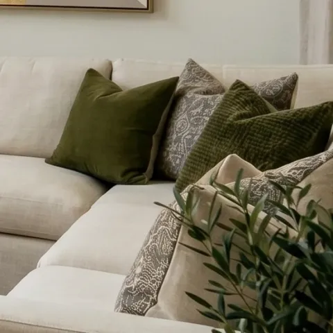
A cream throw blanket adds the “texture you feel” layer that makes a neutral sofa look dressed, not blank. Here it’s draped where the arm meets the seat, so you get a gentle fold pattern without needing a tailored cover. This beats choosing another throw pillow because blankets cover more surface area and look intentional from across the room. The trade-off: fabric will show lint or pet hair faster than you want, so plan to use a lint roller before photos and rotate the blanket during the week.
Lay the fold on the seat seam
Placing the blanket where cushions meet creates a natural crease and keeps it from slipping.
Layer 4 — white lampshade table lamp ($60) Plug-in light for evening depth
A plug-in table lamp with a light-colored shade is what turns daytime calm into evening glow. In the photo, the lamp sits beside the sofa on a small surface and throws a warm pool of light onto the cream cushions and nearby side styling. This choice beats relying only on the brass pendant because pendants can cast heavier light from above. The trade-off: lamps need bulbs that match your tone—use a warm white bulb so the lamp reads like the pendant’s warmth rather than a cool office light.
Don’t pick a “cool white” bulb for this palette
If the shade looks blue in person, switch bulbs—cool lighting will fight the tan-and-cream scheme.
Layer 5 — tall indoor plant in terracotta pot ($40) A living sculptural focal point
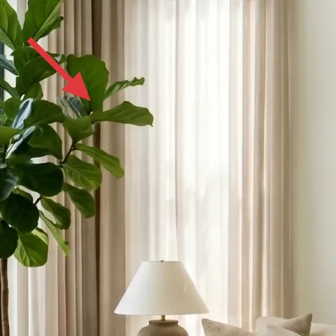
A tall leafy plant in a terracotta pot makes the whole corner feel grounded, especially next to a wall of windows and neutral textiles. The plant in the image reads as a sculptural column—its height balances the framed art and brings the greenery color family into the seating zone. This beats adding a low plant because the scale matters here; a small plant just gets lost against tall curtains and glass. The trade-off: larger plants need light, so place it near bright window light and rotate weekly for an even shape.
Keep the pot color consistent with your accents
Terracotta ties to wood and pottery tones, so you don’t need extra color blocks.
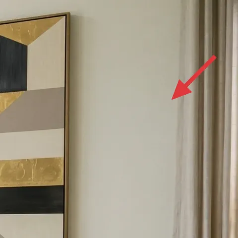
Layer 6 — framed abstract wall art ($80) DIY-friendly geometry for the “designed” look
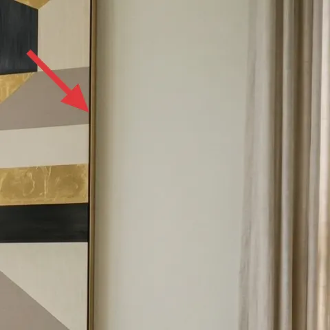
Framed abstract wall art is the easiest way to get the graphic, modern feeling without repainting anything. The hero piece uses bold blocks in black, tan, and cream, which complements the warm wood, brass lighting, and the olive plant leaves. This choice beats adding more small wall decor because one larger focal print keeps the room from feeling busy. The trade-off: art needs to be centered and hung securely—use Command strips rated for frames, and level before you press.
Make it instead of buying it
DIY a similar geometric abstract on cardstock, then slide it into a frame so you get the same color blocking for less.
Materials
- Cardstock sheet (A3 or larger) — 1 — craft store — $2
- Acrylic paint set (tan/cream/black) — 1 small set — craft store — $12
- Fine-tip paintbrush — 1 — craft store — $18
- Basic frame (match the artwork size) — 1 — thrift or discount — $25
Steps
- Sketch geometric rectangles lightly in pencil: keep the shapes large and few.
- Paint your cream/tan base blocks first and let them dry fully.
- Block in black shapes with the fine-tip brush, following clean edges.
- Add small accent panels in tan/black variations to echo the “patchwork” rhythm.
- Let the painting dry completely to the touch before handling.
- Insert the finished cardstock into the frame, centering it and straightening the orientation.
- Use Command strips for the frame weight rating, and press firmly according to label time.
- Step back and adjust by a few millimeters until the art feels level and centered.
Total DIY cost: $57 — saves about $23 over buying.
Layer 7 — beige sheer curtain panel pair ($80) Light filtering that frames the view
Beige sheer curtains make the corner look softer and more intentional while keeping the window light intact. In the photo, the sheers fall behind the sofa and beside the plant, which blurs the outside view just enough to make the interior feel cohesive. This works better than heavier curtains here because the palette is airy—sheers maintain that bright, calm read. The trade-off is that sheers won’t give full privacy, so layer with existing blinds if needed, but keep the curtain look itself swap-friendly for renters.
Hang high to make the corner feel taller
Even a small height increase above the window line adds a “lift” to the sofa area.
The cost, layer by layer
| Layer | Item | Cost |
|---|---|---|
| 1 | green throw pillow cover | $18 |
| 2 | decorative tray on coffee table | $30 |
| 3 | cream throw blanket | $35 |
| 4 | white lampshade table lamp | $60 |
| 5 | tall indoor plant in terracotta pot | $40 |
| 6 | framed abstract wall art (DIY ~$57 materials) | $80 |
| 7 | beige sheer curtain panel pair | $80 |
| Total | $343 | |
A cheaper variant is swapping the framed abstract for a thrifted frame + printed geometric art, and choosing a solid-color throw pillow cover in olive for the same color anchor. Keep the lamp and plant, because the lighting and height do most of the “finished” work.
What worked, what didn't (across the whole room)
The biggest win is the combo of warm neutrals, one olive accent, and layered light at different heights. The second best part is that the decor stays portable: pillows, textiles, a framed print, and a plug-in lamp. The only thing that can go wrong is letting the styling get too random on the coffee table.
What worked
- The olive pillow color matches leaf tones, so it feels intentional rather than like “extra decor.”
- The cream throw adds visible folds that soften the sofa lines without changing furniture.
- The decorative tray limits visual clutter on the coffee table and keeps book-and-vase styling cohesive.
- The plug-in table lamp adds warm depth where overhead light can look flat.
- The tall terracotta plant brings vertical balance, making the corner feel anchored.
- One large framed abstract print gives the room graphic structure that small accents can’t replicate.
What didn't
- If the bulb tone is too cool, the tan-and-cream palette can look gray instead of warm.
- Skipping a tray and leaving small items loose makes the coffee table read busy fast.
- If the sheer curtains are hung too low, the sofa corner loses height and starts to feel boxy.
- Choosing a yellow-olive pillow can clash with terracotta and make the plant look off.
- Using too many small wall pieces instead of one larger abstract makes the room feel unedited.
What we'd skip if we did it again
Skip swapping out furniture for “matching” pieces. The sofa corner already has the right scale—pillows, throws, curtains, and lighting are what bring the look together without breaking the lease.
Skip adding multiple wall items at once (like several small prints). One larger framed abstract keeps the geometric vibe clean and makes the room look curated instead of busy.
Skip going heavy on cool lighting. Keep bulbs warm and prioritize the plug-in table lamp so the textiles and wood tones keep their cozy, beige character.
Frequently asked
How long does this sofa corner refresh take?
Plan for about 2–4 hours for the purchases and styling: pillow swap, throw placement, tray set-up, lamp positioning, and hanging the framed art and sheers. The DIY art layer adds extra time because paint needs to dry before framing and hanging. If you already own the frame, the DIY day can still be done in one afternoon with drying breaks.
Is this renter-friendly if I can’t drill or use wall anchors?
Yes. The plan avoids wall painting and permanent fastenings. For the framed abstract, use Command strips rated for the frame’s weight and apply them exactly as the label instructs. Everything else is movable: textiles, a plug-in table lamp, and a plant that can be repositioned or packed away at lease end.
What if my living room is smaller than this one?
Keep the composition, but reduce the scale of the “hero” items. Choose a smaller framed print and use a narrower plant or tuck the plant closer to the corner. The tray + throw + one olive pillow will still create the layered look. Sheers also help small rooms feel brighter because they keep daylight in the space.
What if my room has darker floors or less natural light?
Lean into the same palette but brighten the surfaces that matter most: go slightly warmer with the lamp bulb, choose a cream throw with a visible weave, and pick sheers that let light through (not a heavy fabric). The framed art should stay high-contrast so the geometry pops even with lower daylight.
Where can I shop for these pieces without over-spending?
For textiles and pillows, department stores and home goods sections usually have the best quick-match options in olive and cream. For the lamp and frame, discount retailers and thrift stores are often better than buying full-price. The plant can be sourced from local nurseries or big-box stores; aim for a similar height so the corner balance stays true.
What’s the biggest mistake people make with this style?
Trying to match everything. Japandi-inspired rooms still look curated when only one or two accents (like olive) show up repeatedly. If every item adds its own color, the room stops reading as calm and cohesive. Stick to cream/tan/wood, add one olive accent, then use textures—throw, rug weave, and framed geometry—to finish the look.
More in Living Room
6 no-drill ways to build a renter-friendly sofa corner for $400
A move-friendly sofa corner refresh for $400 using renter-safe swaps: layered textiles, plug-in lighting, a framed abstract print you can r…
7 renter-friendly living-room swaps for a warm $600 update
A warm, earthy living room refresh on a $600 budget: a neutral 5×7 rug, a wood coffee table, framed botanical art, warm hanging bulb string…
7 no-drill swaps for a $300 living room refresh
A warm-beige and terracotta living room refresh that works for shared housing, with move-friendly swaps. This $300 plan focuses on soft tex…