- Best for
- Counter-to-shelf styling rhythm
- Time
- 1 weekend
- Difficulty
- Easy
- Total cost
- About $500
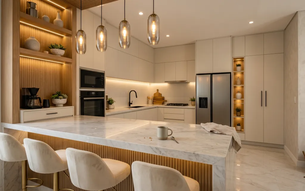
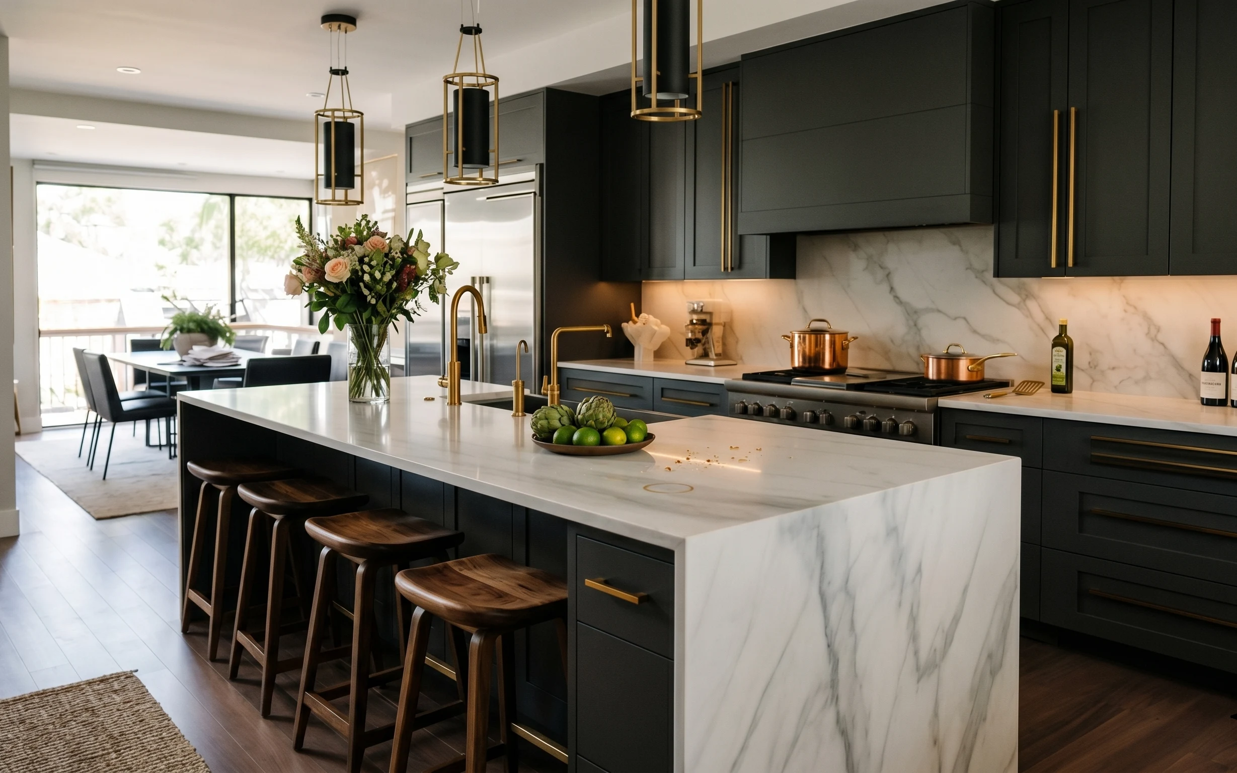
Why warm japandi accents are the kitchen island dining zone of 2026
In this space, the glow is doing as much work as the furniture. Those glass pendant lights throw amber warmth over a marble dining table, while the white kitchen towel adds a clean, linen-like pause. The cream upholstered chairs bring in a soft, padded texture that makes the room feel calmer than all-hard surfaces. It’s a look you can copy for shared housing because the high-impact items here are swap-able—no paint, no drilling, just a few well-chosen, packable pieces.
I used to think kitchen styling meant “more stuff,” especially when I had roommates who kept leaving everything out. What changed my mind was noticing how quickly a kitchen looks intentional when the table gets one restrained textile moment and the plants repeat at different heights. Now I aim for symmetry of vibe, not identical objects—same palette, different silhouettes.
Layer 1 — white kitchen towel draped on the marble countertop ($18) Texture relief in an all-hard kitchen
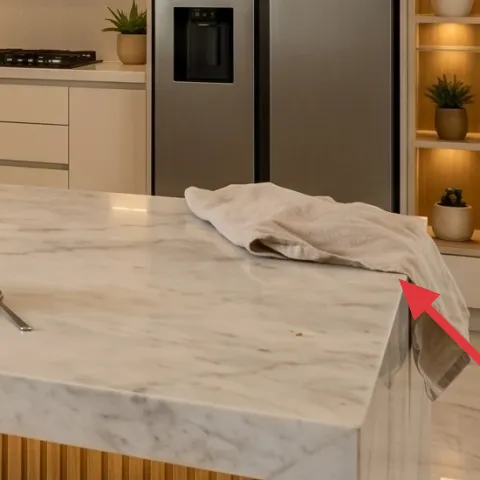
A white kitchen towel draped on the marble countertop is small but visible, and it instantly softens a surface that can otherwise feel slippery and cold. The trick is placement: let it hang with a natural fold instead of smoothing it flat, so it reads like fabric, not clutter. In a shared kitchen where everyone uses the space, this kind of “lived-in on purpose” textile also hides the minor imperfections that happen day to day. I’d choose a heavier cotton/linen blend over thin novelty towels because it keeps shape through multiple weeks.
Match fabric weight, not just color
White works best when the towel holds folds—too-sheer fabric turns into a wrinkled rag.
Layer 2 — cream upholstered dining chair ($60) The padded seat that makes marble feel calmer
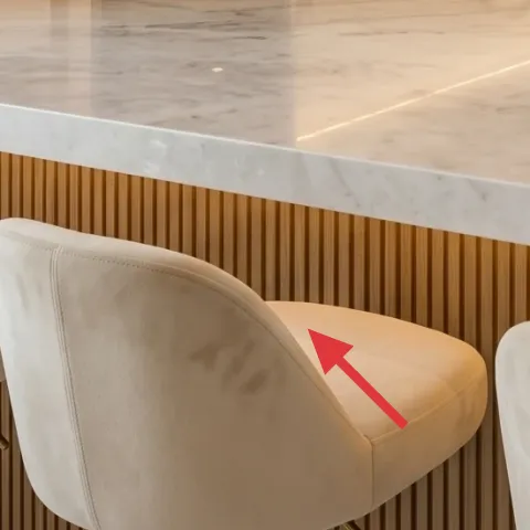
One cream upholstered dining chair is the easiest way to soften a modern kitchen island dining zone, because it adds a matte, textile texture next to glossy stone. I like using chairs in the same family of neutrals as the towel so the room looks curated, not random. The trade-off is that upholstery requires a little care, especially if roommates cook with sauces nearby—but removable covers or spot-clean habits keep it manageable. If you’re starting from scratch, avoid matching a full set; pick two or three to create the “designed” rhythm without overspending.
Pick chairs you can carry
Look for lightweight frames or ones with simple assembly so you can move them without a U-Haul.
Layer 3 — rectangular dining table (marble top) ($140) A single clean surface for plants + mugs
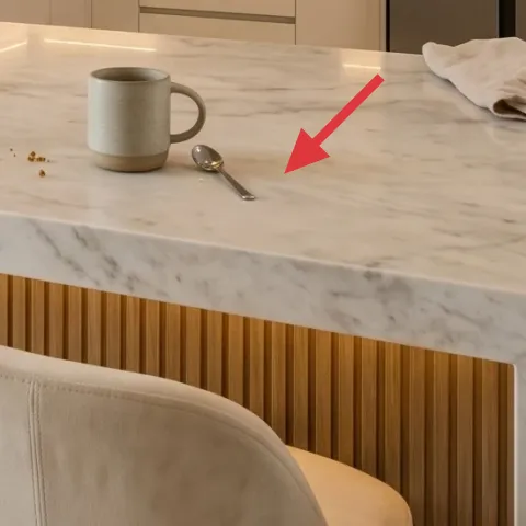
The rectangular dining table acts like a styling stage: marble reads bright, wipes clean, and supports both a towel moment and greenery without fighting the background. The reason to choose a table like this over cluttered accents is scale—one big surface gives you room for a tray-style arrangement without constant rearranging. If you’re working with limited storage in shared housing, a table with a smooth top also means you can clear it fast between meals and still feel like the room “looks done.” Keep the centerpiece simple: one plant area plus one textile cue is plenty.
Style in zones, not objects
Think “plant zone” and “textile zone” on the table, so styling survives a busy week.
Layer 4 — cluster of glass pendant lights with exposed warm bulbs ($70) Warm overhead glow without permanent fixtures
This pendant cluster is doing the mood work—warm amber bulbs make the marble read richer and the cream seating feel softer. If your space already has overhead lighting, treat the pendant look as inspiration for add-on warmth: prioritize warm color temperature bulbs and a glass element that reflects light. The trade-off is glare—glass shades can highlight fingerprints, so wipe them during a deeper clean rather than daily. In a renter or shared-house situation, stick to portable lighting options or plug-in versions so you can pack everything back up quickly.
Don’t assume every pendant is renter-safe
If it’s hardwired where you live, swap the idea into plug-in lighting or use a different warm light source.
Layer 5 — small potted plant on the counter near the sink ($35) Repeated greenery at counter height
A small potted plant on the counter near the sink ties together the island zone and makes the kitchen feel lived-in without adding more “stuff.” Counter-height plants are also practical in shared housing: they’re visible, easy to reach, and easier to rotate when different roommates water—or forget to. The visual win here is repetition: another plant appears on the shelves so the room doesn’t feel like it has one lonely decoration. If you want to keep it low-maintenance, choose a plant that tolerates indoor light variability and use a cachepot that’s easy to carry.
Choose planters you can lift
If the pot looks heavy or wedged into a spot, you’ll stop maintaining it the first time you move.
Layer 6 — potted plant in a gray planter on the left built-in shelf ($40) One pot, cooler neutral, same vibe
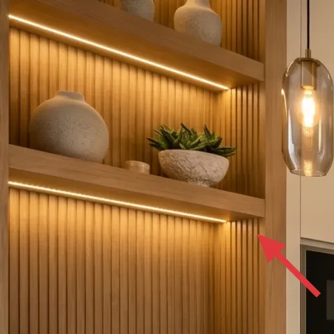
The gray planter on the left shelf is the “anchor plant” that keeps the whole look from feeling too warm or too beige. By repeating greenery at a different height, you get depth—like the island has a foreground (counter) and background (shelf) moment. The gray container also balances the warm bulbs and keeps the palette modern rather than country. The trade-off with shelf styling is visibility: if roommates bump into the area, you’ll want to secure the plant position with a stable, wide base so it can handle daily life.
Repeat the silhouette
Even if the plant species differs, keep the pot shapes in the same visual family.
Layer 7 — small potted plant on the right built-in shelf ($60) Finish with one last plant at shoulder level
That final small potted plant on the right shelf completes the vertical rhythm: plants aren’t only on the countertop, and the room looks finished from different angles. The right-side placement also helps balance the heavier visual mass of the left built-ins, so the eye doesn’t get pulled in one direction. This is the part I usually overdo—after my first few shared-house attempts, I had a habit of buying too many planters. Now I stop at three “plant moments,” spaced across surfaces, so each one gets attention without turning into clutter.
Keep it movable
If a planter can’t survive being carried, it won’t survive moving day.
The cost, layer by layer
| Layer | Item | Cost |
|---|---|---|
| 1 | White kitchen towel ($18) | $18 |
| 2 | Cream upholstered dining chair ($60) | $60 |
| 3 | Rectangular dining table with marble top ($140) | $140 |
| 4 | Glass pendant cluster with warm exposed bulbs ($70) | $70 |
| 5 | Small potted plant on counter near sink ($35) | $35 |
| 6 | Gray planter plant on left built-in shelf ($40) | $40 |
| 7 | Small potted plant on right built-in shelf ($60) | $60 |
| Total | $423 | |
If you want a cheaper variant, prioritize the towel + chair combo first, then keep only two plants instead of three. You can also choose one glass-light moment (or a plug-in warm lamp) rather than the full pendant-cluster look.
What worked, what didn't (across the whole room)
The warm lighting plus cream seating is the winning pairing here, because it makes marble feel softer and more human. The repeated greenery avoids the “one plant, one corner” problem that usually shows up in shared kitchens.
What worked
- The white towel adds textile contrast that makes the island feel less stark.
- Upcycled-looking cream chairs keep the dining zone comfortable without extra furniture.
- One table surface acts as the organizing anchor for plants and daily items.
- Warm glass lighting makes the palette feel cohesive at night.
- Counter-height and shelf-height plants create depth without visual clutter.
What didn't
- Glass light looks better when it’s wiped regularly; fingerprints show fast.
- Small plants can get neglected in shared households if watering isn’t assigned.
- Too many towel styles (or too many colors) starts to fight the japandi simplicity.
- Trying to style the entire table surface at once makes the room feel busy.
What we'd skip if we did it again
Skip adding a bunch of extra decor objects to the marble table. In shared housing, the surface becomes a storage landing zone quickly, and too many small items blur into “messy, not styled.” A single textile cue plus one plant grouping stays readable even when life gets busy.
Skip trying to match every piece by brand or exact color. The look here works because neutrals repeat (cream, warm white, gray) while the shapes vary. If you do chase exact matching, the result can feel precious and fragile—hard to maintain when roommates are using the same space daily.
Skip hardwired-light assumptions. If your rental can’t support ceiling fixtures, don’t force the pendant cluster. Use plug-in warm lighting (or a portable warm bulb setup) so you can pack everything up intact when the lease ends.
Frequently asked
How long does this kind of kitchen refresh take in shared housing?
Most of the work is swapping soft textiles, arranging plants in three spots, and setting a simple table “zone” layout. If you’re starting from scratch, plan for about a weekend: half a day shopping/collecting, then an hour or two of staging and a final wipe-down. The styling part is fast because you’re repeating shapes and keeping the color palette tight.
What if the kitchen already has overhead lighting that I can’t change?
Use the pendant look as a color-temperature cue rather than a hardware target. Choose a portable light source that matches the warm amber feel, and keep the rest of the room in the same neutral family. That way the marble still reads rich and the dining zone still feels intentional, even if the fixture stays landlord-installed.
Can this work if my kitchen island is smaller?
Yes—scale down by keeping the same three-moment structure: one towel moment on the countertop, one plant at counter height, and one plant up higher. In a smaller space, reduce the number of chairs you stage and keep the table surface mostly clear. The goal is readability: fewer items, but placed with intention.
Can I do this if I’m moving again within a year?
That’s the whole premise. Towels, chairs, portable plants, and most tabletop styling pack flat or lift easily. The only “watch this” item is anything permanently installed like ceiling fixtures—avoid relying on those as layers. Choose renter-safe lighting and freestanding decor so the look survives move-out day.
Where should I shop if I want the warm japandi palette?
Start with basics that repeat neutrals well: kitchen textiles, cream chair options, and simple planters in gray or warm tones. For plants, look for reputable indoor plant sellers or big-box stores with a good turnover rate. For lighting, search for plug-in warm pendant alternatives or warm bulbs that mimic the amber glow.
What’s the biggest mistake people make in kitchen styling like this?
Over-decorating the marble surface. In shared kitchens, objects end up where people set them down, and too many small items makes the room look chaotic. Another common miss is skipping repetition: one plant in one corner looks accidental; three plant moments at different heights looks intentional.
More in Kitchen & Dining

7 kitchen island swaps for a $500 renter-friendly refresh
A warm, japandi kitchen island dining zone built from move-friendly swaps. With a $500 refresh budget, the look leans on soft countertop te…
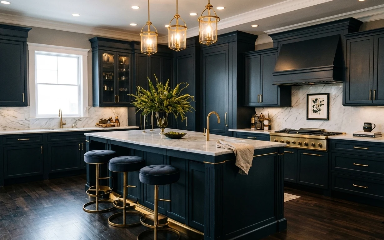
7 renter-friendly swaps for a dark-blue kitchen
A dark-blue kitchen island refresh for renters using no-drill styling: 7 swaps totaling under $400. Focus: brass barstools, a framed botani…
A polished kitchen island look for $400
A move-ready kitchen island refresh under $400 built around textiles, a centerpiece, and easy swaps that pack up fast. This plan borrows th…