
- Best for
- kitchen island refresh
- Time
- 1 afternoon
- Total cost
- $390
- Renter-safe
- yes (no-drill swaps only)
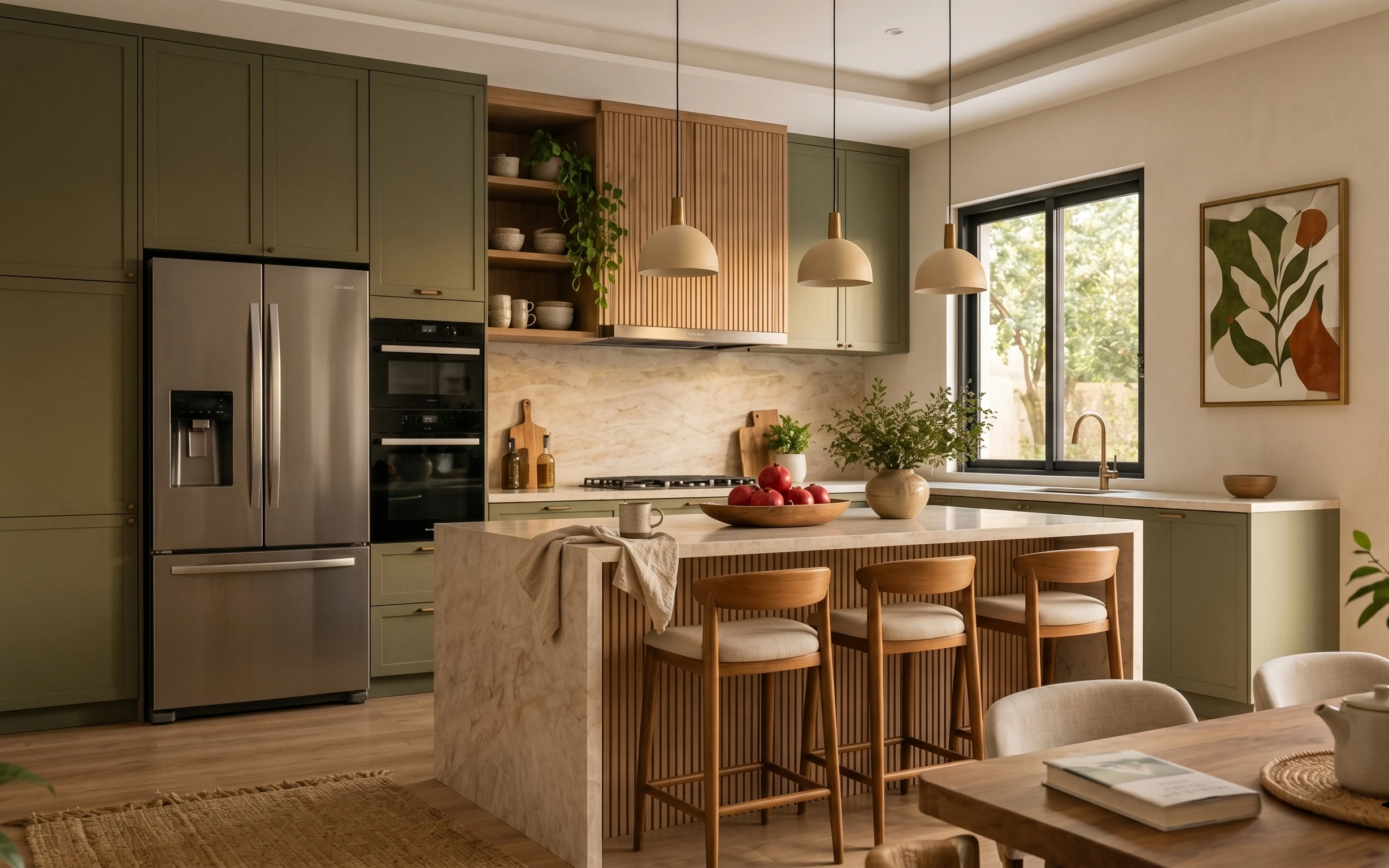
Why warm brass-and-countertop styling is the kitchen island of 2026
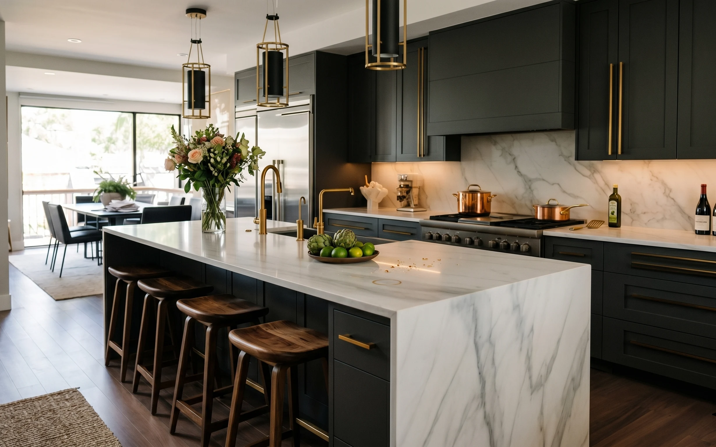
The fastest way to make a shared kitchen feel “yours” is to style the same hard surfaces you already live with: marble-look counters, dark cabinetry, and warm brass hardware. In this photo, the glass vase bouquet brings height and softness, while the small rug breaks up the cold floor with texture. I also love how the stovetop objects and bottles create a repeating rhythm instead of scattered clutter. For students and roommates, the win is that you can change all of it parcel by parcel—no landlord permission, no permanent installs.
I used to overthink kitchen styling and treat it like a living-room shelf: too many items, too tall, and not enough negative space. In one apartment, my “pretty” counter became a landing pad for mail and keys because the containers didn’t pack well. What changed my mind was limiting the island to three zones—underfoot, center height, and a small grouping near the stove—then letting the countertop do the rest. This photo works because the objects are placed, not displayed for display’s sake.
Layer 1 — Small area rug ($80) anchors the first splash zone
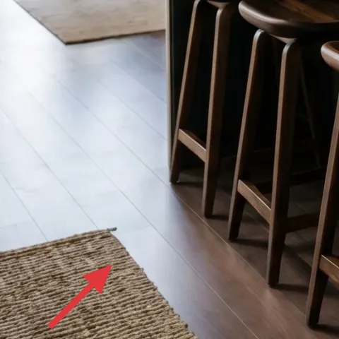
A small area rug in a warm neutral is the easiest way to make a kitchen island area feel intentional, not purely functional. In the hero, the rug corner sits in the foreground and adds woven texture against the wood floor, which also helps visually “buffer” where people walk and where spills happen. The trade-off is that a rug in a kitchen needs to be low-profile and easy to vacuum, so you won’t get that plush look—but you will get cleaner lines and easier packing. For moving soon, pick one rug you can roll tight and slide into a moving box.
Choose a flat-weave you can roll
Look for a flat weave or low-pile rug so it packs tight and doesn’t shed like thicker shag.
Keep the rug corner visible
If the rug fully disappears under furniture, it stops doing its job visually and you end up buying a “random floor mat.”
Avoid shag near the island
High pile collects crumbs and makes day-to-day cleaning slower—time matters in shared homes.
Layer 2 — Wood bar stool ($80) adds warmth behind the counter edge
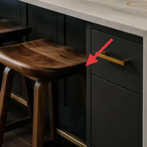
Wood bar stools are a natural warmth partner for dark cabinetry and white counters, and you can use them to “borrow” the cozy part of dining-room styling without changing anything fixed. The hero shows stools with dark wood and upholstered seats, which read mid-century and help the island feel less stark. If you’re working with different stools in your place, match the wood tone and choose seats that don’t look too shiny (matte fabric reads warmer). The trade-off is that you’ll need to keep the seat covers clean—food happens—but the payoff is that the seating already frames your counter accessories.
Match your wood tone, not the exact chair
Warm walnut or medium oak undertones keep the island feeling cohesive even if the stool shape differs.
Use seat styling to change the mood
Swap in removable seat cushions or chair pads when you move—same stool, new vibe.
Layer 3 — Glass vase bouquet centerpiece ($45) brings height without clutter
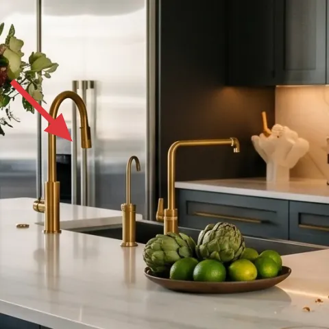
That clear vase moment is doing two jobs at once: it adds vertical height over a long countertop and softens the contrast of dark cabinetry and bright marble-look. When you’re in shared housing, the biggest mistake is putting a low, flat pile of items on the island—everything blends into the counter and you lose the “designed” look. The solution is simple: one centerpiece that reads from standing height. I’m swapping this store-bought bouquet look for a terracotta planter set you can paint and re-use, so it packs flat and stays mobile between leases.
Make it instead of buying it
DIY a painted terracotta planter set to replace the centerpiece while keeping the same “height + softness” role on the island.
Materials
- Terracotta planters (2–3 small sizes) — assorted — craft store — $18
- Cream or warm white acrylic paint — small bottle — craft store — $11
- Paintbrush set (flat + small detail) — 1 kit — craft store — $6
- Painter’s tape or paper for clean edges — 1 roll/pack — craft store — $4
Steps
- Wash and dry the terracotta, then set up a paper-protected workspace.
- Mask any rim areas you want to keep terracotta (or skip masking for a full-coverage look).
- Apply the first thin coat of acrylic paint and let it dry.
- Apply a second coat for even color, then let fully dry.
- Arrange planters by height and add small cut stems or faux greenery for instant height.
- Top off with a little decorative filler (optional) so the arrangement reads “intentional” from standing height.
Total DIY cost: $39 — saves about $6 over buying.
Go for one focal height
Two short pieces read busy; one taller centerpiece reads like a planned island.
Layer 4 — Green produce bowl on island ($25) adds color without a full decor overhaul
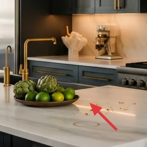
A bowl of green produce is a surprisingly effective “decor object” because it’s both real (it’s supposed to live out) and visually structured. In the hero, the round green bowl sits near the center of the island and creates a natural contrast against the white marble-look. For shared households, this is also practical: you can swap the produce weekly and keep the styling fresh without rebuying decor. The trade-off is that you’ll have to refresh it so it doesn’t look tired—aim for items that stay firm a few days. Packability is a plus: bowls travel well and don’t require any mounting.
Style by shape, not quantity
One round bowl with one dominant color reads cleaner than scattering multiple small things.
Skip greasy mess on stone-look
If you use anything sticky or oily, clean quickly—marble-look surfaces show smudges fast.
Layer 5 — Copper kettle on stovetop ($60) repeats the brass warmth nearby
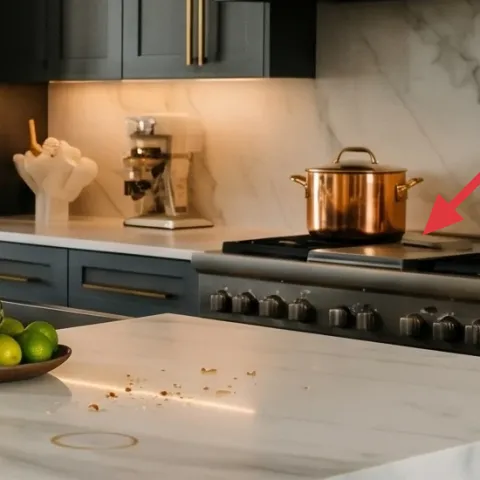
This copper kettle is doing more than being useful—it pulls the warm metal story closer to the island center. In the photo, dark cabinets and brass accents set a palette, and the kettle’s reddish-gold shine echoes that warmth without matching perfectly. When you’re decorating for impermanence, metal cookware you already own (or can thrift) is the easiest “move with me” layer: it fits in a bin and doesn’t care if you have a different wall color next year. The trade-off is that cookware needs storage discipline, so keep it grouped and wipe it before returning it to the counter.
Let cookware be functional decor
If it’s out, it should make sense for your daily routine—otherwise it becomes clutter.
Wipe and dry before styling
Water spots can dull the metal; a quick dry keeps the shine crisp.
Layer 6 — Copper pot on stovetop ($40) builds a stovetop “set” without matching everything
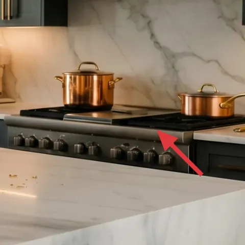
A second copper pot adds repetition, which is what makes counters look curated instead of accidental. In the hero, the stovetop grouping reads like a warm-metal mini still-life, especially because the pots sit at the same general depth along the backsplash. The trade-off with using cookware is that it’s heavier than a candle or tray, so you need a safe way to pack it. Choose a pot you can lift with one hand and protect the finish with a cloth wrap. Once it’s styled, you don’t need many extra accessories—just keep it to a small cluster.
Don’t stack too tall
High stacks block sightlines and make it harder to cook; keep the height low enough to move around.
Group by height level
Set kettle and pot on the same countertop zone so the visual rhythm stays calm.
Layer 7 — Wine bottles on counter ($60) creates a vertical label story you can swap out
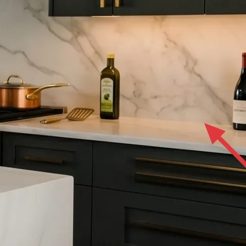
Wine bottles work like a minimalist “label art” wall, but placed horizontally where you can actually see it. In the hero, the bottles add vertical detail and break up the uninterrupted white marble-look with dark glass tones. For shared housing, the best version of this idea is “swapability”: keep a small bottle lineup for hosting or weekends, then rotate based on what you’re buying or drinking. The trade-off is that bottles need a stable spot so they don’t roll—aim for the counter area with natural boundaries. When you move, bottles pack into the same box as kitchen glassware.
Use bottle placement, not extra objects
Instead of adding lots of decor, let labels and glass color do the work.
Pick one label palette
Choose bottles with similar label colors so the grouping reads intentional, not random.
The cost, layer by layer
| Layer | Item | Cost |
|---|---|---|
| 1 | Small area rug | $80 |
| 2 | Wood bar stool (single) | $80 |
| 3 | Glass vase bouquet centerpiece (DIY ~$39) | $45 |
| 4 | Green produce bowl | $25 |
| 5 | Copper kettle | $60 |
| 6 | Copper pot | $40 |
| 7 | Wine bottles on counter (set of 2–3) | $60 |
| Total | $390 | |
If a full copper setup isn’t your vibe, swap one pot for a dark ceramic pot and keep the kettle as the warm-metal focal. That keeps the same visual repetition while dropping the cost and making the kitchen feel less “restaurant.”
What worked, what didn't (across the whole room)
The overall win here is repetition: warm metal accents, rounded forms, and one height-focused centerpiece keep the island looking styled instead of busy. The second win is mobility—everything chosen here is either lightweight textiles or countertop objects that can live in a box for the next lease.
What worked
- A small flat-weave rug adds warmth and helps visually “finish” the island zone on a hard floor.
- One centerpiece with height creates a clear focal point instead of scattering attention across the countertop.
- Green bowl styling brings color contrast that feels intentional even when it’s just produce.
- Copper cookware near the stove repeats the brass warmth and makes the palette feel cohesive.
- Bottles add vertical detail without needing any wall space, hooks, or tricky hanging.
- All chosen pieces pack into bins or rolls, which matters in shared housing moves.
What didn't
- Adding too many small decor pieces on the island makes the marble-look surface feel visually crowded.
- Choosing a high-pile rug near the kitchen entrance can create faster grime and harder vacuuming.
- Using only flat decor (no height) turns the island into “just a counter” instead of a centerpiece.
- Leaving cookware ungrouped near the stove makes the palette feel mismatched instead of curated.
What we'd skip if we did it again
Skip replacing fixed kitchen hardware or doing anything permanent to cabinetry and lighting. In shared housing, those upgrades don’t travel with you, and the visual payoff is rarely as noticeable as countertop styling.
Skip a tall, tangled decor stack on the island. If items start blocking the work zone or eye line, it’s not worth it—one height focal plus a small grouping stays easier for daily cooking.
Skip trendy wall-based decor when you’re decorating a kitchen. Instead, invest in pieces that can live on the island, move into boxes, and still look good from standing height after you move.
Frequently asked
How long does this kitchen island refresh take?
For most shared-housing kitchens, plan on about 60–120 minutes. Laying out the rug, arranging a centerpiece, and grouping cookware usually takes the longest part of the day. If you DIY the painted terracotta planter set, add drying time across the afternoon—though you can still do everything else while layers dry.
What if my kitchen is smaller or my island doesn’t have much counter space?
The rule is fewer zones, not smaller ambition. Keep one centerpiece height item (vase or planter grouping) and reduce the cookware grouping to one pot plus the kettle. Swap bottles for a single bottle or a small candle (if you already own one). The rug can also be scaled down to a runner-sized piece at the doorway.
What if I’m renting and can’t change anything fixed?
This approach avoids anything fixed: no replacing cabinetry, countertops, or built-in hardware. Instead, it relies on moveable objects—textiles, bowls, cookware, and glass—plus a centerpiece you can re-make. Everything should be able to pack into boxes with your everyday kitchen items.
Where should I shop differently to keep it under $400?
For the metal and glass pieces, mix thrift with basics: look for a copper-look kettle or a real thrifted copper pot, and keep bottles for what you’d buy anyway. For textiles, choose a flat-weave rug from discount home stores or end-of-season sales. The DIY terracotta planters can come from any craft or home-goods aisle.
What’s the biggest mistake people make on kitchen islands?
Over-styling the island with too many unrelated items. When everything is “cute,” nothing becomes the focal point. The photo look works because there’s one height anchor, one color anchor (green bowl), and one metal repetition near the stove. Fewer, better-positioned items look more designed from the doorway.
Will the terracotta centerpiece work with real plants or only faux?
You can do either. If using real greenery, keep stems short so they don’t flop when the kitchen gets busy, and use a liner inside the planter to protect surfaces. Faux stems are simpler and lower-maintenance for shared homes. Either way, the planter set should be treated like a portable centerpiece that can be swapped when you move.
More in Kitchen & Dining
A polished kitchen island look for $400
A move-ready kitchen island refresh under $400 built around textiles, a centerpiece, and easy swaps that pack up fast. This plan borrows th…
Under $300: no-drill kitchen island refresh with 7 move-ready swaps
A kitchen island refresh for shared housing that stays renter-friendly: add a 5×7 rug, swap in move-ready counter styling, and upgrade the …
Under $300: no-drill kitchen peninsula refresh with warm neutrals
A move-friendly kitchen peninsula refresh for shared housing, built around textiles, countertop styling, and one no-drill plant moment. The…