
- Best for
- Countertop styling on a kitchen island
- Cost
- Under $400
- Difficulty
- Easy (mostly swapping accessories)
- Time
- 1–3 hours
Why navy-and-brass accents are the kitchen island of 2026
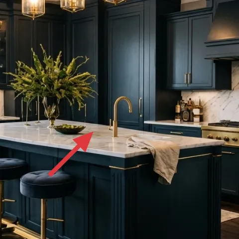
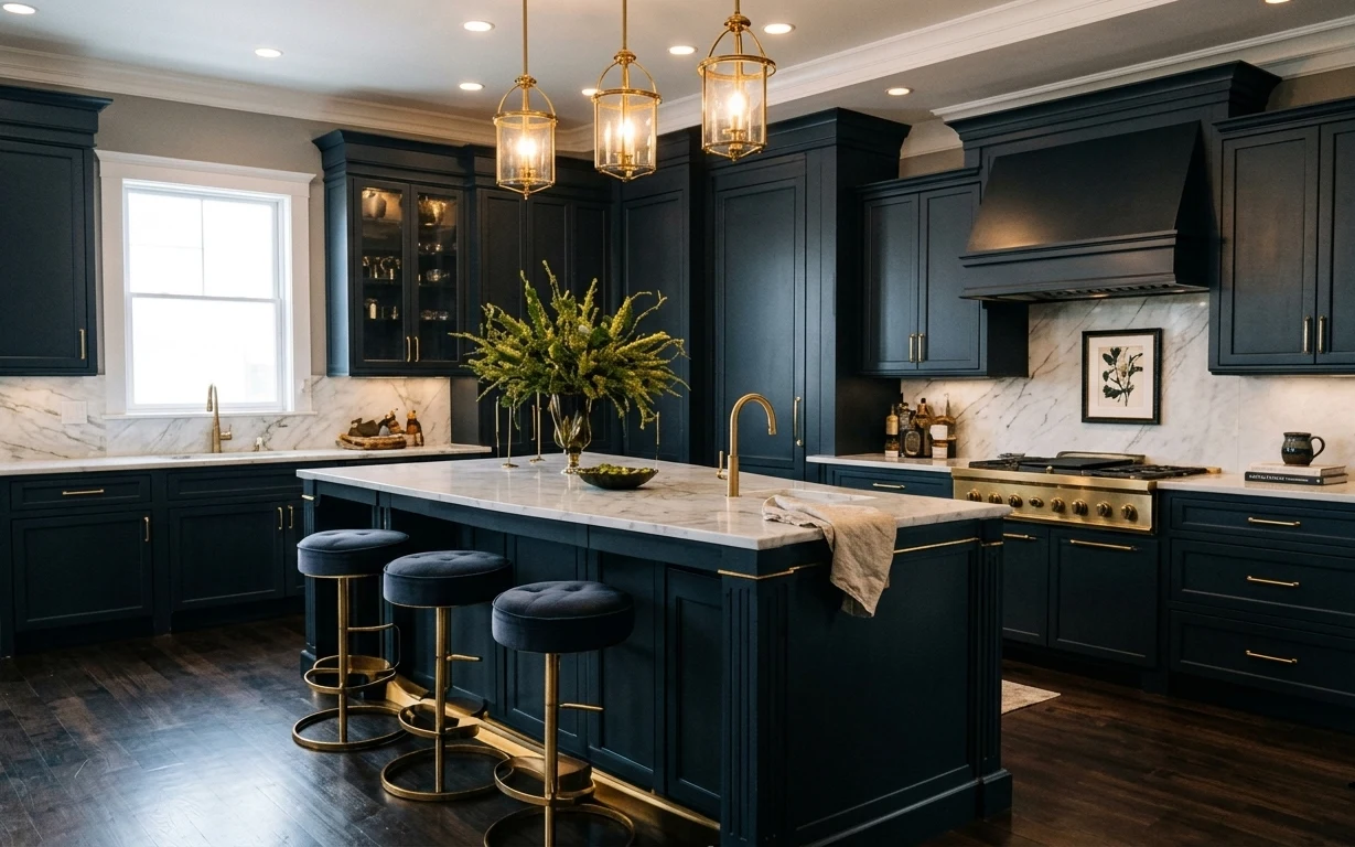
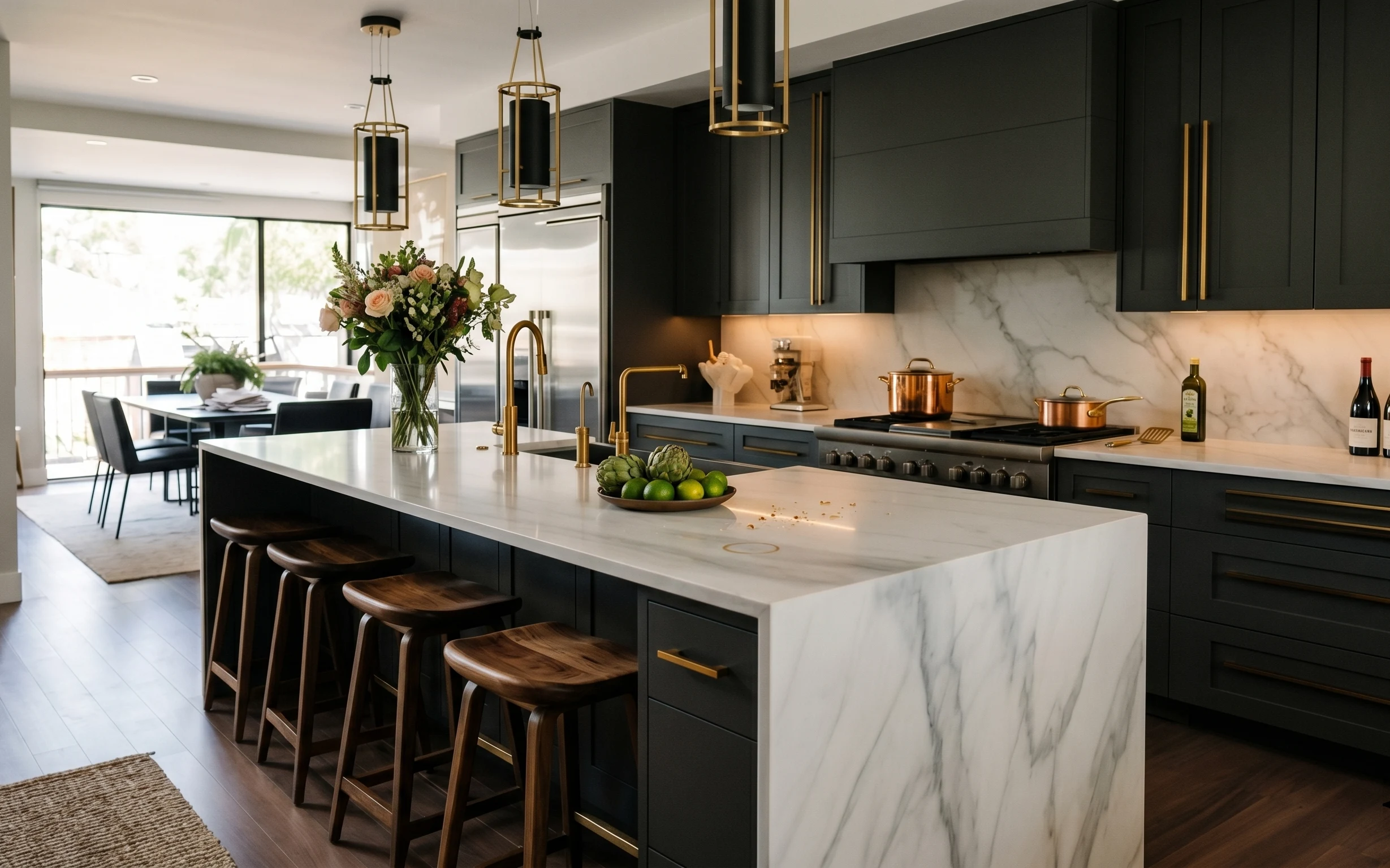
This look works because it mixes strong color blocks with warm metallics and clean, graphic moments. In the photo, the deep navy barstool seats, marble-like countertop, and glossy brass bases create a consistent palette. The framed botanical print adds a calm focal point without competing with the bold cabinets. It also helps that the styling stays “changeable”: a towel, a vase, and countertop objects can be swapped seasonally. For renters, the best part is that the heaviest visual lift comes from accessories and freestanding pieces, not from any permanent updates.
I used to overthink renter decor and try to “match” everything—hardware to fixtures, down to the exact shade of gold. The problem was that my selections looked polite instead of intentional. What changed for me was choosing contrast first: navy seats and brass bases, then adding one soft texture (the folded towel) and one repeatable botanical note (the print + branches). Once that anchor palette felt right, everything else became easy to style and easy to pack away.
Layer 1 — barstool (brass base, navy seat) ($100) Brass-and-navy seating that reads “custom”
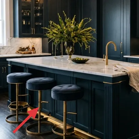
One barstool in the navy seat and brushed-brass base family gives the island area structure, because it repeats the cabinet color while adding warm metal shine. In the photo, the stool’s round footprint also softens the long, linear island shape. If the obvious alternative is a matchy set with one-tone legs, this choice leans into contrast instead: dark upholstery + gold-tone metal feels more styled, even with just a couple pieces. The trade-off is practicality—barstool styling sits front and center, so keeping the seat fabric clean matters, but it’s manageable with regular spot-wipes.
Keep metal tones consistent
When you add brass seating, echo that finish with just one more brass object on the counter so the room doesn’t look mixed in the wrong way.
Layer 2 — folded towel on island ($25) A small textile you can swap fast
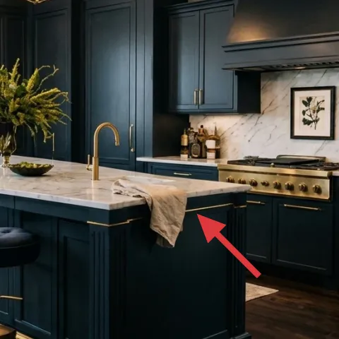
A folded towel on the island might sound tiny, but it’s what makes countertop styling look lived-in instead of staged. The towel in the hero reads in a warm neutral that offsets the deep navy and white marble tones. This works especially well on a kitchen island because textiles interrupt the shine of hard surfaces. Choosing a towel over something more permanent (like a fixed runner you can’t remove) keeps the look renter-friendly. The trade-off is that it needs small maintenance—swapping it when it gets damp or stained keeps the “clean hotel kitchen” effect going.
Fold for height, not just neatness
A slightly chunky fold gives the towel presence without blocking countertop objects.
Layer 3 — framed botanical print ($80) One calm wall focal point over the island
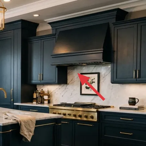
The framed botanical print is the visual breather: it adds organic shape where the cabinetry and backsplash are mostly straight lines. In the photo, it sits above and to the right of the island zone, pulling your eye away from the hardware and toward a softer subject. If the alternative is unframed prints or a cluster of small art, this single statement frame keeps the room readable—especially in dark kitchens where too many elements feel busy. The trade-off is scale: a small print can disappear against large cabinets, so stick close to the framed size range that actually holds wall attention.
Skip any frame you can’t hang safely
For renters, rely on removable methods (like Command hooks) so the frame stays secure without wall damage.
Layer 4 — vase with branches ($35) A stem arrangement that matches the palette
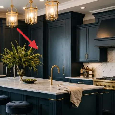
The vase with branches brings movement and height, which is key in a kitchen where the island is low and wide. In the hero, the airy stems soften the heavy navy tones and add a bright green note that doesn’t overpower the room. This works better than a low bowl of flowers because it creates vertical contrast between the hanging lights, the cabinets, and the countertop. The trade-off is longevity: branches can look best when they’re fresh enough at first, so it helps to mist lightly and swap stems when the color dulls.
Use height to balance dark cabinetry
When cabinets are deep, a taller arrangement keeps the island from feeling flat.
Layer 5 — decorative brass bowl ($35) Where the countertop gets “collector” energy
A decorative brass bowl gives the countertop a real object to orbit around—perfect for this navy-and-white-and-brass combination. In the photo, it sits near the stem arrangement and picks up that warm metal note, which helps the whole island feel cohesive. If you’d normally default to a plain tray, this bowl adds shape and shine without clutter. The trade-off is that brass shows fingerprints and water spots, so it’s a quicker-clean kind of decor. Still, that upkeep is usually easier than trying to fix visual clutter with bigger design changes.
Anchor in one “hero” shape
Pick one curvy brass form on the island so the rest of the objects can stay simple.
Layer 6 — countertop books ($15) Editorial styling without taking over the surface
Countertop books add texture, stacked geometry, and that magazine-styling rhythm that makes kitchens feel designed. In the hero, the book stack is positioned so it reads along the counter line rather than blocking the island work area. If the alternative is too many small objects, books help you keep a “curated” look with fewer items. The trade-off is knowing what to leave out—too many titles becomes clutter fast in a high-use kitchen. Keep the set tight (2–3 spines max) and let your tray or vase do the heavy lifting for interest.
Choose covers with the same undertone
Warm neutrals and muted greens work well with brass and deep navy.
Layer 7 — apothecary-style jars (DIY labels) ($45) Personalize your pantry look with printable text
Apothecary-style jars look intentional because they turn storage into decor, especially when the label typography is part of the design. In the photo, the jars sit as a small grouping that reads like a styled vignette on the countertop. Buying labels can get pricey fast, so this layer is where a DIY version makes the biggest difference while staying renter-safe. The trade-off: you’ll need to print carefully and apply labels neatly so they look clean from across the room. Once done, it’s also easy to swap the label set when you switch what you keep in the jars.
Make it instead of buying it
This DIY turns blank jar labels into apothecary-style labels you can print and swap—so the jars stay decorative without extra wall changes.
Materials
- Printable label sheets (letter-size) — 1 pack — $8
- Printable inkjet/laser compatibility (based on your printer) — 1 set — $6
- Clear sticker laminate sheet — 1 — $5
- Small label scissors — 1 — $4
- Alcohol wipes (for clean application) — 1 pack — $3
Steps
- Pick label sizes for your jars and measure the visible jar face width and height.
- Download a simple apothecary-style label layout and adjust the text and font scale.
- Print one test label on plain paper to confirm scale against the jar.
- Print the final labels on the printable label sheets.
- Trim labels with scissors so the edges are crisp and centered.
- Clean the jar surface with alcohol wipes and let it fully dry.
- Apply the label starting at the top edge, smoothing as you go to avoid bubbles.
- Optional: cover with clear sticker laminate for a more durable, glassy finish.
- Let the label set undisturbed for a few minutes before moving the jars.
- Check alignment from standing height and adjust only if needed while still workable.
Total DIY cost: $26 — saves about $19 over buying.
The cost, layer by layer
| Layer | Item | Cost |
|---|---|---|
| 1 | Barstool with brass base and navy seat | $100 |
| 2 | Folded towel for kitchen island styling | $25 |
| 3 | Framed botanical print 16×20 | $80 |
| 4 | Vase with branches (tabletop height) | $35 |
| 5 | Decorative brass bowl | $35 |
| 6 | Countertop books (small stack) | $15 |
| 7 | Apothecary-style jar labels (DIY retail equivalent) | $45 |
| Total | $385 | |
If the $100 barstool price feels high, swap to a single thrifted barstool and keep the styling choices (print, towel, branches, labeled jars) the same. The island still reads cohesive because the palette and focal points do most of the work.
What worked, what didn't (across the whole room)
The strongest wins here come from repeatable, renter-safe objects: seating with brass, one framed botanical moment, and countertop styling that looks curated from standing height. The only element that can get fussy is surface styling—too many small pieces can crowd a kitchen island fast.
What worked
- Deep navy seating links visually to cabinetry while the brass base adds warm contrast.
- A single framed botanical print creates a calm focal point above the busiest work zone.
- Branch height adds vertical balance so the island doesn’t feel visually flat.
- A folded towel introduces soft texture that breaks up the marble shine.
- One decorative brass bowl gives the counter a “center of gravity” for styling.
- A compact stack of countertop books adds editorial rhythm without cluttering the workspace.
What didn't
- Trying to match every detail (hardware, gold tone, frames) can make the look overly precious.
- More than two countertop groupings starts to fight for attention in dark kitchens.
- Labels that aren’t sized carefully can look crooked from across the room.
- If the towel color drifts too cool, it clashes with the warm brass reflections.
- Short arrangements on the island read like leftover clutter instead of intentional decor.
What we'd skip if we did it again
Skip adding a second art piece right next to the framed botanical print. In a kitchen with dark cabinetry and a long island line, one wall focal point keeps the scene clean and lets the countertop styling breathe.
Skip a big, low runner-style textile on the island. Even if it looks “decorative” in a showroom, it blocks leg room and kitchen workflow, while a folded towel gives the same texture in a renter-safe way.
Skip mixing too many jar label styles at once. One label typography—apothecary-style text with consistent sizing—makes the jars look like a designed system instead of random pantry containers.
Frequently asked
How long does a refresh like this usually take?
Plan on 60–90 minutes for the countertop styling (vase placement, towel fold, bowl and book arrangement), plus another 20–30 minutes for the labels. If you’re hanging the framed botanical print with Command hooks, add time for leveling. Most of the “finish” is small alignment tweaks—so expect some trial-and-error on where the focal objects sit so they read well from standing height.
Is this renter-friendly if I have to pack everything up later?
Yes—the key pieces are either freestanding (barstools), placed on surfaces (towel, vase, bowl, books), or hung with removable hardware (the framed botanical print). The DIY jar labels are applied directly to the jars you already have, so they’re easy to remove or redo when you move. The only permanent-looking part is the background cabinetry and backsplash, which you’re not trying to change.
What if my kitchen island is smaller or I don’t have room for multiple stools?
Use the same palette logic, just scale down. One barstool can still anchor the island by introducing the navy-and-brass repeat. Keep countertop groupings minimal: one plant height cue (branches), one label grouping (jars), and one visual break (towel). If the wall space is limited, pick one framed piece and skip extra decor so the island still reads intentional.
Where should I shop if I want this look without spending a lot?
Start with the high-impact basics: a framed art print and a brass-accented bowl or tray. For barstools, thrift and secondhand can work well because the seat color and metal base are what matter most. For jars and labels, use what you already own first—then upgrade only the label typography. Aim for consistency in undertones: warm brass, deep navy, and soft botanicals.
What’s the biggest mistake people make with kitchen island styling?
Overcrowding is the big one. Kitchens are functional spaces, so every object should have a job: texture (towel), height (branches), focal point (framed botanical print), or organized display (labeled jars). If the island feels busy at a glance, reduce by removing the smallest objects first—books are the easiest thing to scale down.
Can I swap the color story to fit my cabinets instead?
Absolutely. Keep the “contrast + warmth” structure: choose seating or accents that echo your cabinet tone, then add a warm metal detail (brass or gold) plus one botanical or botanical-adjacent art moment. If your cabinets are lighter, you can go with darker textiles to keep the same visual weight. The goal is the same: a cohesive palette with a few repeatable pieces.
More in Kitchen & Dining
7 renter-friendly swaps for a dark-blue kitchen
A dark-blue kitchen island refresh for renters using no-drill styling: 7 swaps totaling under $400. Focus: brass barstools, a framed botani…
A polished kitchen island look for $400
A move-ready kitchen island refresh under $400 built around textiles, a centerpiece, and easy swaps that pack up fast. This plan borrows th…
Under $300: no-drill kitchen island refresh with 7 move-ready swaps
A kitchen island refresh for shared housing that stays renter-friendly: add a 5×7 rug, swap in move-ready counter styling, and upgrade the …