
- Best for
- Island dining refresh
- Time
- 2–3 hours
- Total cost
- $350
- Renter-safe
- No-drill styling swaps
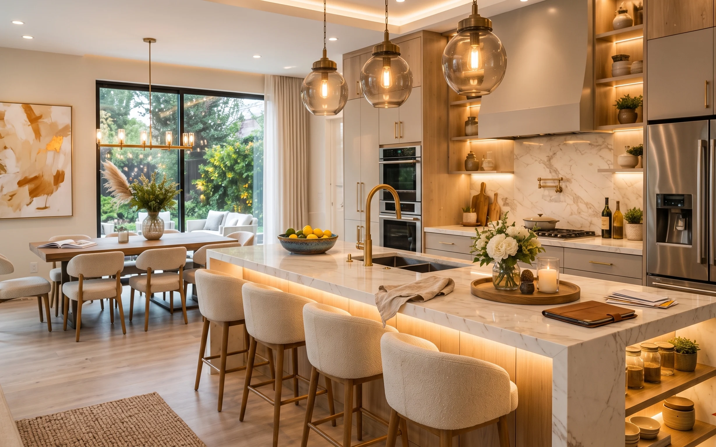
Why warm amber-and-cream styling is the island dining area of 2026
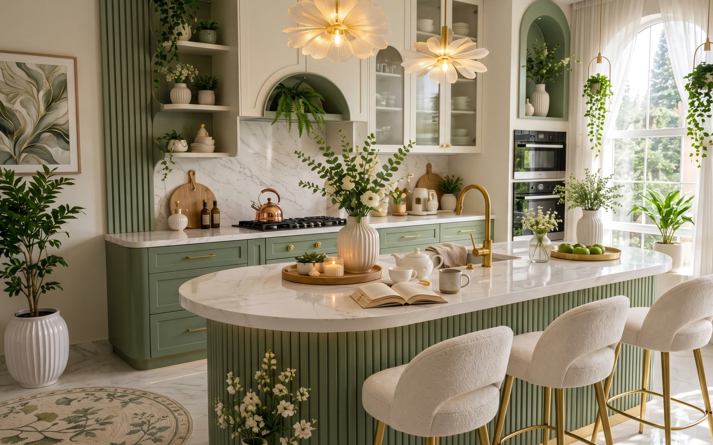
The easiest way to copy this kitchen vibe is to focus on texture: an area rug underfoot, sheer curtains by the window, and small objects that catch light—like the glass candle and the flower vase. The marble-look countertop and backsplash read “polished” already, so the decor shouldn’t be heavy or fussy. Think soft neutrals (cream, oat, warm white) plus one warm accent, and let the gold-toned reflections do their job. For shared-housing life, every swap here is move-ready: it dismantles into boxes without touching fixed installations.
I used to overdo it in rentals by chasing one big “statement” purchase—usually a pricier print or a too-dark rug—and then nothing felt cohesive. This time I leaned into layering like this: soft window fabric, then one warm-lit moment on the island, then a single framed abstract to anchor the left wall. The trick is restraint: choose fewer items, but make sure they repeat the same warm palette.
Layer 1 — Area rug ($80) Grounds the island dining zone

This area rug sits along the bottom edge of the photo, right where foot traffic crosses into the dining seats. A lighter, natural-toned weave helps keep the room bright against the marble-look countertop and backsplash, while the texture adds warmth that polished surfaces can’t. The trade-off versus a larger, higher-pile rug: you get less plush underfoot, but you keep a cleaner look and easier packing. For move-friendly living, choose a rug that rolls tight and fits in the same bin as curtains—no mattress-sized wrestling.
Choose a rug you can roll, not fold-crease into oblivion
Anything with a flat, low pile is easier to coil back into a compact move-box.
Layer 2 — Sheer curtains ($80) Filters daylight without blocking it
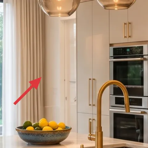
These sheer curtains hang beside the window, softening the hard edges of the glass and making the whole island area feel calmer. They’re working as lighting control: you still get daylight, but it lands more gently on the counter and chair backs. The obvious alternative—thicker blackout panels—can make the island feel heavy and darker at night. The trade-off with sheers is privacy: it’s light management, not total coverage. In a rental, that balance usually wins because you can wash or swap quickly when you change neighborhoods.
Layer sheers, then let objects glow
When the curtains diffuse light, candles and warm-toned decor look steadier without looking harsh.
Layer 3 — Vase with flowers on the table ($25) Adds movement in warm neutrals
The vase with flowers sits on the table line near the window, and it brings that slightly organic, botanical rhythm you can’t get from only stone and wood. The stems add vertical movement; the warm-toned container keeps the palette tied to the light wood. Buying vs. copying: a fresh bouquet is short-lived, but it photographs like “designer,” and replacing is part of the deal for shared housing. If you want to stretch it, pick one long-stem filler plus one textured element so it still reads styled even after a few days.
Pick one main stem, then one texture
Too many different flower shapes makes the arrangement look busy against the marble-look backdrop.
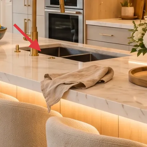
Layer 4 — Wooden serving tray with candle ($35) Creates a portable lighting moment
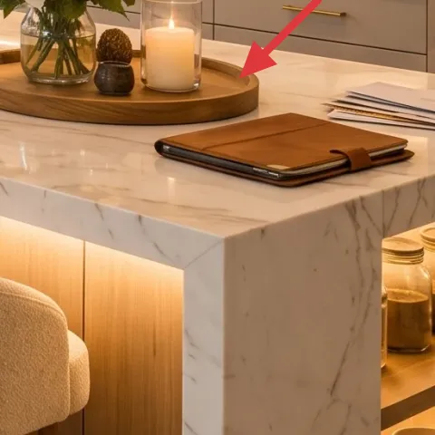
This wooden serving tray anchors the warmer corner of the island, and it’s doing double duty: it organizes small pieces and it elevates the candle glow at dinner time. A tray is also the move-friendly hero—lift, wrap, and pack without rearranging your whole kitchen setup. The alternative would be scattering items directly on the countertop, which looks charming for a day but turns messy fast. The trade-off is that the tray takes a small surface footprint, so it’s best to keep the candle and one small accessory inside one tidy zone.
Don’t use a tray that rings or slides
Pick one with a flat base so it doesn’t scoot when you carry groceries or open drawers.
Layer 5 — Glass candle ($35) Makes the island feel “evening-ready”
The glass candle on the tray is a small object, but it changes the whole room’s mood because it adds warm light near the center of the island. Even in daylight photos, you can see the glow-toned reflections it creates against the marble-look countertop. The obvious alternative—plug-in candles or a diffuser—can feel less intentional and less “special” when guests come over. The trade-off with real candles is planning: you need a few refills and safe placement, especially in shared houses. Still, it’s one of the easiest swaps to pack and reuse across moves.
Trim the burn look, not just the wick
Keeping the wax pool steady helps the flame sit centered and look like “styled” rather than accidental.
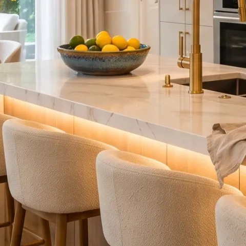
Layer 6 — Fruit bowl with oranges and lemons ($15) Adds bright color without wall changes
This fruit bowl—with oranges and lemons—reads like “lived-in styling” because it brings color to a palette that’s otherwise mostly warm white, wood, and marble-look. It’s also a seasonal trick: swap the contents when the fruit changes and the whole vignette looks refreshed without any new decor. Compared to buying decorative produce or extra plants, a real bowl of citrus is often cheaper and more flexible. The trade-off is rotation—you’ll replace the fruit. For shared housing, that’s actually a benefit: less stuff to store after move-out.
Pick a bowl shape that matches your counter lines
A slightly rounded bowl softens the island’s straight edges and reads more natural in photos.
Layer 7 — Framed abstract print ($80) Anchors the wall with the same warm palette
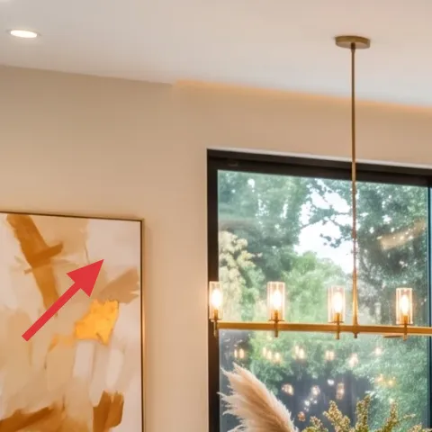
This framed abstract print sits on the left wall, and it works because the colors echo the room’s warm neutrals—cream, sand, and a hint of golden tone. In a rental, wall art like this is perfect because it’s removable and doesn’t require altering fixed elements. The obvious alternative is buying a set of matching prints, but a single piece usually looks more intentional when you’ve got a lot of countertop activity. The trade-off: you’re choosing one statement, so it has to match the room’s temperature and not clash with the marble-look brightness.
Make it instead of buying it
This hand-painted abstract on cardstock is a renter-friendly stand-in for the framed abstract print—same warm-cream direction, cheaper materials.
Materials
- Thick cardstock (A4 or letter-sized) — 1 sheet — craft store — $6
- Warm beige paint (or diluted acrylic) — small tube/bottle — craft store — $10
- Golden/tan acrylic accent — small tube — craft store — $6
- Black fine-tip marker — 1 — craft store — $9
- Mat or foam board backing (to match frame opening) — 1 piece — craft store — $4
Steps
- Lightly sketch 2–3 loose shapes with a pencil (or skip if you like imperfect edges).
- Paint the largest area in warm beige, leaving a few off-white gaps for breath.
- Add one golden/tan stroke cluster to mimic the warm accent tone.
- Use the black marker to draw a few “brushy” lines that break up the big fields.
- Let the ink and paint dry fully (no touching) before moving the cardstock.
- Trim and center the artwork to fit the frame opening, if needed.
- Mount the finished cardstock to the mat/foam backing with dry fit only (no adhesives needed if snug).
- Insert into the existing frame hardware and ensure it’s secure for transport.
Total DIY cost: $35 — saves about $45 over buying.
The cost, layer by layer
| Layer | Item | Cost |
|---|---|---|
| 1 | Area rug | $80 |
| 2 | Sheer curtains (panel pair) | $80 |
| 3 | Vase with flowers on the table | $25 |
| 4 | Wooden serving tray | $35 |
| 5 | Glass candle | $35 |
| 6 | Fruit bowl with oranges and lemons | $15 |
| 7 | Framed abstract print (DIY equivalent) | $80 |
| Total | $350 | |
If you need a cheaper version, swap the rug for a smaller flatweave and choose one fresh-stem bouquet instead of a multi-item flower look—keep the candle tray and the single framed print.
What worked, what didn't (across the whole room)
The room’s warmth comes from repetition: soft textiles at the window and underfoot, plus small glowing moments on the island. The styling objects feel purposeful because they’re grouped into one tray zone and one wall anchor. The only place it can fall apart in a shared kitchen is when too many small items compete on the island surface.
What worked
- The area rug creates a visual “floor boundary” for the dining seats without needing changes to the fixed layout.
- Sheer curtains soften daylight so the island doesn’t look too stark against the marble-look backsplash.
- The flower vase adds vertical rhythm and keeps the styling from feeling purely geometric.
- The wooden serving tray keeps small items contained, so the island looks organized even in daily use.
- The glass candle makes evenings feel intentional, not like an afterthought.
- The fruit bowl gives instant color that’s seasonal and easy to refresh between leases.
What didn't
- Too many separate countertop props would fight the marble-look surfaces and make the island feel cluttered.
- Skipping the window softness can make the whole area read brighter-but-colder, especially in morning light.
- If the framed print palette goes too cool or too dark, it won’t echo the warm amber reflections.
- Using a tray that’s too small forces extra pieces onto the countertop, which breaks the tidy zone.
- A tall, unstable candle setup can look off-center and feels annoying in shared-house logistics.
What we'd skip if we did it again
Skip swapping out fixed fixtures or cabinetry to chase this look. In most rentals, that’s either not allowed or it’s not move-friendly—so you’d be stuck with the “before” inventory in the next lease instead of bringing the updated vibe with you.
Skip a multi-piece matching wall set. One framed abstract print anchors the wall, and it’s easier to keep the palette consistent when the island countertop is already doing a lot of visual work.
Skip bulky, hard-to-pack decor on the island. A tray, candle, and one flower moment travel better and keep the surface functional, which matters more than stacking extra objects you can’t store.
Frequently asked
How long does this kitchen island refresh take?
Plan on 2–3 hours for the full look: rug placement, curtain hang (no drilling required if you’re using existing hardware), styling the tray and vase, and swapping in the framed print. The biggest time variable is waiting for curtains to fall into shape after unpacking and steaming wrinkles.
Is this actually renter-safe for shared housing?
Yes—nothing here requires painting, drilling, or replacing fixed fixtures. The move-friendly part is choosing decor that lifts off the counter and rolls up for transport: a rug you can coil, curtains you can wash, a framed print you can pack flat, and tabletop pieces that live in a small box.
What if my kitchen is smaller than this photo?
Go smaller, not busier. Use one rug (or even a runner), keep the tray area to two objects (candle + vase), and choose a single framed print rather than adding extra wall art. If your island is narrow, reduce the fruit bowl size so it doesn’t block everyday prep space.
What if I have more light or darker floors?
For brighter spaces, keep the sheers and candle, but choose a rug with slightly warmer undertones so it doesn’t feel washed out. For darker floors, lean into cream and warm beige in the rug and art, and keep the candle tray close to the center so the glow isn’t competing with shadows.
Where should I shop if I want this look on a budget?
Rugs and curtains are easiest to find at home goods chains and discount retailers, while candle cups, trays, and vases are often cheaper at thrift stores or home decor outlets. For the framed art direction, you can keep the frame and swap the insert (like the DIY approach here) if the frame opening matches.
What’s the most common mistake with kitchen island styling?
Over-decorating the island so every surface looks “finished” instead of functional. The photo works because there’s one organized zone (the tray) plus one wall anchor (the framed abstract), with everything else kept simpler. If the island feels busy, remove props first—then add one warm-lit detail.
More in Kitchen & Dining
7 move-ready swaps for a $400 kitchen refresh
A warm, marble-and-wood kitchen island style—made renter-safe. Here are 7 move-ready swaps to recreate the look for $400 total, using rug, …
Under $300: renter-friendly kitchen counter refresh with 7 no-drill swaps
A bright kitchen counter refresh for renters under $300—using no-drill swaps like a marble-look peel-and-stick backsplash, styled tray, and…
How to style a green kitchen dining nook for under $500
A bright, botanical kitchen dining nook refresh you can pack up later—using a textured rug, sheer white curtains, framed botanical art, and…