- Best for
- kitchen counters + no-drill styling
- Time
- about 2–4 hours total
- Difficulty
- easy (mostly peel-and-stick + labeling)
- Cost
- around $300
Why blush-and-brass styling is the kitchen counter of 2026
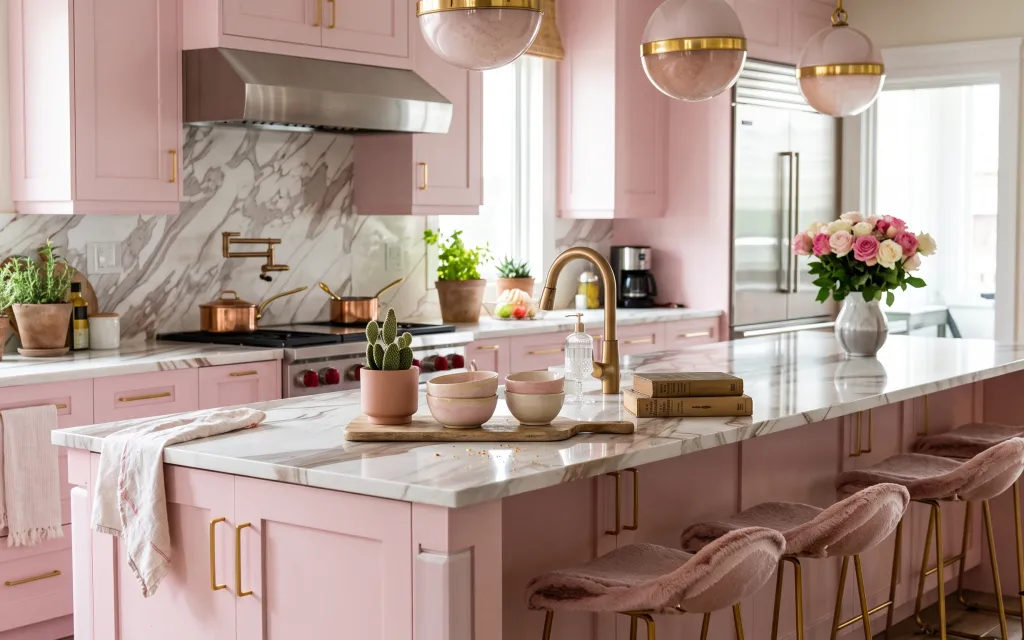
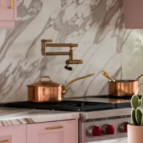
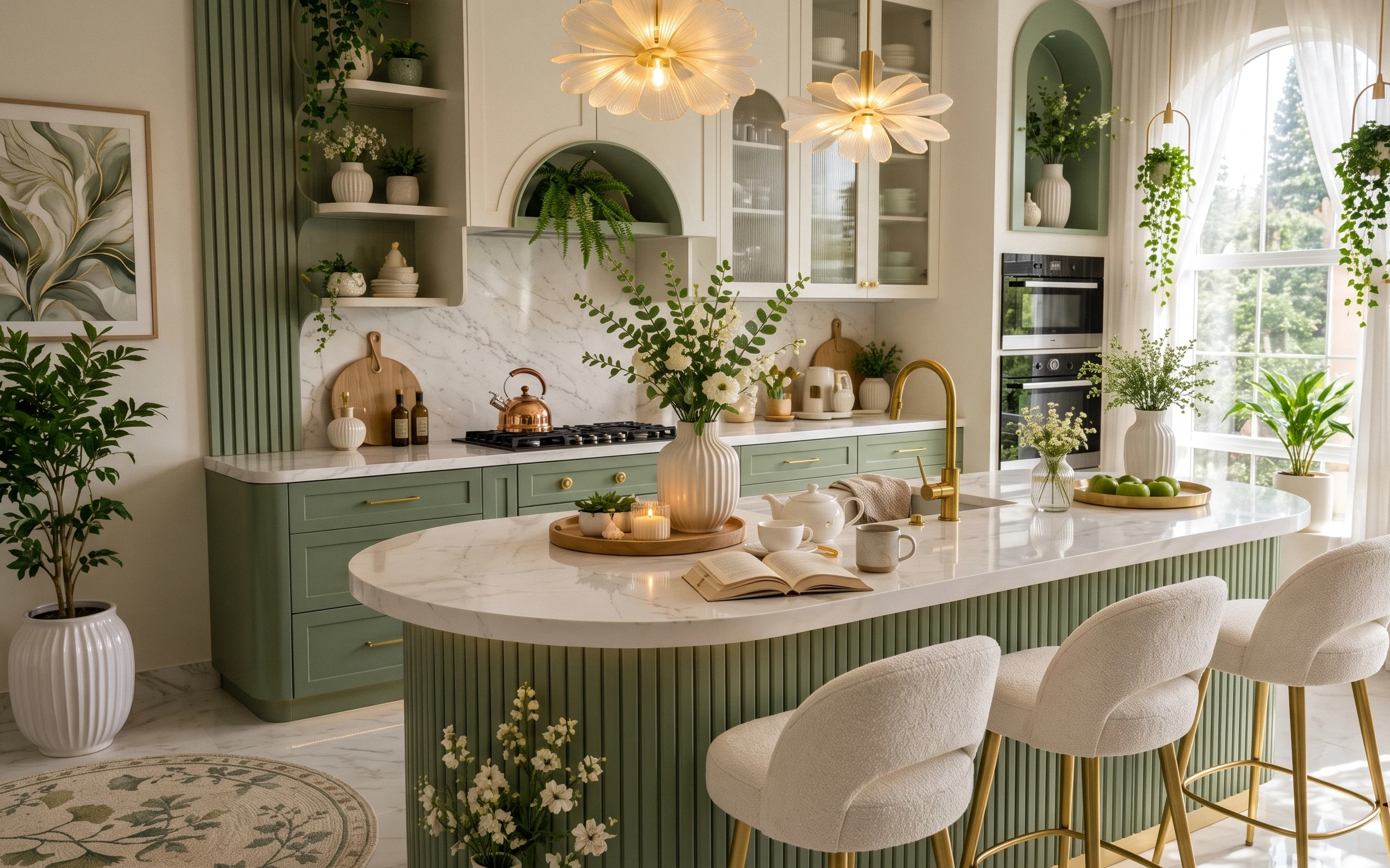
I’m always noticing how a kitchen can feel “finished” without any wall work—just by choosing a tight material palette and repeating it. In this photo, the marble-look countertop and backsplash sit next to blush cabinets, brass-toned details, and soft textiles. You also get three different greenery moments (the terracotta potted cactus, the smaller terracotta pots, and the roses in a vase), which keeps the counter from looking flat. For renters, that’s the key: keep everything on top of existing surfaces so it’s removable with your lease timeline.
The first time I tried to style counters, I rushed and grabbed matching containers that were too similar. It looked tidy for ten minutes, then it felt sterile. The change for me was switching to “one base, multiple textures”—a tray for structure, glass and ceramics for shine, and one soft throw to make it human. This is that same idea, just in a brighter, more blush-forward rhythm.
Layer 1 — throw blanket on bar stool ($35) softens the hard edges
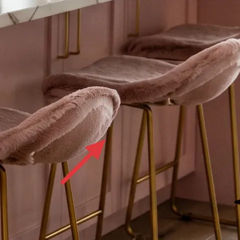
That throw blanket draped over the bar stool is a small, high-impact move because it adds pile texture where the room is otherwise glossy and straight-lined. Pick a warm neutral (like taupe or oatmeal) so it reads calm against the blush cabinets instead of competing with them. The trade-off is practical: a blanket can shift, so the best option is one with enough weight to stay where you place it. In a kitchen, that’s also why this beats adding another decorative object—textile movement makes the space feel lived-in without taking up counter real estate.
Lean into texture, not more color
If the cabinets are already blush, let the textile be a softer grounding layer—look for fuzzy or waffle weaves that photograph like “warm light.”
Layer 2 — peel-and-stick backsplash (marble-look sheet) ($100) brings the crisp pattern up close
The marble-look backsplash pattern is doing heavy visual work here, especially in the zone under the hood. A peel-and-stick backsplash gives that same “stone cameo” without committing to a renovation, and it’s removable when you move. The trade-off is seams: you’ll want a product that’s forgiving at corners and a layout that avoids tiny cuts in awkward spots. This matters because the photo’s beauty is how the pattern reads continuous behind the counter styling. If you’re tempted to skip this step, don’t—without the backdrop, the counter objects look like they’re floating.
Measure the backsplash area like you’re framing art
Even a 1-inch mismatch shows up with marble-look patterns, so plan your starting point before you peel.
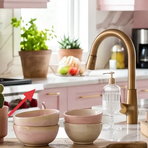
Layer 3 — wooden serving tray ($35) corrals the countertop styling
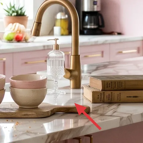
That wooden serving tray is the organizing tool that makes the counter feel intentional, not crowded. Use it as a “landing zone” for the candle, stacked bowls, and any everyday items you want to keep visible (like a book stack). Wood works beautifully here because it ties into the room’s warm tones while still letting the marble-look surface stay the star. The trade-off is deciding what goes in and what doesn’t—without a tray, every small object fights for attention. With one tray, you can group items by height, including the candle jar, and the whole counter reads as a single vignette.
Build height in three levels
Base (tray), mid (stacked bowls), and top (candle/plant) keeps the composition balanced in a long, bright line.
Layer 4 — decorative glass jar candle ($25) adds a warm focal point
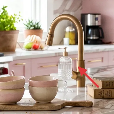
The decorative glass jar candle is small enough to be practical, but it creates a real focal point because glass catches light from the windows and pendant fixtures. Look for a clear or softly tinted jar so it echoes the room’s brass-and-white brightness instead of turning the counter cloudy. The trade-off is wick-and-scent maintenance if it’s an actual candle—so choose an unscented version if the kitchen gets busy with cooking smells. If you’re trying to get the same “styled” look without burning, a candle on a tray still works during the day because the jar shape is the decorative element.
Don’t place wax too close to plants
Keep the candle a few inches away from the cactus and any loose greenery so heat doesn’t dry out leaves.
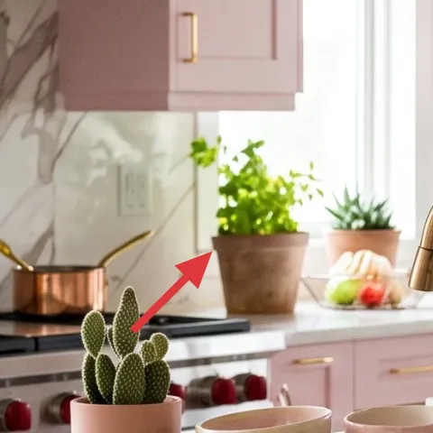
Layer 5 — terracotta potted cactus ($30) repeats the earthy note
The terracotta potted cactus adds a sculptural, modern touch that reads instantly in photos. Cactus textures—chunky, vertical, and rhythmic—also help the counter avoid feeling like it’s all circles from bowls and flowers. Choose a pot in a muted terracotta, not neon, so it stays in the blush-and-cream palette. The trade-off is lighting: succulents like bright spots, so keep it near the window where you already have natural light. If you swap it for a leafy plant, the silhouette changes and the whole counter loses that clean, graphic punctuation.
Use the pot color as your “thread”
Match terracotta across both the cactus and the smaller potted greenery for a cohesive countertop rhythm.
Layer 6 — vase with pink and white roses ($30) gives the counter a soft centerpiece
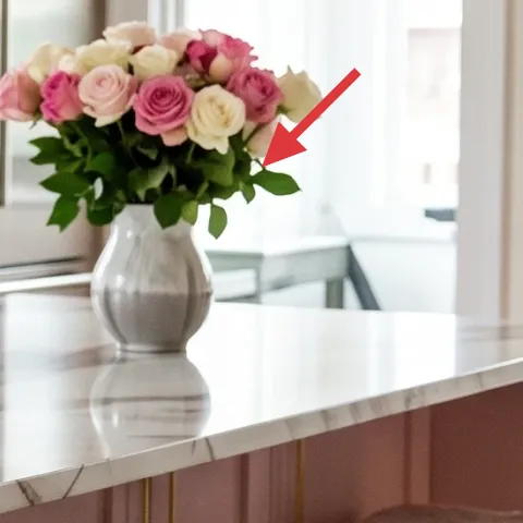
The vase of pink and white roses turns the counter into a centerpiece moment, not just a surface for appliances and storage. This works in renter kitchens because you can rotate the stems seasonally and remove the whole arrangement at move-out. The trade-off is longevity: fresh flowers are time-bound, so it helps to buy a couple of cheaper “filler” stems you can swap out without starting over. Visually, the vase balances the sharpness of the marble-look and keeps the room from feeling too clean. When in doubt, choose one statement arrangement instead of five small, competing ones.
Stick to one bouquet style
If the roses are soft and rounded, don’t mix in wildly spiky stems—your counter will look calmer with one botanical language.
Layer 7 — apothecary-style jar labels (DIY) ($35) makes pantry items look intentional
Make it instead of buying it
This DIY focuses on custom apothecary-style labels for the decorative jar containers so they look coordinated like the photo—no landlord hardware required.
Materials
- Printable label sheets — 1 pack — $10
- Inkjet/laser compatible clear label tape (or laminate sheets) — 1 roll/pack — $8
- Alcohol wipes — 1 pack — $7
Steps
- Print label designs with simple, apothecary-style fonts (keep text short so it fits the jar).
- Wipe the jar with an alcohol wipe so the surface is dust-free.
- Cut labels to size, leaving a neat border for a clean edge.
- Apply clear tape/lamination if you want a more “glass bottle” look and easier wipe-downs.
- Press the label onto the jar firmly from center outward to avoid bubbles.
- Let everything sit for a few minutes before restyling the counter.
Total DIY cost: $25 — saves about $10 over buying.
The cost, layer by layer
| Layer | Item | Cost |
|---|---|---|
| 1 | Throw blanket | $35 |
| 2 | Peel-and-stick backsplash (marble-look) | $100 |
| 3 | Wooden serving tray | $35 |
| 4 | Decorative glass jar candle | $25 |
| 5 | Indoor plant (terracotta potted cactus) | $30 |
| 6 | Vase with pink and white roses | $30 |
| 7 | Apothecary-style jar labels (DIY retail equivalent) | $35 |
| Total | $290 | |
A cheaper variant is to swap the peel-and-stick backsplash for a smaller peel-and-stick panel or skip the roses and use a lower-cost bouquet (even faux greenery) while keeping the tray + candle + plant grouping.
What worked, what didn't (across the whole room)
This counter styling works because it’s built on repeatable materials—wood, terracotta, glass, and brass-toned shine—rather than random décor. The backsplash pattern also matters more than people think: it gives the objects a stable visual backdrop.
What worked
- The marble-look peel-and-stick backdrop makes every counter item read “intentional,” not accidental.
- The wooden serving tray keeps small objects from scattering across the long countertop.
- Terracotta + glass + blush textiles repeat like a palette, so the scene stays cohesive.
- The terracotta potted cactus adds vertical structure next to round bowls and the vase.
- The candle jar creates a light-catching focal point during daylight and evening.
- The throw blanket on the bar stool makes the space feel softer without adding visual clutter.
What didn't
- If the tray is too small, bowls and the candle crowd and the arrangement stops reading as one vignette.
- A label style that’s too long can look cramped, especially on smaller decorative jar containers.
- Using a too-dark plant pot makes the terracotta note disappear against the blush cabinets.
- Mixing spiky stems with soft roses can make the centerpiece feel busy instead of balanced.
What we'd skip if we did it again
Skip adding a bunch of extra countertop décor. When the counter already has a long line and bright window light, fewer objects grouped on one tray will photograph better and feel calmer.
Skip rushing the backsplash layout. Measure twice, plan your seam locations, and line up the marble-look pattern before committing—crooked lines get obvious fast.
Skip “same-shape” styling. The counter needs variety in silhouette (cactus vertical, roses rounded, jar candle glassy) so the arrangement looks curated instead of repetitive.
Frequently asked
How long does this kitchen counter refresh take?
Plan for a half-day if you’re doing the peel-and-stick backsplash and labels on the same day. The backsplash is the only step with any “slow moments” (measuring, aligning, smoothing), while the jar labels are quick and clean. Styling the tray, plant, and centerpiece takes another hour or so once you’re happy with the heights.
Is peel-and-stick backsplash renter-safe?
Yes—choose a removable peel-and-stick backsplash designed for temporary installations. The big practice move is surface prep: clean the backsplash area so the film adheres evenly. When it’s time to move out, you can remove it without drilling into walls. Go gently around corners so you don’t stretch the sheet.
What if my kitchen counter is smaller than in the photo?
Scale down the footprint, not the idea. Use one tray that fits your available space and reduce the number of objects inside it (for example, candle + one bowl stack + plant). Keep one main centerpiece (the rose vase) rather than adding multiple arrangements. The goal is one strong grouping that reads from across the room.
Where should I shop for the jar labels and tray items?
Printable label sheets and simple template fonts make the jar-label look affordable—most craft supply or office supply stores carry the right materials. For the tray, look for wood serving trays in home goods stores, and for the candle jar, choose clear glass canisters in kitchen décor sections. Roses can come from a grocery flower counter or discount florist.
What’s the biggest mistake people make with counter styling?
Over-decorating. When everything is on the counter, nothing becomes a focal point. The fix is to create one “hero area” with a tray and stack items by height, then leave breathing room around it. This keeps the kitchen bright and makes the arrangement look intentional instead of crowded.
More in Kitchen & Dining

Under $300: renter-friendly kitchen counter refresh with 7 no-drill swaps
A bright kitchen counter refresh for renters under $300—using no-drill swaps like a marble-look peel-and-stick backsplash, styled tray, and…
How to style a green kitchen dining nook for under $500
A bright, botanical kitchen dining nook refresh you can pack up later—using a textured rug, sheer white curtains, framed botanical art, and…
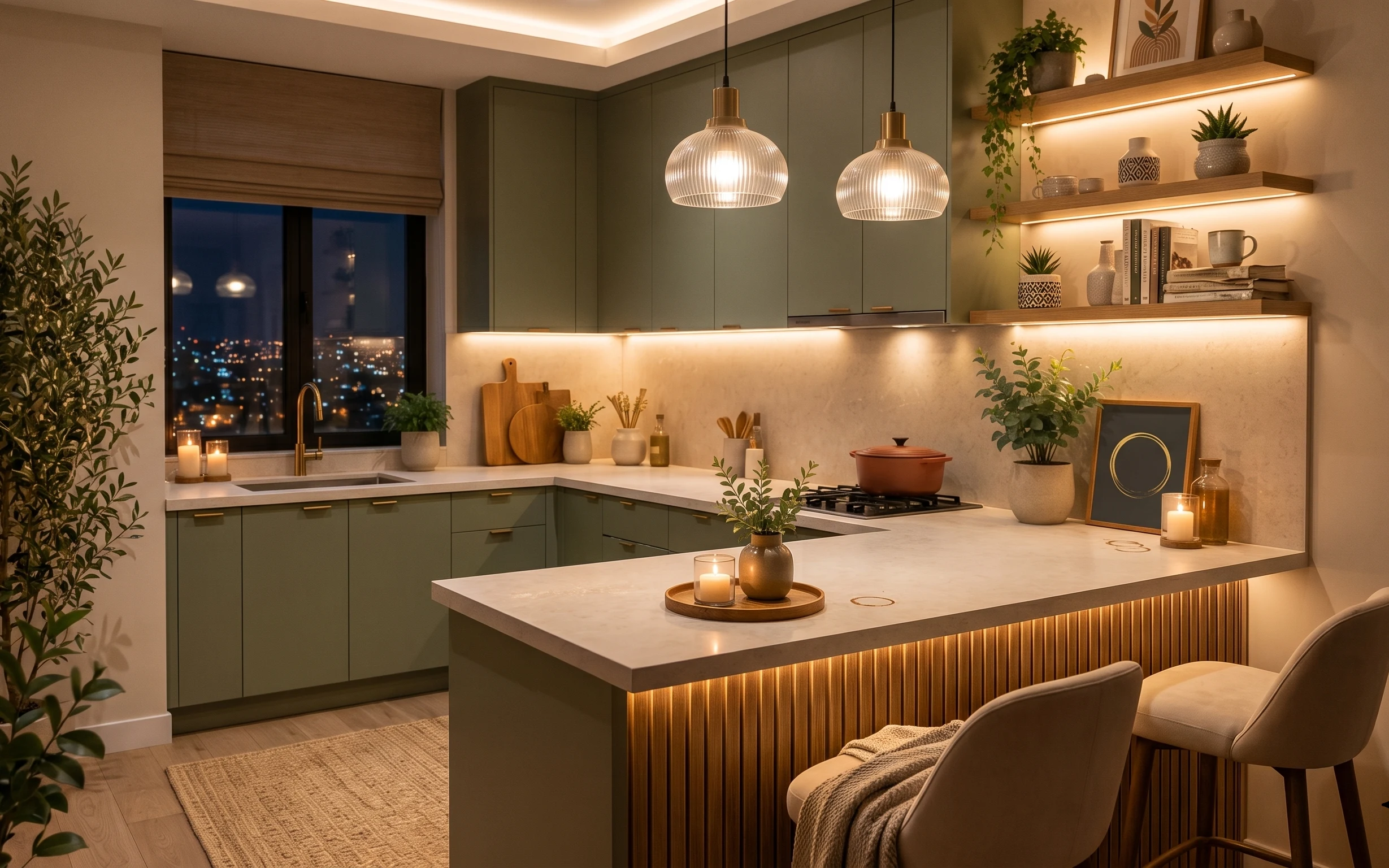
7 renter-friendly swaps for a $400 kitchen island
A renter-friendly kitchen island refresh you can pack up when the lease ends—built around warm lighting moments, a soft rug, and styled cou…