- Best for
- Cost-effective spa styling
- Cost
- About $215 total
- Difficulty
- Easy (no-drill)
- Renter-safe
- Yes
Why warm beige-and-walnut details are the bathroom spa corner of 2026
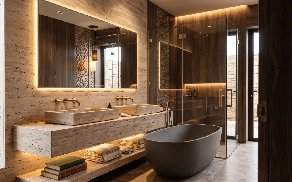
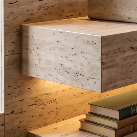
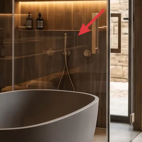
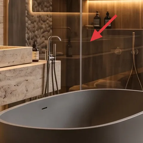
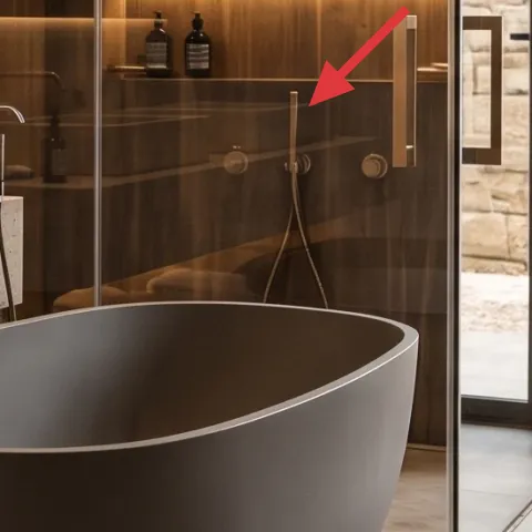
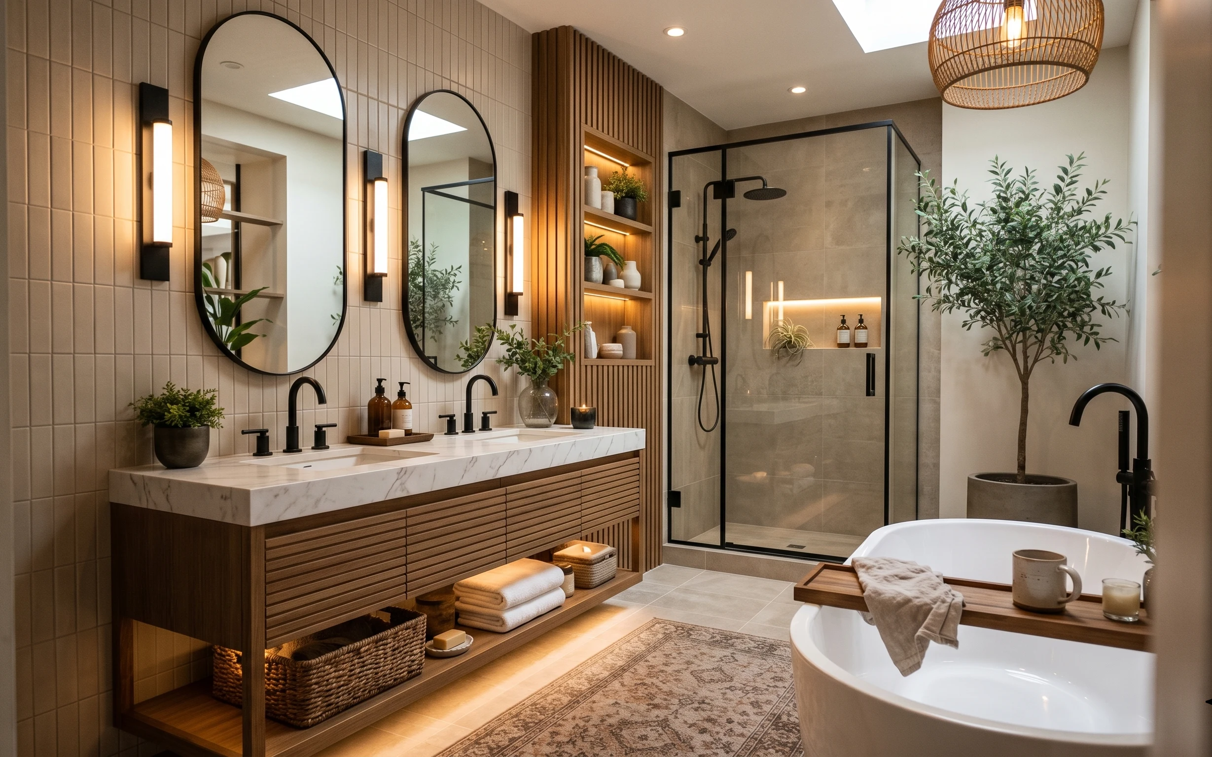
Start with what you already have: the gold-framed mirror glow and the stone vanity make the room feel like a hotel spa, even before styling. What’s missing in a lot of rentals is the softer landing—textiles and small objects with similar undertones. Here you can see the cream/linen towels in two folded textures, a green bath mat grounding the floor, and a neatly stacked book moment that makes the counter feel intentional. That mix of warm lighting, stone, and layered fabrics is why this look reads “designed,” not “bare.”
I used to overthink bathrooms and reach for permanent upgrades. Then I noticed how my own place changed the minute I stopped chasing “matchy” and started repeating undertones: the same creamy towel color, one grounded mat, and a few small things placed at eye level. The point wasn’t decoration—it was creating a consistent rhythm against the stone and warm wood. Once you do that, the room’s built-in features carry the mood.
Layer 1 — green bath mat ($25) Grounds the stone floor without matching the walls
This green bath mat is the smallest “color anchor” in the photo, sitting right on the tile near the tub. In a rental, that’s a win because you can swap it out without touching grout, installing hardware, or replacing anything landlord-installed. Choose a mat in a deep sage/olive tone so it doesn’t compete with the mirror’s warm glow or the walnut wood paneling. The trade-off is that green can look cold if it’s too bright—go for muted, slightly earthy dye so it harmonizes with beige towels and stone.
Keep the mat undertone earthy
Olive or sage reads warmer next to gold lighting than emerald green does.
Layer 2 — rolled beige towels ($30) Adds “hotel folding” texture at floor level
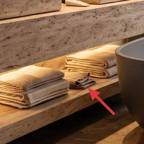
Rolled beige towels bring the spa look in a way that’s easy to maintain. They’re placed where your eyes drop when you walk in, so they soften the hard lines of tile and stone without needing any wall changes. Rolling (instead of stacking flat) adds height and a subtle fabric texture that feels more curated. The trade-off is roll size: too tight makes them look cramped, too loose looks messy—aim for a neat cylinder that matches the width of the spot you’re styling. Swap them seasonally if you want variety, since towels are totally move-friendly.
Use two fabric feels, not two colors
Same beige family, different folding/texture, reads intentional under warm lighting.
Layer 3 — folded beige hand towels ($35) Makes the counter feel styled, not uncovered
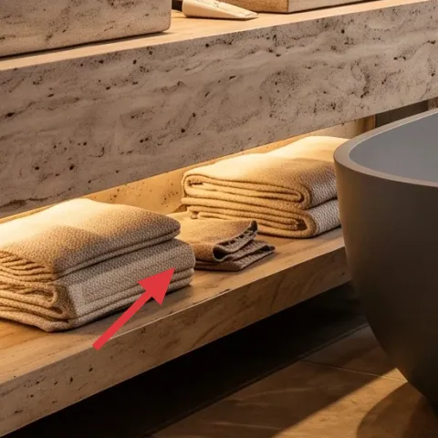
These folded hand towels add a crisp, flat plane that balances the rolls nearby. On a stone ledge, the look matters: smooth folds make the counter feel tidy, while the beige tone keeps the room calm against warm wood. If you’re worried about “too much beige,” you don’t have to add a third color—just keep beige but vary the fold shape. The trade-off is that folds can slip if towels are too slippery or too thin, so pick cotton with enough structure to hold creases. This is the easiest way to make the bathroom look lived-in and polished.
Match the warmth, not the exact shade
A slightly different beige is fine if both read creamy under gold lighting.
Layer 4 — decorative book stack ($20) Adds a countertop moment you can move room-to-room
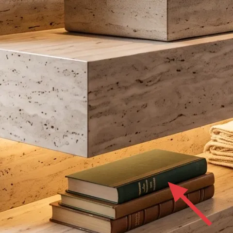
The book stack is small but powerful: it turns a blank stone surface into a styled vignette. In bathrooms, books work best when they’re placed on top of a tray or near a contained zone so they don’t feel random. Pick neutral covers or muted earth tones so the stack doesn’t fight the mirror’s warm glow. The trade-off is practicality—paper in a humid bathroom is never the long-term plan, so treat the books as “rotation decor” and swap them out every so often. In rentals, this is a low-commitment way to add personality without changing fixtures.
Don’t put paper right next to splash zones
Keep books and covers away from where water would hit during everyday use.
Layer 5 — clear pump soap bottles ($35) Makes everyday essentials look cohesive
These clear pump soap bottles are doing design work for you—they create repeat shapes on the vanity counter and keep the styling clean. Instead of hiding products in cabinets (or leaving labels bare), you can swap in nicer bottles with similar silhouette and finish. The trade-off is refills: you’ll need to refill on a schedule, and some bottles need a specific pump head brand. If your landlord requires safety rules for chemicals, stick to store refills labeled for bathroom use. Styled soap dispensers are a renter-safe way to make the “functional” side of the room look intentional.
Repeat the pump shape
Two similar bottles look designed; two random ones look accidental.
Layer 6 — stone countertop soap tray (styling piece) ($25) Keeps bottles aligned with one visual boundary
A shallow tray gives the countertop a defined “zone,” which matters in bathrooms because everything tends to collect. When bottles sit on the same tray footprint, your counter stops looking like a landing pad and starts reading as a composed vignette. Keep it simple—natural stone, matte ceramic, or a warm wood tray that echoes the room’s walnut tones. The trade-off is cleaning: trays collect drips and soap residue, so choose a surface you can wipe quickly. This one small object helps all the other layers look more intentional.
Choose a wipeable tray finish
Matte ceramics and sealed woods handle bathroom splashes better than porous finishes.
Layer 7 — matte ceramic hand-soap pump replacement ($45) Gives the counter a calmer finish than clear plastic
If you want the most “spa” upgrade from this palette, swap one pump bottle to matte ceramic in a warm neutral. Matte finishes play nicely with gold lighting because they don’t glare as much as glossy plastic can. The room already has warm stone and wood textures—ceramic adds another believable surface so the counter feels finished, not temporary. The trade-off is that matte ceramic can show water spots more than you’d expect, so wipe it down when you do your weekly bathroom reset. For renters, this is a quick swap that packs away with your essentials.
Pick warm neutrals that read creamy
Look for “ivory,” “sand,” or “oat” undertones rather than cool white.
The cost, layer by layer
| Layer | Item | Cost |
|---|---|---|
| 1 | Green bath mat | $25 |
| 2 | Rolled beige towels | $30 |
| 3 | Folded beige hand towels | $35 |
| 4 | Decorative book stack | $20 |
| 5 | Clear pump soap bottles | $35 |
| 6 | Countertop soap tray (styling piece) | $25 |
| 7 | Matte ceramic hand-soap pump replacement | $45 |
| Total | $215 | |
If you need a cheaper version, start with towels and a bath mat (they’re the most visible). Skip the extra pump replacement and use only one nicer bottle with a simple tray—then rotate the book stack seasonally.
What worked, what didn't (across the whole room)
The biggest wins came from texture and repeat shapes: towels with two folding methods plus a matched pump silhouette. The other strong move was grounding the floor with an earthy green so the stone doesn’t feel cold. The only weak point is that countertop styling needs upkeep—soap residue and water spots can make “designed” slip back to “messy” fast.
What worked
- Green bath mat adds earthy contrast against warm wood and cream stone surfaces.
- Rolled towels bring height and fabric texture without any permanent changes.
- Folded hand towels create a neat counter plane that reads intentional under gold mirror light.
- Soap pumps with consistent shape make essentials look like a curated set.
- A tray creates one clean “zone,” so bottles don’t spread across the countertop.
- Matte ceramic reduces glare compared to shinier finishes in warm lighting.
What didn't
- Countertop paper decor is easy to ruin if it sits near splash during daily routines.
- Matte finishes can show water spots sooner than glossy plastic.
- Towels that are too thin won’t hold folds and start to look rumpled quickly.
- If soap labels don’t match the bottle finish, the styling looks mismatched.
What we'd skip if we did it again
Skip swapping anything you can’t pack away at the end of your lease. With this bathroom already featuring strong stone, wood, and mirror glow, you’ll get more visual payoff from renter-safe accessories: towels, mat, and countertop styling.
Skip adding too many “separate” colors at once. When everything is warm and creamy, it’s better to repeat beige undertones and add only one grounding hue (that earthy green) rather than chasing multiple accents.
Skip leaving countertop items uncategorized. If books, bottles, and small objects don’t share one tray boundary, the surface reads cluttered—even when there are only a few things.
Frequently asked
How long does this renter-friendly bathroom refresh take?
Plan on 45–90 minutes total. The “work” is mainly sorting textiles (fold/roll), setting the bath mat, and arranging countertop items so they sit inside one visual zone (like a tray). If you’re swapping soap bottles, budget an extra 10–15 minutes for refills and cleanup. After that, it’s mostly weekly upkeep: quick wipe-downs and towel resets.
Is this truly lease-safe?
Yes—nothing here requires painting, drilling, anchors, or replacing landlord-installed fixtures. The layers are renters’ swaps: towels, a bath mat, soap bottles, and small countertop styling. Even the book decor is optional and can be removed before move-out. Keep everything away from splash zones and you’re good to go.
What if my bathroom is smaller?
Scale down the number of textiles, not the style. Use one rolled towel spot and one folded towel spot instead of stacking multiple items, and keep the tray and soap bottles tighter together. Choose a smaller mat size so it doesn’t creep across too much tile. The goal is still “one zone” of calm, not a full countertop collection.
What if my bathroom has cooler lighting instead of warm?
Lean even harder into warm undertones. Choose beige towels that read creamy (not grayish) and pick an earthy green mat instead of bright cool green. For soap bottles, warm neutrals and matte finishes usually look better than glossy clear plastic under cooler bulbs.
Where should I shop for these kinds of swaps?
Start with big-box basics for towels and mats, then focus on detail pieces at home stores or kitchen/athleisure shops for soap bottles and trays. Thrift and discount retailers are great for book stacks and neutral-toned towel options. The key is matching undertones, not chasing brand names.
What’s the biggest mistake people make with spa-style bathroom styling?
They try to copy the look by adding lots of different colors and textures at once. In warm stone and wood bathrooms, the fastest path is repetition: one beige family across towels, one grounded accent (like earthy green), and consistent bottle silhouettes. Add fewer things—but place them with clearer boundaries.
More in Bathroom

7 renter-friendly bathroom swaps for a spa corner, $250
A warm, spa-like bathroom look is achievable in a rental by swapping towels, mats, and small-counter accessories—no drilling or fixture cha…
Under $500: renter-friendly bathroom vanity and shower corner refresh
A move-friendly bathroom vanity and shower corner refresh that leans on warm, no-drill details—starting with an area rug, folded towels, an…
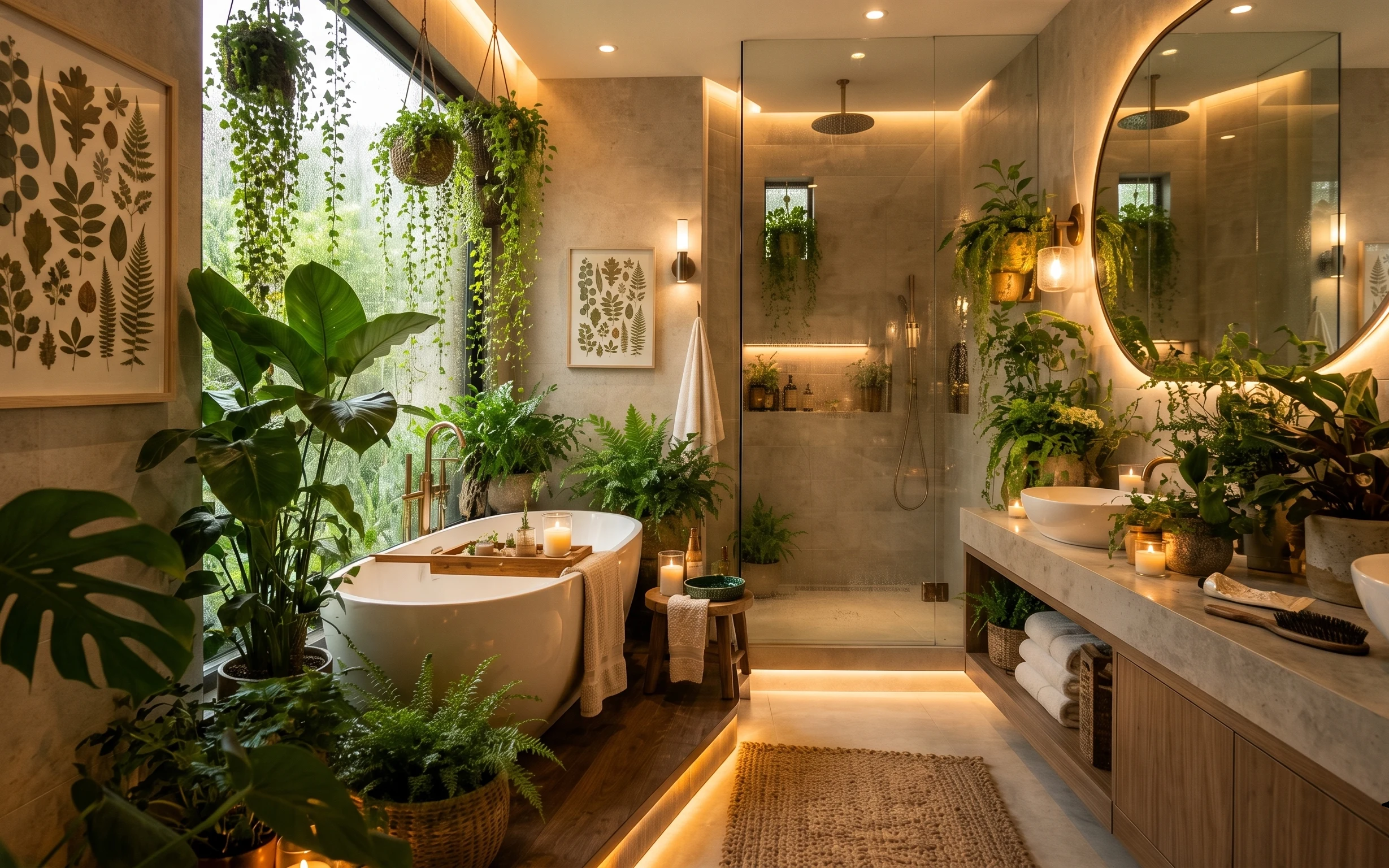
7 renter-friendly botanical bathroom swaps for a $500 refresh
A botanical bathroom refresh for renters with no drilling—plus move-out-friendly styling. For about $500, this look adds a warm rug, a roun…