
- Best for
- quick kitchen island polish
- Cost
- $700 weekend budget
- Difficulty
- Confident DIY
- Time
- 1–2 weekends
Why sage-green, brass-and-plant details are the kitchen island corner of 2026
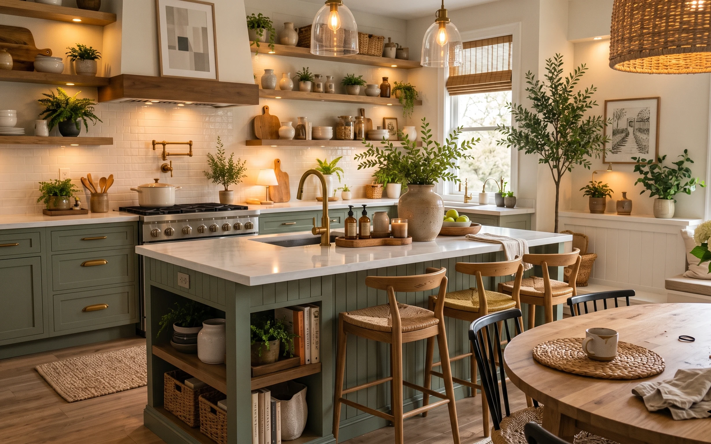
Start with the anchor pieces you can see immediately: the big ceramic vase on the island, the jute-style rug underfoot, and that framed landscape print on the right wall. Then repeat the same materials around the room—warm brass in the sink area, light wood tones in the shelves and stools, and the creamy subway-tile backdrop that makes everything feel clean. For homeowners on a time-and-budget refresh, this approach beats “wait for the perfect renovation,” because paint and swap-level lighting choices can still read expensive.
I used to over-plan kitchens by copying “showroom” photos with matchy hardware and matching décor, and it always looked a little too neat—like a staged set. What changed my mind was realizing the best kitchens have one clear focal object (that island vase) plus a few living elements (green plants) that keep the surface from feeling flat. When those details share the same warm palette, the room feels pulled together without demanding perfect symmetry.
Layer 1 — large ceramic vase on the island ($35) Weight + movement for the island
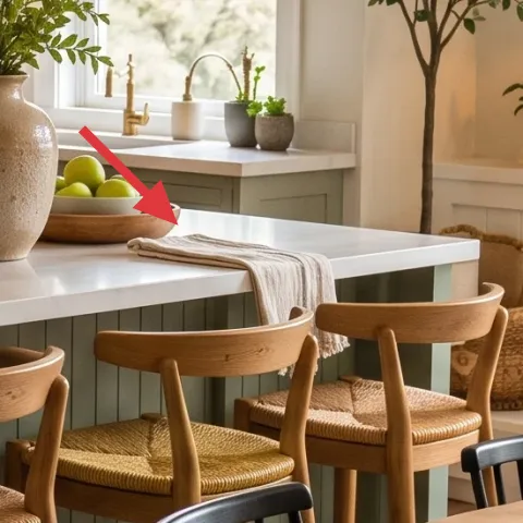
A large ceramic vase sitting centered on the island countertop gives the whole corner a visual “pause,” and it’s doing double duty: it’s décor when it’s empty and style when it holds greenery. This one reads as earthy with a slightly textured, matte look, which keeps it from fighting the shiny brass faucet and the glossy countertop. The alternative is buying a bunch of smaller décor items, but that often turns into clutter fast—especially in kitchens where you’re constantly wiping surfaces. Accept the trade-off: one bigger piece is easier to maintain than five tiny ones.
Go one size up for the island
On a countertop that wide, a medium vase can look like it’s “hiding.” Choose a piece that visually spans the center zone so it can hold the light and your plants.
Layer 2 — jute-style area rug ($80) Softens the hard kitchen floor
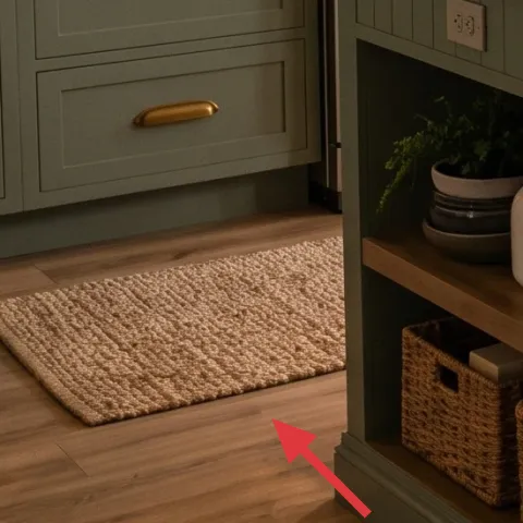
The jute-style rug anchors the cooking zone and adds texture right where kitchens usually feel too echo-y: on light floors with white tile. It’s also a practical choice—the woven fibers help hide everyday scuffs and crumbs better than smooth, high-pile rugs. You could skip the rug and rely on wall color, but then your feet never get that warmth cue, and the space feels flatter. Keep the trade-off in mind: jute can be a little less forgiving with spills than a synthetic rug, so regular shaking and quick blotting matter.
Use it as a zone marker
Place the rug so it sits under the front legs of the seating nearby, not just a corner of the island. That’s what makes it read intentional instead of accidental.
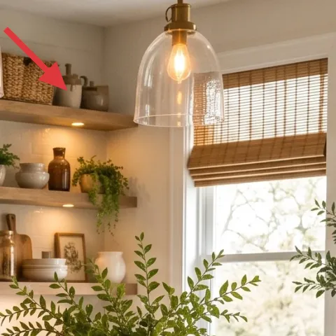
Layer 3 — framed landscape print (right wall) ($55) Brings outdoors-in without clutter
The framed landscape print on the right wall keeps the kitchen from feeling like only “utility surfaces.” Because the print has both sky-light tones and darker tree lines, it harmonizes with the green plants and the warm white tile. If you choose a print with only one color family, the wall can look flat against all the cabinetry tones. This one works because it adds a second layer of depth while staying calm. The trade-off: artwork requires a little spacing discipline—measure the wall and hang it so it’s centered where your eye naturally lands near the window.
Pick one print that matches your plant palette
Bring home the print and compare it to the greens you already have. If it echoes the plant undertones, it will “stick” even as seasons change.
Layer 4 — wood bar stool ($100) Makes the island feel lived-in
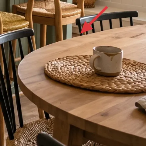
Wood bar stools add warmth and a human scale to an island that’s otherwise all countertops and cabinetry. The light wood tone connects directly to the open shelves and cutting-board warmth, so the corner feels cohesive instead of “bought from different places.” You could swap in metal stools for a cleaner look, but then you’d lose that soft, tactile feeling that makes farmhouse-leaning kitchens work. Accept the trade-off: wood needs a bit more care with moisture and fast-cleaning spills, especially near the sink zone.
Match wood tone, not necessarily the exact wood
If the stools aren’t the same species as the shelves, try to match the warmth level (light honey vs. cool birch) so everything reads from the same family.
Layer 5 — glass dome ceiling light ($120) Warm glow + kitchen clarity
That glass dome ceiling light adds a soft, warm glow above the center of the room, which makes the island surface look inviting even after the sun drops. Because the glass diffuses the bulb light, it avoids harsh glare on the countertop and backsplash. The alternative is a flat shade or opaque fixture, which can make the kitchen feel dimmer and more “boxed in.” This choice is worth it because it visually elevates the ceiling line without asking for major work. Trade-off: glass shows fingerprints—quick wipe-downs become part of the routine.
Use warm bulbs for the right color temperature
If the bulb reads too cool, brass can look dull and the cabinets can start to feel gray instead of warm. Choose a warm temperature and keep it consistent across fixtures.
Layer 6 — brass kitchen sink faucet ($140) The small hardware moment that wins
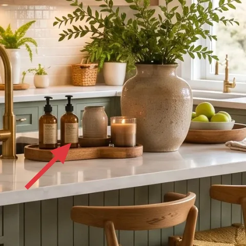
Brass in the sink area is the detail that pulls the whole palette together. It shows up near the white tile and the greenery, so it feels intentional rather than random—like a piece of jewelry for the kitchen. When the faucet is a warm metal finish, the countertop highlights look richer and the brass doesn’t fight the sage-green cabinetry. You could go for a plain chrome fixture, but it tends to shift the room toward cooler tones and makes the whole corner feel less cohesive. Trade-off: brass finishes look best when they’re maintained, so plan on occasional gentle cleaning.
Let hardware repeat once
Repeat brass in one other place nearby (like a small tray or accessory) so it reads like a theme, not a one-off purchase.
Layer 7 — sage-green cabinet paint refresh ($155) DIY cabinet color that reads built-in
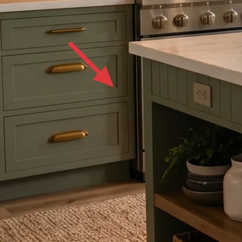
Sage-green painted cabinet fronts give the kitchen its “designed” backbone because they control the largest visual surface in the room. Painting is also one of the few upgrades that can change the whole tone of a kitchen without permits or structural work, and it’s achievable in a weekend if the prep is organized. Going from drab to a warm muted green instantly changes how the white tile and countertop look beside it. The trade-off is prep time: cabinet paint looks good only when the surfaces are properly cleaned and lightly sanded for adhesion.
Make it instead of buying it
Paint the sage-green cabinet fronts with a durable interior cabinet finish so the kitchen reads cohesive without swapping hardware or replacing doors.
Materials
- Cabinet/interior paint (1 quart to start) — ~1–2 coats — home improvement store — $60
- Bonding primer — enough for one full cabinet run — home improvement store — $25
- Roller + angled brush set — 2–3 inch brush or foam roller — hardware store — $25
- Sandpaper (120–220 grit) + sanding block — pack — hardware store — $15
- Drop cloths/tack cloth — roll + cloth — hardware store — $10
Steps
- Degrease cabinet faces and wipe dry so paint grips kitchen oils.
- Lightly sand for adhesion, then remove dust with a tack cloth.
- Prime all cabinet surfaces in thin, even coats.
- Let primer cure fully, then scuff-sand lightly for smooth topcoat grip.
- Roll and brush the first paint coat with the grain/door panel direction.
- Let the topcoat cure fully before you stack doors back in place and style the counters.
Total DIY cost: $135 — saves about $20 over buying.
The cost, layer by layer
| Layer | Item | Cost |
|---|---|---|
| 1 | Large ceramic vase for island styling | $35 |
| 2 | Jute-style area rug (approx. 5×7) | $80 |
| 3 | Framed landscape print (16×20) | $55 |
| 4 | Wood bar stool | $100 |
| 5 | Glass dome ceiling light | $120 |
| 6 | Brass kitchen sink faucet | $140 |
| 7 | Sage-green cabinet paint refresh (retail-equivalent) | $155 |
| Total | $685 | |
If you want a cheaper variant, keep the same palette but go smaller on the statement piece: choose a smaller framed print, use one ceiling light instead of updating both, and buy the vase plus a couple of small pots for less than $100. The look still holds because the sage cabinets and warm brass remain the backbone.
What worked, what didn't (across the whole room)
The strongest wins were the palette repeats: sage-green cabinetry, brass metal, and warm white tile made every other object look purposeful. A single large vase plus plants kept the island from feeling like “just counters,” while the jute rug softened the hard flooring. The only parts that needed careful adjustment were placement and finish choice—small errors show up fast in kitchens.
What worked
- The large ceramic vase creates a central focal point that keeps the island from looking busy.
- The jute-style rug adds texture and makes the kitchen feel warmer without changing any layout.
- Brass in the sink area ties together the shelves, countertop highlights, and plant greens.
- The framed landscape print adds depth on the right wall where windows can otherwise dominate.
- Glass dome ceiling light diffuses brightness so the backsplash doesn’t glare in the evening.
- Wood bar stools connect to the shelf and board tones, keeping the corner cohesive.
What didn't
- Too many small décor pieces on the island can visually crowd the sink and faucet area.
- Cool bulbs make brass look gray and shrink the warmth coming from the cabinets.
- A framed print hung too high makes it feel like “window décor” instead of wall art.
- If the rug shifts even slightly, the seating area stops reading as a defined zone.
- Cabinet paint looks uneven if sanding and priming aren’t thorough, especially on edges.
What we'd skip if we did it again
Skip buying multiple mid-size décor items for the island and instead pick one large ceramic vase. In kitchens, surfaces get wiped constantly, and too many objects makes it harder to keep the look intentional.
Skip a glass dome light with a cool-temperature bulb. Warm bulbs keep the white tile and brass reading rich, while cooler light can turn the cabinet tone from sage to slightly gray.
Skip cabinet color changes without a real sanding + priming routine. Paint is unforgiving on kitchen fronts, and the “extra hour” in prep is what prevents sticky spots, chips, and visible brush marks.
Frequently asked
How long does this kind of kitchen island refresh take?
Swapping décor (vase, rug, bar stools, framed art) can be done in a single afternoon once you’ve picked items. If you’re painting cabinet fronts, plan for prep and cure time: sanding, priming, then letting coats cure before reinstalling doors. Overall, most homeowners can finish the full look in 1–2 weekends, with the paint being the pacing item.
Is this renter-friendly?
Most of the plan is renter-friendly: a rug, framed print, and tabletop styling are removable. The lighting and faucet are not renter projects by default because they involve electrical/plumbing. If renting, keep the lighting as-is and focus on the rug, framed art, and plant styling, then swap to removable shelf décor only.
What if my kitchen is smaller than this one?
Use the same “palette repeat” idea, but scale the pieces down. Choose a narrower rug so it still reaches under the seating area, and keep the vase tall enough to be a focal point without overwhelming the island. For wall art, pick one framed print and center it over the area your eye lands on most.
What if my kitchen has more overhead lighting or a different backsplash?
If your lighting is harsher, the glass dome light choice becomes even more important—diffused warmth helps. If your backsplash is a darker tile, you may want the framed print to pull more light tones, and the rug to be slightly more neutral to prevent everything from reading heavy. The core strategy is repeating the same two metals and one green undertone.
Where should I shop to keep costs down?
For the vase, rug, and framed print, look for store brands and standard sizes at big-box home stores, then check resale for the same materials. For the faucet and lighting, use mid-range retailers and compare models by finish (warm brass tone) and bulb compatibility. Buying a single “anchor” piece (vase or light) tends to look better than splitting the budget across five tiny items.
What’s the biggest mistake homeowners make in a kitchen refresh like this?
Trying to fix the whole room at once with too many unconnected purchases is the most common miss. Kitchens read instantly when surfaces, metals, and colors don’t repeat. Pick one main color direction (sage here), repeat brass once, and keep the island styling to a focal object plus plants.
More in Kitchen & Dining
A calmer kitchen island corner for $700
Refresh a kitchen island corner with 7 budget-friendly upgrades, including a statement ceramic vase, a jute-style rug, and warm glass dome …
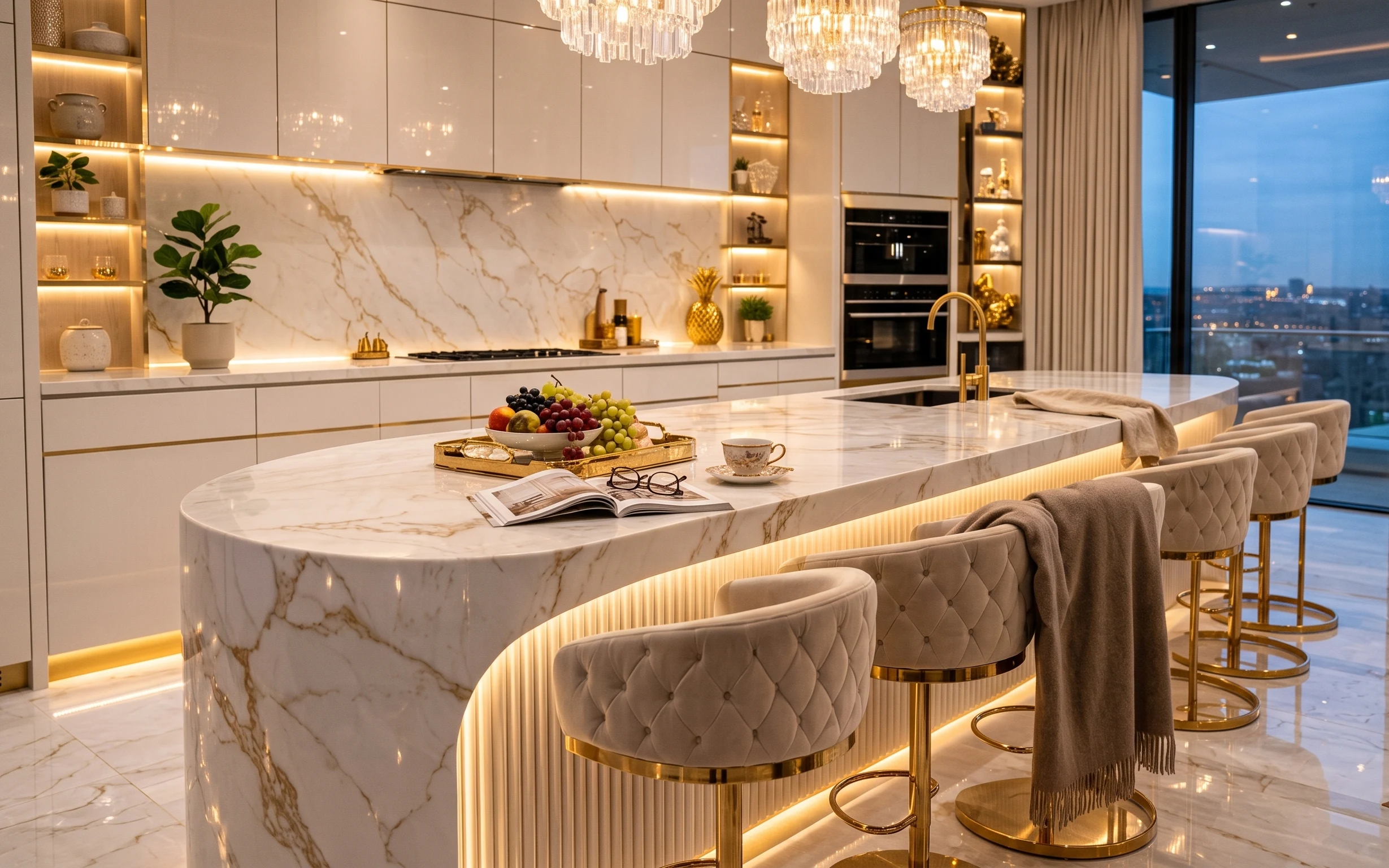
Glam kitchen island styling that feels designer for $600
A renter-friendly glam refresh for a kitchen island with $600 worth of swaps: a tufted bar-stool pair, styling pieces, and move-ready shelf…
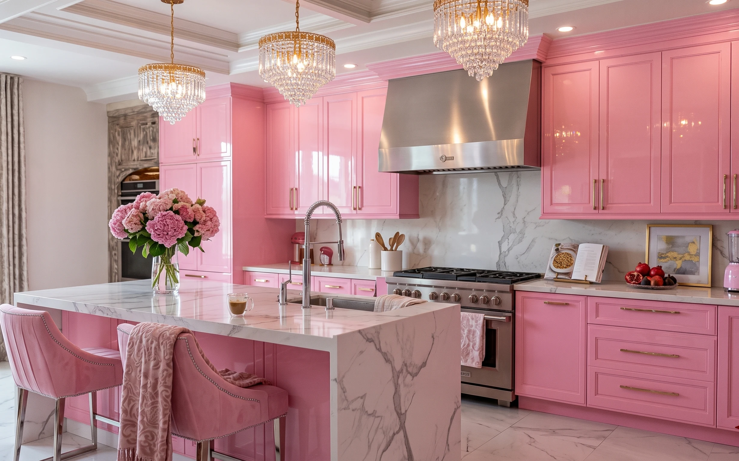
A golden-light kitchen island corner for $700
A golden-light update for a pink kitchen island corner with 7 budget-friendly upgrades. Swap curtains and styling details, refresh the hydr…