- Best for
- Shared housing kitchen corners
- Time
- 2–4 hours total
- Total cost
- $390–$400 range
- Renter-safe
- Yes (swap-only refresh)
Why warm botanical details are the kitchen breakfast nook of 2026
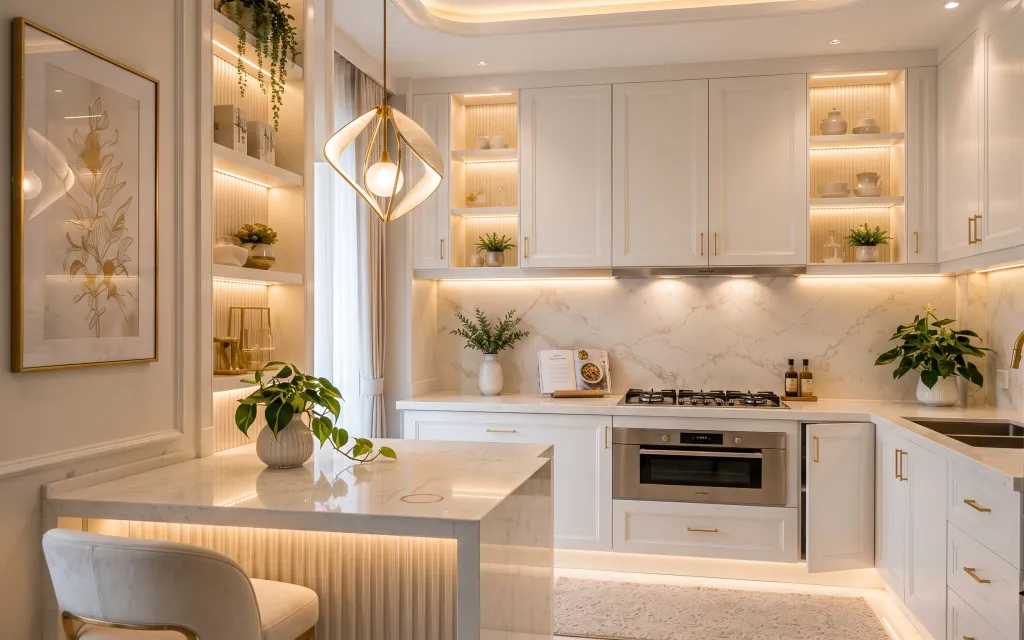
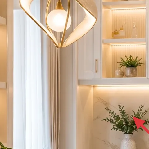
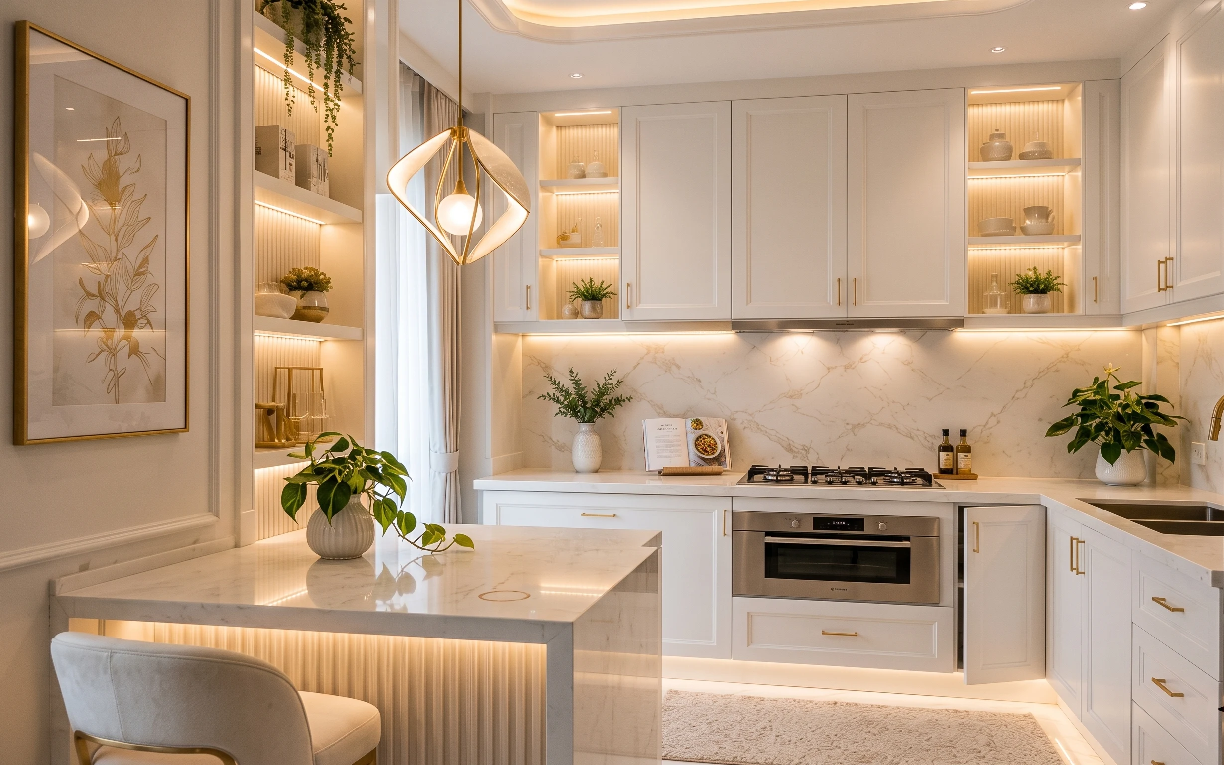
In this photo, the look starts with a gold-framed botanical print that reads like “gallery wall” without the heavy layout. The whole space also leans on soft textiles—there’s a light curtain panel plus a beige area rug that warms up the marble-look surfaces. For plants, the big white ceramic vase on the island gives you a vertical moment that still feels clean and modern. It’s achievable in shared housing because the changes are mostly swap-able and packable: art, fabric, rug, and small decor.
I used to overbuy hard goods for kitchens, and then felt stuck the minute it was time to move—counter clutter and rugs that were too bulky to fold were the worst. What finally clicked for me was treating the “kitchen vignette” like styling for one corner, not remodeling the whole kitchen. This palette—white, soft gold, and sage-green greenery—stays cohesive even when you relocate the pieces room to room.
Layer 1 — Framed botanical print (gold frame) ($30) Botanical art that reads “curated”
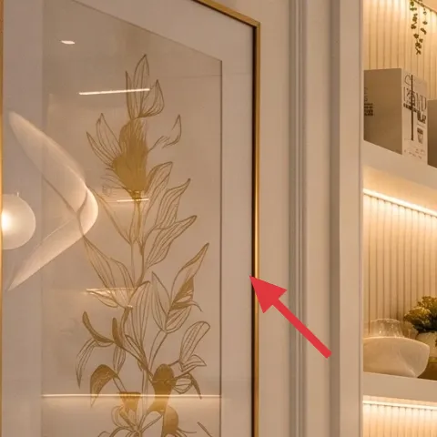
This gold-framed botanical print is the fastest way to make a shared kitchen feel intentional. It gives you a vertical focal point on a wall, and because the art is self-contained, it packs better than anything that needs mounting hardware or wall changes. The gold tone also works with the warm hardware feel you often see in kitchens without forcing a new finish into the space. The trade-off: you have to choose art you actually like living with daily—this isn’t background decor. For moving, plan to keep the frame intact and protect the front with tissue or a flat cardboard sleeve.
Pick the frame first, then the print
A slightly warm frame metal (like gold-toned) makes botanical line drawings look “designer” even if you switch the print later.
Layer 2 — Curtain panel pair (light neutral) ($60) Softens the doorway line
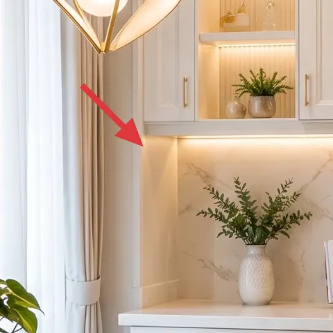
The light neutral curtain panel is doing a quiet job: it turns a hard-edged doorway and opening into something softer. In a kitchen, that matters because marble-look surfaces can feel too crisp when you’re cooking, cleaning, and sharing the space. A curtain also gives you color control—white and beige tones keep the room bright while hiding visual noise behind it. The trade-off is that curtains collect dust, so choose washable fabric and plan on a quick wash before you move on to the next place. For packing, fold it flat and store in a bag so it doesn’t crease into stubborn lines.
Keep the shade light, not sheer
Sheers can read flimsy against strong cabinetry lines; a light opaque or semi-opaque panel keeps the look polished.
Layer 3 — Area rug (beige) ($200) Tones down the “hard floor” feeling
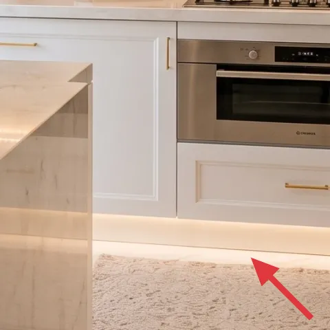
This beige area rug is what makes the kitchen breakfast nook feel lived-in instead of showroom-smooth. With a marble-look floor and backsplash, a rug acts like a noise-canceling layer—visually and acoustically—especially around the island where people stand and move. Go for a medium neutral so the plant greens and gold frame don’t fight the floor. The trade-off is that rugs can be bulky, so size and thickness matter: a 5×7 in a flatter weave packs flatter than a plush high-pile. For shared housing, a rug you can roll tightly and wrap with straps is the real upgrade.
Skip thick rugs if you move often
High-pile rugs feel great, but they’re harder to roll and store in boxes during lease changes.
Layer 4 — Large white ceramic vase with leafy plant ($30) Instant height on the island
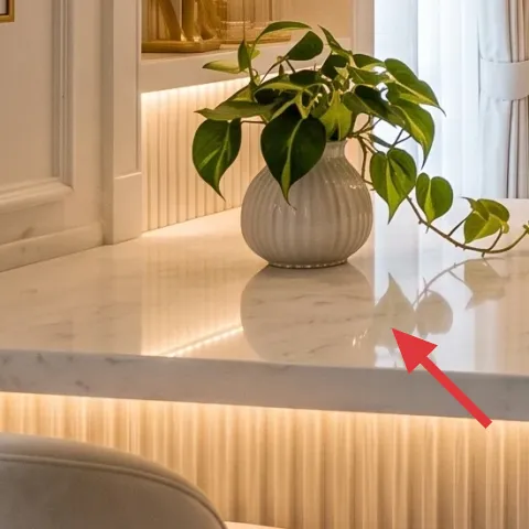
The large white ceramic vase with leafy green plant on the island is a styling anchor. It sits at counter height, so it visually balances the cabinetry and keeps the island from looking like a flat work surface only. White ceramic stays neutral with almost any kitchen palette, and the greens echo the botanical art without turning the room into “farmhouse.” The trade-off is that plants need care—if your schedule is chaotic, swap for a hardy variety or a high-quality faux that you still dust. For moving, empty and pack the vase carefully, and keep leaves wrapped so you don’t arrive at the next lease with broken stems.
Choose a vase that can travel
If the vase is heavy, it’s a storage headache—go for ceramic you can wrap and tote solo.
Layer 5 — Decorative book stack on countertop ($15) Gives the vignette a “use” cue
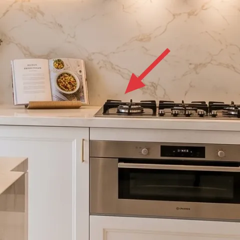
A small decorative book stack on the countertop adds structure to the island styling. Books are one of the easiest moveable objects you can style without drilling or installing anything, and they also explain the “why is it here?” question for guests. In this photo, the stack’s warm cover tones play well with the soft gold frame and the white ceramics. The trade-off: books can look random if you don’t keep the colors limited, so stick to neutral covers or one accent color. When you move, stack them the same way in a box—no chasing spacing once you find a layout you like.
Let the cover color repeat once
If the botanical art is warm, match that warmth in one book cover instead of adding multiple new colors.
Layer 6 — White ceramic jars on open shelf ($20) Storage that looks like decor
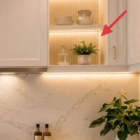
The white ceramic jars on open shelving are an easy way to make “kitchen items” look styled. Jars read clean and intentional, and they’re also practical: you can pack them when you go, then refill with pasta, tea, or pantry staples in your next kitchen. The trade-off is that open shelving makes everything visible, so choose jars that stay visually uniform—same tone, similar shape, no mismatched labels. If your roommates share the kitchen chaos, this is one place where a consistent set really helps. For moving, wrap lids separately so you don’t scratch ceramic and so nothing leaks.
Uniform labels beat clutter
Even without matching brands, jars look “designed” when the label colors don’t compete.
Layer 7 — Small potted plant on shelf ledge ($35) Adds a second layer of green
That small potted plant tucked onto the shelf ledge gives you a second wave of greenery without competing with the big island vase. It’s the kind of moveable styling that makes the whole breakfast nook look layered: one plant at counter height, one at shelf height. That vertical rhythm is what keeps a kitchen vignette from flattening into one line. The trade-off is scale—if the plant is too tall, it can look crowded; if it’s too small, it disappears. Pack it with a drip tray or plastic liner so it survives the next transport day.
Rotate for even growth
Plants lean toward light; rotate the pot every couple of weeks so the silhouette stays balanced.
The cost, layer by layer
| Layer | Item | Cost |
|---|---|---|
| 1 | Framed botanical print (gold frame) | $30 |
| 2 | Curtain panel pair (light neutral) | $60 |
| 3 | Area rug (beige, 5×7) | $200 |
| 4 | Large white ceramic vase with leafy plant | $30 |
| 5 | Decorative book stack on countertop | $15 |
| 6 | White ceramic jars on open shelf | $20 |
| 7 | Small potted plant on shelf ledge | $35 |
| Total | $390 | |
If you need it cheaper, swap the rug for a thinner 5×7 in a tighter weave and choose a single plant vase instead of multiple greens. Keep the botanical print and curtain—those two do the most visual work for the least storage stress.
What worked, what didn't (across the whole room)
This refresh works because it focuses on portable “surface styling” rather than fixed kitchen changes. The framed botanical print and rug do the heavy lifting for warmth, while plants and jars keep everything feeling lived-in instead of staged.
What worked
- The gold-framed botanical print creates a focal point without any wall modifications.
- The beige area rug softens marble-look surfaces and helps the breakfast nook feel calmer.
- White ceramic + sage-green plant tones repeat across the vignette for a cohesive palette.
- Curtain panels soften door openings and make the kitchen feel less stark.
- Countertop books make styling look functional, not just decorative.
- Uniform ceramic jars keep open shelving from turning into visual clutter.
What didn't
- Overstuffing the island with too many objects made it feel busy during shared cooking.
- Using very thick rugs was a packing problem when the next lease came up.
- Adding multiple unrelated frame metals made the botanical art look less intentional.
- Plants that needed frequent trimming turned into a roommate argument.
What we'd skip if we did it again
Skip anything that requires permanent wall changes, like replacing fixed cabinetry details or drilling for organizers. In shared housing, the “next place” is the real deadline, and hard installs never pack well. Choose freestanding decor that lifts off with a quick wrap and stays protected in a box.
Skip high-pile rugs if moving is frequent. They look plush, but they’re heavy, harder to roll, and sometimes snag during transport. A flatter weave in a warm neutral gives the same cozy read with less logistics.
Skip adding too many separate accents in the same nook. When the island already has a vase, book stack, and a rug, the smart move is repetition—one botanical artwork, one curtain tone, and greens in two heights. Fewer pieces, repeated materials.
Frequently asked
How long does this kitchen breakfast nook refresh take?
Plan on about 2–4 hours, depending on rug positioning and plant setup. The slow part is usually finding a rug that sits comfortably in the “traffic path” and aligning the curtain so it hangs nicely beside the doorway. Everything else—art placement, countertop styling, and shelf jars—is more like arranging than building.
What if my kitchen is smaller or shaped differently?
If the nook is tighter, keep the same color logic (white + soft gold + sage) but scale down one item. A smaller rug works, and you can use either the big island vase or the shelf plant—not both. The framing move still matters; even a single framed print anchors the whole corner.
What if I rent and I can’t change anything beyond decor?
That’s the whole point of this approach. The changes are textiles, freestanding decor, and wall art you can take with you. Avoid anything that involves drilling, replacing fixtures, or hard installs. As long as the pieces can pack flat or roll, they’re renter-friendly by design.
Where should I shop for these items if I want it move-friendly?
For the rug, look for easy-roll formats and neutral weaves at big-box home stores or discount marketplaces. For the art and ceramics, focus on sets that match metals (gold-toned frame) and tones (white ceramics). Plants are easiest when you buy mid-size and can transport them safely in a box with padding.
What’s the biggest mistake people make in kitchens like this?
Overstyling the island. Kitchens get used hard, and too many small items turn into a clutter problem fast. If there’s already a rug and a framed art anchor, limit the counter to one plant/vase zone plus one functional-looking stack (books or jars) so the nook stays calm under real life.
More in Kitchen & Dining
A kitchen breakfast nook refresh for $400
A kitchen breakfast nook refresh built for shared housing: seven move-friendly swaps focused on framed botanical art, light curtains, and w…
7 move-ready swaps for a $400 kitchen refresh
A warm, marble-and-wood kitchen island style—made renter-safe. Here are 7 move-ready swaps to recreate the look for $400 total, using rug, …
Under $300: renter-friendly kitchen counter refresh with 7 no-drill swaps
A bright kitchen counter refresh for renters under $300—using no-drill swaps like a marble-look peel-and-stick backsplash, styled tray, and…