- Best for
- A calm, layered renter living room corner
- Cost
- About $600 all-in
- Difficulty
- Easy (mostly textiles + décor)
- Time
- 2–4 hours to style, 1 evening for DIY art
Why warm cream-and-walnut layering is the sofa corner of 2026
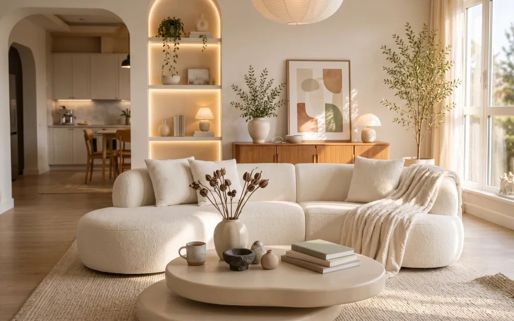
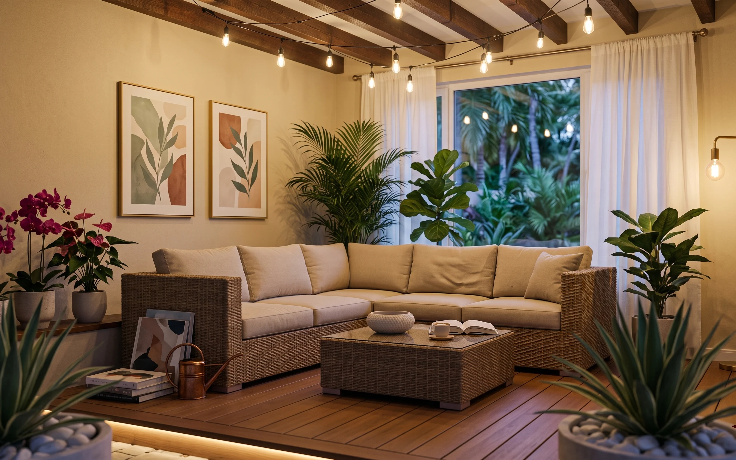
That creamy, sunlit vibe comes from a few repeat decisions: warm neutrals, lots of soft textiles, and art that feels graphic but not loud. In the photo, the cream upholstery texture reads almost like bouclé, while the beige rug adds a dry, woven contrast. The wooden-framed abstract print keeps the palette grounded, and the plant height plus sheer curtains prevent the corner from feeling flat. Because this approach relies on swap-in pieces—rugs, removable textiles, and plug-in light—it’s achievable for renters who need everything to pack up at the end of a lease.
I used to overthink “matching” and buy coordinated sets that all looked the same from five feet away. What changed for me was noticing how often this look repeats one tone (cream) and one material idea (natural texture) instead of repeating exact colors. Once I stopped chasing perfect sameness, the layering suddenly looked intentional. That’s the same logic behind this sofa-corner recipe.
Layer 1 — Area rug 8×10, beige jute-style ($200) Anchors the whole corner
The beige area rug sits under the front edge of the sofa and coffee table, so it does the heavy lifting: it defines the “room within the room” and makes the creamy upholstery feel warmer instead of washed out. Choose a jute-style texture to keep the floor plan interesting, since the rest of the palette is fairly smooth—cream fabric, matte ceramics, and soft sheers. The trade-off is shedding and vacuum frequency: texture rugs need a bit more care than a flat weave. Still, for renters, a rug is one of the safest, most noticeable swaps you can make.
Let the rug do the sizing
If you can fit the sofa front legs on the rug, the layout reads grounded—even in a compact rental.
Layer 2 — Cream throw blanket ($45) Adds texture you can feel
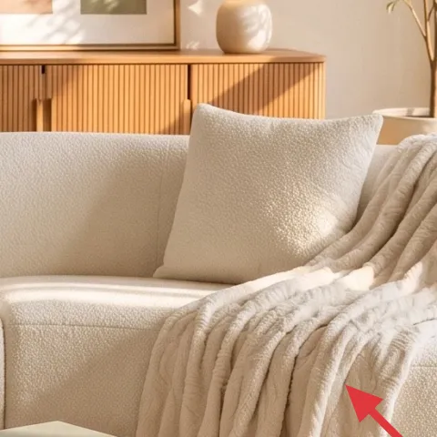
This cream throw is draped over the sofa arm, and that placement matters. It breaks up the large cushion mass with a second texture—soft, slightly thick, and visually “light” against the cream upholstery. If the throw were folded more tightly, it would look like bedding; draped low keeps it casual and lived-in. The best alternative (and one that won’t fight your furniture fabric) is a neutral throw with subtle knit or waffle texture. The trade-off is that textured throws attract lint—quick lint-roller passes help keep the look crisp.
Use drape, not symmetry
A slightly uneven fold gives the corner the same relaxed rhythm as the photo.
Layer 3 — Throw pillow covers with botanical print ($30) Brings the botanical note
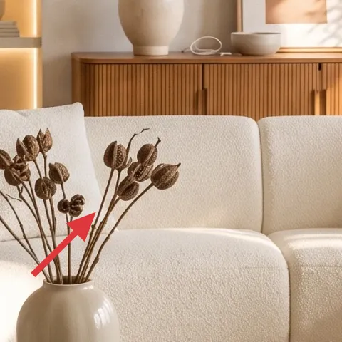
The botanical print pillows act like mini art pieces: they add an illustration layer without turning the room into a pattern parade. In the photo, the leaves are dark and warm, which makes the cream sofa feel less blank while still staying in the same color family. If you replace only one pillow, the look can drift toward “random accent,” so aim for two covers with similar scale and line weight. The trade-off is that bold botanical artwork can look dated if you go too graphic—stick to muted neutrals and smaller leaf shapes. This keeps the theme calm, not costume-like.
Match scale to sofa depth
For a deep sofa, choose pillow covers that read legible from standing height, not micro-detail.
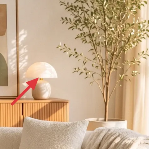
Layer 4 — White-shade table lamp on the sideboard ($60) Softer evening light
Warm light changes everything in this corner, and the photo leans on a table lamp with a white shade to keep the glow diffused rather than harsh. Because renters can’t rely on rewiring, a plug-in table lamp is the simplest way to mimic that mood at night. Position it on the sideboard (or any stable surface) so the light comes from a mid height—roughly eye level when seated—then let the shade do the softening. The trade-off is finding the right bulb temperature: go too cool and the cream tones turn gray. A warm bulb keeps everything looking like it belongs together.
Don’t skip the bulb color
A plug-in lamp with a cool-white bulb will fight the creamy palette even if the shade looks right.
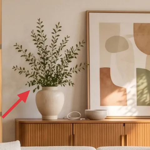
Layer 5 — Framed abstract art print, wooden frame (DIY) ($80) Makes the wall feel curated
This framed abstract print is the graphic “anchor” on the wall: it holds the cream-and-warm-beige family while adding shape (circles and blocks) so the corner doesn’t feel too literal. If you buy the same size and keep the frame warm-toned, you can mimic the overall effect without needing a full gallery wall. For renters, DIY helps because the art is the only wall element that truly can come down and go. The trade-off is time: you’ll spend an evening making the print, but you’ll get a custom piece that looks more expensive than a generic poster.
Make it instead of buying it
This DIY replaces the framed abstract art print by painting simple shapes on cardstock and sealing it for a clean, gallery-ready look.
Materials
- Cardstock sheet(s) — 2 large sheets — craft store — $8
- Acrylic paint set (earth tones) — 1 set — craft store — $20
- Small wooden frame (16×20-ish) — 1 — thrift or discount — $25
- Optional: matte medium or clear craft varnish — 1 small bottle — craft store — $0
Steps
- Pick your shapes (one circle, one organic block, one muted rectangle) and sketch lightly in pencil on the cardstock.
- Paint the lightest background blocks first so the darker shapes don’t muddy.
- Rinse your brush and add mid-tone forms, keeping edges slightly imperfect for an organic look.
- Paint the darkest botanical-adjacent brown shapes last, using smaller brushes for control.
- Let the paint dry completely without moving the piece.
- Check for balance by holding the card from a few feet away and adjusting one shape if it feels too heavy.
- Optional: seal with a thin matte layer if you want extra durability.
- Let the sealant dry fully, then place the artwork into the frame and secure the backing.
- Hang with picture-rail hooks or removable methods that match the frame’s hardware.
Total DIY cost: $53 — saves about $27 over buying.
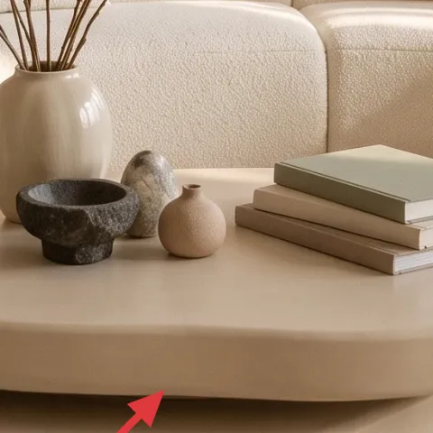
Layer 6 — Decorative ceramic dish on the coffee table ($15) Adds a small “collected” detail
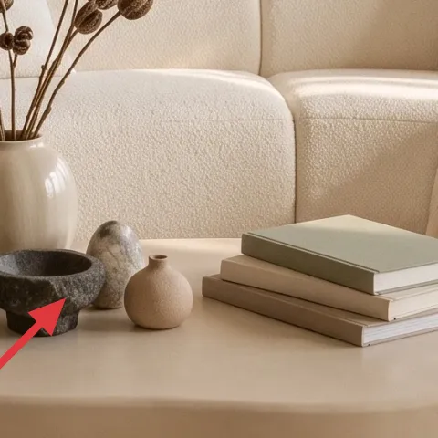
The coffee table styling in the photo looks intentional because it’s built in mini groupings: books, a small ceramic dish, and one curated object. That ceramic dish gives you a place to anchor a tabletop arrangement without adding more height, which matters because the vase and dried stems already bring vertical interest. If the dish were too shiny, it would fight the matte ceramics and the textured rug; keep it in a matte stoneware or soft clay finish. The trade-off is that delicate ceramics can chip during moves, so wrap it in a towel before packing. For renters, small décor is one of the easiest “big effect” purchases.
Keep tabletop items in odd numbers
Three objects (dish + books + one candle holder or small pot) tends to look styled, not cluttered.
Layer 7 — Sheer white curtain panel pair ($80) Softens the windows
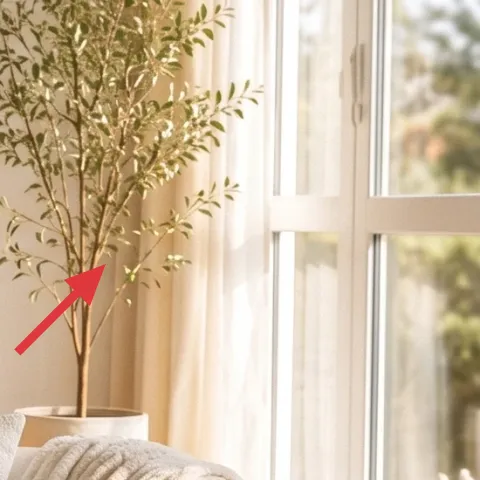
Sheer curtains are doing two jobs here: they diffuse daylight so the cream tones stay flattering, and they add movement when sunlight hits them. In a rented space, choosing removable curtain panels is a low-commitment way to echo that soft backdrop without changing the windows themselves. Go for airy fabric with a natural drape; avoid stiff sheers that look like shower curtains. The trade-off is that sheer fabric can feel private-light at night, so pair it with your existing window coverings rather than relying on sheers alone. If you’re starting from scratch, use tension rods to keep it landlord-friendly.
Hang slightly higher than the window trim
Higher placement makes the ceiling feel taller and frames the art more evenly.
The cost, layer by layer
| Layer | Item | Cost |
|---|---|---|
| 1 | Area rug 8×10, beige jute-style | $200 |
| 2 | Cream throw blanket | $45 |
| 3 | Throw pillow covers with botanical print | $30 |
| 4 | White-shade table lamp on the sideboard | $60 |
| 5 | Framed abstract art print (DIY equivalent) | $80 |
| 6 | Decorative ceramic dish on the coffee table | $15 |
| 7 | Sheer white curtain panel pair | $80 |
| Total | $510 | |
A cheaper variant keeps the same layering logic: swap to a 5×7 rug, pick one botanical pillow cover instead of two, and choose a smaller plug-in lamp with a basic white shade.
What worked, what didn't (across the whole room)
The biggest win is the mix of textures—rug weave, creamy throw drape, and botanical pillow line work—so the corner feels styled even without heavy furniture changes. The second win is warm, mid-height light from a table lamp, which makes the palette look cohesive after dark.
What worked
- The beige rug anchors the coffee-table styling and keeps the cream sofa from looking washed out.
- Cream throw and pillow covers add texture variety while staying in the same color family.
- The botanical print provides visual interest without turning the space into a busy pattern moment.
- A white-shade plug-in lamp gives a softer glow that flatters warm neutrals.
- The wooden-framed abstract print adds graphic structure above the sideboard.
- A small ceramic dish adds “collected” character without adding visual clutter.
What didn't
- Using a cool-white bulb would flatten the creamy tones and make the corner feel less warm.
- Too much matching (same exact fabric everywhere) can make the look feel costume-like.
- Oversized wall art proportions can crowd the sideboard height in compact rentals.
- Sheer curtains that are too stiff don’t drape the same and can look accidental.
- Skipping a rug can make coffee-table items float like they’re floating in space.
What we'd skip if we did it again
Skip a big “all-in-one” bundle where every item comes from the same set. That strategy makes everything look coordinated but not layered, and it’s harder to fix one piece later when the room changes.
Skip a cool-toned lamp bulb. Even if the shade and lamp are perfect, gray cast will fight the cream upholstery and make the botanical print feel colder.
Skip cluttering the coffee table with many tall objects. This corner works because the vase height is one vertical note, and everything else stays lower and calmer.
Frequently asked
How long does this kind of rented sofa-corner refresh usually take?
Most of the time is scheduling: rug delivery, picking pillow covers, and swapping in a plug-in lamp. If you already have wall-mount permission for art (or use removable hanging), the styling part is quick—about 30–60 minutes. The only true “project time” is the DIY abstract artwork, which is typically an evening for sketching, painting, and framing.
Will this work if my living room is smaller than the photo?
Yes—just scale down one item, not the whole look. In small spaces, keep a similar rug texture but use a 5×7 instead of 8×10 so the sofa still sits visually anchored. For the pillows, choose two covers instead of more, and keep tabletop styling to a dish + books + one sculptural object.
What if my windows don’t have sheers already?
Start with sheer curtains as the backdrop layer, but use tension rods or removable curtain hardware that doesn’t require drilling. If you need more privacy at night, rely on your existing blinds/liner coverings after dark. Daytime softness is what makes the cream palette look expensive—so even one set of sheers on the main window helps.
Where should I shop for the pieces without overpaying?
For the rug and curtains, look for end-of-season sales and open-box options. Pillow covers and ceramic dish-style décor are easiest to find at discount home stores and thrift marketplaces. The framed abstract print is where the markup can get silly—this post’s DIY approach is the easiest way to match the look while staying budget-friendly.
What’s the biggest mistake people make with neutral, cream-heavy rooms?
They pick only one texture. Cream fabric, smooth table tops, and flat paint can all look good individually, but together they feel flat. The fix is texture stacking: rug weave + throw drape + matte ceramics + a framed art layer. Once there are at least three textures, the palette starts looking intentional.
More in Living Room

A move-ready sofa corner for $600
Turn a rented sofa corner into a calm, layered look for $600. This refresh uses a beige rug, creamy textiles, a plug-in lamp, framed art, a…
Tropical no-drill sofa lounge refresh, $500
A renter-friendly way to build a warm, tropical sofa lounge using seven no-drill upgrades, all removable at move-out. With a $500 budget ce…
Candlelit living room for $500
A candlelit living room refresh on an impermanent/shared-house timeline, built from 7 move-ready swaps. The look uses a warm rug, soft pill…