- Best for
- textured backsplash + island styling
- Time
- 2–4 hours (plus drying)
- Total cost
- about $500
- Renter-safe
- mostly yes (peel-and-stick + removable decor)
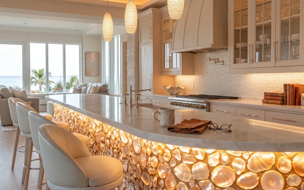
Why the warm pebble backsplash-and-stool corner is the kitchen island seating of 2026
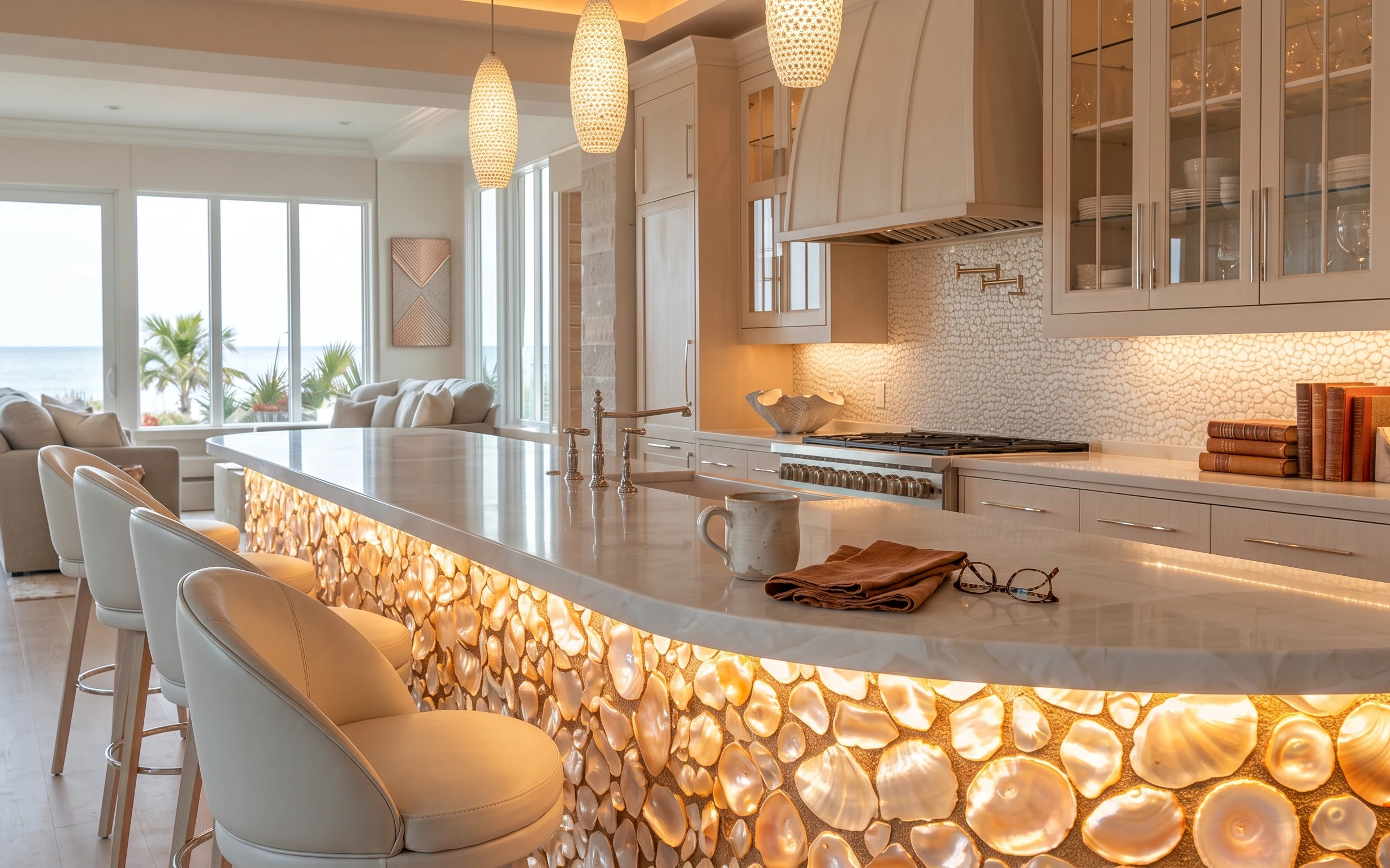
This look leans coastal-warm without going beachy: the stone-pattern backsplash reads like sunlit texture, while the light upholstery on the bar stools keeps everything airy. You can also see the mix of materials—glossy white countertop, creamy framed wall art, and that shimmering pebble surface—making the island feel styled instead of bare. It’s achievable on a renter’s budget because the “big impact” part is peel-and-stick, and the rest is swap-friendly countertop styling.
Last year, I caught myself trying to “fix” a rental kitchen by buying the most expensive decor on earth… and then realizing it still looked flat. What changed my mind was leaning into placement: one towel folded neatly, one mug set where your hand naturally lands, and just a small stack of books for height. The texture does the heavy lifting—your objects just guide the eye.
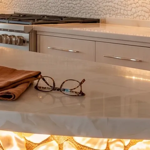
Layer 1 — folded brown towel ($18) folded for color contrast
A folded brown towel works as an instant color anchor on the glossy island top. In the photo it’s placed near the front edge, where it catches warm light and adds a soft, matte texture next to the shiny counter. The trade-off is that it’s a “do it daily” item—if it’s messy or rumpled, the whole island looks less intentional. The alternative is leaving the counter empty, but then the backsplash pattern becomes the only visual story. This small piece keeps the look styled without taking over the space.
Fold with intention
Keep the fold crisp (not bunched) so the towel reads like decor, not laundry.
Layer 2 — ceramic mug ($15) a single everyday object
This ceramic mug is the kind of object that makes a kitchen feel lived-in on purpose. It sits on the island top close to the towel, which means it shares the same warm palette instead of introducing a new color. I like choosing a plain mug over something super graphic here because the pebble backsplash already has a pattern-heavy personality. The downside is that you’ll need to keep it from becoming a clutter magnet—once it turns into “three cups and a spoon,” the styling stops working. One mug keeps the moment specific and tidy.
Let the backsplash be the pattern
When the wall texture is busy, the mug should stay simple and neutral.
Layer 3 — decorative book stack ($15) height without visual clutter
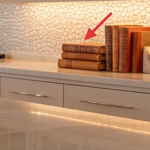
The book stack gives the island a bookstore-like vertical rhythm. In the hero, it’s grouped tightly so the spines read as warm blocks rather than scattered paper. Choosing a small stack (two or three books) is key: it adds height for balance, but it doesn’t block the work zone. The trade-off is dust—covers collect it—so plan a quick wipe when you’re changing the towel. Compared with adding a random vase, a book stack is easier to move, easier to remove at move-out, and it still feels styled even when you’re not using the island.
Use one warm color family
Pick book covers that echo the backsplash warmth so everything looks cohesive.
Layer 4 — peel-and-stick stone-pattern backsplash ($120) renter-safe texture on the wall
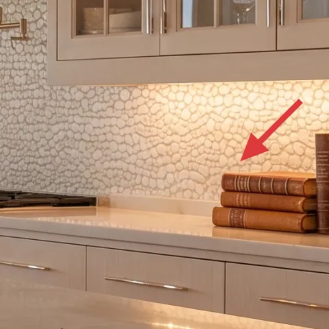
The stone-pattern backsplash is the main “wow” element because it mimics the kind of sculptural texture you’d normally see in an owner-renovation. On a rental, the version to buy is peel-and-stick designed for wall surfaces, then apply it to the visible backsplash area in clean sections. The advantage is that it’s removable at lease end, and the texture does the work of making the kitchen feel designed. The trade-off: you need patience during alignment—especially around outlets and edges—so the pattern lines up instead of looking patchy. If your landlord forbids changes, keep it to peel-and-stick only and save receipts.
Skip this if your wall surface is rough
Peel-and-stick shows imperfections on flaky paint—make sure the wall is smooth and dry before applying.
Layer 5 — hand-painted abstract art on cardstock (in frames) ($45) a DIY wall moment
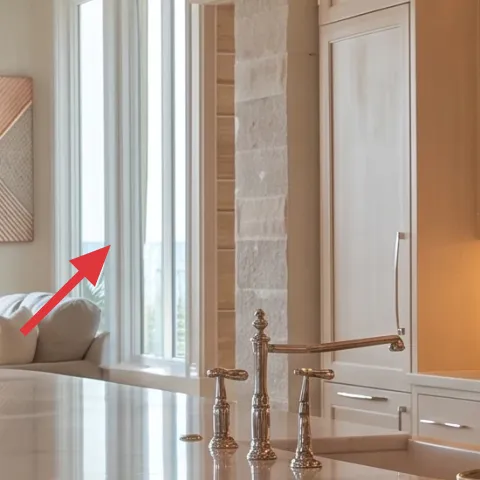
Those framed abstract panels bring the warm cream-and-brown palette from the backsplash into the room’s “eye level.” This layer works because the wall art echoes the same calm neutrals without competing with the backsplash’s texture intensity. The best part for renters is you can place art exactly where it looks balanced, then remove it with no wall damage. The trade-off is that DIY art looks best when it’s intentional—simple shapes, consistent tones, and a clean margin. Buying a ready-made set would be easier, but DIY keeps the cost down and the palette personal.
Make it instead of buying it
This DIY turns cardstock into warm abstract panels that match the framed wall art look—then you swap them out when the lease ends.
Materials
- Cardstock (pack) — 2 sheets — craft store — $4
- Acrylic craft paint (warm neutrals) — 1 small set — craft store — $8
- 8×10 simple frames — 1 or 2 — thrift store — $18
- Command Strips (hanging set) — 1 pack — grocery/drugstore — $8
Steps
- Cut cardstock to your frame’s inner size, leaving a clean border.
- Paint a warm base wash with diluted acrylic, keeping it light and even.
- Layer in two to three abstract shapes (lines, triangles, or chunky blocks) using thicker paint.
- Let the paint dry fully, then touch up edges for a crisp silhouette.
- Insert the cardstock into the frames and align the artwork straight in the mat.
- Hang with Command Strips at eye level, then step back to check symmetry.
Total DIY cost: $38 — saves about $7 over buying.
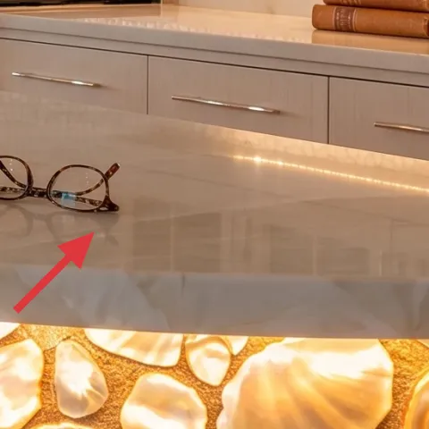
Layer 6 — pair of eyeglasses ($25) a small styling detail
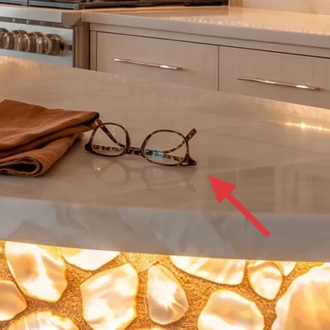
The eyeglasses on the island make the whole vignette feel like it belongs to a real routine, not just a staged photo. Because they’re brown-toned and metal-framed, they blend with the towel color and the warm backsplash highlights. Placing them near the front edge also gives the island a “ready to reach” feel, which is why the scene reads comfortable. The trade-off is that it’s easy to overdo—too many small items turns into clutter fast. A single pair of glasses is a simple rule: one personal object that looks casual but stays deliberate.
Keep one “busy” object
With textured backsplash, let the glasses be the only secondary detail.
Layer 7 — bar stools with light upholstery ($200) seating that stays light
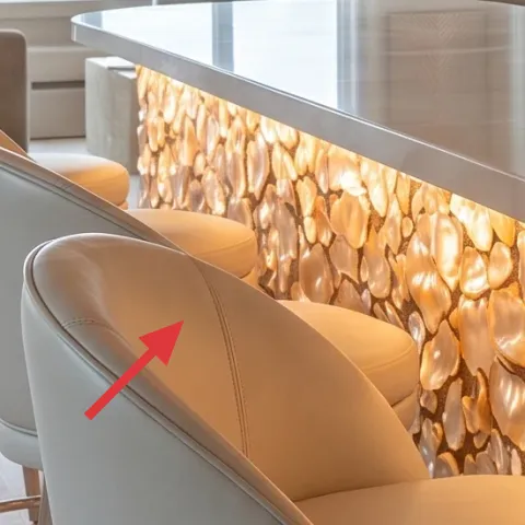
The light upholstered bar stools keep the seating area bright against the warm stone backsplash. They also add softness—fabric reads gentler than wood or metal when the wall texture is strong. The advantage of choosing upholstered seats for this kind of kitchen is comfort, especially if you use the island for quick meals or morning coffee. The trade-off is maintenance: spills show more on light upholstery, so you’ll want a fabric-safe cleaner ready. Compared with adding a random extra chair, matching stools to the island scale instantly makes the whole “island seating” zone look intentional.
Pick seats that match the countertop brightness
Stools in cream or warm off-white keep the palette cohesive.
The cost, layer by layer
| Layer | Item | Cost |
|---|---|---|
| 1 | Folded brown towel | $18 |
| 2 | Ceramic mug | $15 |
| 3 | Decorative book stack | $15 |
| 4 | Peel-and-stick stone-pattern backsplash | $120 |
| 5 | Hand-painted abstract art on cardstock (in frames) | $45 |
| 6 | Pair of eyeglasses | $25 |
| 7 | Bar stools with light upholstery | $200 |
| Total | $438 | |
If you want a cheaper variant, swap the backsplash to a smaller peel-and-stick section (just the most visible strip) and pick one framed abstract panel instead of two. You can also reduce the stool cost by choosing pre-owned upholstered bar stools in a neutral tone and keeping the towel/mug placement just as crisp.
What worked, what didn't (across the whole room)
The biggest win is texture: the stone-pattern backsplash makes the island feel finished even when the countertop styling stays minimal. Layering one warm textile, one ceramic piece, and a tight book stack kept the scene looking intentional without clutter. The only thing that takes attention is alignment—both with peel-and-stick placement and with how straight the framed art sits.
What worked
- The stone-pattern peel-and-stick brings visual depth without permanent changes.
- The folded towel adds matte warmth against the glossy countertop.
- One ceramic mug reads “daily life,” not just decor styling.
- A compact book stack gives height without blocking the island work zone.
- Warm framed abstract panels echo the backsplash palette at eye level.
- Light upholstery on bar stools keeps the seating area bright and inviting.
What didn't
- If the backsplash pattern is off by even a little, the whole wall starts to look patchy.
- Too many countertop objects (bigger stacks or extra glassware) makes the island feel busy.
- Light upholstery can show crumbs and marks faster than dark seats.
- DIY art that’s too detailed competes with the backsplash texture and feels heavy.
- Leaving the towel unfolded turns the vignette into “functional” instead of styled.
What we'd skip if we did it again
Skip adding lots of small decor at the same time. In this kitchen-island look, the backsplash already has strong texture, so extra figurines and multiple random trays usually tip it into clutter. Keep the island to a tight edit: one towel, one mug, and one height element like the book stack.
Skip expensive “permanent-feeling” wall fixes. If the goal is move-out safe, peel-and-stick is the right category—hardware-free, renter-friendly, and repeatable elsewhere. Also, don’t go too large on the first attempt; a smaller test area reduces the chance you’ll fight with alignment.
Skip matching everything too perfectly. The warm palette works because it’s varied—matte towel, glossy counter, textured backsplash, and soft upholstery—so choose neutrals that share a warmth (beige/golden) instead of buying items in one exact shade.
Frequently asked
How long does this kitchen-island refresh take?
Plan on about 2–4 hours total. Peel-and-stick backsplash is usually the longest part because you’re aligning pattern edges and smoothing out bubbles. The rest is quick: place the folded towel, set the mug and books, hang the framed abstract panels with Command Strips, and seat the bar stools. The DIY abstract art needs dry time between layers, so build in an extra hour even if you’re not “waiting around.”
Will this work if I’m not allowed to change the backsplash?
Yes—use the same island styling without the backsplash layer. Keep the warmth and texture effect by choosing a peel-and-stick option only on the landlord-approved area, or skip it and lean on textiles and wall art for visual interest. A folded towel in warm brown, a ceramic mug in cream, and framed abstract panels can still make the island look styled. If your lease is strict, choose removable pieces only.
What if my kitchen is smaller than the photo?
Scale down the “island zone” instead of removing the concept. Use the towel and mug, but keep the book stack smaller (two books). Consider one framed abstract panel rather than two to avoid crowding the wall. If you’re choosing stools, pick a narrower footprint and keep the island styling near the corner so you don’t block traffic. The goal is one focal texture and one small counter vignette.
What if my kitchen is bigger and needs more balance?
Add one more height element on the island—another slim stack of books or a second framed abstract panel to extend the wall composition. If the backsplash looks too “short,” expand the peel-and-stick area vertically where your rental allows. For seating, keep the stools in the same light palette, but consider adding one extra personal item only if the counter still feels edited. The key is balance, not more objects.
Where should renters shop for these pieces?
For budget-friendly neutrals, look at big-box retailers for towels and mugs, thrift shops for frames and books, and home stores for peel-and-stick backsplash products. Bar stools are often a better value secondhand—search neutral upholstered options locally. For hanging art, a Command Strips multi-pack is an easy, no-drill route. The DIY art uses craft supplies you can buy in small quantities to keep the project affordable.
What’s the biggest mistake to avoid in this kind of kitchen?
Over-styling. When the backsplash texture is strong, too many countertop items make the island feel chaotic instead of intentional. Another common mistake is rushing peel-and-stick alignment—if the pattern edges don’t line up, it looks patchy from across the room. Keep your choices limited: one towel, one mug, one book stack, and framed art that echoes the warmth.
More in Kitchen & Dining
How to style a renter-friendly kitchen island for under $500
A warm, pebble-textured kitchen-island look is doable for renters under $500. This plan uses peel-and-stick backsplash, two framed wall pie…
7 renter-friendly ways to style a peninsula nook for $250
A warm, japandi-style peninsula nook for shared housing—built from a gray patterned runner, two framed prints, plants, and candlelight. Thi…
7 swaps for a brass-and-ivory kitchen island for $300
A bright, warm kitchen island look that moves with you: curtains, flowers, a folded cloth, and a few small styling objects. This $300 plan …