- Best for
- Renter-friendly kitchen island styling
- Time
- 1–3 hours total
- Total cost
- $200 (plus optional refresh stems)
- Renter-safe
- Yes—no drilling, no fixture swaps
Why warm brass-and-marble styling is the marble-kitchen island of 2026
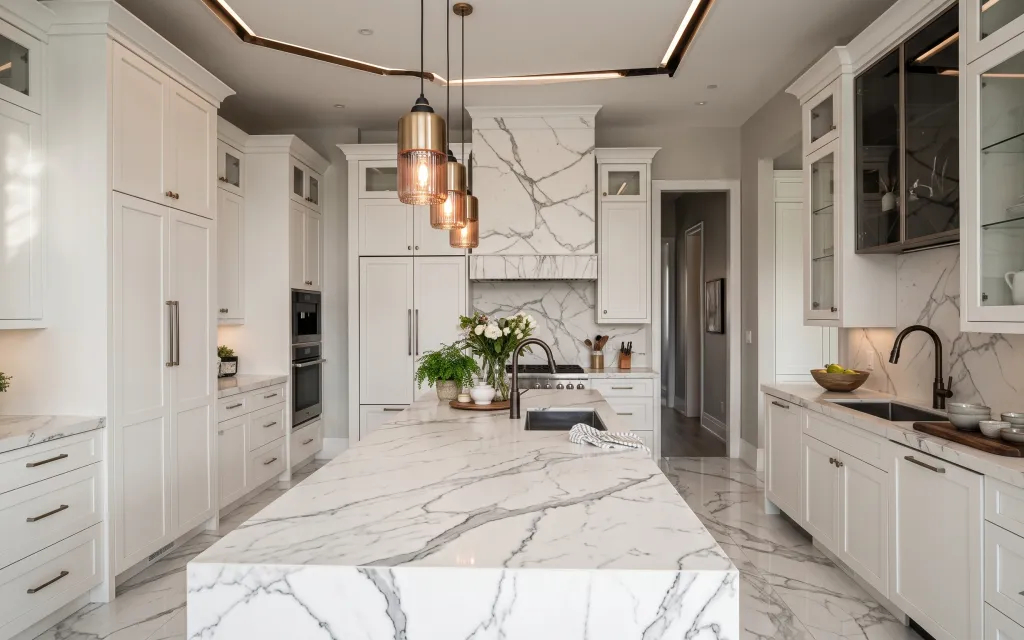
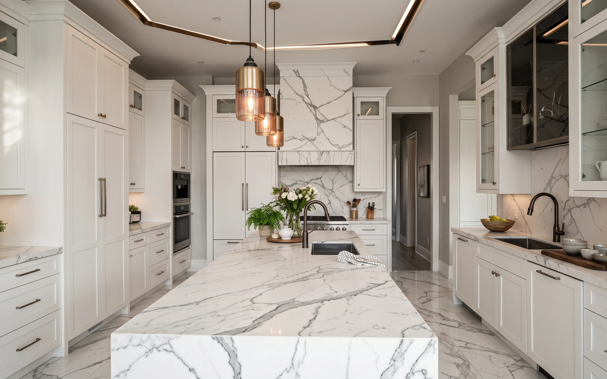
The first thing I notice in this kitchen is how the warm pendant glow bounces off the marble-look surfaces, then pulls your eye down to the island styling. That’s exactly the effect you can recreate with three textures: crisp white ceramics, leafy green stems, and the subtle stripe of a striped dish towel. In magazines, this reads like “intentional utility”—think kitchen styling photos from Architectural Digest and House Beautiful. For renters, it’s achievable because none of the changes need wall paint, drilling, or swapping hardwired fixtures.
I used to overdo it with “decor” and then wonder why the island still felt messy. The moment I switched to a smaller lineup—one framed piece, one flower vase, and a couple of kitchen-appropriate ceramics—the whole counter looked calmer. Here, the warmth comes from the brass tone you already have, and the softness comes from the plants and linen-like textile. It’s the kind of balance I’ve learned to hunt for after renting my place six times.
Layer 1 — Striped dish towel ($18) keeps the island from looking too showroom-clean
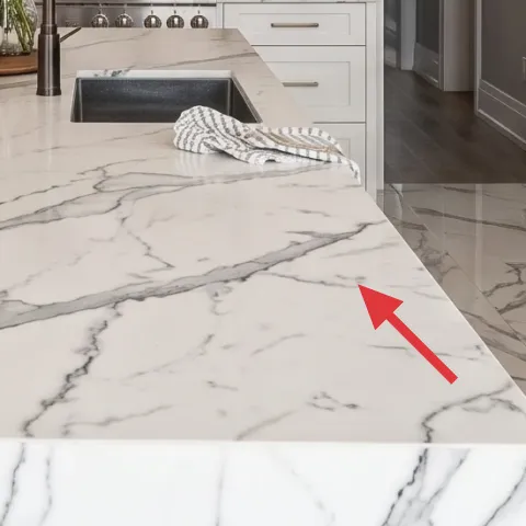
The striped dish towel sits folded on the marble island, right where you’d naturally set it while cooking. It works because it adds a soft, fabric “pause” to all the hard, glossy stone and white cabinetry. The trade-off is that the towel can look fussy if it’s too large or brightly patterned, so the key is choosing stripes that stay neutral (think cream/gray) and folding it with clean edges. Compared with adding another object to the counter, this reads more like lived-in function instead of extra clutter.
Match the stripe to your stone tones
Pick cream-and-gray stripes so the textile echoes the marble veining without fighting it.
Layer 2 — Small white planter with green plant ($25) adds life without taking over the counter
This small white planter is tucked on the counter at the left side of the kitchen, and it’s doing a lot of work for very little visual mass. Plants are the fastest way to soften a kitchen that’s otherwise all white panels and stone reflections. The trade-off here is scale: go too big and you’ll block sightlines and “shrink” the room visually. This size stays believable for daily use and keeps the greenery from competing with the main flower arrangement on the island.
Use greenery as a background, not the headline
A small plant should support the main styling focal point, which is the vase in the center.
Layer 3 — Large vase with mixed flowers ($35) gives you that “host-ready” island focal point
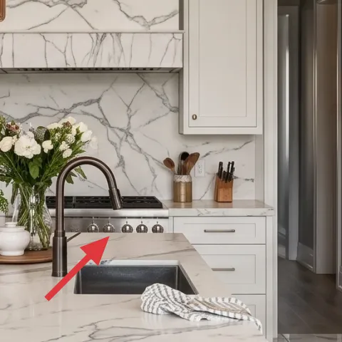
The large vase of mixed flowers sits at the center of the island, and that placement matters. It anchors the whole scene because your eye lands on the tallest, most organic silhouette. The trade-off is upkeep—real stems fade—but you can keep the look by refreshing weekly or choosing stems that hold longer. Compared with leaving the island bare, the vase adds color variation (white blooms plus green foliage) and movement, which also balances the symmetry of the cabinetry.
Repeat one color in a second spot
Pull one petal tone (white or blush) into your framed art or ceramics so everything feels related.
Layer 4 — Framed vertical artwork ($45) brings warmth at eye level without changing anything structural
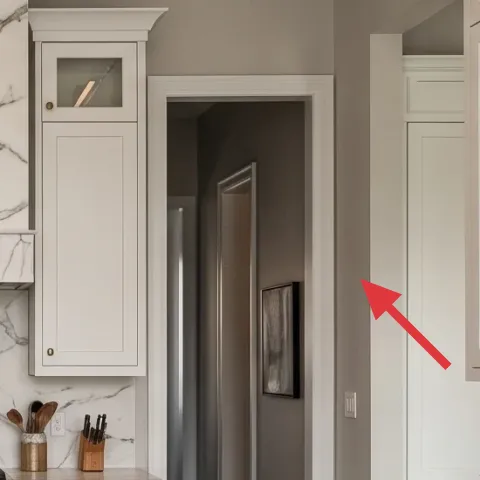
The framed vertical artwork is set up on the backsplash wall, and it gives the kitchen a little “gallery pause” when you’re standing at the island. Vertical composition works well here because it visually elongates the sightline and keeps the room from feeling purely horizontal and practical. The trade-off is picking the right scale: too small and it disappears against the busy stone; too large and it fights the vase. This option is renter-friendly because framed art can be hung with non-damaging hardware.
Don’t choose a frame that’s too dark
In a bright, white kitchen, a heavy black frame can feel harsh unless the rest of your decor matches.
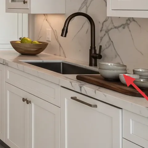
Layer 5 — Decorative ceramic bowls on counter ($22) adds “still-life” texture where you already look
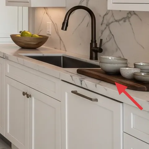
These small ceramic bowls live on the counter near the sink area, and they read like a styled moment even though they’re kitchen objects you could actually use. Ceramic shapes add a matte-soft texture that contrasts nicely with the marble shine and the glassy pendant light reflections. The trade-off is that you need to keep them in a tight cluster—spread out, and they start to look like random storage. For a renter refresh, this beats adding more wall decor because it brings depth to a surface you already have.
Keep the cluster tight and low
Low bowls keep the counter usable while still giving you that collected look.
Layer 6 — Apothecary-style jar labels (DIY) ($30) make pantry jars look intentional instantly
That apothecary-style jar on the counter looks curated because the label typography is doing the heavy lifting. Labels are a renter-friendly way to “dress up” an object you probably already have, and they visually connect the kitchen to the warm, traditional styling cues in the rest of the room. The trade-off is that labels need to be crisp and readable from a short distance, not tiny and fussy. Compared with buying a new jar set, DIY labels let you match the exact vibe without committing to a whole new storage system.
Make it instead of buying it
You’ll print and apply clean, apothecary-style labels so a plain jar reads like the styled one in the photo—without changing any fixtures.
Materials
- Printable label sheets (8.5×11) — 1 pack — store printer paper aisle — $8
- Black cardstock scraps (for a thicker edge) — 1 sheet — craft store — $4
- Scissors or paper trimmer — 1 tool (use what you have) — home — $3
- Clear packing tape (for a quick protective top coat) — 1 roll — office/discount store — $6
- Light tack removable adhesive dots (optional) — 1 pack — craft store — $2
Steps
- Pick a label size that wraps cleanly—measure the jar circumference with a strip of paper.
- Format the label in a simple serif font and keep text to one “ingredient” line plus a smaller descriptor line.
- Print on the label sheets, then cut to size with straight edges.
- Trim a thin black cardstock border so the label looks like it has a label “mat.”
- Lay the label face down and tape a clear top layer over it to protect ink from counter splashes.
- Clean the jar surface with a dry cloth so the label adheres smoothly.
- Apply using removable dots or tape at the edges so the label can come off cleanly later.
- Press for 30 seconds and check alignment from the counter height before the label fully sets.
- Wipe any tape residue and keep the jar dry until you place it back on the counter.
- Stage the jar with the other ceramics so the label typography matches the cluster’s scale.
Total DIY cost: $23 — saves about $7 over buying.
Layer 7 — Wood cutting board ($25) adds a warm “work surface” note against marble
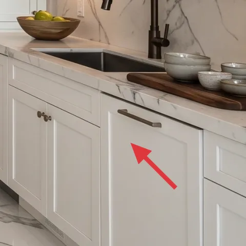
The wood cutting board sits near the sink area, and it brings warmth right where the kitchen feels busiest. Wood adds a softer grain texture that makes the marble feel less cold, and it also gives you a practical place to set a knife, fruit, or a small stack of kitchen items. The trade-off is choosing the right tone: too red and it clashes with the warm brass; too pale and it can read washed out. A medium walnut-ish board keeps the palette cohesive and gives that styled-but-functional look.
Choose a medium tone, not honey
Medium walnut or similar reads warm with brass tones and doesn’t overpower white kitchens.
The cost, layer by layer
| Layer | Item | Cost |
|---|---|---|
| 1 | Striped dish towel | $18 |
| 2 | Small white planter with green plant | $25 |
| 3 | Large vase with mixed flowers | $35 |
| 4 | Framed vertical artwork | $45 |
| 5 | Decorative ceramic bowls on counter | $22 |
| 6 | Apothecary-style jar labels (DIY) — retail-equivalent | $30 |
| 7 | Wood cutting board | $25 |
| Total | $200 | |
If you need a cheaper version, swap the framed artwork for a single inexpensive framed print and use one larger bouquet stem bundle instead of mixed flowers—keep the label styling and the wood cutting board. That preserves the focal points while trimming the cost.
What worked, what didn't (across the whole room)
The biggest win is that the styling is layered but not crowded: one towel, one plant “background,” one flower “anchor,” and a small set of counter objects. The mix of matte ceramic and soft fabric keeps the marble from reading too sterile. The one place it can slip is when labels or ceramics don’t match the scale of the rest of the island, which makes the whole counter feel accidental instead of collected.
What worked
- One striped dish towel adds the only real textile texture on the island.
- The small white planter keeps greenery present without blocking counter space.
- A tall, mixed flower vase creates a clear focal point against bright cabinetry.
- Vertical framed artwork draws the eye upward and makes the backsplash feel finished.
- Clustered ceramic bowls add matte texture right where light reflects off marble.
- Apothecary jar labels turn “storage” into a styled moment.
- A warm wood cutting board introduces grain and softens stone’s coolness.
What didn't
- Too many separate countertop items makes the island look like overflow rather than styling.
- Labels that are too small read like clutter instead of typography.
- Framed art that’s the wrong scale disappears against the marble-look wall.
- Very dark or very red wood tones can fight the warm brass palette.
- Greenery that’s too tall can overwhelm the vase instead of supporting it.
What we'd skip if we did it again
Skip adding a second large “centerpiece” object to the island. When the vase is already acting as the anchor, an extra tray or stack often pushes the counter from styled to crowded—especially on bright marble surfaces.
Skip choosing a framed print that’s too busy or too colorful. This kitchen already has movement in the marble-look backsplash; a simpler, quieter frame and print lets the rest of the palette breathe.
Skip DIY jar labels that are hard to read from standing height. Labels need a clear typographic hierarchy—one ingredient line and one smaller descriptor—so the jar looks intentional, not like a homemade science project.
Frequently asked
How long does this kitchen island refresh take?
Plan for about 1–3 hours. The framed art hanging takes the most time, especially if you’re measuring for height. Styling the island is quick once you’ve chosen one main focal point (the flower vase) plus smaller supporting items (towel, plant, ceramics). If you DIY jar labels, printing and cutting adds another 20–40 minutes depending on how many labels you make.
Is this renter-safe if my lease is strict about hanging things?
Yes—as long as you use non-damaging hanging methods and avoid touching landlord fixtures. In a kitchen, the safest bets are removable hooks or picture-rail hooks when the rail already exists. For everything on the counters, you can set it down or remove it instantly when you move. The goal is to add style without relying on permanent installation.
What if my kitchen island is smaller or narrower than the photo?
Scale down the supporting objects first. Keep the single tallest element (the vase) but reduce the number of ceramics around it, and choose a smaller planter so it doesn’t crowd the left side. A cutting board that’s too large can also make the island feel cramped, so pick a board that leaves clear “usable” space around it.
What if my countertops aren’t marble-look?
You can still keep the same system: one towel for textile contrast, one framed vertical piece for eye height, one plant and one flower vase for organic shapes, and ceramics for matte texture. If your counters are darker, lean slightly lighter with ceramics and flowers; if your counters are lighter, go a touch warmer with wood tone and label typography.
Where can I shop for these items without it becoming expensive?
Look for the “repeatable” pieces first: frames, small planters, simple ceramics, and label-friendly jars. Discount home stores and thrift shops are great for wood cutting boards and ceramic bowls. For the flowers, you can buy stems once and rework the arrangement weekly—real stems are the cheapest way to keep the island feeling fresh.
Biggest mistake people make with kitchen island styling?
Over-styling the surface with too many unrelated objects. Kitchens already have visual activity from backsplash patterns, hardware, and reflections—so the island needs a small set of intentional elements. Another common miss is mismatched scale: a tiny frame against a bold wall or a vase that’s too low so it can’t anchor the composition.
More in Kitchen & Dining
How to style a renter-friendly marble-kitchen island for under $250
A renter-friendly refresh for a marble-kitchen island using 7 visible swaps: a striped dish towel, small planter, flower vase, framed art, …
A kitchen breakfast nook refresh for $400
A kitchen breakfast nook refresh built for shared housing: seven move-friendly swaps focused on framed botanical art, light curtains, and w…
7 move-ready swaps for a $400 kitchen refresh
A warm, marble-and-wood kitchen island style—made renter-safe. Here are 7 move-ready swaps to recreate the look for $400 total, using rug, …