- Best for
- Soft lighting + texture layering
- Time
- 2–4 weekends
- Total cost
- About $855
- Renter-safe
- Mostly renter-friendly swaps
Why warm beige-and-sand lighting is the bedroom with vanity of 2026
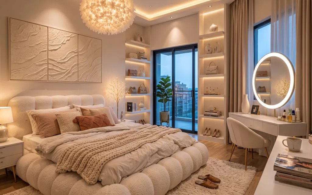
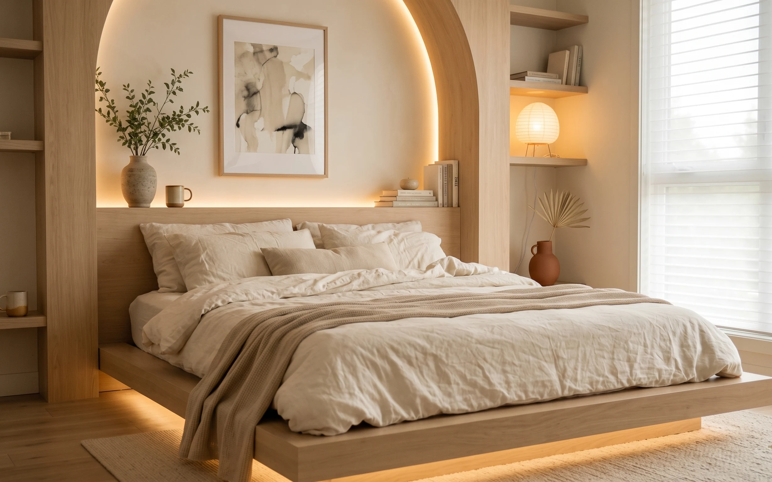
The room feels expensive because every surface is doing something: the cream area rug grounds the bed, the taupe curtain panels soften the windows, and the round mirror ring gives you that “bathroom glow” effect in a bedroom. The mix of textures is specific—tufted upholstery, a chunky knit throw, and a framed textured triptych on the left wall. Even the styling reads intentional: a tall potted plant near the door and neatly arranged bottles on the vanity. For US homeowners, this is a satisfying weekend refresh because you can pick the highest-impact pieces first.
I almost overcomplicated this look the first time I tried it in my own place. My mistake was chasing “matching sets” instead of matching proportions and texture density. The fix was to anchor the room with large soft goods (rug + curtains), then add one warm light element that repeats the same color temperature across the space. In this photo, that’s the mirror ring and the globe pendant doing the heavy lifting after dark.
Layer 1 — cream area rug ($200) Plush underfoot, made to disappear in the best way
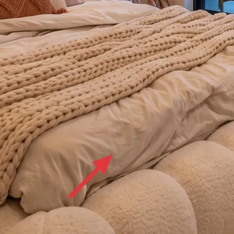
A large cream area rug is the foundation here: it cushions the bed zone, visually widens the floor, and makes the tufted headboard feel even richer. I’d choose a rug with a low-to-medium pile so the knit throw and pillows don’t fight for attention. The trade-off is that light colors can show wear faster, but that’s exactly why the styling matters—chunky neutrals hide dust better than you’d think when the room has warm lighting. If you’re swapping out a smaller rug, go bigger than feels necessary; the room will feel more “designed” immediately.
Go wide enough that the rug touches the bed’s footprint
Even a subtle under-bed gap makes a room feel staged—full coverage is what keeps it calm.
Layer 2 — taupe curtain panel pair ($80) Soft window framing in the same temperature as the walls
The taupe curtain panels on the right side are doing more than privacy—they frame the whole bedroom and blur the line between “window” and “wall.” Look for drapes that hang from a ceiling-height rod (or as close as you can get) so the fabric starts near the top of the sightline. The fabric choice matters: something with a gentle body makes folds look intentional instead of flat. The trade-off is that sheer, cheap material won’t give you the same structure. If you’re keeping everything else neutral, this is the one moment you can add dimension through fabric weight.
Keep the color in the same warm family
When curtains are too cool (gray-beige), the mirror glow and lamp warmth start to look mismatched.
Layer 3 — textured art triptych in frame ($180) One bold wall texture instead of scattered decor
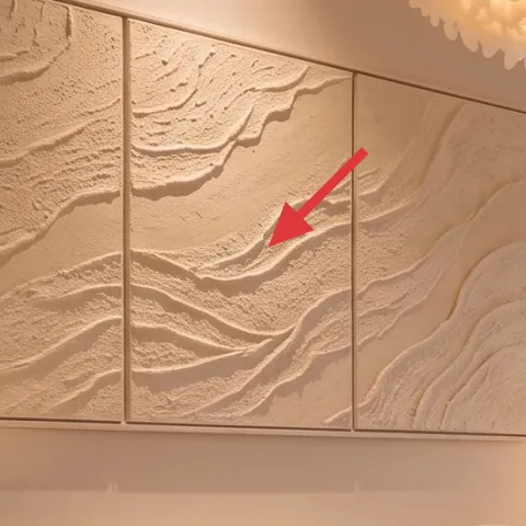
This framed textured art triptych is the left-wall anchor, and it’s why the bed area feels curated instead of empty. Texture reads even when colors are quiet, so the piece stands up to the headboard upholstery without competing. Choose a triptych (or a single large framed artwork with heavy texture) rather than three unrelated prints—your eye needs one “system.” The trade-off is that textured art isn’t always cheap, but it’s a weekend-friendly buy and it prevents the next mistake: over-hanging tiny frames that don’t carry scale. Hang it so the center panel lands roughly at eye level.
Measure the center panel, then fine-tune from there
It’s easier to get symmetry right when the midpoint is the only thing you’re chasing.
Layer 4 — table lamp with ceramic base ($60) Warm ambient light where you actually sit
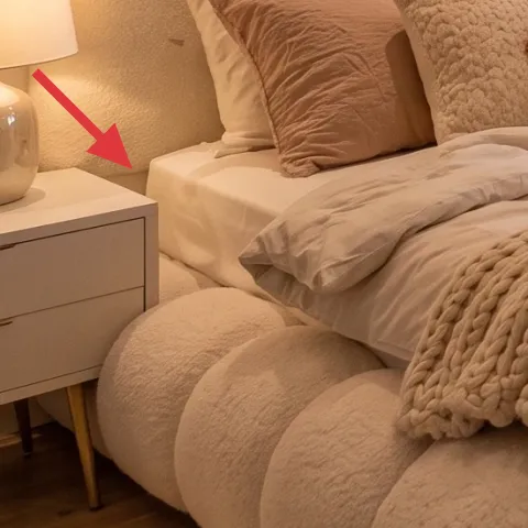
The table lamp with a ceramic base on the left nightstand gives you the same warm “golden” tone as the mirror ring, which keeps the bedroom from looking flat. A lamp like this works best when the shade is soft and opaque enough to diffuse—so you see glow, not harsh beams. The trade-off is that you’ll want a bulb temperature that matches the vibe (warm white), or the whole palette can look slightly off. If you’re only lighting one corner, pick the one next to your bed where you’ll actually read. That’s where the lighting feels like design, not decoration.
Don’t mix bulb temperatures across lamps
If one light is warmer and another is cooler, your neutrals start to look two different colors.
Layer 5 — tall potted indoor plant ($80) A vertical “breather” between bed and windows
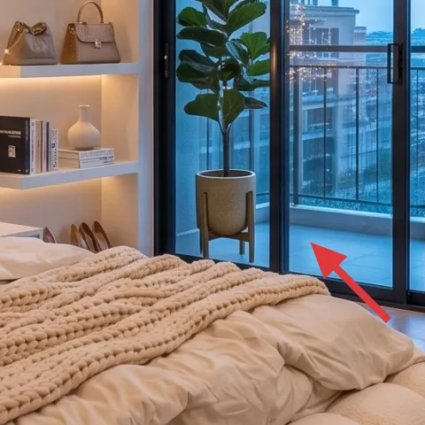
The tall potted indoor plant near the sliding door adds vertical movement and breaks up all the horizontal bedding planes. It also gives the room a natural contrast against the smooth finishes: wood floor, painted walls, and the clean lines of built-in shelving. Choose a plant with strong structure (not airy leaves) so it reads from the bed. The trade-off is ongoing care, but the payoff is that the plant feels like it belongs, not like a last-minute add-on. If you don’t want constant maintenance, pick a hearty option and keep it where the light stays steady.
Place it where it interrupts a hard corner
Here, it visually softens the doorway and makes the window area feel styled.
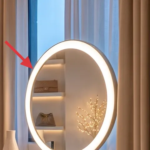
Layer 6 — round mirror with warm light ring ($120) The “glow detail” that makes everything look intentional
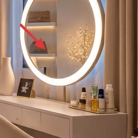
The round mirror with the warm light ring is the moment that makes this bedroom-with-vanity setup feel like a boutique suite. The ring light creates a flattering halo that also makes skin tones look better in daylight and evening, which is why it reads functional—not just pretty. I’d prioritize the mirror ring if you’re choosing between mirror and vanity accessories, because this is the piece people notice first. The trade-off is power/placement planning—ensure the cord and outlet placement work smoothly. Once it’s installed, keep the counter accessories minimal and cohesive so the glow stays the star.
Match the mirror’s warm tone to the lamp
Warm light repeat makes the whole palette feel pulled together without needing extra color.
Layer 7 — decorative bottle set on vanity counter ($135) Small objects, curated like a still life
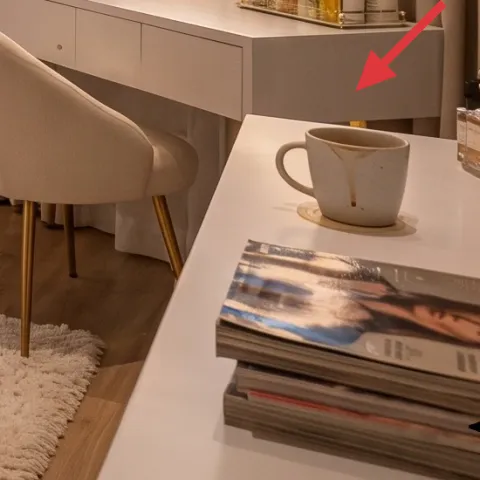
The decorative bottle set on the vanity counter works because it’s treated like a display, not a junk tray. The bottles’ shapes repeat the room’s rounded lines (chair silhouette, mirror shape, globe pendant), which keeps the styling from looking random. Choose containers in similar finishes—think glass and off-white—so the counter doesn’t become a color collage. The trade-off is that you’ll need a little discipline: too many different heights and labels will start to look cluttered. A tight group of a few products plus one tray makes the vanity feel designed even on busy mornings.
Start with fewer items than you think
Then add only one “tall” piece to keep the arrangement from feeling flat.
The cost, layer by layer
| Layer | Item | Cost |
|---|---|---|
| 1 | Cream area rug 5×7 | $200 |
| 2 | Curtain panel pair (84") in taupe | $80 |
| 3 | Textured art triptych in frame | $180 |
| 4 | Table lamp with ceramic base | $60 |
| 5 | Tall potted indoor plant (4–6 ft) | $80 |
| 6 | Round mirror with warm light ring (24–36") | $120 |
| 7 | Decorative bottle set on vanity counter | $135 |
| Total | $855 | |
If you want a cheaper version, keep the same order: rug first, curtains second, then one hero wall piece. Swap the mirror ring for a standard round mirror and use a warm bulb in a vanity-friendly lamp to keep the glow effect. Finally, limit the vanity styling to a few neutral bottles and one tray.
What worked, what didn't (across the whole room)
The overall win is coherence: warm light + large soft goods + one textured wall moment. The result feels polished because the room repeats shapes (round mirror, globe pendant, rounded chair) and repeats temperature (warm beige lighting). The only things I’d refine are the small-object density and whether the art scale matches the wall distance.
What worked
- The cream rug anchors the bed and makes the entire floor feel intentional, not transitional.
- Taupe curtain panels add structure and soften the window sightline without adding new colors.
- The textured art triptych brings visual depth so the left wall doesn’t need lots of smaller frames.
- Warm ambient lamp light keeps neutrals flattering and consistent after dark.
- The tall plant adds height and movement between the shelving and the window opening.
- The round mirror ring creates a “suite” glow that also makes the vanity feel functional.
What didn't
- When counter styling gets too tall and too many bottles appear, the vanity starts to look cluttered.
- If curtains hit the floor but don’t start high, the room can feel shorter than it really is.
- If the textured wall art is scaled too small, it won’t balance the tufted headboard’s size.
What we'd skip if we did it again
Skip buying a tiny rug “just to cover the floor.” In this layout, rug scale is doing real work—small rugs make the bed look like it’s floating and the room reads less finished.
Skip mixing bulb temperatures across lamps and the mirror ring. Warm and cool whites fight with beige tones, and that’s when even great furniture looks a little off.
Skip adding multiple small wall decor pieces once the triptych is in place. With this much wall texture and lighting already happening, a cleaner, single-anchor approach keeps the bedroom calm.
Frequently asked
How long does this bedroom refresh take?
Plan for 1 weekend if you’re only swapping soft goods (rug, curtains) and adding the mirror glow and vanity styling. If you’re sourcing the framed textured art triptych and placing shelving decor, add another weekend for measuring, hanging, and styling. The biggest time sink is getting curtain height right and centering the art so it looks intentional instead of “eyeballed.”
Can I do this look if I’m renting or if changes need to be reversible?
Yes, with a few swaps. Choose a round mirror that uses a removable hook option, and stick to plug-in lighting where possible. For curtains, use a tension rod if you don’t want to install hardware, then keep the fabric weight the same so the folds still read “designer.” If the art triptych can’t be hung, place it on a console surface or use a lightweight alternative.
What if my room is smaller than this photo?
Scale down carefully: keep the same texture strategy, just reduce the size of the rug and the width of the curtains. For the mirror, pick a round size that still feels like a focal point, not a small detail. The key is still proportion—small rugs and short curtains are what make smaller bedrooms feel cramped.
Where should I shop differently to stay on budget?
For this look, spend where the room reads from across the bed: the rug, curtain fabric, and the hero mirror. Then shop smarter for the “supporting cast,” like the plant and vanity bottles, which can come from home goods aisles rather than designer showrooms. Framed textured art is also a place where you can find deals—look for multi-panel pieces that arrive as one set.
What’s the biggest styling mistake in a bedroom vanity setup?
Overstuffing the counter. The vanity in this photo works because the bottles feel like a curated set and there’s breathing room around them. If everything is the same height, it looks flat; if everything is different height and color, it looks busy. Start with fewer items, then add only one “tall” element and one tray to keep the rhythm.
More in Bedroom

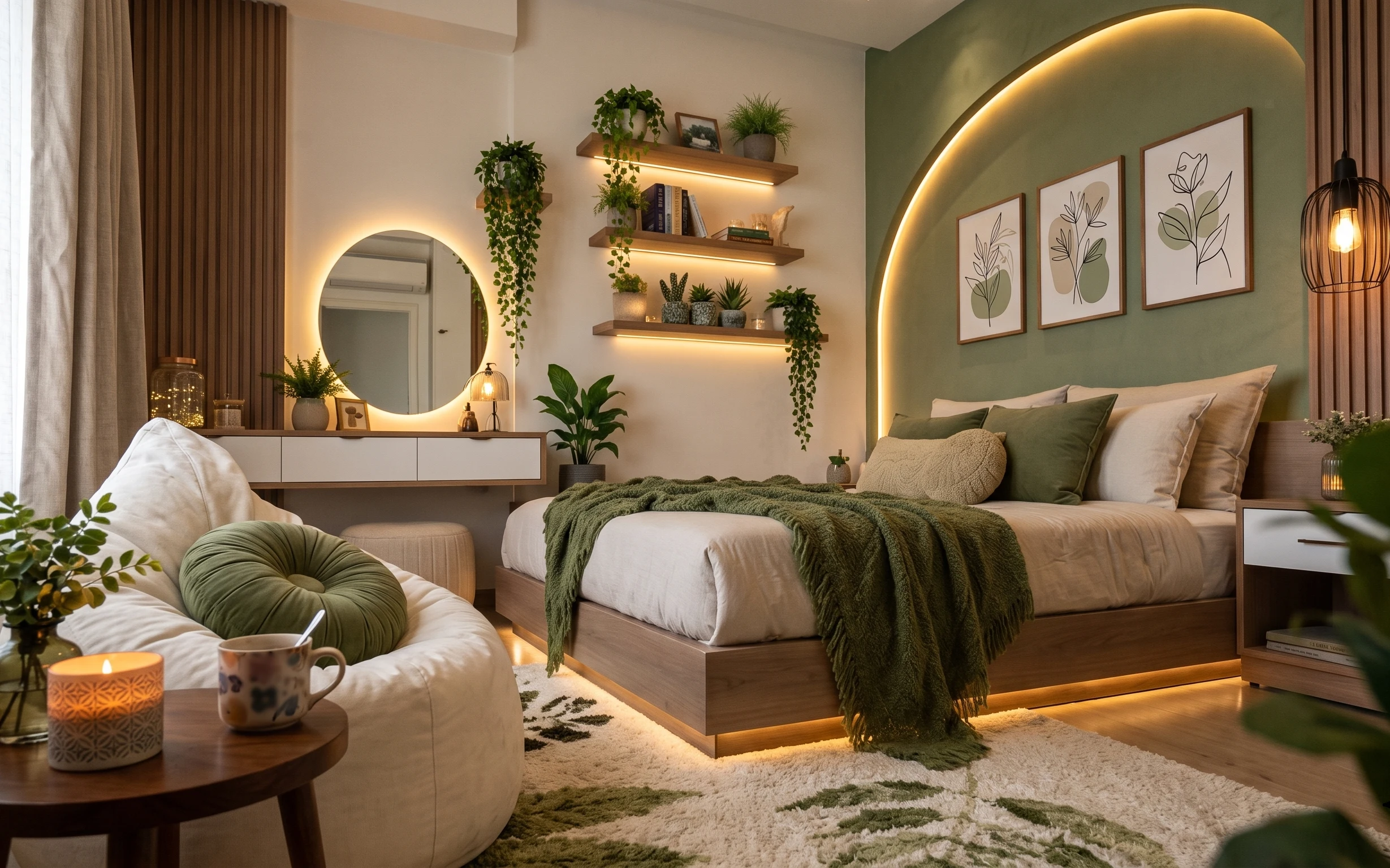
Under $1000: warm-beige bedroom with vanity refresh
A warm cream-and-taupe bedroom with vanity gets a luxe look by swapping 7 budget-friendly pieces—curtains, art, lighting, plant styling, an…
What $300 buys: a move-ready bedroom refresh
A warm, japandi-leaning bedroom refresh built from 7 no-drill, packable swaps—focused on layering textiles, adding one plug-in lamp, and sw…
What $300 buys: a bed-and-vanity nook refresh
A bed-and-vanity nook refresh for shared housing that stays move-friendly. This $300 plan leans on warm textiles, a rug anchor, and no-dril…