- Best for
- Adding warmth to a fixed kitchen island setup
- Cost
- $365 total for 7 renter-safe swaps
- Difficulty
- Easy (mostly styling + removable hanging)
- Time
- About 2–3 hours
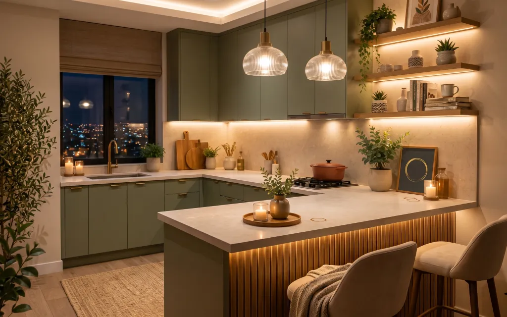
Why brass-and-olive lighting is the kitchen island of 2026
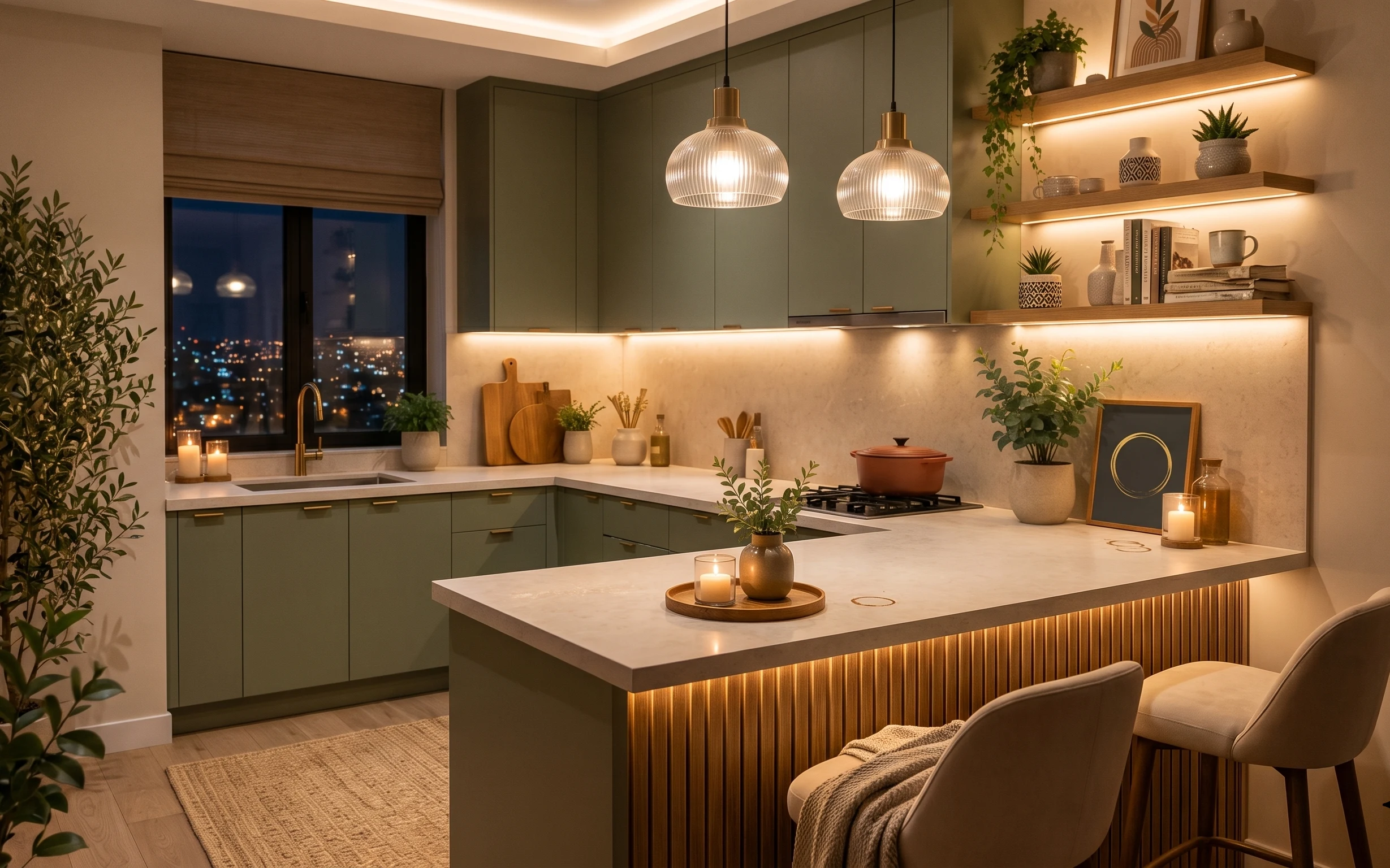
What I love here is how the whole island reads like a little stage: warm under-cabinet light, brass accents, and the contrast of olive-green plants against pale stone. You can get that same “styled but not precious” feeling with renter-safe swaps—especially soft textiles like a rug and a throw, plus countertop objects you can move room to room. The textures matter too: smooth ceramic, matte stone, and the slight glow from candles. This is achievable for US renters because every upgrade listed below comes off cleanly at move-out.
The first time I tried to copy this kind of look, I leaned too hard on matching sets—same color everywhere, same shape everywhere. It ended up feeling flat, like a catalog spread instead of a lived-in counter. What changed my mind was adding one anchored base (a rug) and then varying height: candles in jars at one height, a plant at another, and art up on the wall. Suddenly the island stopped looking “decorated” and started looking assembled.
Layer 1 — gray area rug ($150) Anchors the island zone underfoot
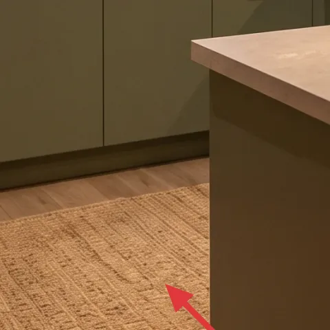
A medium-tone gray rug gives you the most visible “designer” impact in a kitchen because it creates a calm boundary for the island and the seating area. In the photo, the rug sits under the front edge of the kitchen floor and visually collects the warm chair and throw, so the whole scene feels intentional instead of floating. Choosing a rug that isn’t too dark helps prevent the space from feeling heavy, especially with warm lighting already doing most of the glow work. The trade-off is that lighter rugs show foot traffic, so you’ll want a quick vacuum routine.
Pick a rug with a texture you can feel
Even when the color is subtle, a woven texture keeps the look from going flat under warm light.
Layer 2 — woven candle tray ($35) Builds a “stackable” styling surface
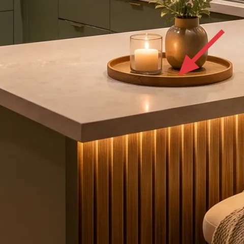
This woven candle tray is what turns scattered small objects into a composition. In the hero image it sits on the island with the candles, acting like a low platform that defines the center of the counter. I like trays here more than just placing items directly on stone because it helps you keep the same silhouette from different angles—standing at the sink, leaning on the island, or walking past. The trade-off is that you’ll need to wipe the tray regularly, since woven fibers can catch dust around candle heat.
Trays help even when you can’t change cabinets
When the cabinetry is fixed, styling platforms are the renter-safe way to create “new” hierarchy.
Layer 3 — pill candle ($30) Adds warm flicker without any wiring changes
A single pill candle in a lidded glass jar (like the ones in the hero) gives you that same soft, evening glow without touching the landlord’s hardwired lighting. The visual trick is scale: the small, compact candle sits in the middle of the island styling zone and reads clearly even with under-cabinet light running. This is one of the easiest swaps because you can move it to a shelf or windowsill later, then pack it away when the lease ends. The trade-off is that candles are consumables—so plan for replacement and keep your jar lids nearby for safety.
Don’t leave a candle unattended
Use within sight, keep it away from plants and linens, and never burn longer than the jar manufacturer recommends.
Layer 4 — framed wall art ($60) Brings the warm color story up to eye level
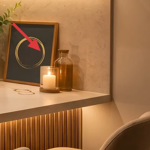
That framed print on the right side wall matters because it balances all the horizontal surfaces: stone counters, cabinetry lines, and the long underlighting. In the photo, the art sits above the backsplash area and echoes the warm palette—so your eyes travel upward instead of getting stuck on the counter. For renters, framed art is ideal because it can be hung with removable methods (like Command-style hooks) when your lease allows. The trade-off is that placement is everything: too high and it feels detached; too low and it competes with the backsplash details.
Match art to the strongest metal tone
In this space, brass reads as the dominant metal, so warm-toned frames feel more cohesive.
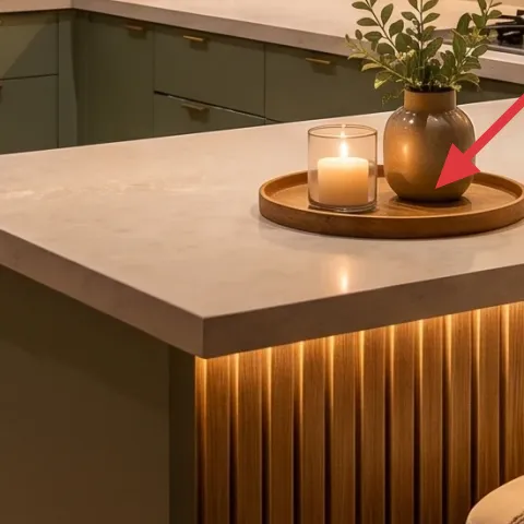
Layer 5 — brown ceramic vase ($25) Gives you shape and negative space
A brown ceramic vase (the warm, slightly speckled look in the hero) adds organic shape to an otherwise structured kitchen. On the island, it works because it’s both functional styling and visually textured—so it doesn’t feel like “just a container.” I’d rather use one statement ceramic than several tiny items because it keeps the counter from turning into a clutter pile. The trade-off is that ceramics can tip if you bump them, so use a stable base and avoid placing it right at the edge of the work zone.
Vase + plant reads more “intentional” than vase alone
Even a small sprig makes the vase feel like part of a scene, not an afterthought.
Layer 6 — small potted plant on counter ($35) Adds life without blocking the cooktop zone
The small potted plant near the backsplash adds that signature “green in the mix” without demanding floor space. In the hero, the plant sits at counter height and ties together the darker greens from other pots in the scene, so the kitchen reads layered instead of empty. Choose a plant with upright leaves if you’re trying to keep the counter clear near cooking—compact shapes look neat even when the rest of the island is busy. The trade-off is maintenance: plants need light and a regular watering rhythm, but it’s still an easy renter win because the plant is portable.
Wipe leaves, not just pots
Dust dulls green quickly; a quick wipe makes the plant look freshly placed.
Layer 7 — throw blanket ($30) Softens the seating area in one minute
The throw blanket on the chair adds that last touch of warmth that kitchens often miss—especially when everything is stone, metal, and cabinetry. In the hero image, the blanket’s neutral knit texture sits over the armchair, giving the room an obvious “you can relax here” cue. I prefer a draped throw over a folded one in a kitchen because it looks casually lived-in, not like a living room prop. The trade-off is that knit fibers can collect lint, so keep a small lint roller nearby and give the blanket a quick shake before guests.
Texture beats color matching
The knit’s texture works even when the blanket isn’t the exact same shade as the rug.
The cost, layer by layer
| Layer | Item | Cost |
|---|---|---|
| 1 | gray area rug | $150 |
| 2 | woven candle tray | $35 |
| 3 | pill candle | $30 |
| 4 | framed wall art | $60 |
| 5 | brown ceramic vase | $25 |
| 6 | small potted plant on counter | $35 |
| 7 | throw blanket | $30 |
| Total | $365 | |
If the rug budget is tight, look for a smaller rug size that still sits under the island-front zone—then add a textured runner down the main walkway to keep the island feeling grounded.
What worked, what didn't (across the whole room)
The biggest win is that the island looks styled at multiple heights, but still readable because the pieces are grouped into one clear center vignette. The warm lighting effect is also easy to mimic with tabletop candles and a layered plant mix, without touching any fixed fixtures.
What worked
- The gray rug creates a boundary for the island area, so the seating feels connected instead of separate.
- The woven candle tray makes small decor items look deliberate and keeps the counter from looking scattered.
- Brass-toned warmth in the styling objects echoes the fixed lighting, keeping the palette cohesive.
- The framed wall art balances all the horizontal lines from the backsplash and countertop.
- Plant height changes prevent the kitchen from feeling flat, especially near the backsplash.
- The throw blanket adds a soft texture that kitchens usually lack, making the island feel more inviting.
What didn't
- Too many small bottles and jars on the island can crowd the center and hide the candle glow.
- Placing decor right at the island edge makes it easier to bump while cooking or cleaning.
- Using only one green plant reads “decor” instead of “living”—a second plant height helps.
- Oversized wall art near the backsplash can visually compete with the underlighting strip.
What we'd skip if we did it again
Skip matching decor sets in every finish. In a kitchen, that kind of uniformity makes the counter look staged; mixing ceramic, woven texture, and matte stone reads more lived-in.
Skip hanging anything directly over the cooktop working area unless you can keep it well clear and stable. For renters, it’s smarter to place removable art and decor where it won’t become a constant safety trade-off.
Skip going all-in on a neutral-only palette if the fixed lighting is already warm. Add one olive-green plant accent (or a similar green tone) so the space has contrast beyond beige and stone.
Frequently asked
How long does this kitchen island refresh take?
Most of the time is styling and placement. Plan on about 2–3 hours total: rug vacuuming and smoothing, tray + candle grouping, a plant wipe and reposition, and then hanging the framed wall art with removable hardware.
Is this renter-safe if I can’t drill or install anything into the wall?
Yes. Every piece here is either freestanding (rug, tray, candles, plant, vase, throw) or wall art you can mount with removable hooks. The look is built around styling, not changing fixed landlord fixtures.
What if my kitchen is smaller than in the photo?
Go lighter on object count, not on height. Keep one candle cluster on the tray, use a single plant on the counter, and choose a rug size that still covers the main foot-traffic zone in front of the island.
What if my space is bigger and feels bare?
Add one extra “level,” not more clutter: a taller plant near the backsplash or a second framed piece on the same wall. The goal is to maintain clear grouping—center vignette on the island plus one upward anchor.
Where should I shop if I want this style on a budget?
For the fastest wins, shop for the rug texture, framed art, and candle jars at home goods stores and marketplace listings. Woven trays and ceramic vases are often less expensive when you mix sources—one thrift find plus one consistent finish.
What’s the biggest mistake people make with kitchen island styling?
They place too many small items directly on the stone so nothing feels anchored. Use one base (a tray or one larger vessel), then add just 2–3 supporting pieces that create different heights: candle, plant, and one vertical accent like framed art.
More in Kitchen & Dining
7 renter-friendly swaps for a $400 kitchen island
A renter-friendly kitchen island refresh you can pack up when the lease ends—built around warm lighting moments, a soft rug, and styled cou…
A calmer kitchen island corner for $700
Refresh a kitchen island corner with 7 budget-friendly upgrades, including a statement ceramic vase, a jute-style rug, and warm glass dome …
Glam kitchen island styling that feels designer for $600
A renter-friendly glam refresh for a kitchen island with $600 worth of swaps: a tufted bar-stool pair, styling pieces, and move-ready shelf…