- Best for
- A calmer, spa-like shelf feel
- Cost
- About $300
- Difficulty
- Easy (styling only)
- Time
- 1–2 hours
Why warm marble-and-shelf lighting is the renter bathroom of 2026
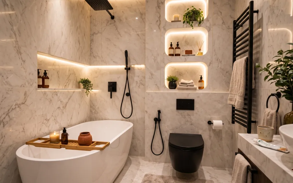
The first thing to notice here is how the warm illuminated niches make the marble-look tiles feel softer, not colder. The palette stays calm—warm white, marble gray, and black—then gets punctuated by natural textures: folded white towels, a small candle flame, and plant greenery. A wooden bath tray gives everything a grounding rhythm against the sleek tub shape. For renters, the trick is to borrow that same contrast: keep surfaces visually “clean,” then add texture in places you’re allowed to change (countertop, tub ledge, and freestanding styling).
I once tried to “fix” a bathroom like this with too many matching items—everything was the same color, and it ended up looking like a catalog photo instead of a space I’d actually use. The shift came when I started thinking in textures first: one linen stack, one glass-and-wax moment, one plant silhouette, and one warm ceramic accent. This is the balance that feels intentional without needing permission.
Layer 1 — large floor plant in pot ($45) Adds height without touching a wall
{{LAYER_1_FIGURE}}
A tall potted plant on the right side gives you that vertical “breathing room” the eye needs in a bathroom with big, glossy tile. It works here because the plant silhouette echoes the rounded shapes of the bathtub and the warm niche glow, while the leaves add contrast to all that marble-look veining. The freestanding placement is the real renter win: no drilling, no swapping fixtures—just a base you can lift out at move-out. The trade-off is that plants want light and a little water schedule, so pick a location that matches your day-to-day habits.
Scale it to the room’s height
In a tiled bathroom, a small plant disappears. Choose one tall enough that the top leaves land near your visual “light zones.”
Layer 2 — folded white bath towels ($60) Makes the niche styling feel lived-in
{{LAYER_2_FIGURE}}
These folded white towels read as “soft architecture”—they add a pile of clean texture that offsets marble-look tile slickness. In the photo, the towels sit in the illuminated niche zone, so the glow bounces off the fabric and makes the whole corner look brighter than it is. That’s why towels are better than, say, a single decorative cloth: you get volume, not just color. The trade-off is keeping them fluffy—overly thin towels look flat against the tile. Aim for a fold that’s consistent, then vary thickness by how you stack the edges.
Choose white, but buy texture
Plain white can look sterile unless the towel has visible weave or a subtle loop texture.
Layer 3 — candle in glass jar ($35) Adds warm movement next to the niche glow
{{LAYER_3_FIGURE}}
The candle in the glass jar is doing two jobs: it adds a second source of warmth, and it introduces a “tiny sparkle” detail that keeps the bathroom from feeling too minimal. Because it’s placed on the tub ledge area, the light stays close to the action—bath time—so it feels practical, not staged. It’s also a swap-you-can-pack layer: no hardware, no replacement fixtures, just a burnable accessory. The trade-off is safety and scent control—use it on a stable tray, away from towels, and keep the jar footprint small enough that it can’t get nudged.
Keep candles away from towel edges
Loose towel corners and heat don’t mix, especially in steamy bathrooms.
Layer 4 — small ceramic vessel (tan/terracotta) ($40) Warmth in one earthy shape
{{LAYER_4_FIGURE}}
This tan/terracotta ceramic vessel adds that earthy “human” note the marble-look tiles would otherwise dominate. It works because it’s both warm-toned and tactile—your eye reads it as handcrafted compared with the crisp, graphic tile veining. Placing it with the candle and tray gives you a small grouping with different materials (ceramic, glass, wood), which is the easiest way to look designed without buying a full set. The trade-off is finding the right scale: too small looks like clutter; too big crowds the tray. Aim for a vessel that’s clearly visible but still leaves negative space.
Pair ceramic with one glass item
Marble + ceramic alone can feel flat. Glass (a jar candle or bottle) adds the reflective “pop.”
Layer 5 — wood bath tray ($35) Organizes the tub ledge like a mini station
{{LAYER_5_FIGURE}}
The wood bath tray is the organizer that makes everything else look intentional. Here, it anchors candle + ceramic + bottle styling in a warm rectangle against the smooth tub and marble-look ledge. A tray beats scattered items because it creates a visual boundary—your styling reads as one composition, not five separate “things.” It also helps practical flow: bottles don’t roll, towels don’t brush the counter edge, and you can wipe everything as one unit. The trade-off is surface care—wood needs a quick dry-off after splashes so it doesn’t look tired or spotty.
Use a tray with a raised lip
A slight edge keeps oils and water from migrating when the bathroom gets humid.
Layer 6 — potted tabletop plant in black pot ($30) The green accent that matches the black hardware
{{LAYER_6_FIGURE}}
The small potted plant in a black pot is the quiet connector between all the other elements. The pot color ties into the black fixtures and pump bottles, while the leaves add softness right where your eye focuses—near the warm niche glow. This is a more renter-friendly choice than changing tiles or adding wall-mounted planters, because it stays freestanding and easy to swap. The trade-off is you’ll need to keep it looking tidy: trim straggly stems and rotate the pot so it grows evenly toward the light.
Rotate every week
Most tabletop plants lean. A quick rotation keeps the silhouette symmetrical.
Layer 7 — apothecary-style soap bottles on shelf ($50) Gives the “spa shelf” a finished rhythm
{{LAYER_7_FIGURE}}
Those apothecary-style bottles on the shelf are what make the bathroom feel curated instead of random storage. Their consistent shapes and warm amber color repeat across the niche zone, so your eye gets a pattern to follow. This works particularly well in rooms with strong tile lines because the bottle shapes “reset” the geometry with organic product silhouettes. Instead of buying a full cabinet organizer system, you’re buying three or four bottles and arranging them in a tight cluster. The trade-off is space: keep the number of bottles limited, and choose a refillable or easy-to-clean option to avoid sticky residue.
Avoid mismatched labels
If the bottle labels clash in font and color, the shelf reads messy. Stick to a cohesive set.
The cost, layer by layer
| Layer | Item | Cost |
|---|---|---|
| 1 | large floor plant in pot | $45 |
| 2 | folded white bath towels | $60 |
| 3 | candle in glass jar | $35 |
| 4 | small ceramic vessel (tan/terracotta) | $40 |
| 5 | wood bath tray | $35 |
| 6 | potted tabletop plant in black pot | $30 |
| 7 | apothecary-style soap bottles on shelf | $50 |
| Total | $295 | |
If you want to go cheaper, downshift the “centerpieces”: choose one plant, one candle, and a smaller ceramic vessel, then put most of the budget into towels and the wood tray (those read the most in photos).
What worked, what didn't (across the whole room)
The overall effect comes from stacking softness (towels + candles) against the crisp tile lines, then repeating a few warm materials across the niche shelf zone. The room stays calm because the accessories share shape language and sit inside the boundaries of a tray and niches.
What worked
- Warm glow plus white towels creates a brighter “surface” without adding any new fixtures.
- The wood bath tray keeps bottles and objects from looking scattered on the tub ledge.
- Plant silhouettes add softness and balance the strong marble-look veining.
- Amber-toned soap bottles repeat across niches, so the shelf styling reads cohesive.
- The candle jar gives a subtle, moving highlight near the bathing zone.
- Terracotta ceramic brings the earthy note that keeps the palette from feeling too sterile.
What didn't
- If the towels are too thin, the niche glow makes them look “flat” instead of plush.
- Overbuying accessories can make the tray feel crowded against the clean tub lines.
- Plants that lean or shed leaves make the styling look neglected fast in humid bathrooms.
- Mixing bottle sets with different label styles breaks the spa-shelf rhythm.
What we'd skip if we did it again
Skip adding extra decor that doesn’t belong to a boundary. In this kind of bathroom, the tray and niche zones do the heavy lifting—loose items on counters and ledges quickly read messy.
Skip buying a full matching set of everything from one store. A cohesive shelf is about repeating a few materials (wood, glass, ceramic) and one warm color family—not about every object being identical.
Skip “just one” textile. One towel often looks like laundry. Instead, stack folded towels so you get volume, clean edges, and that soft contrast against the tile lines.
Frequently asked
How long does this bathroom refresh take?
For most renters, plan for about 1–2 hours. The time goes into arranging the tray so the candle, ceramic, and bottles form one small grouping, then folding towels with consistent edges. Plants add a few extra minutes for positioning and rotating so they face the light.
Is this renter-safe if my lease doesn’t allow changes?
Yes. This look avoids painting and avoids swapping landlord-installed fixtures. Everything here is removable—plants, towels, candles, tray styling, and freestanding decor. When you move out, you can box the items and keep the bathroom layout intact.
What if my bathroom is smaller than the photo?
Go down in scale, not in materials. Use one plant (either tabletop or floor), choose a smaller tray, and keep the bottle count to a tight cluster. If the niche area feels crowded, prioritize towels + one candle and simplify the rest.
What if my bathroom is brighter and cooler than this one?
Lean into warmth where you can control it: pick amber-leaning bottles, warm-toned ceramic, and a candle jar that throws a soft glow. The goal is to avoid a stark contrast between cool light and warm objects that look mismatched.
Where can I shop for these pieces without it getting expensive?
Start with towels and candle jars at big-box home stores, then use marketplaces or consignment shops for trays and decor. For the “apothecary” bottle look, match shape and color first, and don’t worry about brand names—consistency matters more than exact product type.
Biggest mistake to avoid in a tile-heavy bathroom like this?
Overcrowding the ledges. When everything is decorative, nothing looks intentional. Keep one organizing surface (like the tray) and repeat the same warm material language across niches.
More in Bathroom
What $300 buys: a warm marble renter bathroom refresh
A renter-friendly bathroom refresh with no-drill styling: warm lighting emphasis, folded towels, and shelf-calm accessories. This look fits…
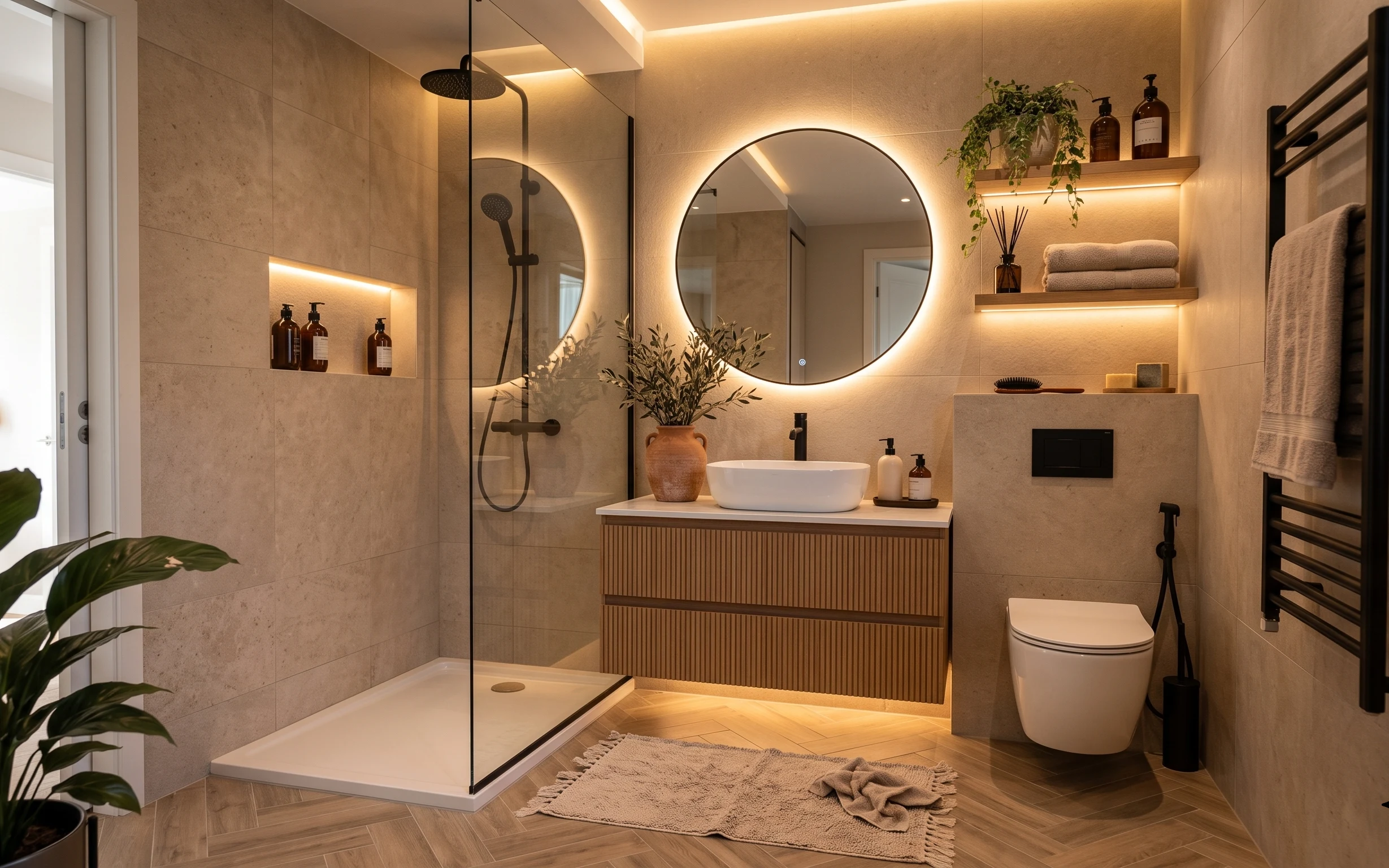
What $1000 buys: a spa-style bathroom refresh
A spa-style bathroom can feel calmer and more finished with just a few weekend upgrades. This $1000 refresh focuses on the backlit round mi…
What $200 buys: a move-ready spa bathroom feel
A spa bathroom refresh on a $200 budget that stays renter-safe: swap textiles, add plant life, and use a reflection-friendly styling trick.…