- Best for
- Renter living rooms with big windows
- Cost
- About $690 total
- Difficulty
- Easy to moderate
- Time
- 1 weekend
Why warm earthy-neutrals are the garden-facing living room of 2026
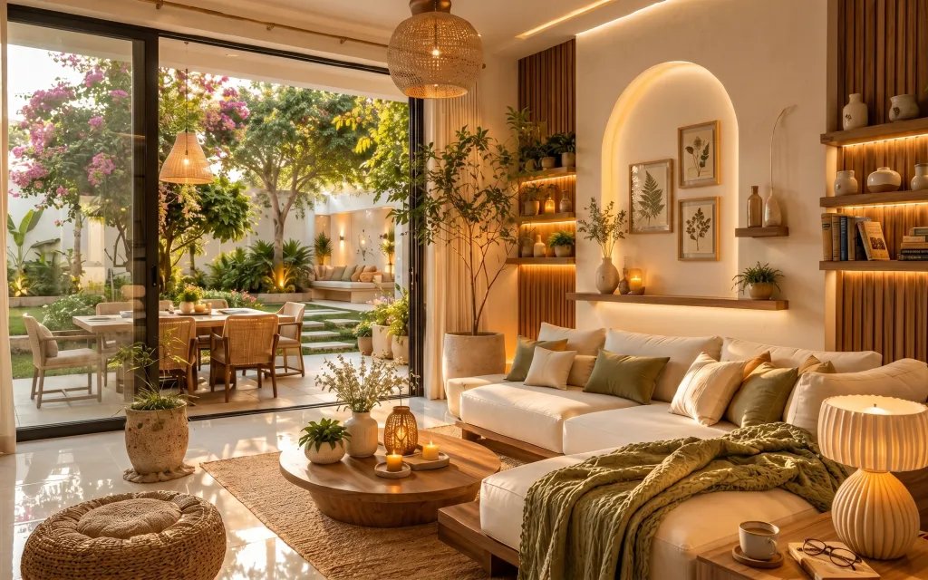
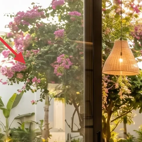
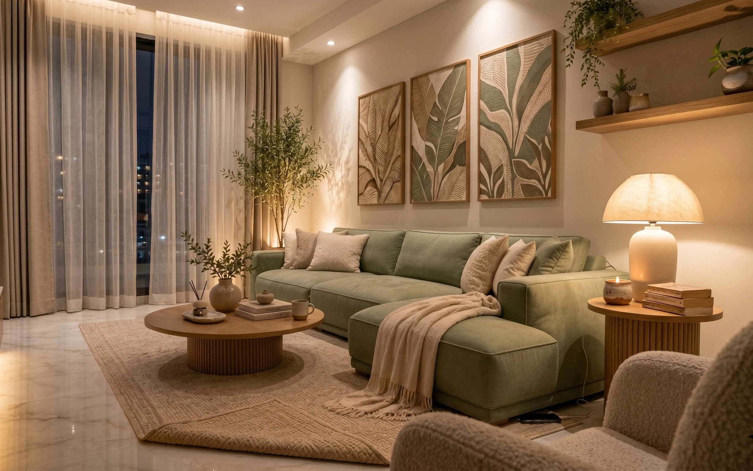
Sunlight in the hero does most of the heavy lifting, but the styling choices are doing the rest—especially the jute-look area rug under the coffee table, the cream curtains framing the doorway, and the olive-green throw blanket that adds depth without going loud. The warm wood tones and woven textures pull the room toward “cozy day,” even when the view is bright. This is achievable for renters because it relies on removable textiles, freestanding decor, and Command-friendly wall styling.
I used to think this kind of look had to come from permanent changes—new paint, maybe even a whole layout shift. Then I noticed how often the same shapes show up in design spreads: layered textiles, warm surfaces, and framed botanical art grouped with intention. When I stopped chasing the “perfect” foundation and started repeating materials (linen, wood, ceramics, plant life), the room finally started to feel finished.
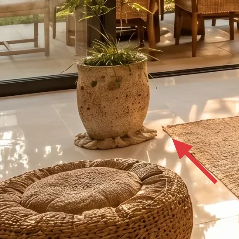
Layer 1 — area rug 8×10, jute-look (layered underfoot) ($200) Grounds the coffee table without hard edges
Start with a medium-to-large area rug in a jute-look texture, like the one beneath the round wooden coffee table in the hero. The texture matters: it reads woven in daylight, but it also softens the shine from the glossy tile floor when the lamps/candles come on. Choosing a size large enough to tuck at least the front legs of seating (or to visually anchor the whole coffee-table zone) keeps the room from feeling like a rug “sticker.” A quick trade-off: you may need to add a rug pad for grip, but it’s still renter-safe and packable at move-out.
Go bigger than you think
In a bright, open room, a small rug floats. Oversizing helps the coffee-table styling feel intentional.
Layer 2 — curtains, full-length linen in cream ($80) Frames the view like architectural trim
Cream, full-length curtains are the quiet move that makes the whole scene feel dressed—because they give the doorway a “finished” edge the photo already uses as a visual anchor. In the hero, the curtain folds sit on the light side, so they don’t compete with plants and window light; they just add rhythm. For renters, this works because you can use tension or existing rod setups and remove everything at the end of the lease. The trade-off is maintenance: linen-look fabric benefits from careful spot cleaning to keep the color even.
Why cream works here
Against warm wood and olive accents, cream reads cohesive instead of flat.
Layer 3 — round wooden coffee table with warm stain ($120) Gives you a styling “landing pad”
A round wooden coffee table brings two benefits at once: it echoes the room’s warm, curved lamp shades, and it makes it easy to style candlelight and ceramics without harsh corners. The hero uses the table as a central organizing surface, with the decorative tray and candles placed in the middle so the light pools rather than scattering. If you’re choosing between round vs. rectangular, the round option wins for a window-heavy layout—it visually calms the line of sight. The trade-off is storage flexibility: a coffee table with a clear top means your tray has to do the organizing job.
Style a center, not a clutter field
Keep the tallest items near the center so the rest of the table reads calm.
Layer 4 — cluster of candles on decorative tray ($35) Adds soft, warm depth after sunset
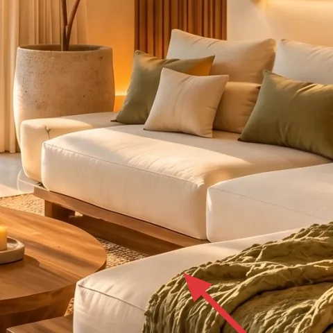
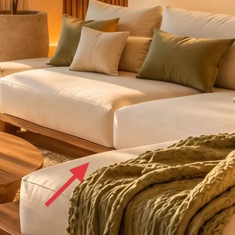
The hero’s candle cluster is what turns a sunny room into an evening room. You’re not trying to get “party lighting”—you’re creating small pools of warm glow that echo the warm wood and terracotta-toned ceramics. This works on a renter budget because candles are easy to swap seasonally, and they don’t require any fixture changes or wiring. The trade-off: you’ll need to use real candles safely and keep flammables like curtains and plants a comfortable distance away.
Don’t stack too high
Tall candles make the table feel top-heavy and can look messy next to curtains and plants.
Layer 5 — decorative tray on coffee table ($35) Keeps candle styling tidy and transportable
A decorative tray is the styling “system” that makes candles, glass containers, and ceramics look curated instead of accidental. In the hero, the tray sits centered on the round coffee table, acting like a boundary for the candle cluster and giving the surface a consistent shape. Choosing a tray in a warm neutral (wood, rattan, or a ceramic-like tone) helps it disappear into the overall palette rather than fighting the rug. The trade-off is that trays take up usable surface area—so it’s best to treat the tray as the main station and keep the rest of the table clear.
Use the tray to control height
If the candles and jars vary in height, the tray keeps the arrangement looking intentional.
Layer 6 — large ceramic planters (front corner) ($40) Brings life close to the rug
That front-corner moment with large ceramic planters is doing a lot: it adds scale, softens the edges of the seating zone, and gives the eye something to land on between the rug and the wall shelving. In the hero, the planters read earthy and speckled, which keeps them from looking too precious for everyday rental living. This is renter-friendly because large planters are freestanding—you can move them to a patio, swap them for a different plant type, or pack them away when you move. The trade-off is weight: ceramic gets heavy, so place it where you can easily reach without dragging.
Match tones, not plants
Use ceramic color (cream/earth) to tie to candles and prints, even if the plant variety changes.
Layer 7 — framed botanical prints (set of 3) ($180) Creates a curated wall pocket without drilling
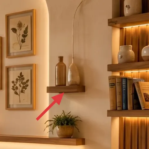
Multiple framed botanical prints on the right wall give the room a soft, garden-influenced rhythm that pairs perfectly with the window view. In the hero, the frames are grouped near the arched mirror area, so the botanical theme repeats at two scales: leaf shapes inside frames and real foliage outside. For renters, the key is mounting without damage—use Command Strips or picture-rail hooks if you have a rail already. The trade-off: prints should be close enough to read as a set, but not so tight that they overlap visually with the shelves.
Keep mat colors warm
Off-white or cream mats prevent the botanicals from looking too cold next to warm wood.
The cost, layer by layer
| Layer | Item | Cost |
|---|---|---|
| 1 | Area rug 8×10, jute-look (layered underfoot) | $200 |
| 2 | Curtains, full-length linen in cream | $80 |
| 3 | Round wooden coffee table with warm stain | $120 |
| 4 | Cluster of candles on decorative tray | $35 |
| 5 | Decorative tray on coffee table | $35 |
| 6 | Large ceramic planters (front corner) | $40 |
| 7 | Framed botanical prints (set of 3) | $180 |
| Total | $690 | |
If the botanical frames feel pricey, swap to two larger framed botanical prints instead of three small ones, and use one oversized frame above the shelf line. That keeps the same “leaf repeat” effect while cutting the overall cost.
What worked, what didn't (across the whole room)
The combination of a textured rug, cream curtains, and warm ceramics created a cohesive, garden-forward vibe even though the lighting is busy. The candle-and-tray approach also helped the coffee table look styled rather than cluttered.
What worked
- The jute-look rug anchored the coffee-table zone and softened the glossy tile reflection.
- Cream curtains framed the bright doors without adding a second strong color story.
- The round coffee table kept candlelight from feeling boxy and made the center feel intentional.
- The tray gave the candle cluster structure, so varying jar shapes still read curated.
- Large ceramic planters brought plant scale close to the seating, balancing the wall decor.
- Botanical frames repeated the leaf shapes from the window view for a cohesive “garden” theme.
What didn't
- Too many candle heights at once can make the coffee table look top-heavy next to cushions.
- Curtains that are too short visually cut the window area and make the room feel unfinished.
- Smaller framed prints in a tight group can get lost against the warm shelving line.
- Planters placed too far from the rug break the connection between floor texture and decor scale.
- Choosing a rug with a very cool gray tone fights the warm wood palette.
What we'd skip if we did it again
Skip buying lots of matching small decor objects to “fill in” the coffee table. In rooms with windows and plants, the better move is one centered station: rug + tray + candle cluster, repeated with ceramic tones elsewhere.
Skip oversized wall art that crowds the shelves and competes with the botanical frames already doing the leaf-repeat work. A set of framed botanicals creates rhythm without swallowing the arched mirror zone.
Skip cold-toned textiles (gray curtains, blue-gray rugs) that don’t match the warm wood and cream palette in the hero. Warmer neutrals make the room feel intentional in daylight and still flattering at night.
Frequently asked
How long does this kind of renter-friendly refresh take?
Plan on about a day for styling and surface setup, plus an extra morning if you’re matching curtain fabric or sorting frames into a clean group. Most of the time goes into getting scale right—rug size, candle placement height, and spacing for framed botanicals—because those choices make the room look “finished” rather than temporary.
What’s the safest way to hang the framed botanical prints as a renter?
Use Command Strips rated for the frame weight, or picture-rail hooks if your building already has a rail. The goal is to avoid drilling and wall anchors entirely. Measure the frame group first, then do a quick mock placement on the floor to confirm spacing before sticking anything to the wall.
My room is smaller than the hero. How do I scale this down?
Keep the same material palette (cream curtains, warm wood, olive throw) but reduce the grouping size: use a smaller rug footprint that still anchors the coffee table, and choose either two botanical frames or one larger frame above the shelf line. For candles, fewer pieces look better—aim for one tray with 2–3 candles rather than a big stack.
What if my room has a different light level (dimmer or brighter)?
Brighter rooms can handle more texture and darker accents, while dimmer rooms benefit from sticking to cream textiles and lighter ceramic tones. If the space is darker, prioritize the curtain fabric transparency and keep the candles clustered so the warm glow is concentrated where you want it.
Where should someone shop differently to stay on budget?
For the rug and curtains, look for store brands or off-season colorways that match warm neutrals. For candles and ceramics, thrift stores are great for jar shapes and earthy containers—just keep everything in a consistent palette. For framed botanicals, choose pre-made sets and then refine by spacing rather than buying five separate frames.
Biggest mistake people make with this look?
Overstuffing. When there are already plants, window light, and shelving, the room needs fewer but larger decisions: one rug, one centered tray, one candle cluster, and a tight frame grouping. If the coffee table has too many tall items and the wall art group is too spread out, the whole look starts to feel busy.
More in Living Room

What $700 buys: a garden-facing living room update with warm texture
A garden-facing living room refresh built for renters using no-drill upgrades and renter-safe decor. With a $700 budget ceiling, this setup…
5 renter-friendly swaps for a green sofa corner for $600
A green sofa corner gets calm, japandi energy with no-drill swaps. For about $600, this refresh adds a textured rug, taupe drapes, framed b…
7 no-drill swaps for a $300 sofa seating area
A warm japandi sofa seating area refresh for renters using no-drill swaps, soft textiles, and plug-in lighting for about $300. The result: …