- Best for
- Renter-friendly sofa seating areas with warm, earthy neutrals
- Cost
- $275 total (about $300 budget cap)
- Difficulty
- Easy (mostly textiles + plug-in lighting)
- Time
- 1 weekend afternoon + 1 small art session
Why olive-and-cream no-drill styling is the sofa seating area of 2026
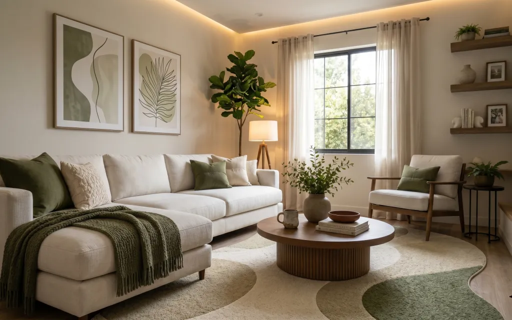
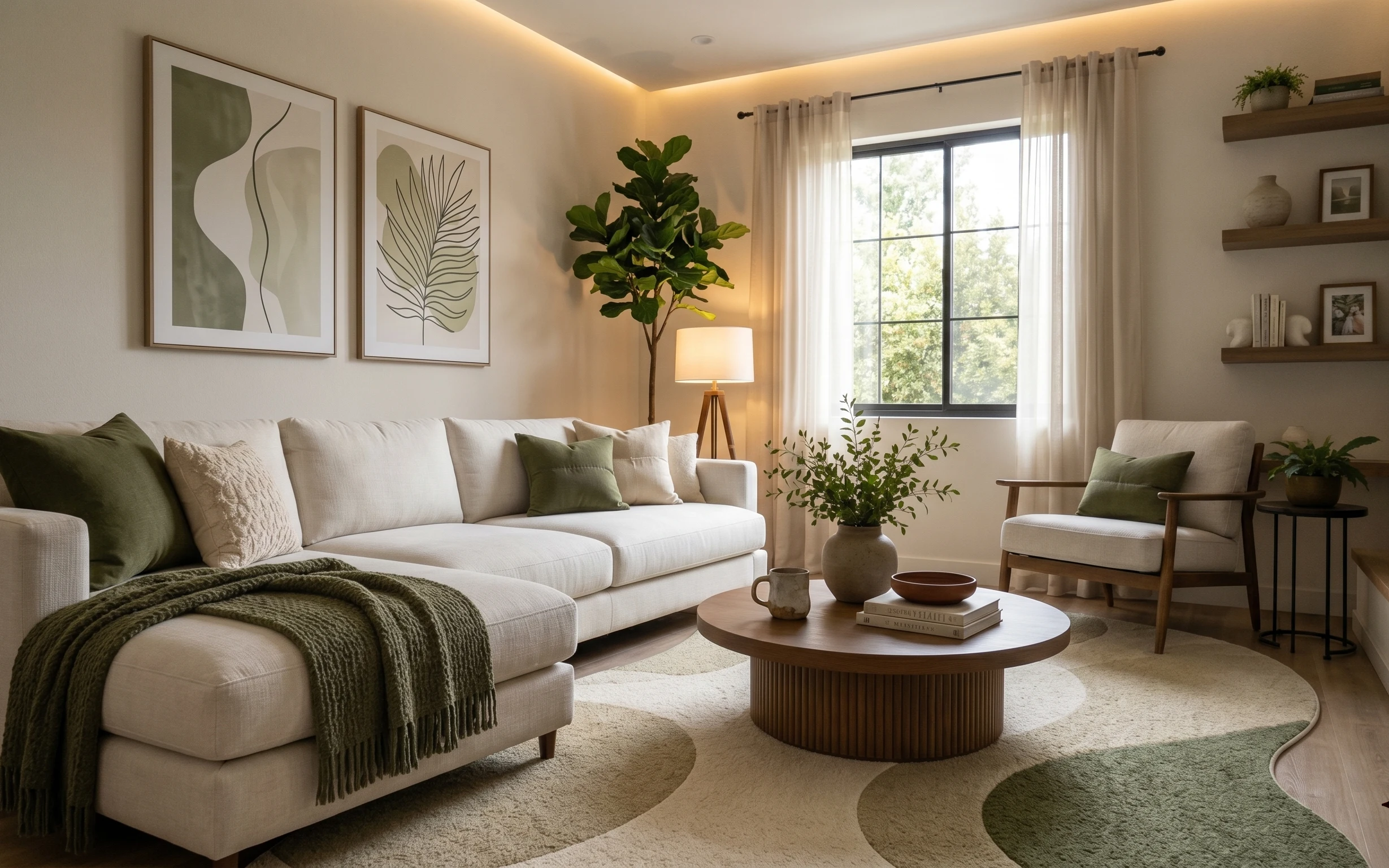
What I love here is how calm the palette stays while the textures do the talking. The cream sofa and armchair ground everything, while the olive knit throw and textured beige rug add a grounded, slightly rugged feel. The white curtain panels soften the harshness of windows, and the warm lamp shade keeps the room from looking flat after dark. This is the kind of mix you see in recent japandi spreads: light neutrals, a single plant moment, and just enough contrast to keep it from going beige-on-beige.
I almost overdid it the first time I tried to copy this “quiet but not sterile” look. My mistake was layering too many patterns at once, which made the room feel busier than it actually was. In this setup, the framed abstract print and the botanical print both stay graphic and minimal, so the textiles can be the main softness. Once the lighting and rug are in place, everything else reads more like styling than decorating-for-decorating’s-sake.
Layer 1 — Area rug 5×7 (beige textured) ($80) Textured underfoot that hides wear
A beige 5×7 area rug anchors the seating zone and visually ties the cream sofa, olive throw, and warm lamp glow together. In the photo, the rug’s short, textured weave keeps the floor from feeling too empty, especially where the coffee table sits. The obvious alternative is a thin flat-weave, but that tends to show footprints and looks “temporary” under a big sofa. Choosing a textured rug gives you depth right away, and it’s renter-safe to roll up when the lease ends.
Rug placement trick
Center the rug under the front legs of the sofa and armchair so the seating feels like one pulled-together area.
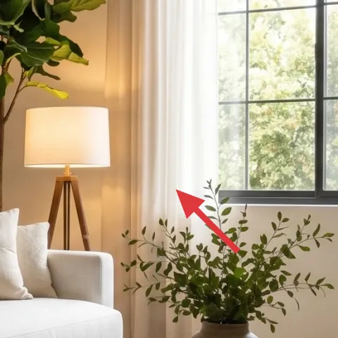
Layer 2 — White curtain panel pair (84") ($30) Sheer softness without the blackout drama
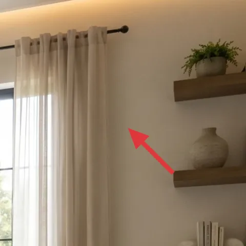
White curtain panels soften the window wall and add height, which matters in a sofa seating area because tall sightlines make the whole room feel bigger. In the hero, the curtain panels sit on a ceiling-height rod, creating a clean frame around the window and balancing the darker furnishings at the right. The easy alternative is short curtains that only cover the window—pretty, but they make the wall feel chopped up. Panel pairs are also one of the fastest ways to introduce movement and softness without changing any landlord fixtures.
Why panels work with this palette
The curtains keep the cream base light, so the olive throw can stay the strongest color note.
Layer 3 — Olive knit throw blanket ($25) Adds the tactile “japandi” contrast
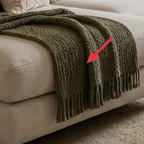
The olive knit throw is what turns a neutral sofa into a lived-in moment. It’s draped over the sofa in the photo in a way that looks casual but intentional, and the chunky knit texture catches the warm light from the lamp. The trade-off with knit throws is shedding—so it helps to shake it out and choose a blend that’s meant for everyday use. If this look had only pillows and no big texture, it would read flatter; the throw gives you that “one patterned element” feel without introducing new prints everywhere.
Don’t pick an olive that’s too brown
If the throw leans too khaki, it fights the fresh green notes in the pillows and the plant.
Layer 4 — Framed abstract print (DIY hand-painted cardstock) ($35) One bold graphic that stays move-friendly
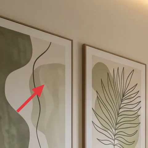
That abstract print on the left is the visual divider between “soft textiles” and “clean lines.” The graphic shapes are muted, but they still add structure to the wall, and framing keeps it crisp enough to feel curated. For renters, a simple cardstock-and-acrylic DIY is a smart substitute: you get the same role in the room (color + composition) without paying for multiple framed originals. The trade-off is you’re responsible for clean edges—so the best approach is light pencil sketching first, then paint with thin layers.
Make it instead of buying it
DIY a minimal abstract print on cardstock and place it in an affordable frame, so the wall gets the same calm graphic anchor as in the photo.
Materials
- Cardstock (11×14 or larger) — 1 sheet — craft store — $12
- Acrylic paint set (starter colors) — 1 set — art store — $8
- Thin paintbrush (detail) — 1 — craft store — $6
- Affordable frame (matches wall frames) — 1 — thrift or craft store — $4
Steps
- Sketch 2–3 abstract shapes lightly on the cardstock with pencil, keeping edges simple.
- Paint the light base shape first and let it dry fully.
- Layer in the darker lines with a thin brush, following the same rhythm as the hero print.
- Build one olive/green accent area, keeping it semi-abstract (no tiny details).
- Let the paint dry completely, then check for streaks or smudges under bright light.
- Place the finished paper into the frame and close it snugly.
- Hang with picture-rail hooks or removable methods available in the current space.
- Step back and align the print so it visually balances the second botanical print.
Total DIY cost: $30 — saves about $5 over buying.
Layer 5 — Plug-in floor lamp with fabric shade ($60) The warm glow that makes neutrals feel finished
A plug-in floor lamp with a fabric shade is what makes the room feel soft instead of flat. In the photo, the lamp’s warm light creates a gentle “pool” that makes the cream upholstery look creamy rather than gray. It also gives height to the seating area, which is crucial when most of the visual weight sits low (rug + sofa + coffee table). The obvious alternative is a bright LED bulb in a cheaper fixture, but that can wash out olive tones. A fabric shade and warm bulb choice keep the whole palette cohesive.
Place it to light the wall
Angle the lamp so some light hits near the framed art, not only the floor by your feet.
Layer 6 — Indoor plant tree in a pot ($30) Brings the outside in without clutter
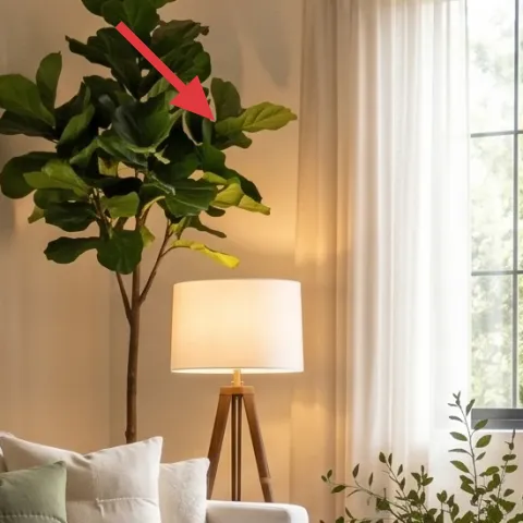
The tall potted tree is a vertical anchor that balances the sofa’s long, horizontal line. In the hero, it sits near the window and pulls the eye upward, while the greenery echoes the olive throw and the green pillows. If the plant were smaller, it would feel decorative instead of structural; if it were too big or bushy, it would compete with the framed prints. A mid-height indoor tree hits the sweet spot for a renter setup: easy to reposition, and it adds color without needing wall modifications.
Match the plant to the palette
Look for leaves that read true green, not neon, so they harmonize with olive textiles.
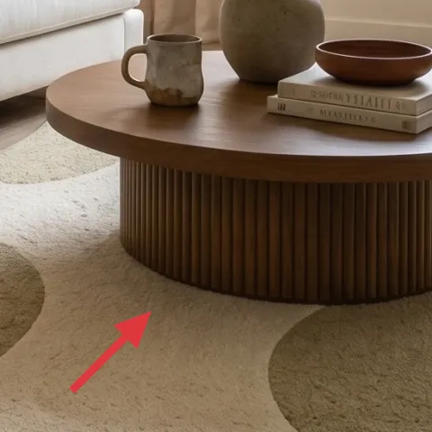
Layer 7 — Decorative ceramic bowl on coffee table ($15) Small ceramics that read “styled,” not random
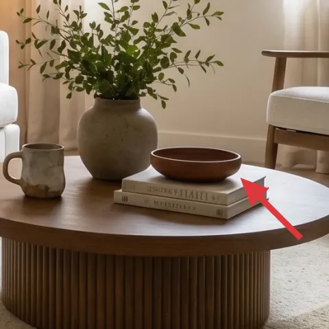
A decorative ceramic bowl on the round coffee table adds a finishing layer that feels intentional at a glance. In the photo, the bowl’s warm tone sits with a couple of everyday objects, giving the table surface a tidy rhythm without needing a cover or complicated styling. The alternative is loading the table with many small items, but that often looks cluttered once dust and daily life start accumulating. With one bowl, you get a clear focal object that works with the warm lamp and the beige rug, and you can move it from room to room when the lease ends.
Use one surface rule
Keep the coffee table to 1–3 objects total—then vary height with a book stack or plant leaf.
The cost, layer by layer
| Layer | Item | Cost |
|---|---|---|
| 1 | Area rug 5×7 (beige textured) | $80 |
| 2 | White curtain panel pair (84") | $30 |
| 3 | Olive knit throw blanket | $25 |
| 4 | Framed abstract print (DIY hand-painted cardstock) | $35 |
| 5 | Plug-in floor lamp with fabric shade | $60 |
| 6 | Indoor plant tree in a pot | $30 |
| 7 | Decorative ceramic bowl on coffee table | $15 |
| Total | $275 | |
If the curtain panels feel too pricey for the moment, swap in a slightly lighter fabric pair or a smaller panel width and focus the savings on the rug texture and the plug-in lamp shade.
What worked, what didn't (across the whole room)
The overall formula works because the palette stays restrained and the textures do the heavy lifting. Warm lamp light plus one strong graphic print prevents the space from reading too generic.
What worked
- The beige textured rug gives the sofa seating area a grounded base that hides everyday scuffs.
- White curtain panels add vertical softness, making the window wall feel taller and cleaner.
- The olive knit throw introduces tactile contrast without adding extra patterns.
- The framed abstract print provides structure so the room doesn’t drift into “only neutrals.”
- The plug-in floor lamp warms up cream upholstery and makes neutrals look richer at night.
- The tall potted tree brings height and color while staying easy to move.
What didn't
- Stacking too many small decor pieces on the coffee table would make the styling feel crowded quickly.
- Using a cooler lamp bulb would wash out the olive and make the cream look slightly gray.
- Choosing a flat, thin rug would reduce the “finished” look under a large sofa.
- Adding additional bold prints around the framed pair would compete with the calm graphic rhythm.
- A plant that’s too short would lose the vertical balance against the sofa’s long line.
What we'd skip if we did it again
Skip swapping in multiple new framed pieces at once. One abstract print plus one botanical print is enough structure; more can push the room into “busy gallery” instead of calm japandi.
Skip a floor lamp with a bright white bulb or a hard, reflective shade. The warm lamp glow is doing real work here, and cheap lighting choices tend to dull cream and flatten olive tones.
Skip over-styling the coffee table. Stick to a ceramic bowl plus a couple of purposeful objects—so the rug, curtains, and throw stay the dominant texture story.
Frequently asked
How long does this kind of renter refresh usually take?
Most of the work is textiles and styling placement, so it’s usually 3–5 hours spread across one afternoon. Hanging framed art and dialing in rug and curtain position can take another 1–2 hours. The DIY abstract print is the wild card—plan on about an extra evening for dry time and careful brushwork.
Is this doable if I’m staying in a rental with strict rules?
Yes, because the main upgrades are renter-safe: an area rug you can roll up, curtain panels you can hang with a standard rod, and plug-in lighting that doesn’t touch electrical boxes. The wall art can be hung with renter-safe methods like picture-rail hooks where available. The goal is to keep every purchased item removable at the end of the lease.
What if my living room is smaller than the photo?
Scale down the rug size first and keep the sofa seating area “zoned” by centering the rug under the front legs. For the curtains, avoid overly heavy drapery—light white panels keep the wall feeling tall. If the plant space is tight, choose a narrower tree with the same height and keep the coffee table styling minimal.
What if my room is larger and feels empty?
Add one extra soft textile layer instead of extra prints—another throw or more pillows in cream and olive can extend the texture story. Consider a taller plant for more vertical balance, and place the floor lamp a bit farther from the seating so the light cone spreads across the area. The framed art can also be hung slightly higher to “lift” the wall.
Where should I shop if I want the same look on a budget?
For this specific palette, look for rug and throw options in natural fibers and knit textures rather than glossy synthetics. Thrift or discount craft stores are great for affordable frames and ceramic objects. For curtains, search for white or off-white panel pairs in neutral lengths and prioritize fabric that drapes easily.
What’s the biggest mistake people make with this style?
The most common miss is adding too many accent colors or competing patterns. This look depends on a controlled olive-and-cream range and texture variety (rug weave, knit throw, fabric shade). If the framed art isn’t limited in colors or the curtains are patterned, the room stops feeling calm and starts feeling mismatched.
More in Living Room
7 no-drill swaps for a $300 sofa seating area
A warm japandi sofa seating area refresh for renters using no-drill swaps, soft textiles, and plug-in lighting for about $300. The result: …
7 renter-friendly no-drill swaps for a $500 sofa corner refresh
A renter-friendly sofa corner refresh for under $500: warm lighting, two pillow colors, a framed botanical print, and a plant that makes th…
Under $300: move-ready living room refresh with 7 swaps
A boho living room refresh for shared housing that you can pack up in a year or two. With $300 worth of soft-goods swaps and small decor, t…