- Best for
- Soften a living room corner with layered texture
- Cost
- $700
- Difficulty
- Moderate
- Time
- One weekend
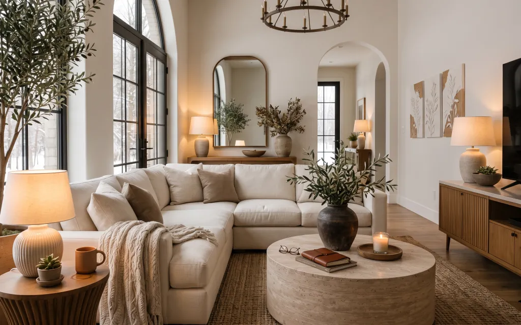
Why warm neutrals and botanical prints are the sofa-and-console living room corner of 2026
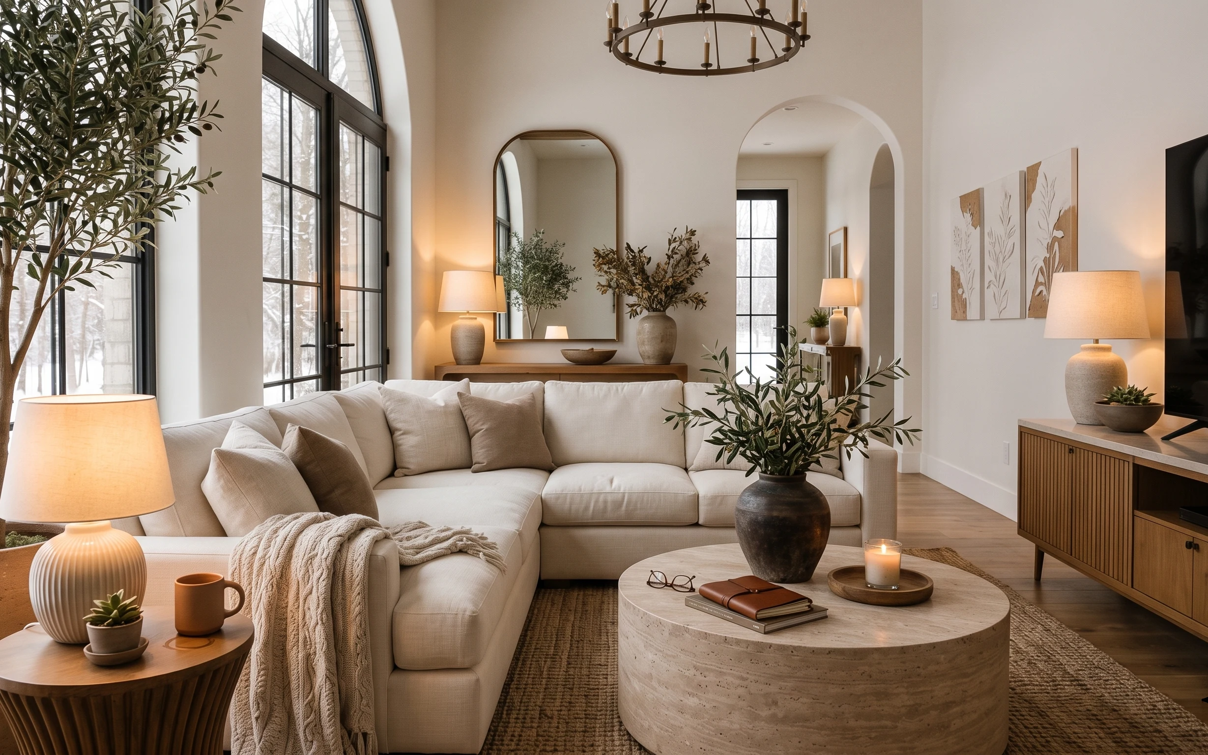
The hero here is a quiet mix: a cream fabric sofa with soft pillows, a beige and taupe area rug under everything, and that arched mirror that makes the whole back wall feel deeper. In my own living room redo (my fifth, and definitely not the first time I overbought pillows), I learned that texture does the heavy lifting—think knit throw blanket + matte rug + ceramic vase. This look works on a homeowner budget because the upgrades are mostly “surface wins,” not structural changes: new textiles, lighting that reads warm, and wall art that gives your eye somewhere to land.
My mistake the first time I tried to copy this vibe: I matched too many things. The rug was fine, but I kept adding “the same shade” until it all blended into one flat beige. What changed my mind was pulling contrast forward—warmer lamp light, a slightly deeper taupe rug, and botanical prints with enough line detail to feel intentional. Once I did that, the corner finally looked styled instead of decorated.
Layer 1 — Beige and taupe area rug ($150) Grounds the sofa in one soft zone
A beige and taupe area rug is what makes this seating area read as a “room within a room.” It sits directly under the coffee table and tucks the sofa legs into the same visual footprint, so the space feels anchored instead of floating. Choosing a rug with both beige and taupe (not just one color) helps the throw blanket and ceramic pieces look coordinated without matching perfectly. The trade-off is that rug shopping is fiddly—you’ll measure twice and live with the pile height decision—but it’s the quickest fix for visual organization.
Pick rug size from the sofa, not the coffee table
Let the front sofa legs and the coffee table sit on the rug; that’s the easiest way to avoid the “rag under furniture” look.
Layer 2 — Cream throw blanket on the sofa ($50) Adds texture without changing the palette
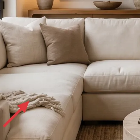
This cream throw blanket is draped where your eye already rests: along the sofa arm and front edge, with visible knit texture. That matters because the rest of the palette is mostly smooth—pillows, ceramic, and a matte rug—so the throw gives you tactile contrast. The obvious alternative is a lighter “buttoned” throw or a sleek faux-satin version, but texture reads more natural and pairs better with the botanical styling. The trade-off is maintenance: if you choose a knit, plan to spot-clean and fluff it so it keeps that lived-in drape.
Let the blanket sag a little
If it’s stretched tight like a towel, it stops feeling casual and starts feeling staged.
Layer 3 — Table lamp with cream drum shade on side table ($60) Brings warm light to the left side
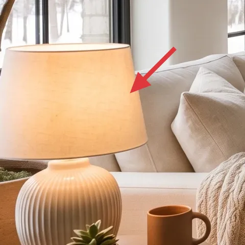
A table lamp with a cream drum shade adds warmth exactly where daylight fades—on the left side of the sofa. The shade shape keeps the glow diffused (less harsh glare than a pointed shade), and the cream tone ties back to the sofa cushions and throw. I like this over adding another overhead bulb because you can control the mood by switching it on at night. The trade-off: you’ll need a clear path for the cord and enough table surface for stability, but that’s a weekend-only fix.
Don’t pair a cool bulb with a warm-cream scheme
If the lamp bulb runs too blue, the whole corner looks “gray-beige” instead of soft and creamy.
Layer 4 — Framed botanical wall print (right wall) ($60) Gives the walls line-and-depth detail
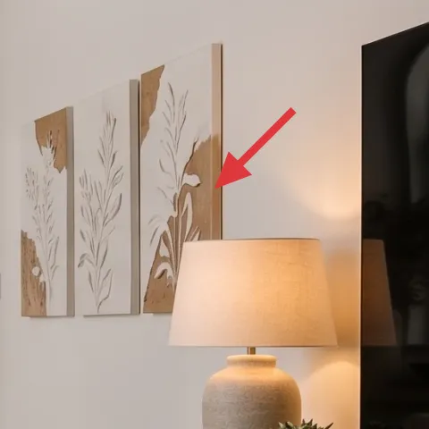
These framed botanical wall prints work because they’re mostly linework and muted color—perfect for a corner that already has plants and ceramics competing for attention. One print (instead of a dense gallery wall) also keeps the wall breathable, so the console and arched mirror remain the main storytelling elements. The obvious alternative is abstract art, but botanical line drawings mirror the olive tree and potted greenery without repeating the exact plant shape. Trade-off: keep the frame size consistent, because mismatched frames tend to look accidental in a minimal scheme.
Match by finish, not by subject
Keep the frame color (light wood or neutral) consistent so the print theme can stay botanical.
Layer 5 — Arched wall mirror ($100) Makes the back wall feel longer
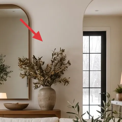
An arched wall mirror adds one architectural curve to an otherwise straight-lined room—windows, console edges, and the rug border. That curve also bounces light from the lamps, which is why this kind of mirror is so effective in a living room corner. The alternative is a rectangular mirror, but the arched shape feels more intentional with botanical styling and the warm neutral palette. The trade-off is placement: hang it at a readable height so the reflection catches the lamp glow and doesn’t clip furniture too low.
Lean into the arch
If your ceiling has any rounded features, keep the mirror arch height roughly aligned with them.
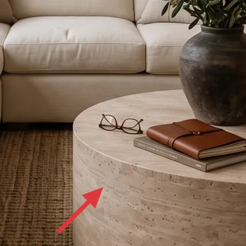
Layer 6 — Large ceramic vase on coffee table ($30) Adds a warm clay accent you can DIY
A large ceramic vase gives the coffee table a focal point, and because the vase is already part of the room’s plant styling, it’s the easiest way to carry the palette through without buying another accessory. For this refresh, the vase is the DIY hero: a warm clay tone makes it look “collected,” especially next to the cream throw and the taupe rug. The obvious alternative is buying a whole new vase, but painted color is cheaper and lets you match the exact undertone you want. Trade-off: a handmade finish only looks good if the paint coverage is even and the clear coat (if you use one) dries uniformly.
Make it instead of buying it
Paint a plain ceramic vase in a warm clay tone so it matches the cream-and-taupe scheme and reads cohesive next to the sofa.
Materials
- Spray primer for ceramic/porcelain — 1 can — $8
- Acrylic paint (warm clay) — 1 small bottle — $6
- Sea sponge or small stipple tool — 1 piece — $3
- Fine detail paintbrush — 1 — $4
- Matte clear acrylic sealer — 1 can — $4
Steps
- Wash and fully dry the vase, then scuff lightly so primer sticks.
- Spray on primer in thin coats; let it dry completely.
- Stipple on the clay color with a sponge for an even, ceramic-like finish.
- Use the detail brush to fix edges and smooth any streaks.
- Let the paint cure until it feels dry all the way through.
- Spray matte clear sealer in light coats; keep coats thin to avoid drips.
Total DIY cost: $25 — saves about $5 over buying.
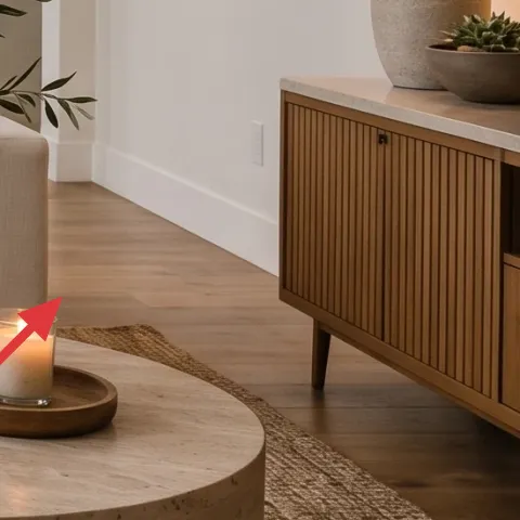
Layer 7 — Long wood console credenza ($250) Adds storage and a “landing place” for styling
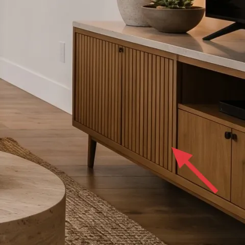
A long wood console credenza anchors the right side and creates a stable surface for the ceramic vase, small bowl, and potted plant. In a living room corner like this, it’s what turns décor from scattered to intentional—because every item has a home at the same height. I’m choosing a longer, low console instead of a taller cabinet because the sightline stays open between the sofa and the arched mirror. The trade-off is surface organization: you’ll want to keep the top mostly styled (vase + plant + one small bowl) and let drawers do the real work.
Style in odd numbers
On the console top, aim for one tall vase, one plant, and one smaller vessel or bowl.
The cost, layer by layer
| Layer | Item | Cost |
|---|---|---|
| 1 | Beige and taupe area rug | $150 |
| 2 | Cream throw blanket | $50 |
| 3 | Table lamp with cream drum shade | $60 |
| 4 | Framed botanical wall print | $60 |
| 5 | Arched wall mirror | $100 |
| 6 | Large ceramic vase (DIY to warm clay tone) | $30 |
| 7 | Long wood console credenza | $250 |
| Total | $700 | |
If the console budget is tight, swap to a shorter wood media console and keep the top styling minimal: one vase, one plant, and one small bowl. The rug + lamp + throw still carry the softness, even with less display area.
What worked, what didn't (across the whole room)
The best wins here are the ones that organize sightlines: rug first, then a warm lamp, then a couple of botanical details. The corner started looking cohesive as soon as the mirror curve and framed prints gave the walls a rhythm. My only miss was letting too many “soft creams” compete at once—when everything is the same value, the room loses depth.
What worked
- The beige and taupe area rug makes the sofa feel seated, not floating in open space.
- The cream throw blanket adds knit texture where the eye naturally rests at arm height.
- The cream drum lamp shade keeps the lighting diffused and warm against off-white walls.
- The arched wall mirror adds architectural curve without overcrowding the back wall.
- The framed botanical print brings line detail that echoes the olive tree and console plants.
- A warm clay-toned ceramic vase ties ceramics to the textile palette.
What didn't
- Matching too many items to the exact same cream value flattened the whole corner.
- When the framed print was hung too high, it competed with the pendant glow.
- Using a cool-toned bulb made the rug read gray and pulled warmth out of the ceramics.
- Over-styling the console top turned the scene into clutter instead of a calm vignette.
What we'd skip if we did it again
Skip the “all-in-one” furniture set where everything matches (rug, pillows, side table). In a corner like this, that approach makes the palette feel flat; the better move is to match finishes and textures, not the exact shade.
Skip adding a second floor lamp at the same height. With the table lamp and the pendant, you already have warm light layers; two lamps in the same spot level out the depth instead of shaping it.
Skip a multi-print gallery wall on the right wall. One framed botanical print plus the arched mirror keeps the space breathable and lets the plants and ceramics do their job.
Frequently asked
How long does this sofa-and-console refresh usually take?
Plan for one weekend if the rug and console are already delivered or easy to pick up. The slow parts are measuring for rug size and fine-tuning lamp placement so cords don’t show. The DIY vase adds drying time, but it’s mostly paint-and-coat waiting rather than active labor.
Is this renter-friendly if I can’t change walls?
Yes, most of the impact is movable: rug, throw, lamp, and styling on the console. For wall prints and the arched mirror, use removable hanging options (like picture hooks) if you can’t use screws or anchors. The goal is keeping the arrangement, not the hardware.
What if my room is smaller or the console wall is narrower?
Downsize by choosing a smaller rug that still lets the front sofa legs sit on it, and keep only one framed botanical print if you need more breathing room. If the console is narrow, style with just the large ceramic vase plus one plant and bowl so the surface stays balanced.
Where should I shop for these pieces without overspending?
For rugs and lamps, big-box home stores and reputable online retailers are easiest because you can filter by size and light type. Botanical prints and mirrors are often worth checking for sales at art-print marketplaces and home decor shops; target consistent frame finishes so the set feels intentional.
What’s the biggest mistake people make with a warm neutral living room corner?
The biggest miss is letting everything drift toward the same undertone—like all beige, no contrast. Use at least one deeper element (taupe rug or a darker wood console) and keep the lighting warm. Texture also matters: a flat throw won’t do the job a knit does.
More in Living Room
What $700 buys: a sofa-and-console living room corner refresh
A warm neutral sofa-and-console living room corner refresh built around a new rug, layered textiles, and a pair of framed botanicals. For a…
7 no-drill ways to style a living room for $800
A living room lounge refresh on a $800 ceiling: swap a flatweave rug, add a teal-and-gold pillow mix, and tune the warm lighting with match…
A move-ready sofa corner for $600
Turn a rented sofa corner into a calm, layered look for $600. This refresh uses a beige rug, creamy textiles, a plug-in lamp, framed art, a…