- Best for
- mirror-and-plant focal points
- Cost
- $495 total / $500 ceiling
- Difficulty
- Moderate
- Time
- 1–2 weekends
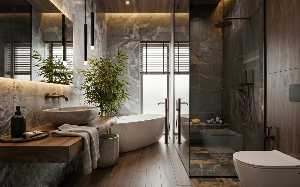
Why warm stone details are the spa bathroom of 2026
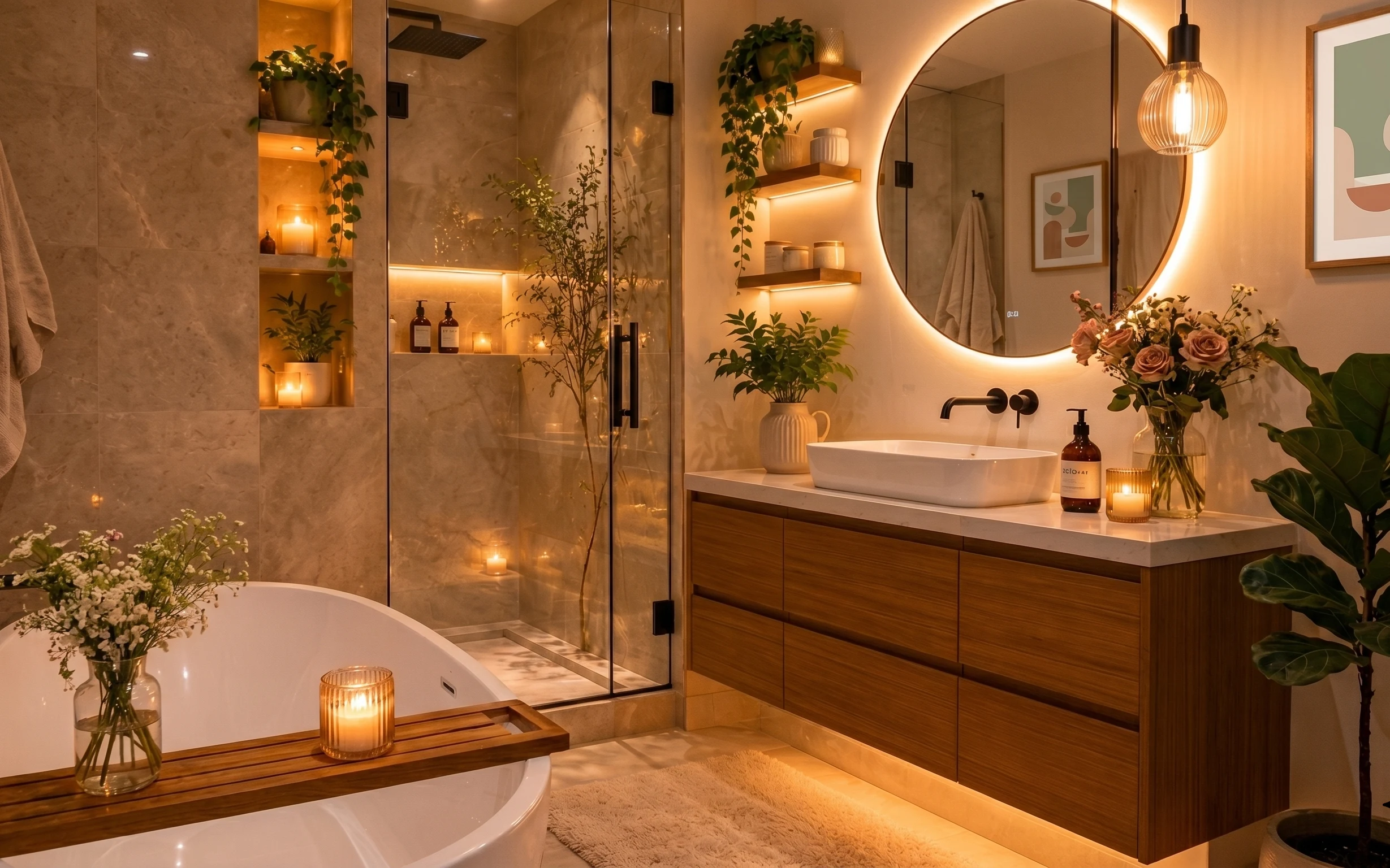
That calm, resort-like feeling comes from repetition: warm stone tones, dark metal lines, and soft textiles. The folded gray towel on the vanity keeps the whole scene from going too hard, while the tall green plant adds height you can see over the tub. I’m always drawn to bathrooms that mix matte finishes (towels, plant leaves) with glossy highlights (the black pendant light and brass taps). For homeowners on a weekend timeline, you can get this effect by choosing one “anchor” wall moment (the mirror cabinet) and then repeating two or three materials everywhere else.
I almost over-decorated this exact kind of bathroom once—more bottles, more little trays, more “stuff” on every surface. The problem was simple: the marble-look tile already has movement, so extra accessories just competed with it. This layout works because the plant reads as living vertical texture, the towel is a single folded shape, and the mirror cabinet gives you a clean, symmetrical focal point. After that shift, the room started feeling quieter, not busier.
Layer 1 — folded gray towel ($30) keeps the vanity from feeling too sterile
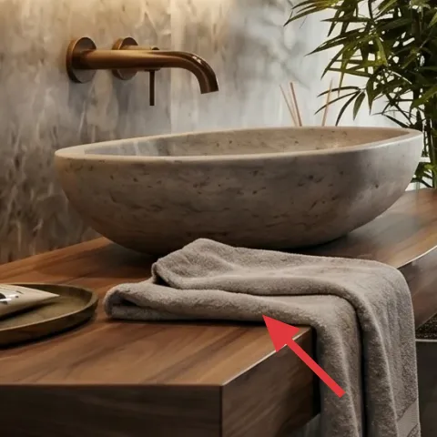
The folded gray towel on the wood bathroom vanity is small, but it changes the “temperature” of the whole scene. Gray is pulled straight from the surrounding marble-look tile, so it doesn’t fight the stone palette. Folding it—rather than draping it—creates a crisp edge that visually connects to the cleaner lines of the mirror cabinet and shower controls. The trade-off is that towels won’t stay perfectly crisp if the bathroom gets steam-heavy, but that’s also the point: this style looks best when it’s used, not staged once and never touched.
Fold for shape, not just neatness
A tri-fold with the short end tucked keeps the towel’s silhouette visible from the doorway and from the mirror line.
Layer 2 — tall green plant in bath plant pot ($40) adds vertical life in the center foreground
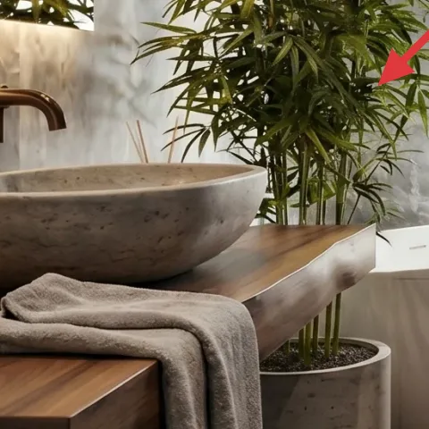
This plant is doing more than “decorating”—it’s the height cue that softens the hard geometry of tub, shower wall, and mirror rectangle. The leaves also echo the warm-light reflections, so the room feels calmer instead of strictly gray-and-stone. The best part is that you don’t need new furniture: you need the plant pot to look intentional against the stone-look surfaces. A small container paint job is the easiest upgrade because it changes the perceived finish without changing anything structural.
Make it instead of buying it
Paint the bath plant pot in a warm stone tone so it matches the bathroom’s gray-and-wood palette instead of looking generic.
Materials
- All-purpose sandpaper (fine grit) — 1 pack — home improvement store — $8
- Bonding primer — 1 small can — home improvement store — $7
- Warm stone-toned paint (gray-beige) — 1 small can — home improvement store — $5
- Matte topcoat — 1 small can — home improvement store — $6
- Disposable gloves + foam brush — 1 set — hardware/discount store — $4
Steps
- Lightly scuff the pot surface with fine sandpaper so paint grips.
- Wipe off dust with a dry cloth until the surface feels clean.
- Apply bonding primer in thin coats, letting it fully dry between coats if needed.
- Paint the warm stone tone in smooth, even strokes.
- Let the paint cure fully before touching the finish.
- Seal with a matte topcoat, then let it cure before returning the plant.
Total DIY cost: $30 — saves about $10 over buying.
Layer 3 — black soap dispenser ($25) creates a dark line that matches the lighting
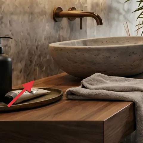
On the vanity, the black soap dispenser is a small but repeatable “dark metal” note, and it matters because the bathroom has a lot of pale surfaces. The monochrome black reads like the pendant light’s hardware line, so the eye stays in one visual family. If you’ve ever had soap bottles that look too shiny or too bright, you already know the issue: they make the room feel less designed even when everything else is neutral. This is a simple buy-and-place choice—just keep the pump height similar to the way the folded towel sits, so the two objects feel like a set.
Choose matte if the rest is glossy
Matte black keeps the contrast refined and prevents the soap from looking like plastic.
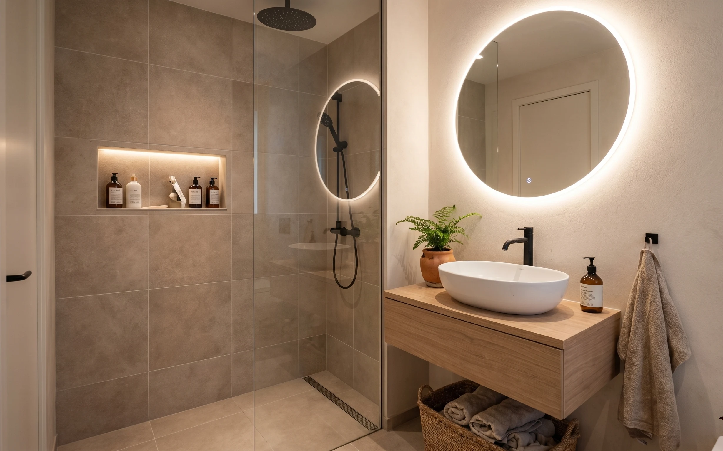
Layer 4 — rectangular wall-mounted mirror cabinet ($120) gives symmetry and makes the stone palette feel intentional
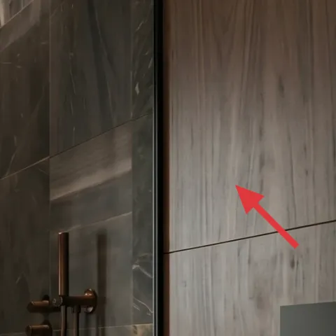
The rectangular wall-mounted mirror cabinet works like the frame for everything else: the plant, the towel, and the brass lines all look more curated when there’s a defined vertical rectangle to anchor them. In a bathroom with marble-look tile and a lot of gray movement, a clean mirror edge helps the room feel structured rather than chaotic. I’d rather spend here than on another decorative object, because the mirror cabinet also improves day-to-day function—everything can live behind the door instead of on the shelf. The trade-off is that placement needs to be right for sight lines.
Center it to your vanity width
Keep the cabinet visually aligned with the vanity so the symmetry reads even when you’re just glancing in.
Layer 5 — black pendant light ($80) adds warm vertical glow above the tub zone
The black pendant light’s warm glow ties into the rest of the spa mood without competing with the stone tile. The black finish pulls the eye through the room’s darker accents, while the upward-and-downward light makes the bathtub area feel like a destination instead of a utilitarian space. This is the opposite of an “everybody buys the same vanity light” choice; it feels intentional because it’s in the right visual height zone. If swapping the fixture is part of your weekend, aim for warm temperature bulbs to keep the marbles from looking cold.
Don’t go too cool on bulb temperature
Very white bulbs can make the gray stone feel bluish and harsher than the rest of the palette.
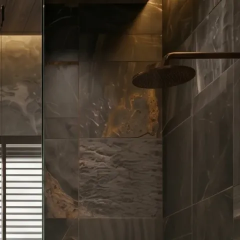
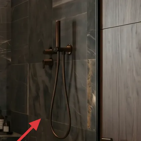
Layer 6 — wall-mounted shower controls ($120) keep the brass-metal story cohesive
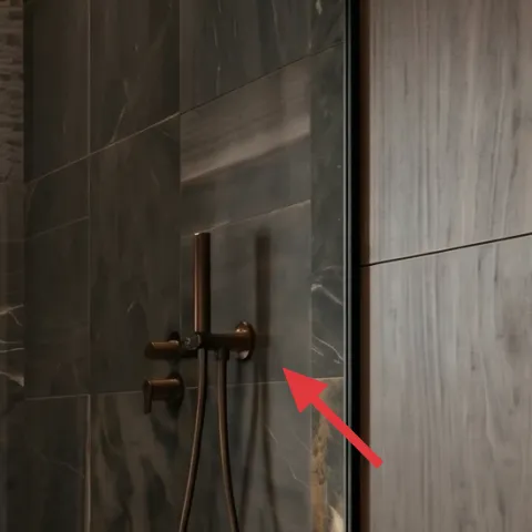
Even when you don’t consciously notice it, the shower controls set the finish language for the entire room. The wall-mounted controls are visually close to the warm brass tub-filler tones, so swapping to a matching finish level keeps the spa look tight. The benefit here is cohesion: fewer “metal families” means the gray tile feels less random. The trade-off is budget and timing—plumbing-adjacent swaps can be fiddly—so this is best treated as a weekend plan only if your current setup is already compatible. Otherwise, choose finishes that at least visually match the brass tones you already have.
Match finish sheen, not just color
Matte and polished brass-read differently against marble-look tile—aim for the closest sheen you can.
Layer 7 — two glass bottles on shelf ($80) reduces visual clutter while keeping the scene lived-in
The two glass bottles on the shelf add “used and ready” realism without turning into clutter. Because they’re in glass, they catch some of the warm light and soften the darker wall tiles, which makes the shelf feel more integrated. This is a smarter choice than a single big bottle because the smaller scale visually repeats the towel’s folded shape—compact, tidy, and not overpowering. The trade-off is refilling: bottles look best when they’re not half-empty and cloudy, so it’s a small upkeep habit rather than a set-and-forget decoration.
Pick one label look, then refill consistently
When the bottles all match in color and label style, the shelf becomes part of the design instead of a catchall.
The cost, layer by layer
| Layer | Item | Cost |
|---|---|---|
| 1 | Folded gray towel | $30 |
| 2 | Tall green plant in bath plant pot (DIY paint pot) | $40 |
| 3 | Black soap dispenser | $25 |
| 4 | Rectangular wall-mounted mirror cabinet | $120 |
| 5 | Black pendant light | $80 |
| 6 | Wall-mounted shower controls | $120 |
| 7 | Two glass bottles on shelf | $80 |
| Total | $495 | |
If the mirror cabinet cost is too much, use a simpler wall mirror and keep everything else the same; the plant pot paint and towel styling will still do most of the visual work.
What worked, what didn't (across the whole room)
The room reads more intentional because the updates repeat the same “metal + stone + soft textile” language. The biggest win is how the mirror cabinet and plant height organize the scene, even before you notice any individual item. Where it fell short was mainly in upkeep—small details can drift if the bathroom gets heavy daily use.
What worked
- Folding one gray towel kept the vanity visually calm instead of cluttered with loose linens.
- The tall plant created height that balances the tub and the rectangular mirror cabinet.
- Black soap and black pendant hardware felt like a matching design family across the room.
- The mirror cabinet made the marble-look tile feel more like a cohesive backdrop than random pattern.
- Warm lighting helped the gray stone look softer, not icy, throughout the day.
- Keeping two smaller bottles on the shelf looked lived-in without taking over the space.
What didn't
- If bottles look too cloudy or half-empty, they read messy against the polished stone.
- Too-cool bulbs can make gray tile look bluish, especially near the tub filler area.
- Plant pot color mismatch shows up fast because the pot sits right in the center foreground.
- Overstuffing the shelf behind the glass mirror cabinet makes the room feel heavier.
- Switching finishes without matching sheen can make the brass tones look accidentally mismatched.
What we'd skip if we did it again
Skip adding extra decorative trays or more small bottles on every surface. The marble-look tile already has movement, and too many small objects fight for attention. Two bottle “beats” plus a towel fold reads intentional; anything beyond that starts looking like storage.
Skip the impulse to chase the biggest fixture purchase first. A mirror cabinet and plant moment do more to shape the composition than one more standalone decor item. Spend where the eye lands in the first five seconds—then refine with smaller details.
Skip cool-white bulbs. In a gray-and-stone bathroom, the wrong temperature makes the walls feel sharper and less spa-like. Warm bulbs preserve the soft, resort mood and keep brass-adjacent tones looking flattering.
Frequently asked
How long does a bathroom refresh like this take on a weekend?
Most of the work is placement and styling: towel folding, styling two glass bottles, and centering the plant in its pot. If you’re doing a simple paint DIY on the plant pot, plan for drying time plus a second pass if coverage needs it. For fixture-adjacent items like a pendant light or shower controls, factor in any extra trips for parts and the time it takes to confirm compatibility. In practice, it’s a strong 1–2 weekend project.
Can I do this if I rent?
This particular photo includes more than pure no-drill changes—there’s a mirror cabinet and lighting hardware, plus shower controls. If you’re renting, prioritize the fully reversible pieces: towel styling, swapping in new soap dispensers, and painting only items that you own (like the plant pot). For the mirror, use your landlord’s approved hardware path if any. The mirror cabinet and pendant light are the “maybe” layers; everything else is renter-manageable.
What if my bathroom is smaller than this one?
Scale the same strategy down: keep one towel as the only textile, place the plant pot so it sits in the biggest visual lane near the tub or vanity, and avoid adding extra shelf decor beyond the two-bottle idea. If the mirror cabinet feels too large, choose a simpler rectangular mirror and keep the rest of the palette (gray towel + black accessories + warm plant) intact. The look comes from repetition, not from volume.
What if my bathroom is bigger—can I add more than two bottles?
Bigger bathrooms can handle more, but the rule stays the same: one shelf “moment” should look curated, not crowded. If adding bottles, keep the number small and cohesive—stick to matching glass height and label style. Add one taller plant rather than multiple small plants, and let the mirror cabinet stay the primary frame. Otherwise the marble-look tile pattern will feel busier than spa-like.
Where should I shop for these pieces without it looking cheap?
For the towel and the soap dispenser, look for neutral textures in solid colors—gray linen blends or thick cotton towels look most expensive. The mirror cabinet and pendant light are worth shopping in a range that matches the hardware finish you already have. For the plant pot, the simplest upgrade is paint plus a matte topcoat so it won’t look like bare craft paint. The goal is the finish level, not the brand.
What’s the biggest mistake people make in a spa-style bathroom refresh?
They usually add too many small accessories at once. A spa look needs fewer, stronger visual beats: one framed reflection moment (mirror cabinet), one plant height cue, one towel textile cue, and a dark metal thread. If everything shows equally, nothing feels calming. Start with the largest focal items first, then stop once the room looks balanced from the doorway.
More in Bathroom

5 weekend bathroom swaps for a $500 spa bathroom
A spa bathroom refresh that reads expensive without major construction: five swaps focused on towel styling, a painted plant pot, a mirror …
Warm-gray tile bathroom refresh, $800
A warm, spa-like bathroom refresh that leans on renter-proof updates: fresh toiletries styling, a better towel setup, a potted fern, warm w…
What $250 buys: a renter-friendly bathroom spa corner
A renter-friendly bathroom spa corner built from 7 no-drill upgrades—warm lighting cues, soft textiles, and styled countertop moments. With…