- Best for
- Spa-like vanity wall organization
- Cost
- $825 total for 7 layers
- Time
- 1 long weekend (paint + installs)
- Difficulty
- Confident DIY
Why warm, wood-and-stone details are the bathroom vanity wall of 2026
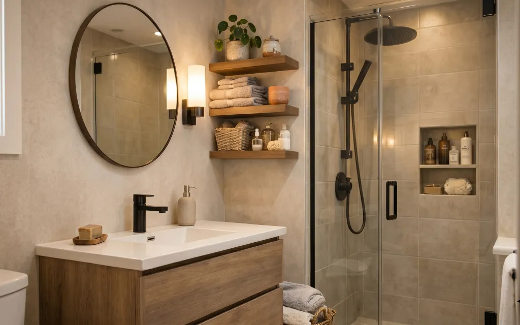
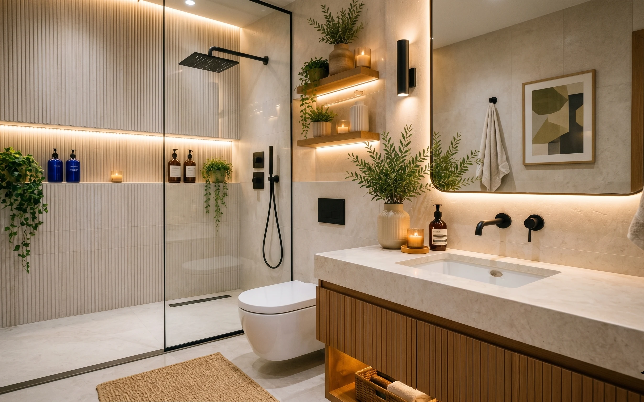
That oval mirror, the wood-front vanity, and the floating shelves all share one job: they break up busy tile with calmer shapes and warm textures. In this photo, you can see three tactile materials right up front—smooth white countertop, warm wood shelves, and the softly folded gray towels stacked like a hotel. The wall color reads light-beige and intentional, not flat, which is why the whole corner feels settled even with open shelves. For US homeowners, this is a satisfying refresh because you can pick the highest-impact moves you can actually live with while you shop.
I made the mistake on my own bathroom wall of choosing “pretty” decor first—then wondering why everything looked random once the shelves went up. The fix was switching the order: start with the main shapes (mirror + vanity + shelves), then add only the small pieces that repeat the same palette. Once I grouped towels by height and kept toiletries off the counter until the very end, the space started behaving like a single design plan.
Layer 1 — wood bathroom vanity with drawers ($300) Built-in storage that still feels light
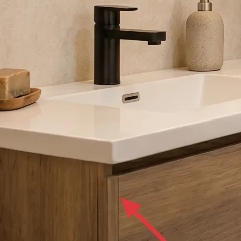
A wood bathroom vanity with drawers and a crisp white countertop is the anchor here. The warm wood front gives the beige-tile backdrop a place to “rest,” while the drawer storage keeps daily items from turning into countertop clutter. The obvious alternative is buying a smaller vanity or going too dark—both can make the wall feel heavier against light tile. This choice keeps sightlines clean and lets you style the sink area with just a pump dispenser and a tray. Trade-off: choosing a vanity means measuring carefully for faucet and clearance, but it’s the quickest way to upgrade the feel without touching plumbing.
Measure like a carpenter, not like a shopper
Write down the drawer depth clearance and your faucet height, then compare those numbers to the vanity spec sheet before ordering.
Layer 2 — oval wall mirror ($120) Softer than a rectangle, better than a tiny one
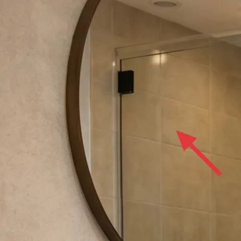
This oval wall mirror matters because it echoes the rounded “spa” shapes without competing with the straight lines of tile. Mounted above the vanity, it expands the visual space and gives you one focal moment that isn’t a shelf of small objects. A rectangle mirror can work, but it often looks more procedural—like a checklist for the bathroom instead of a design. Trade-off: oval mirrors can be pricier and harder to match to framing, so pick one with a dark metal edge or finish that reads warm next to the wood vanity.
Center it to your eye line, not the tile grout lines
If the mirror feels “off” in photos, it’s usually height; move it up or down a few inches before committing to anchors.
Layer 3 — floating wood shelves ($180) Towel display you can style in minutes
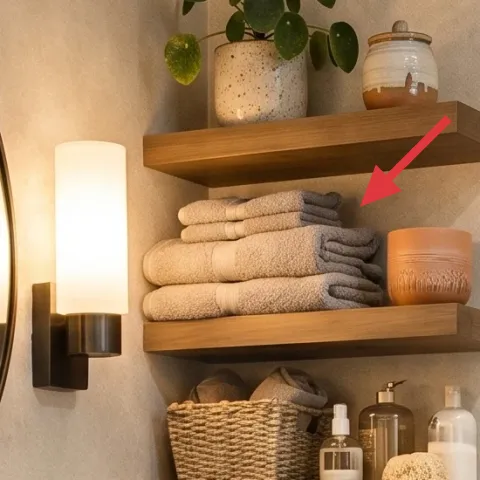
Floating wood shelves create that layered, vertical storage look—towels on the middle shelf, smaller bottles and jars on top, and a basket lower down. They work here because the wood tone ties directly into the vanity front, and the open design makes the wall feel curated instead of crowded. The obvious alternative is a cabinet or closed medicine storage, but that tends to hide the styling and flatten the wall. Trade-off: shelves mean you’ll commit to tidier mornings, since anything stored there is always visible.
Don’t overcrowd the middle shelf
Leave a little breathing room between stacked towels and bottles so the shelves don’t look like storage bins.
Layer 4 — woven basket ($50) Soft texture that makes storage look intentional
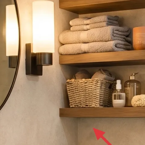
A woven basket is the “texture buffer” between smooth surfaces—like the glass and ceramics—and the hard edges of tile. In the photo, the basket sits on the lower shelf and holds what you’d otherwise scatter into the bathroom: extra towels or small toiletries. Compared with plastic bins, a basket reads warmer and hides the visual noise. Trade-off: woven materials show dust if they’re too open, so choose a basket you can wipe quickly and keep it away from splashes when possible.
Pick one weave tone and repeat it
If your basket is honey or natural, echo that warmth with another small accessory in the same undertone.
Layer 5 — potted green plant on top shelf ($80) A live element that keeps the corner from feeling staged
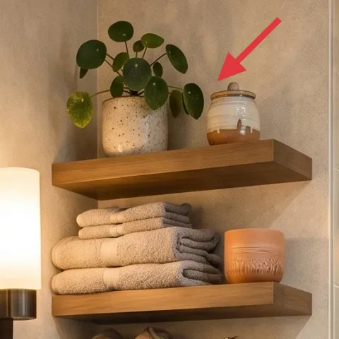
A small potted green plant on the top shelf adds a third texture layer—leafy and organic—so the wall doesn’t feel like only wood, tile, and gray towels. It also brings color focus without needing a bold paint job, which is why it fits this warm neutral palette so well. The alternative is dried florals, but those can look dusty fast in bathrooms. Trade-off: plants need some light and occasional wiping, yet a compact plant is easier to manage than an oversized one.
Choose a plant that tolerates bathroom humidity
Even if it’s not direct sunlight every day, frequent humidity can be helpful—just avoid soaking the leaves.
Layer 6 — ceramic soap dispenser ($25) One countertop object with a spa finish
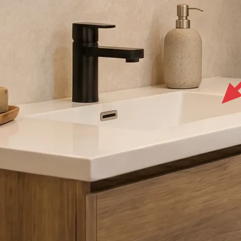
The ceramic soap dispenser keeps the sink zone looking “finished” without adding more visual clutter. In this setup, it’s the only daily-use item in the immediate counter frame, and its light neutral color blends with the white countertop and beige wall. The alternative—leaving multiple bottles out—usually makes the vanity look busy, especially with open shelves nearby. Trade-off: it’s worth paying for a pump that feels sturdy, since a wobbly dispenser makes the whole corner feel cheaper.
Limit the counter to one height level
Staying consistent on placement (same side, same height) makes the vanity feel designed, not improvised.
Layer 7 — paint, 1 gallon ($70) Light-beige color that makes tile feel softer
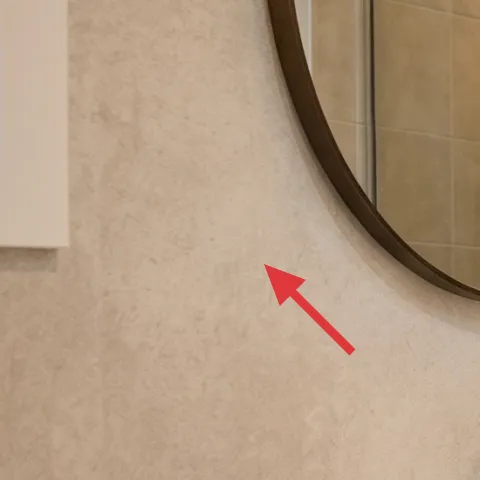
Painting the surrounding wall in a light-beige tone is what turns a tile-heavy bathroom into something calmer. In this photo, the wall color supports the wood vanity and makes the gray towels read clean rather than flat. The alternative is leaving the wall as-is and relying only on decor; that works until the lighting shifts and the corner looks a little gray or uneven. Trade-off: paint won’t fix bad water exposure, so use it only on walls that can handle bathroom conditions (or already look dry and intact).
Make it instead of buying it
This weekend paint refresh brings the same warm light-beige backdrop, so the vanity wall and shelves look cohesive without replacing any fixtures.
Materials
- Bathroom wall paint (1 gallon) — interior use — $40
- Roller cover + tray liner (standard 9-inch) — paint aisle — $12
- Painter’s tape (1.5-inch) — hardware store — $7
- Foam brush (2-inch) — trim touch-ups — $6
Steps
- Clean the wall with a damp cloth and let it fully dry.
- Tape edges around the mirror and shelf lines, pressing firmly for clean borders.
- Stir paint thoroughly and cut in corners with a foam brush.
- Roll the main wall in vertical passes, then lightly smooth with a second direction.
- Let the first coat dry fully (follow the label dry-time).
- Apply a second coat for even coverage, checking against the light near the vanity.
- Remove tape at a slight angle while the paint is still touch-dry.
- Allow full cure time before hanging anything close to fresh paint.
Total DIY cost: $65 — saves about $5 over buying.
The cost, layer by layer
| Layer | Item | Cost |
|---|---|---|
| 1 | Wood bathroom vanity with drawers | $300 |
| 2 | Oval wall mirror (24–36") | $120 |
| 3 | Floating wood shelves | $180 |
| 4 | Woven basket (towel storage) | $50 |
| 5 | Potted green plant (4–6 ft) | $80 |
| 6 | Ceramic soap dispenser | $25 |
| 7 | Paint, 1 gallon | $70 |
| Total | $825 | |
If you want it cheaper, start with the mirror + paint first, then add shelves only after the wall color is right. Skip replacing the vanity unless measurements truly demand it; a refreshed counter look can come from fewer items placed more carefully.
What worked, what didn't (across the whole room)
This vanity wall works because it’s built from repeated warm materials—wood, ceramic, and woven texture—plus a soft light-beige backdrop that flatters gray towels. The shelves also help because they’re styled like a system, not like random decor. The biggest risk in this look is overloading the shelves and letting the counter turn into a grab-bag.
What worked
- Wood vanity and shelves give the tile wall warmth without needing bolder color.
- Oval mirror softens straight tile lines and makes the corner feel more open.
- Gray towels stacked with spacing read intentional instead of messy laundry.
- Woven basket adds a third texture so storage feels styled, not utilitarian.
- Plant on the top shelf adds organic movement and keeps the wall from looking staged.
- Keeping the counter to one ceramic dispenser makes the whole zone feel calm.
What didn't
- When towels fill every shelf edge, the shelves stop looking curated and start looking crowded.
- Too many small bottles visible at once reduces contrast, especially against beige tile.
- If the mirror height is off by even a few inches, it throws off the entire visual balance.
- Choosing a cooler wall paint undertone can make gray towels look dull.
- Using glossy paint on textured walls can highlight imperfections instead of smoothing the feel.
What we'd skip if we did it again
Skip adding more decor before the shelf plan is set. The look depends on spacing—towels stacked neatly, bottles grouped intentionally, and one “soft” element like the plant—so extra items usually just fight for attention.
Skip going too dark on the mirror frame or shelf finish if the room already reads beige and warm. A darker tone can look heavy next to light tile, and then you’re forced to compensate with brighter accessories everywhere.
Skip painting without cleaning and taping well. If the wall has dust or residue, paint can turn patchy, and a rushed taped edge around the mirror usually ends up looking worse than the original wall.
Frequently asked
How long does this kind of bathroom refresh take?
Plan for 1 long weekend if the wall condition is good and you’re only painting plus installing shelves/mirror. Day 1 can cover prep and paint (including full drying), plus staging the shelves. Day 2 is for mounting, styling, and final spacing tweaks. If you’re waiting on orders or shelf mounting hardware, add a buffer day.
What if I rent and can’t commit to paint or shelf installation?
Prioritize the reversible changes first: swap or style a framed mirror look (if allowed), use freestanding organizers on the counter and inside the niche, and lean on textiles (towels) to create the same stacked, spa feel. For shelves, choose a freestanding ladder shelf or an over-the-door organizer that doesn’t require drilling, then match the palette to your vanity and towels.
My bathroom is smaller—will this still work?
Yes, but keep the shelves visually light. Use fewer objects per shelf, stack towels with clear negative space, and keep the counter to one functional dispenser plus one tray. Choose an oval mirror that isn’t too large for the wall, and keep your plant compact so it doesn’t crowd the upper shelf.
What if I have a bigger bathroom—how do I scale it?
In a larger room, you can add a second plant or increase the shelf length, but keep the same rhythm: one rounded focal point (mirror), one warm storage zone (wood shelves + basket), and one calm counter zone (tray + dispenser). Avoid filling every ledge; instead, increase spacing and add height variety with towel stacks.
Where should I shop differently for this look?
For the mirror and shelves, home-improvement retailers and hardware-focused brands often have better finish consistency than general big-box decor aisles. For the plant and woven basket, home and garden stores usually carry better textures. For the paint, buy from a store that can match your undertone and advise on bathroom suitability.
What’s the biggest mistake people make with this vanity-wall style?
Overstacking shelves. When everything is “displayed,” the wall stops feeling like a system and starts feeling like storage. The second most common issue is choosing an undertone for paint that fights the wood—if the beige turns cool, the whole palette looks off. Fix it by limiting objects and matching warm undertones.
More in Bathroom

5 weekend swaps for a spa-like bathroom vanity wall, $1000
A spa-like bathroom vanity wall refresh on a $1000 weekend budget—starting with a wood vanity, oval mirror, and floating shelves. The resul…
What $300 buys: a spa-like bathroom corner refresh
A spa-like bathroom corner refresh that leans into warm wood, cream tile, and black accents with seven practical swaps—starting with a soft…
Spa Bathroom Corner Refresh Under $600 With Renter Swaps
Build a spa-style bathroom corner that any renter can pack up at lease end. This plan leans on a plush 5x7 bath rug, a soft shower curtain,…