
- Best for
- boho bed nook refresh
- Total cost
- $570
- Difficulty
- Confident DIY
- Renter-safe
- No (painting nightstand)
Why warm-boho textures are the bed nook of 2026
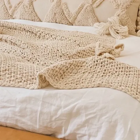
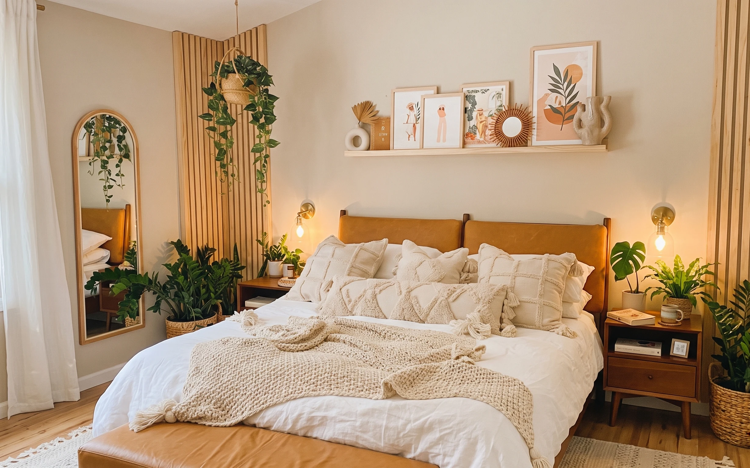
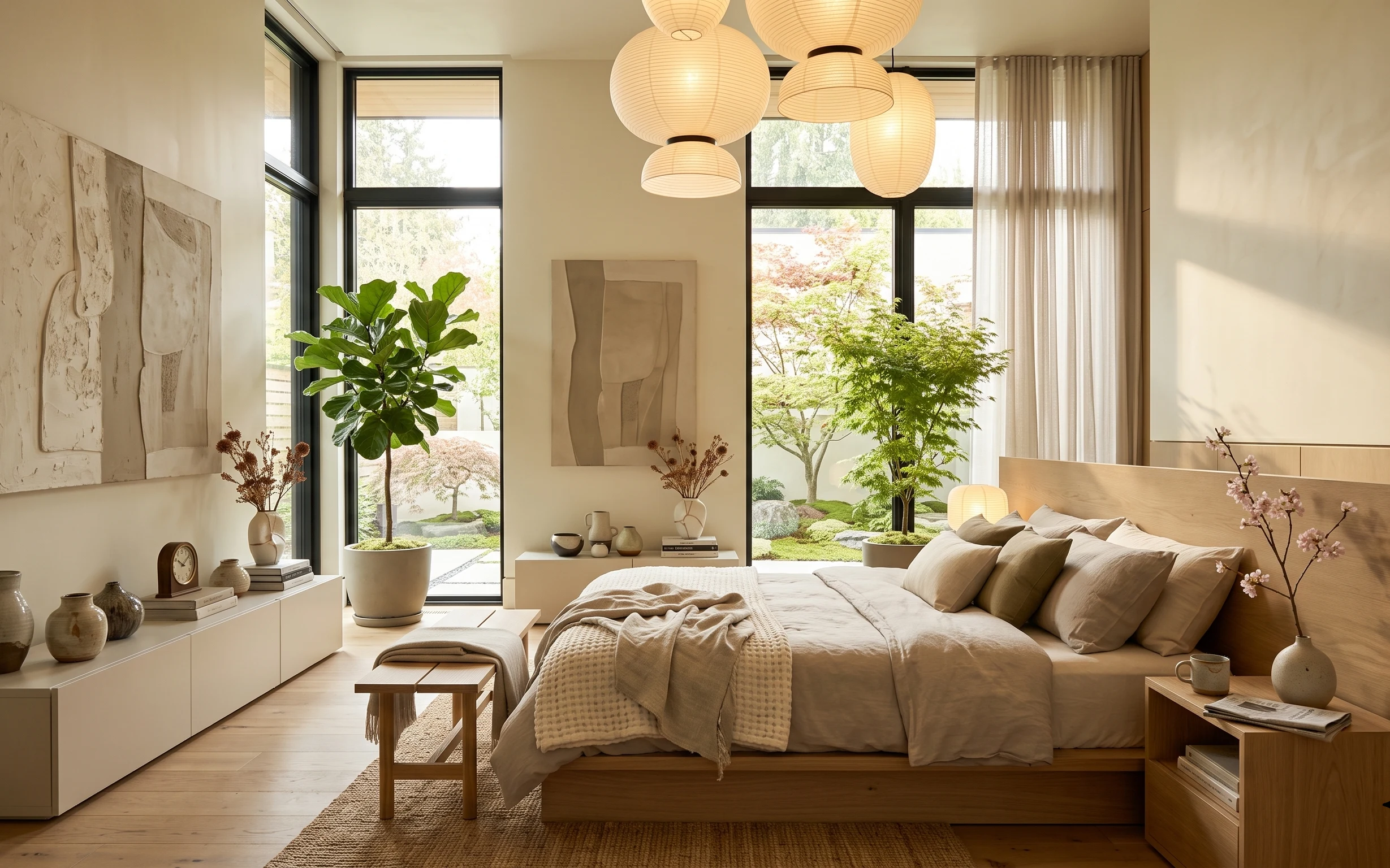
In this bed nook photo, the warm modern feel comes from texture stacking: a creamy knitted throw on top of layered cushions, plus the steady glow from brass-finished wall sconces. The vertical wood slat wall behind the headboard adds rhythm, so the accessories don’t need to be loud. The floating shelf also does heavy lifting by giving your framed art, round decor, and small objects a place to live. For US homeowners working on a weekend refresh, this plan is achievable because every change is either swappable, paintable, or bolt-on with basic tools.
I used to assume a room like this needed “more stuff”—more pillows, more decor, more height. Then I tried placing objects with the same warm palette across the shelf, and suddenly the bed looked calmer even with the same number of pieces. The other moment that changed my mind: matching the lighting warmth to the cream textiles so nothing turns yellow or harsh. That’s why this setup focuses on fewer, better-textured elements.
Layer 1 — jute-look area rug ($200) Grounds the whole bed nook
A rug is the easiest way to make a bedroom feel intentional, and this jute-look area rug is doing that quiet job under the bed. It bridges the warm wood floor, the tan headboard, and the cream textiles so the whole scene reads as one unit. The trade-off is that a natural-fiber look can show foot traffic over time, but the payoff is a more layered, “collected” feel than a flat, pale mat. Compared with adding only more wall art, a rug changes how the room anchors and how the light reflects off the floor.
Keep the rug edges straight under the bed
Even a slightly off-center rug will show in a photo like this because the bed takes up so much horizontal space.
Layer 2 — bedside nightstand with drawer (right) ($80) Gets painted for a lighter look
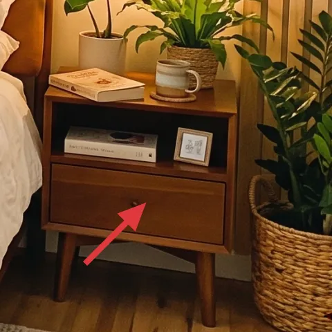
The right nightstand supports the bed’s styling and balances the leaf-filled corner on the opposite side. In the photo, it’s dark wood next to warm cream textiles and the brass sconces, so repainting it is a fast route to the same “soft and airy” mood without changing the layout. A light finish also makes the small objects on top—books and a small plant—look more curated and less heavy. The trade-off with paint is prep time, but it’s still a weekend project, and it beats replacing nightstands when you want impact per dollar.
Make it instead of buying it
Paint the right nightstand so the warm brass lighting and cream textiles look brighter against the vertical wood slats.
Materials
- Degreaser/cleaner — 1 bottle — hardware store — $8
- Sandpaper (120 + 220 grit) — assorted sheets — hardware store — $7
- Primer (for wood) — 1 can — home improvement store — $18
- Interior furniture paint (semi-gloss or satin) — 1 can — home improvement store — $12
- Brush + small foam roller covers — 1 kit — hardware store — $3
Steps
- Clean the nightstand thoroughly, then let it dry fully.
- Sand to scuff the surface (especially drawer fronts), then wipe off dust.
- Apply a thin, even primer layer and allow it to dry.
- Lightly sand the primed surface for smoothness, then wipe clean.
- Brush-and-roll the first paint coat with thin coverage.
- Let paint cure, then apply the second coat.
- Touch up edges and drawer pulls if needed, then let it cure again.
- Reinstall anything removed (if applicable) and style once dry.
Total DIY cost: $48 — saves about $32 over buying.
Layer 3 — white curtain panel (left window) ($80) Softens the wood and tan
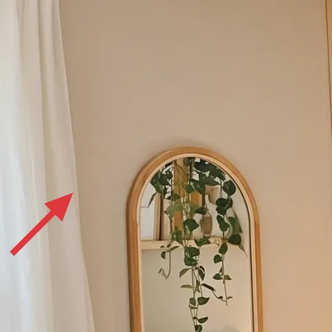
The white curtains on the left create visual breathing room next to the large arched mirror and the warm tones in the bed area. Because the curtains are sheer-ish and bright, they also help the room feel less boxed-in by the vertical wood slats behind the bed. The obvious alternative would be a heavier blackout curtain, but that tends to make the scene darker and more formal. With white panels, you get a lighter frame for the window and a gentle backdrop for the greenery. The trade-off is privacy at night, so consider sheers with blinds for real-life coverage.
Hang them high enough to “lift” the wall
Even if the window is small, ceiling-height curtain placement makes the bed nook feel taller.
Layer 4 — floating shelf styling (framed prints and decor) ($60) Builds a tidy art moment
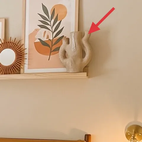
That floating shelf above the bed is where the boho personality stays controlled. You can see framed illustration prints, a decorative round mirror, and sculptural objects arranged along the shelf line—so the wall doesn’t feel empty even with the strong texture of the slats behind the headboard. This choice beats adding a larger gallery on both sides, because it keeps the eye from bouncing and makes the bed feel like the central “destination.” The trade-off is scale: if the shelf is too small or too crowded, it will look like decor spilled out rather than edited.
Use a 3-height grouping on the shelf
One tall object, one medium, one small creates a rhythm that looks intentional from across the room.
Layer 5 — brass plug-in wall sconce (right side) ($60) Adds warm pools of light
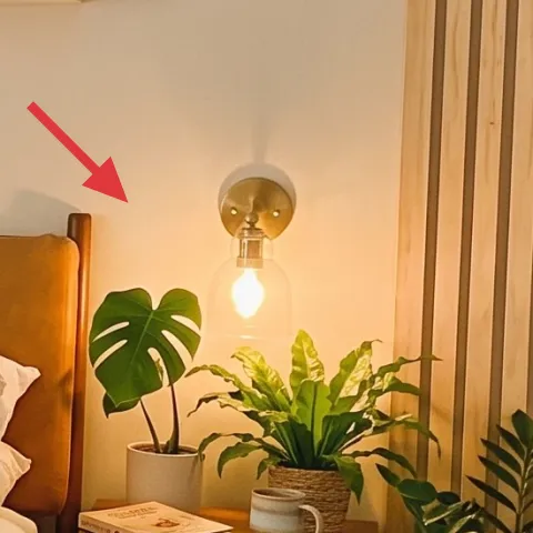
Two wall sconces on either side of the bed are a big reason this nook feels calm after dark. The brass finish harmonizes with the warm wood slats and the tan headboard, while the exposed bulb glow keeps the palette from reading too cool. Swapping in wall sconces also beats using just a single bedside lamp, because side lighting reduces harsh shadows and makes the headboard area look framed. The trade-off is that you need to plan placement carefully so the light lands where you’re actually sitting or reading.
Test the bulb color before you commit
If the bulb runs too cool, it’ll fight the cream textiles and make the room look less cohesive.
Layer 6 — cream throw pillows ($30) Makes the bed feel styled, not crowded
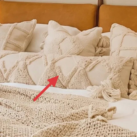
These cream throw pillows work because they repeat the same neutral tone family, so the mix reads cohesive rather than busy. The textures matter, too: the knitted and stitched surfaces catch light softly, which is exactly what you want next to brass sconces and warm wood. The alternative is buying all satin covers, but that tends to look flatter and more “event” than everyday cozy. Here the trade-off is staying in one palette; it limits contrast, but it makes the room feel curated. Even if you start with fewer pillows, keep the cream range consistent.
Keep one texture as the “main” pillow
If everything is equally textured, the bed can start to look loud instead of layered.
Layer 7 — cream knitted throw blanket ($60) Adds the last texture cue
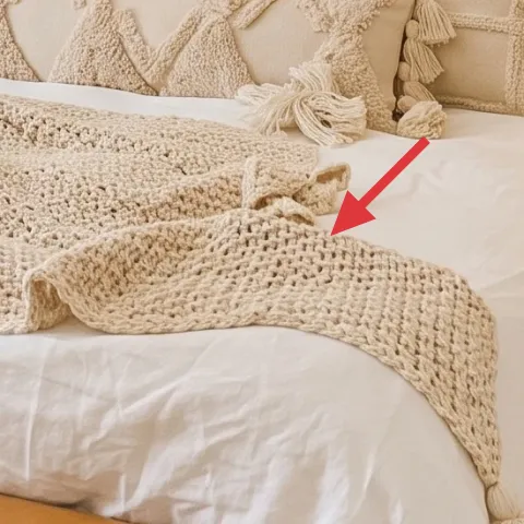
The cream knitted throw blanket is the finishing layer that makes the bed look lived-in while still styled. It drapes across the front area where your eye naturally lands, and the chunky knit texture adds depth against the smooth tan upholstery and the vertical wood slats. If you tried to replace it with a thin cotton blanket, it wouldn’t bring the same texture contrast, and the scene would feel flatter. The trade-off with a knit throw is it can shed a little at first, so shaking it out before styling helps. In a boho bed nook, texture is the whole point.
Let the throw spill past the cushion edge
A slight overhang makes the bed feel relaxed, not neatly folded for photos only.
The cost, layer by layer
| Layer | Item | Cost |
|---|---|---|
| 1 | Jute-look area rug 5×7 | $200 |
| 2 | Bedside nightstand with drawer (right) | $80 |
| 3 | Curtain panel pair (white sheers) | $80 |
| 4 | Wall-mounted floating shelf | $60 |
| 5 | Plug-in brass wall sconce | $60 |
| 6 | Cream throw pillow covers (set) | $30 |
| 7 | Cream knitted throw blanket | $60 |
| Total | $570 | |
If you want a cheaper variant, start with the rug and curtains first (they set the palette), then choose one “anchor” change: either paint the nightstand or swap the wall shelf styling. Keep pillows and throws to two textures max, and use what you already own on the shelf.
What worked, what didn't (across the whole room)
The overall verdict here is that this bed nook stays cozy because the palette repeats: cream textiles, warm wood, and brass tones. The arrangement feels deliberate rather than random, mainly because the shelf editing and side lighting keep the visual noise low.
What worked
- The jute-look rug grounds the bed area and makes the warm wood floor feel intentional.
- Brass wall sconces add symmetrical, warm light that flatters the headboard.
- The floating shelf styling uses mixed heights so framed art looks curated, not crowded.
- Cream pillows and a chunky throw create texture contrast against the tan upholstery.
- White curtains brighten the left side so the wood slats don’t dominate.
- Matching warm neutrals across objects keeps the boho feel cohesive.
What didn't
- If the shelf gets too tall with decor, the bed can feel visually buried by objects.
- Too many pillow textures in one palette can read busy instead of layered.
- Heavier curtains in a dark fabric would make the nook feel tighter with the wood slats.
- Cool-toned bulbs can turn cream textiles gray and fight the brass finish.
- A rug that’s too small leaves the bed floating instead of anchored.
What we'd skip if we did it again
Skip buying a full new nightstand set just to “match.” Painting the one nightstand used by your bed styling gets you the lighter look here with less cost and less waste. A simple paint finish plus new hardware (if needed) makes the nightstand read as part of the palette rather than as a separate piece.
Skip adding a large, symmetrical gallery wall on both sides of the headboard. With strong vertical wood slats, the wall already has texture—so a smaller shelf-based art moment keeps the bed nook from turning into a visual competition.
Skip extra contrast colors in the pillows and throws. Staying in cream, tan, and warm wood keeps the sconces and framed art from clashing. One or two texture changes do more than adding color swings that don’t show up consistently in this photo’s palette.
Frequently asked
How long does this kind of bed nook refresh take on a weekend?
If you’re buying everything, plan for about 4–7 hours: assembling the shelf styling, hanging curtains, setting up sconces, and styling pillows and throws. If you’re DIY-painting the nightstand, add drying and cure time—usually 1–2 extra days depending on paint thickness and humidity. The key is doing prep (cleaning and sanding) early so the visible work stays concentrated.
If I rent, can I still get this look?
You can borrow the biggest visual moves while skipping anything permanent. Choose removable wall decor, use tension rods or a standard curtain rod that doesn’t leave damage, and swap lighting only if it’s plug-in (and safe). For the shelf styling, keep it freestanding or use lightweight adhesive-friendly options where allowed. For the bed texture, focus on rug, pillows, and a knitted throw—those changes are fully reversible.
My bedroom is smaller—what should I scale down first?
Start with the rug size and curtain width. A rug that’s too small is the fastest way to make a compact room feel cramped. Then scale shelf decor so you still get three height points, but with fewer pieces. Keep pillows to a tight set and let the throw blanket provide the main texture spill. Wall lighting can stay, but ensure the sconces aren’t too close together.
What if my wood slats (or wall texture) aren’t the same?
The approach still works. Strong wall texture means you want repeated neutrals and soft textiles so the room doesn’t feel busy. If your walls are smoother, consider adding either a textured rug or a thicker throw to create depth. The shelf styling should be edited the same way: mixed heights, fewer objects, and a consistent cream-and-warm palette.
Where should I shop for these items without overspending?
Look for the rug and curtains where you can compare texture in person (especially for rug shedding and sheerness). Floating shelves and plug-in sconces often have good options online, but check reviews for cord length and stability. For pillows and a knitted throw, focus on texture first—then choose the cream tone that matches your lighting temperature. If you DIY the nightstand, buy primer and paint from the same line so the finish levels more easily.
What’s the biggest mistake people make in a bed nook like this?
The most common misstep is mixing too many neutrals at different temperatures—cream that’s actually cool, brass that looks yellow-green, and wall decor in a contrasting undertone. When those elements don’t agree, the room feels off even if every piece is pretty. The fix is to pick one warm-neutral lane and stick to it across rug, textiles, and lighting.
More in Bedroom
7 budget-friendly bedroom upgrades for a boho bed nook
A boho bed nook refresh that leans on warm textures: rug, a painted nightstand, and soft lighting. This weekend plan keeps the look cohesiv…
What $350 buys: a move-ready bedroom refresh
A warm japandi-style bedroom refresh that packs into boxes: rug, soft beige textiles, simple styling ceramics, and one statement abstract. …
Warm blush-and-gold bedroom refresh, $1000
A blush-pink curtain, a crystal ceiling light, and a tufted bed make the bedroom feel polished fast. This $1000 weekend refresh focuses on …