
- Best for
- Kitchen island seating corners
- Cost
- About $310 total
- Difficulty
- Beginner
- Time
- 1–2 weekends
Why brass-and-cream lighting mood is the kitchen island seating nook of 2026
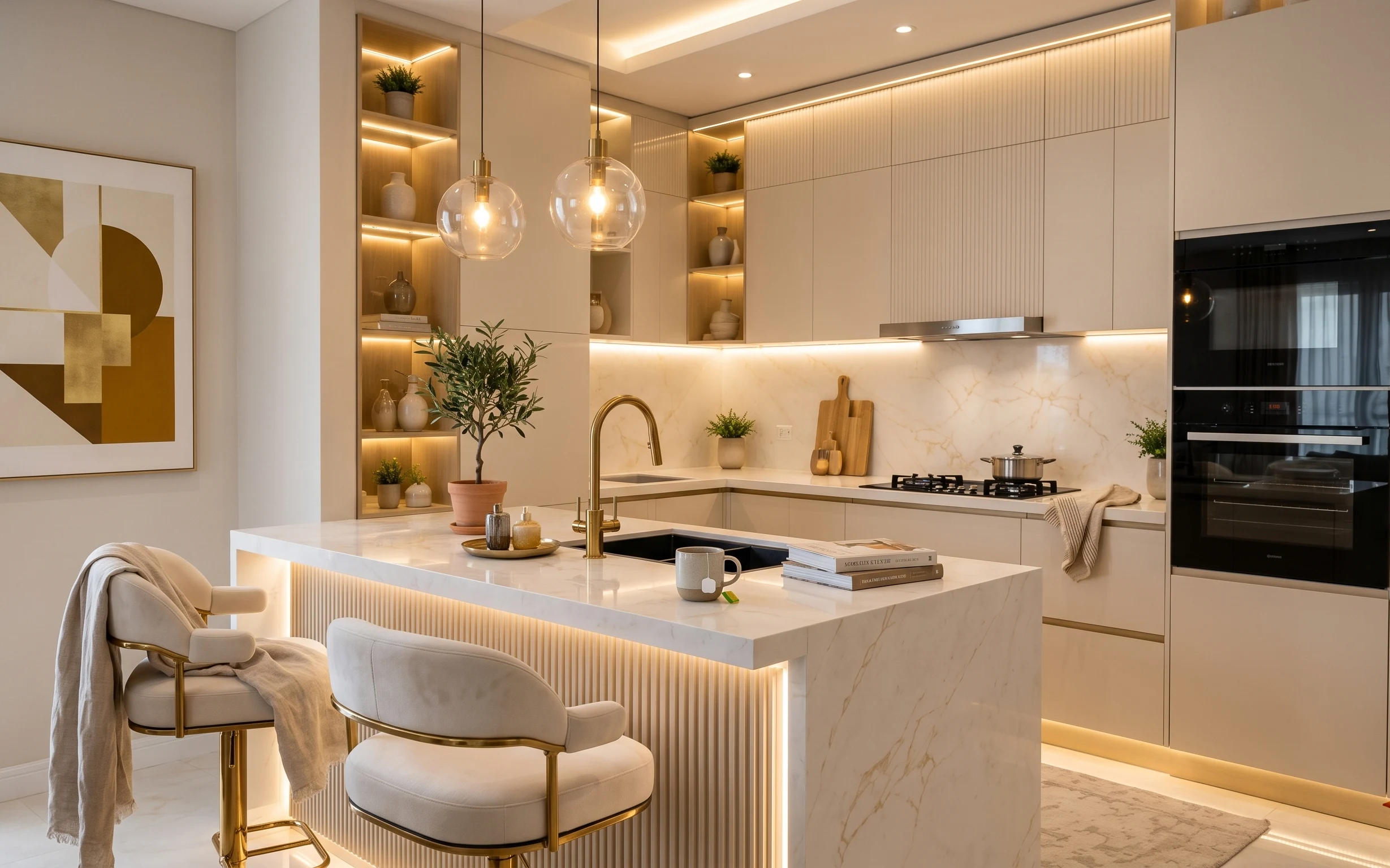
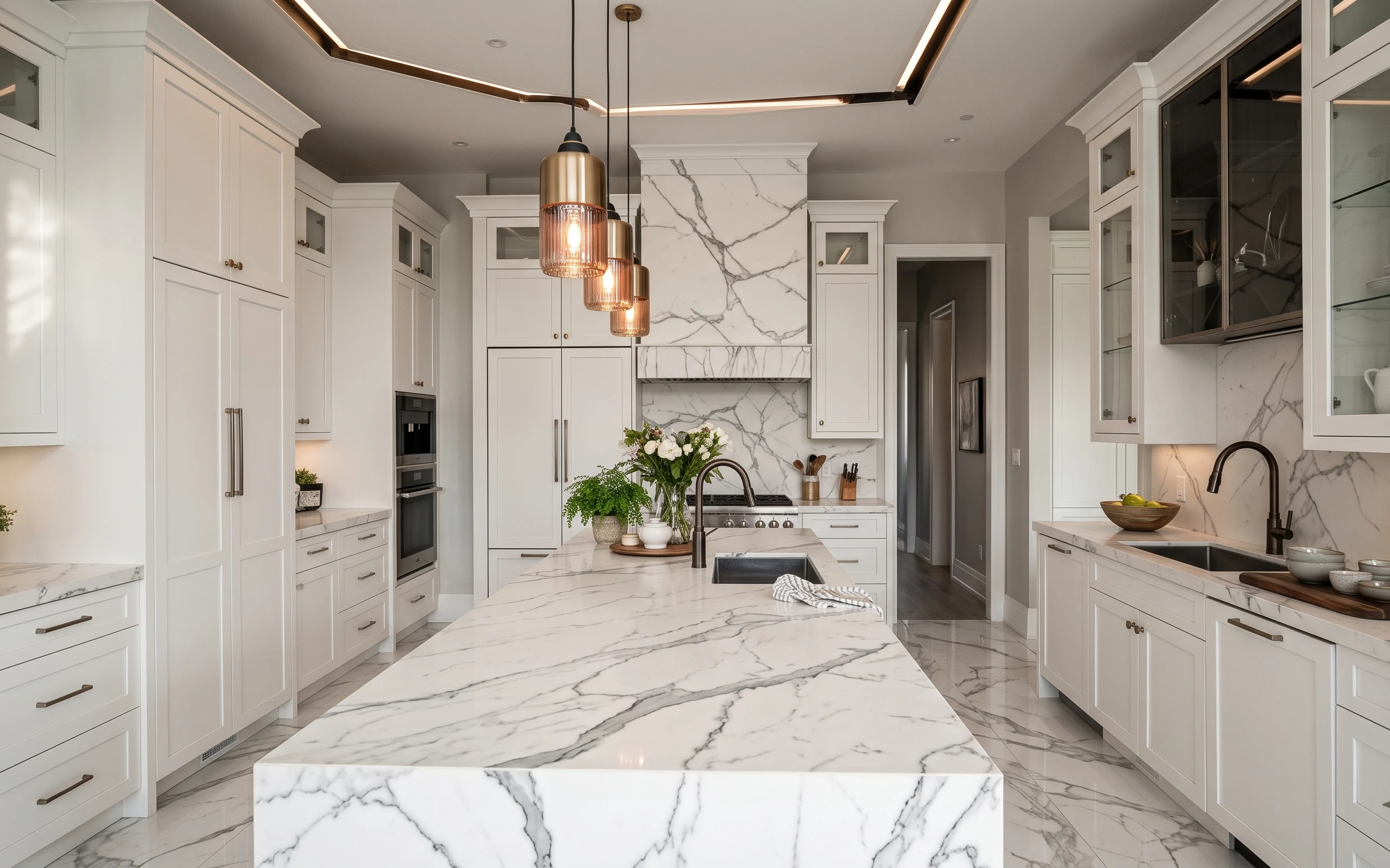
There’s a particular calm in this space: the glossy white island reads crisp, while the warm brass details and the olive greens keep it from feeling clinical. The textiles matter here—the light throw on the chair arm softens the hard lines—and the framed abstract print gives the left wall a focal point. Even the island styling is intentional: a tray, small glass jars, and a potted olive tree create a “designed shelf” effect without needing any demolition. For renters, this is achievable with swaps you can fully remove at the end of the lease.
I used to think kitchens needed a bigger, louder centerpiece—usually a statement art piece or a major rework. But the more I live with it, the more I trust small repeats: same warmth in metals, similar neutral textures, and one green plant to keep things lively. The first time I tried styling around a kitchen island, I overfilled the tray and it looked busy under warm light. This time, fewer objects plus a clear base (tray + candle jar + book-leaning height) makes the island feel curated instead of crowded.
Layer 1 — 5×7 jute-style area rug ($80) Hides the kitchen floor messiest moments
A jute-style rug anchors the seating area and makes the floor feel less “showroom tile.” In the photo, the rug sits right where feet land from the barstools, so it does double duty: visually it grounds the glossy white island, and practically it softens everyday scuffs and dropped crumbs. The obvious alternative is skipping a rug entirely, but then the space reads harder and louder. Going with a natural, neutral tone keeps the warm brass pendant glow from clashing. The trade-off is that natural-fiber rugs like this need a quick shake or gentle spot-cleaning, not heavy scrubbing.
Pick a rug with a tight, even weave
In a kitchen, you want texture that forgives daily life—loose weaves snag faster under chair legs.
Layer 2 — framed abstract art print ($50) Brings the left wall into the same palette
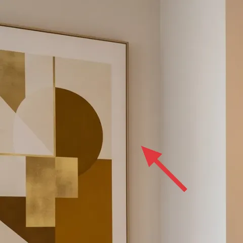
That framed abstract print on the left wall is doing more than decoration: it’s the bridge between the warm brass metal tones and the creamy, marble-look island. A renter-safe refresh is to swap in an affordable framed print with similar warm neutrals (cream, sand, and a muted tan/olive geometry) so the room feels connected instead of patched. The obvious alternative is hanging a photo collage, but the lines and color blocks in this kind of abstract art keep the look modern. The trade-off is choosing “calm abstraction” over high-contrast prints—too much contrast can fight the warm lighting.
Let the frame width match your furniture vibe
A slimmer frame reads lighter next to the barstools’ gold base.
Layer 3 — upholstered barstool (seat + gold base) ($60) Gives you soft seating without changing the kitchen
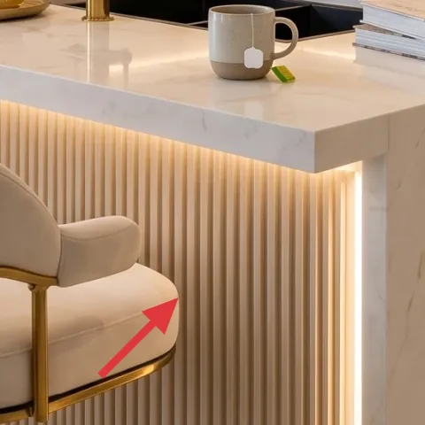
The upholstered barstool is the piece that makes the kitchen island feel like a seating nook instead of a work surface. In the hero, you can see a cream upholstery with a warm gold base, which echoes the brass tones elsewhere and keeps the texture palette consistent. The alternative—hard, backless stools—often looks sleek in photos but feels harsher over time, especially with warm pendant light overhead. Buying one or two similar stools is also renter-friendly because you can take them with you. The trade-off: upholstered seating won’t hide stains, so choosing a cleanable fabric or using a removable cover is the smarter move.
Match metal warmth, not just color
If your lighting hardware reads brassy, pick gold bases in the same warmth range.
Layer 4 — light throw blanket draped over chair arm ($30) Softens the line from island to seat
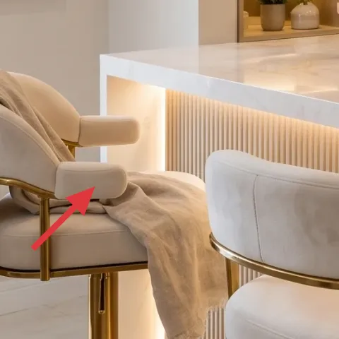
This throw blanket is a small thing that changes the whole perception of the seating corner. Draped over the chair arm, it breaks up the sleek island edge and adds a casual, lived-in layer—exactly what warm modern interiors need to avoid feeling too engineered. The obvious alternative is adding another small object (like another candle or vase), but textiles add dimension without clutter. The trade-off is keeping it light enough to look intentional under warm pendants; thick, heavy throws can overpower the creamy palette and make the space feel crowded.
Don’t choose a throw that clashes with the olive
If the fabric has a strong cool undertone, it will fight the terracotta and olive greens.
Layer 5 — decorative tray with small jars on the island ($25) Creates “styled” order in minutes
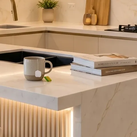
A tray turns loose kitchen objects into a single composed vignette, and you can see that effect on the island: the tray groups a cup and small jars into one intentional block. The reason this works is visual hierarchy—your eyes land on one container first, then read the smaller items inside. The obvious alternative is scattering items across the counter, but kitchen islands quickly look cluttered under bright, reflective surfaces. A neutral tray (light wood, cream, or brass-accented) also keeps the overall palette cohesive with the framed art and barstools. The trade-off is that trays take a little maintenance—wipe and reset so the arrangement stays clean-looking.
Keep the tray’s footprint consistent
Using the same tray size each time prevents “too many things” drift.
Layer 6 — candle jar ($15) Adds warm glow without any wiring changes
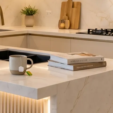
The candle jar is the smallest layer, but it’s doing the biggest mood work. With warm pendant lights already on, a jar candle continues that glow and makes the island feel inviting after dark—without needing any renter-incompatible upgrades. The obvious alternative is adding more greenery, but too much plant volume can crowd a kitchen counter. A single candle jar gives height and a soft reflective surface, which photographs beautifully against the glossy countertop. The trade-off is basic safety and smell control: in a busy cooking space, choose an easy-to-trim wick and place it where it won’t get bumped.
Use the “one jar, one height” rule
One candle jar plus one supporting item keeps the island from looking busy.
Layer 7 — potted olive tree in terracotta pot ($30) Brings life and a Mediterranean note
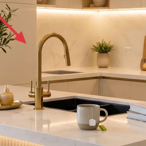
The potted olive tree in a terracotta pot adds real depth to this setup—both color and shadow. Olive green sits perfectly between cream and warm brass, so it harmonizes with the rest of the palette while still feeling fresh. The obvious alternative is using only small plants in the built-in shelves, but one larger tree reads as “intentional centerpiece” and anchors the composition. The trade-off is scale: go too small and it looks like an afterthought; go too large and it blocks sightlines across the island. Positioning it near the middle of the island group keeps it balanced in the frame.
Choose a pot color that matches your metal warmth
Terracotta flatters brass accents and reads warmer than cool ceramics.
The cost, layer by layer
| Layer | Item | Cost |
|---|---|---|
| 1 | 5×7 jute-style area rug | $80 |
| 2 | framed abstract art print | $50 |
| 3 | upholstered barstool (seat + gold base) | $60 |
| 4 | light throw blanket draped over chair arm | $30 |
| 5 | decorative tray with small jars on the island | $25 |
| 6 | candle jar | $15 |
| 7 | potted olive tree in terracotta pot | $30 |
| Total | $310 | |
A cheaper variant keeps the palette, but switches one big spend: choose an unframed print in a poster frame for the wall ($25–$35) and a smaller plant for the island ($15–$20). The rug and tray do the heavy visual lifting, so the overall look stays cohesive.
What worked, what didn't (across the whole room)
The wins here are about cohesion: warm metals, cream surfaces, and olive green all repeat without shouting. Styling on the island feels intentional because it’s grouped (tray + candle + one plant), and the rug grounds the seating zone.
What worked
- The jute-style rug visually anchors the barstools and softens the kitchen’s hard surfaces.
- Warm-toned framed art on the left wall keeps the palette consistent across rooms.
- Upholstered barstools add texture and make the island feel like seating.
- The throw blanket adds an easy, remove-at-move-out softness right where people sit.
- A decorative tray turns small island pieces into one composed vignette.
- One larger olive tree gives the room depth without needing many small accessories.
What didn't
- If the tray is too crowded, the glossy countertop reflects everything and it looks messy fast.
- Choosing a rug with a very high-contrast pattern can fight the warm pendant glow.
- Skipping textiles around bar seating often makes the island look more like a workstation.
- Using only small plants can feel decorative but not anchored, especially in wide kitchen shots.
What we'd skip if we did it again
Skip multiple matching “mini” items on the island. When everything is the same size and height, the counter reads flat and busy under warm light. One tray, one candle jar, and one supporting element keeps the composition calm.
Skip a rug that’s too shiny or too busy for the kitchen. A high-sheen or bold pattern makes crumbs and footprints more noticeable and pulls attention away from the warm brass and cream surfaces.
Skip overfilling the framed abstract wall with extra decor. In this layout, the wall art already connects to the olive-and-cream palette; adding more can make the left side feel crowded compared to the clean lines near the island.
Frequently asked
How long does a refresh like this usually take for renters?
Plan on 3–6 hours the first day for laying down the rug, styling the tray, and placing the plant. Then another 1–2 sessions for adjusting chair textiles and fine-tuning the wall art height. If you’re buying stools and a rug, allow time for returns because sizing matters for island seating.
What if my kitchen island is smaller (or I don’t have room for a rug)?
If the space is tight, use a runner-style neutral rug pad under a smaller rug footprint—still grounded, but less coverage. You can also reduce the island objects to just the tray and one plant, keeping the candle jar for evening mood. The key is grouping, not filling every surface.
What if my room has a different metal finish than the photo?
Match warmth, not the exact hue. If your hardware reads cooler (nickel), swap to warmer textiles (cream and oatmeal) and choose plants with more muted green tones. If your lighting or hardware is brass-heavy, keep accessories in terracotta, ivory, and gold-warm accents so everything feels intentional.
Where should I shop differently to stay move-friendly?
For renter-safe upgrades, prioritize marketplaces with easy returns: rugs from big-box or specialty sellers, framed art from poster/print shops, and stools from furniture resellers that list exact seat height. For styling items, opt for kitchen-safe decor sections—trays, candle jars, and planters are easy to replace and pack.
What’s the biggest mistake people make in kitchen island styling?
The biggest mistake is treating the island like a catch-all. Under warm light and glossy surfaces, reflections and small objects add up quickly. Use one tray as the “home” for small items, add a single plant for depth, and keep the rest of the countertop mostly clear for daily use.
More in Kitchen & Dining
7 kitchen island tweaks for a $400 renter-friendly refresh
A warm modern kitchen island seating nook—built with no-drill swaps—using a jute-style rug, framed art, a draped throw, and styled island d…
7 no-drill kitchen island swaps for a $400 refresh
A renter-friendly guide to styling a kitchen island workspace with a beige rug, upholstered chair, and marble-and-gold inspired tabletop de…
How to style a renter-friendly marble-kitchen island for under $250
A renter-friendly refresh for a marble-kitchen island using 7 visible swaps: a striped dish towel, small planter, flower vase, framed art, …