- Best for
- Kitchen island styling + renter-friendly staging
- Cost
- About $400 total
- Difficulty
- Easy (mostly shopping + arranging)
- Time
- 1–2 hours
Why marble-and-gold countertop styling is the kitchen island workspace of 2026
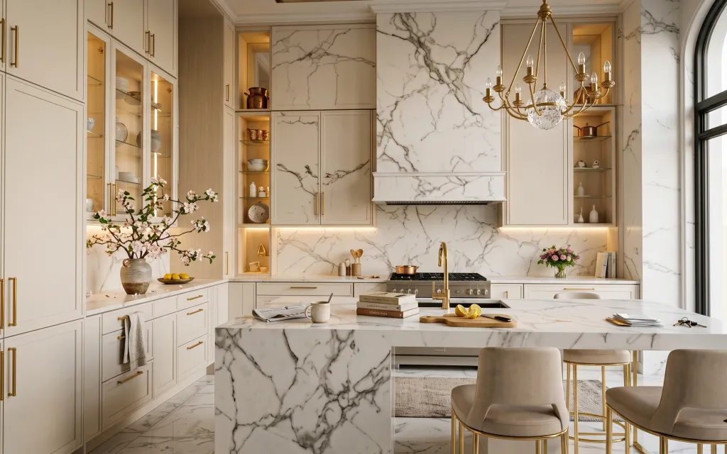
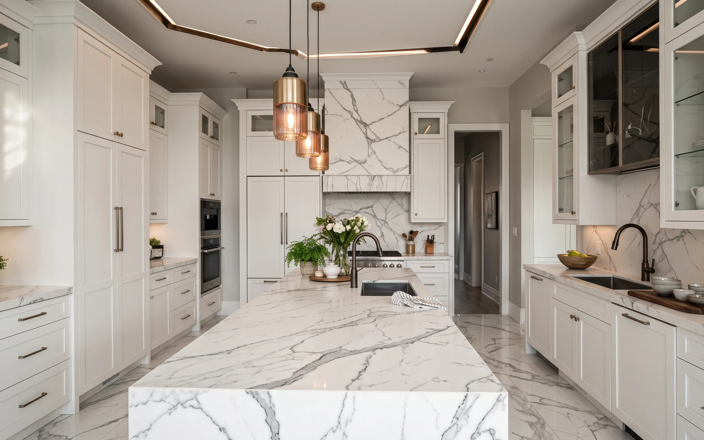
Start with a strong surface baseline (that pale marble look and warm brass tones) and then add small, moveable softness where your hands land. In the photo, the beige area rug, upholstered chair, and textured ceramic vase all interrupt the shine so the island feels welcoming. The chandelier’s warm glow also makes gold feel intentional instead of flashy. This setup is achievable for renters because everything here is either freestanding furniture or counter styling you can pack away when the lease ends.
I used to overdo kitchen decor by stacking more stuff on the island than I could actually cook with. One move later, I learned the island should read like a styled still life for ten minutes, not like a permanent showroom. What changed my mind was treating texture (rug + ceramics) as “foundation,” then using one fresh (or dried) bouquet and a couple of printed objects for the finish. The result looks curated, but it still works day-to-day.
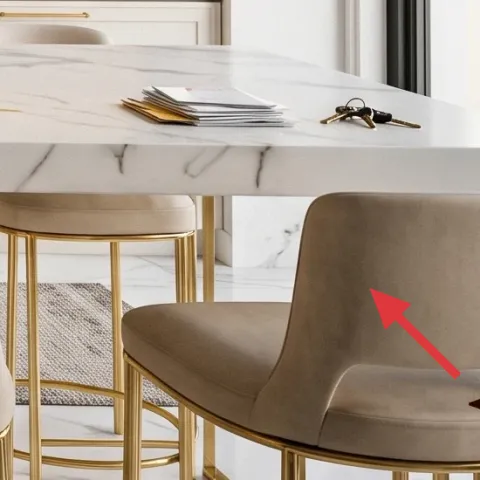
Layer 1 — Area rug 5×7, beige wool-look ($150) Ground the island seating
This beige area rug sits under the dining chairs, making the whole island zone feel anchored instead of floating over marble. Choose a rug with a wool-look pile or a tightly woven texture so it reads soft in daylight but doesn’t fight the marble veining. The obvious alternative is skipping a rug to “keep it clean,” but that’s how the seating area starts to feel cold. A rug also gives you a place to hide daily-life reality—crumbs, scuffs, and the occasional spill—without changing anything permanently.
Rug size that fits the moment
Let the front chair legs sit on the rug so the seating cluster looks intentional from every angle.
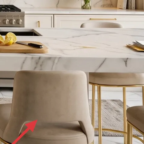
Layer 2 — Upholstered beige dining chair with gold legs ($120) Add softness around hard surfaces
The upholstered chair in a warm beige tone is the counterpoint to the hard, glossy marble and the bright gold lighting. Its slim gold legs echo the warm metal hardware, while the fabric prevents the island from feeling like a showroom. If you swap in a chair with a slick, shiny seat, the space can start to feel more formal than livable. The trade-off I accept with upholstered seats is simple: they’re slightly fussier to keep tidy, but they make the whole room feel calmer and more human.
Match metal, not the exact shade
You don’t need identical gold. Aim for “warm brass” in the chair legs so it harmonizes with the chandelier.
Layer 3 — Textured ceramic vase with pink blossoms ($25) Bring in one tactile focal point
This textured ceramic vase is doing heavy lifting: it adds matte surface, shadow, and shape right where the eye wants something organic. In the photo it sits on the counter near the floral branches, which makes the whole island feel styled without covering the work area. A plain glass vase would be pretty, but it wouldn’t read as grounded against the marble’s high contrast. The trade-off with ceramic is that you’ll want to wipe it clean quickly after handling, but it’s a small effort for a big change in “finished” look.
Keep the vase scale honest
Pick a vase that’s tall enough to show stems clearly, not one that turns into a low, messy bowl.
Layer 4 — Foraged dried floral arrangement in the same vase ($30) DIY the look with less fragility
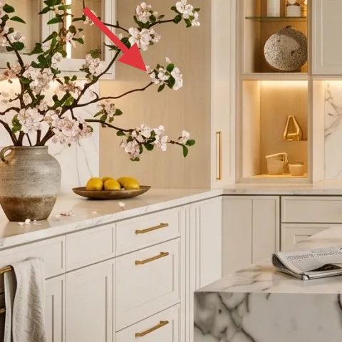
Dried stems give you the same romantic, light-and-dark contrast as fresh blossoms—without the wilting deadline. The photo’s pink flowers create a gentle color pop against white and gold, and you can get that by using foraged or store-bought dried branches in a similar scale. The obvious alternative is buying another fresh bouquet every week, but that’s expensive and adds constant maintenance. This DIY keeps the “styled countertop” feeling longer, and it packs away easily when you move.
Make it instead of buying it
DIY a foraged dried floral arrangement and reuse a similar ceramic vase for the same pink, airy effect.
Materials
- Dried stems bundle (pink/neutral branches) — 1 bundle — thrift/forage — $8
- Floral wire or thin twist ties — 1 roll — craft store — $4
- Small ribbon or twine wrap — 1 spool — craft store — $6
- Paper tape (or painter’s tape) for bundling — 1 roll — dollar store — $5
- Freshening spray (optional, alcohol-free) — 1 bottle — craft store — $2
Steps
- Gather dried stems in two lengths: a taller “center” handful and shorter side stems.
- Sort stems by thickness so the arrangement looks intentional, not random.
- Bundle the center stems and wrap with paper tape to hold the base.
- Tie the side stems onto the bundle with floral wire, adjusting for a gentle outward curve.
- Trim ends for balance, so the top hits the same visual height.
- Wrap twine or ribbon around the bundle base to clean up the tie points.
- Transfer the bundle into the ceramic vase and re-angle individual stems until the silhouette matches.
- Optionally mist lightly with a spray to knock down dust (let it dry fully).
Total DIY cost: $25 — saves about $5 over buying.
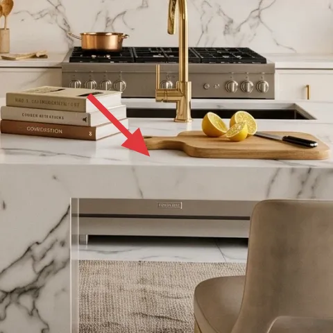
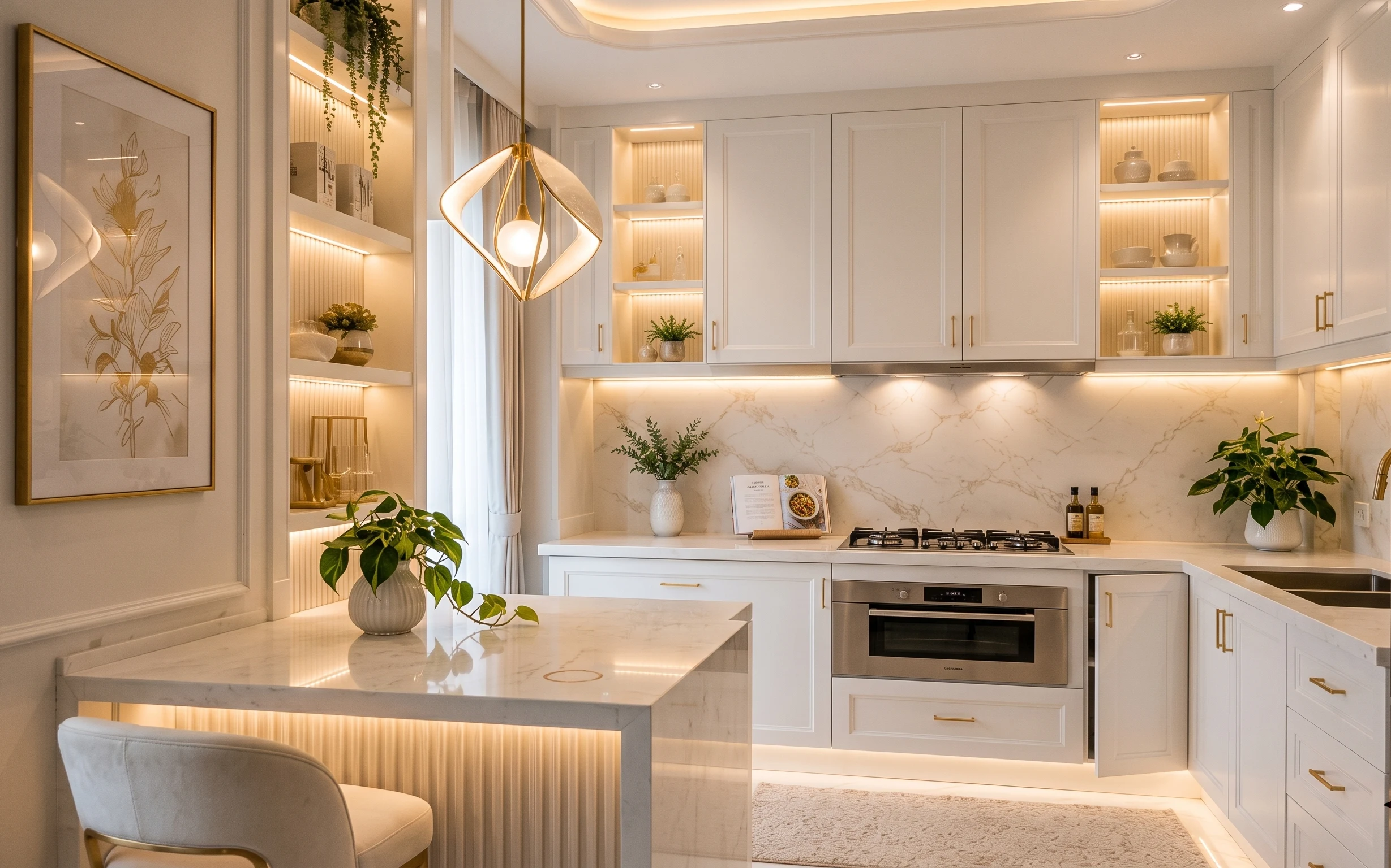
Layer 5 — Decorative book stack on the counter ($15) Add a crisp, editorial layer
A small book stack gives your island styling that “I meant to do this” clarity. In the photo, the books sit flat on the marble surface and work like a height shim for everything around them—especially the tray and the bowl. Choose covers with calm colors (cream, soft gray, black) so the books don’t start competing with the pink blossoms. The alternative is leaving the counter bare, but then the space can feel unfinished even with flowers. Keeping only one stack keeps the island usable for real meals and prep.
Don’t stack too many
More height usually means more clutter—aim for two to three books so they stay readable at a glance.
Layer 6 — Decorative tray for fruit and small styling pieces ($25) Create an “island vignette” zone
A tray organizes small, shiny, and textured objects into one visual cluster. Here, it supports fruit-and-bowls styling so the countertop stays neat even when the island is actively used. If you skip the tray, everything spreads out and the marble surface stops looking curated. Go for a tray with a warm finish that plays nicely with gold tones—think light gold, brass, or warm wood tones—so it doesn’t look cold next to the vase. The trade-off: trays take up a small footprint, so choose one that’s big enough for your bowl but not large enough to crowd prep space.
Use a tray as a boundary
When the tray stays in the same spot, the room always looks styled even on busy weeks.
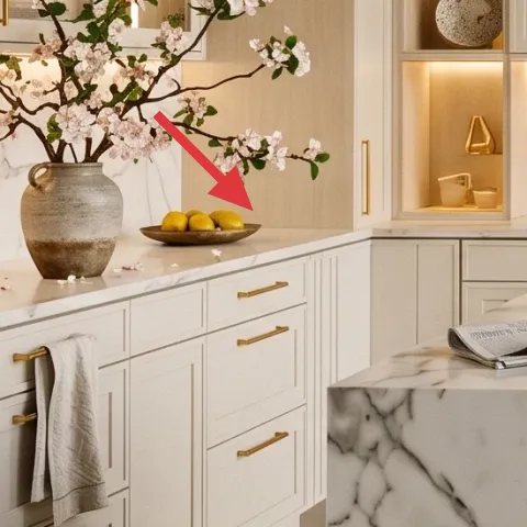
Layer 7 — Decorative bowl for lemons ($20) Keep the color pop functional
The lemon bowl is the kind of countertop detail that looks decorative and practical at the same time. The bright yellow reads like a warm accent against white marble, but because it’s fruit, it also signals “real life happening here,” not just staging. The alternative is replacing it with a single decorative object, but fruit gives you that natural movement and occasional refresh as the lemons change. For renter practicality, a bowl is easy to move, easy to clean, and doesn’t require any hardware. That’s why it works so well on a kitchen island workspace.
Refresh with a quick swap
If the lemons start to soften, swap them out the next grocery run and the look resets instantly.
The cost, layer by layer
| Layer | Item | Cost |
|---|---|---|
| 1 | Area rug 5×7, beige wool-look | $150 |
| 2 | Upholstered beige dining chair with gold legs | $120 |
| 3 | Textured ceramic vase with pink blossoms | $25 |
| 4 | Foraged dried floral arrangement in the same vase (DIY) | $30 |
| 5 | Decorative book stack on the counter | $15 |
| 6 | Decorative tray for fruit and small styling pieces | $25 |
| 7 | Decorative bowl for lemons | $20 |
| Total | $385 | |
If the chair or rug feels too pricey, swap the chair for a simpler upholstered option (or buy only one chair first) and use a smaller rug size that still sits under the front legs. Keep one vase and tray so the island stays styled even with fewer pieces.
What worked, what didn't (across the whole room)
The look works because it balances shine (marble), warmth (gold tones), and texture (rug + ceramics) in a tight island zone. The vignettes read “intentional” without blocking the counter’s practical job. The biggest downside is that it only stays right if the styling stays edited—too many objects makes marble look busy fast.
What worked
- The beige area rug makes the chair zone feel anchored and visually softer than bare marble.
- Upholstery plus warm metal legs keeps the island seating from feeling too stark.
- The textured ceramic vase adds matte shadows that calm down bright marble veining.
- A single pink floral moment gives color contrast without overwhelming the counter.
- Books stacked flat create an editorial height layer while staying easy to reuse.
- A tray turns scattered small items into one clean island vignette.
What didn't
- Counter styling without boundaries spreads out visually and reads messy against marble.
- Too many tall objects compete with the vase and make the island feel crowded.
- Cold-toned decor (cool grays or chrome) clashes with warm brass and looks less cohesive.
- Skipping textiles under the chairs can make the whole dining zone feel cold and unfinished.
What we'd skip if we did it again
Skip adding more than one “tall” centerpiece. On a marble island, multiple heights quickly turn into visual clutter, especially when there’s already a strong focal like the chandelier glow.
Skip matching everything from one store. Instead of buying a full set, mix one warm-metal cue (chair legs or tray finish) with texture (rug + ceramic) so the look stays rich, not uniform.
Skip using clear-glass only decor for the vase moment. Clear pieces can reflect glare on countertop shine; a textured ceramic vase reads softer and steadier in daylight.
Frequently asked
How long does this kind of kitchen island refresh take?
Plan on about 60–120 minutes. Shopping for the rug, one upholstered chair, and small tabletop items is usually the slow part. Styling is fast: rug goes down first, then chair placement, then the island vignette (tray → bowl/fruit → books → vase). The dried-floral DIY part takes about 30–45 minutes if stems are prepped.
Can this work in a rental without changing cabinets or countertops?
Yes. The layers here are freestanding furniture and counter styling—an area rug, chairs, a vase arrangement, a tray, a bowl, and books. Those don’t require drilling, anchors, or replacing landlord fixtures. The only “active” part is editing the arrangement so it stays functional when you actually cook.
What if my kitchen island is smaller or bigger than the photo?
For smaller islands, use a smaller tray footprint and keep the book stack low (two books instead of three). For bigger islands, keep the same recipe but spread the objects slightly—still within one tray zone—so it looks intentional rather than sparse. The rug can scale too, but aim for front chair legs on the rug either way.
Where should I shop for the rug and chairs to match this look?
Start with retailers that carry mid-century or traditional neutrals for upholstery and rugs. Look for a beige wool-look or tightly woven texture rather than a high-shine synthetic. For chairs, warm gold legs matter more than exact matching—brass tones in the same family read cohesive with the gold lighting you already have.
What’s the biggest styling mistake on a marble island?
The biggest mistake is letting the island become a catch-all. Marble reflects light and shows edges, so extra objects feel louder. A tray creates a boundary, the book stack adds height without clutter, and one floral moment provides softness. Edit down until the island still has clear prep space.
More in Kitchen & Dining

7 no-drill kitchen island swaps for a $400 refresh
A renter-friendly guide to styling a kitchen island workspace with a beige rug, upholstered chair, and marble-and-gold inspired tabletop de…
How to style a renter-friendly marble-kitchen island for under $250
A renter-friendly refresh for a marble-kitchen island using 7 visible swaps: a striped dish towel, small planter, flower vase, framed art, …
A kitchen breakfast nook refresh for $400
A kitchen breakfast nook refresh built for shared housing: seven move-friendly swaps focused on framed botanical art, light curtains, and w…