- Best for
- renters who want japandi calm
- Cost
- under $600
- Difficulty
- easy
- Time
- about a weekend
Why a japandi green-and-wood palette is the bed nook of 2026
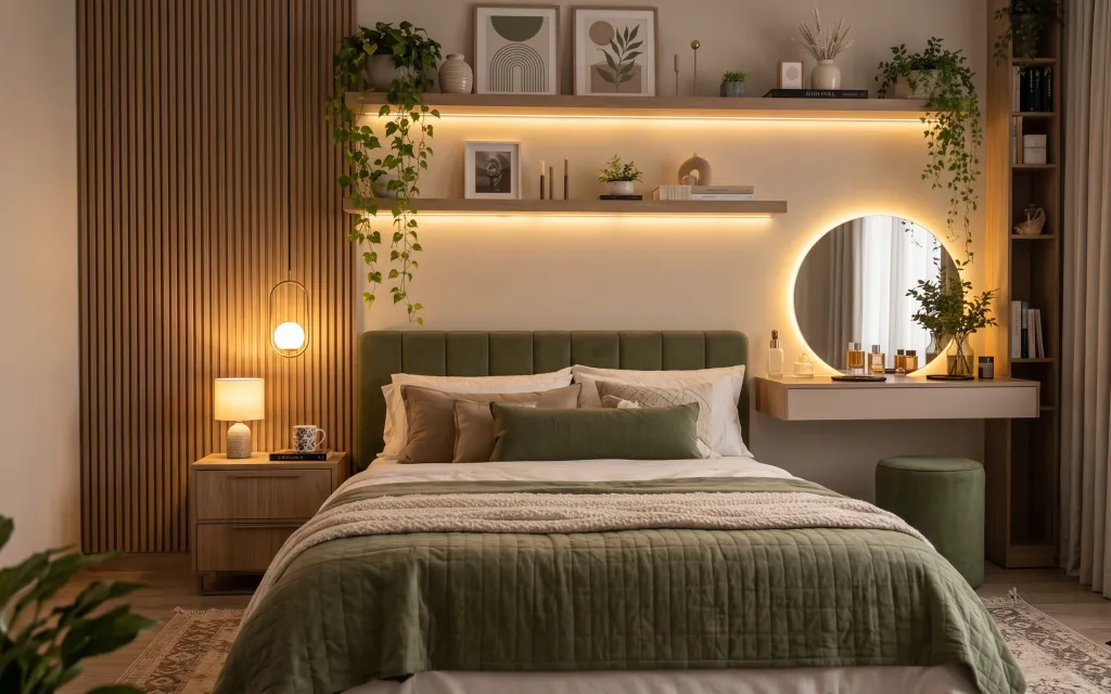
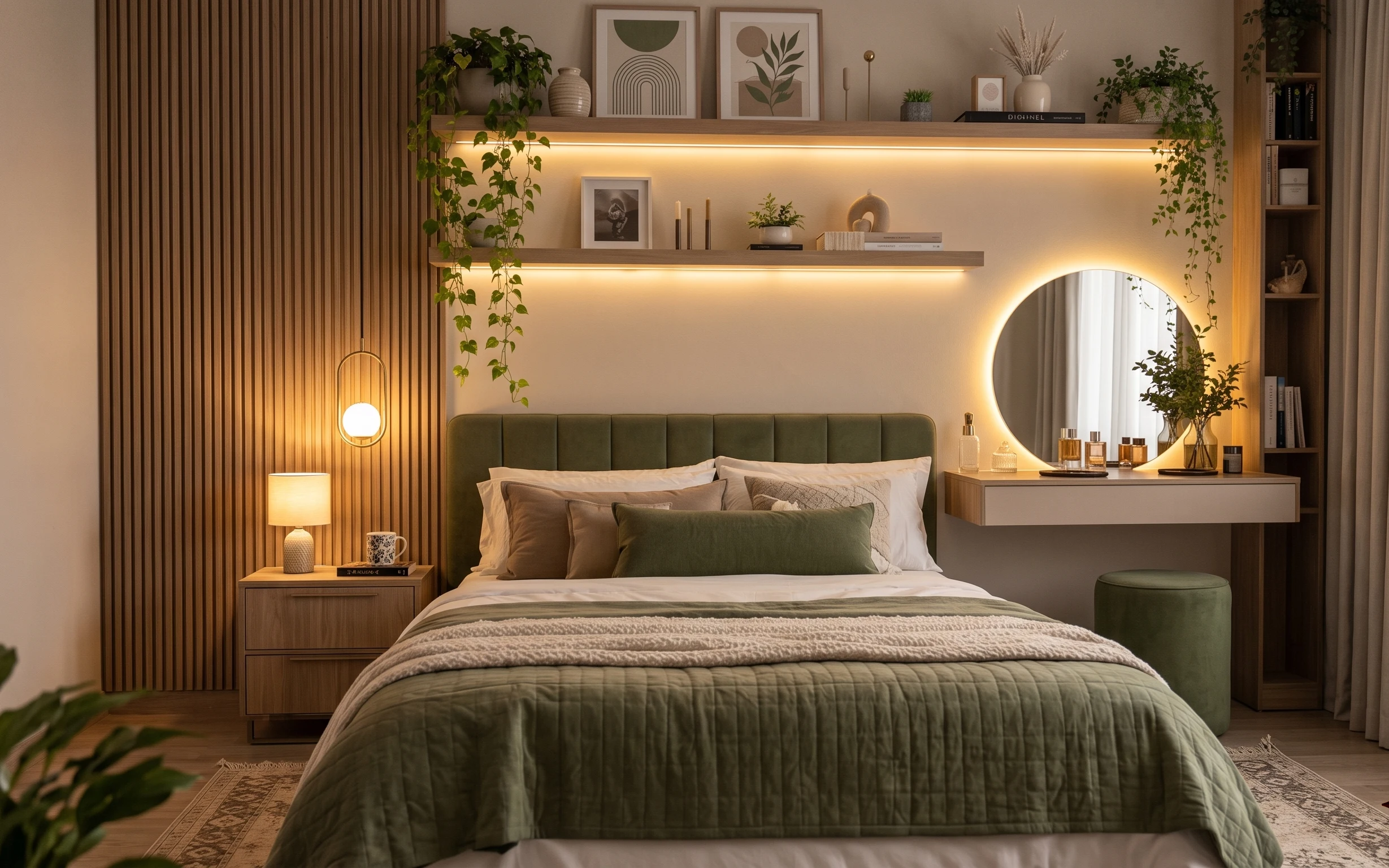
The photo sells the mood through restraint: a quilted olive bed cover, warm beige curtain panels, and a patterned area rug that softens the wood floor. The shelf styling adds vertical breath, while the plug-in table lamp keeps everything lit like evening dinner—never harsh. If you’ve ever stared at a blank rental bedroom wall and thought “I have to choose either comfy or calm,” this setup argues for both. It’s achievable on a renter budget because most of the work is textiles and surface styling that pack away at move-out.
I used to overcorrect by buying matching “sets” after I’d found one good reference photo. This time, I followed the opposite rule: pick one anchor palette (olive + warm beige + walnut) and vary textures instead—quilted fabric, linen-like curtains, and a rug with pattern depth. The first time it clicked was when I layered curtains to the floor and let the lamp do the glow, not the overhead lighting. That’s how the room stays serene even on busy days.
Layer 1 — area rug ($200) Pattern underfoot that hides the moving-day mess
This area rug sits across the bed’s front zone, so it has to look intentional in both daylight and at the end of the day when you’re walking barefoot. Choose a 5×7 size that reaches at least under the front edge of the bed so the pattern doesn’t look “stuck on.” The trade-off is that a patterned rug takes a little more time to vacuum, but it’s what makes the room feel finished without new wall work. A solid rug can look clean, yet it rarely hides scuffs and tracked dust as well as this one does.
Anchor the palette with one grounded pattern
If the rug already has olive and warm beige tones, you can repeat those colors in pillows and jar labels without buying a whole new furniture lineup.
Layer 2 — curtain panels ($80) Floor-length framing for a rented bedroom
These curtain panels add height and softness, especially on the right side where they fall next to the rounded wall arch. In a rental, that visual “frame” effect is doing more work than any paint job ever would. Go for panels that skim the floor (not pooling puddles) and hang them high—closer to the ceiling line—so the room reads taller. The obvious alternative is blinds or short curtains, but those make the ceiling feel lower and the bed feel heavier. Long curtains also create a quieter backdrop for the shelf styling.
Choose texture over blackout if you rent
Sheer-to-medium curtains keep the warm lamp glow flattering without locking the room into one function forever.
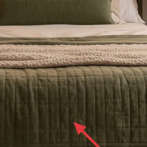
Layer 3 — throw pillows ($30) Olive + cream so the bed cover doesn’t feel flat
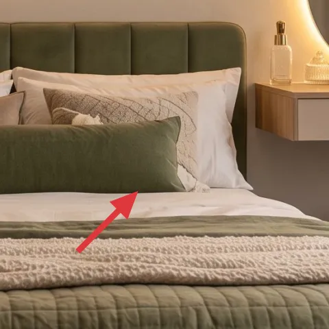
The throw pillows bring contrast against the quilted green bed cover and keep the bed from reading one-note. A good renter move is to pick two cover tones—one close to the bed cover (olive or sage) and one warm neutral (cream, oat, or linen)—then add a small texture variation like a subtle weave or grid. The trade-off with fewer pillows is that you’ll need better placement: don’t stack everything in the center; vary heights so the top pillow sits where your eyes land from the doorway. This is the layer that makes the bed look styled, not just covered.
Build a “two-height” pillow stack
Use a back layer pillow and a front layer pillow so the bed has shape even when you’re not doing the full make.
Layer 4 — plug-in table lamp ($60) Warm light you can pack away
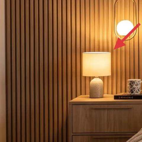
The plug-in table lamp provides the soft, golden mood you see in the room, and it’s a renter-safe shortcut: you can control the atmosphere without touching wiring. Place it on the left bedside table so it balances the visual weight of the bed cover and keeps the shelf glow from looking like it’s the only light source. If you try to get this look with overhead-only lighting, the room reads flat. The trade-off with a table lamp is you’ll want a warm bulb (around 2700K) so the palette stays olive instead of turning gray.
A cool bulb will ruin the olive
If your lamp bulb reads blue-white, the green bed cover can shift to an unflattering olive-gray.
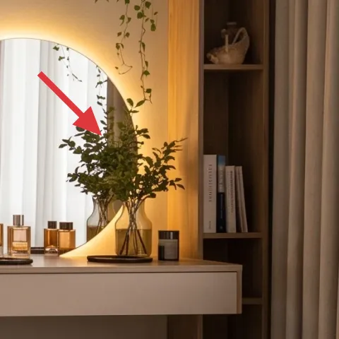
Layer 5 — framed art print ($80) One calm graphic so the shelf feels curated
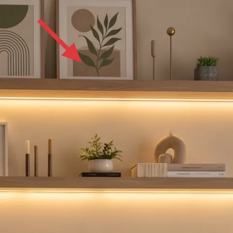
This framed art print echoes the room’s minimalist lines while still giving warmth through color choice. On a shelf or console surface area, one framed piece works like punctuation: it stops the eye from bouncing between candles, books, and plants. Pick art with curves or geometric bands in tones like warm beige, olive, and light clay so it harmonizes with the curtain and rug. The obvious alternative—buying several small prints—can look busy fast in a rental, especially when your shelf already holds plants and jars. Keep it to one anchor print per surface and repeat the color palette elsewhere.
Let frame matting be part of the palette
Off-white mats make the room feel softer than bright white when everything else is warm-toned.
Layer 6 — decorative jar labels ($45) Readable little “library” on the shelf
Those decorative jar labels are what turn a cluster of glass into a styled moment. Instead of buying matching containers, you can keep whatever jars you already have and focus on consistent label typography and spacing. The trade-off is that hand labeling needs patience—crooked labels are more noticeable on glass than on cardboard. This is why a clean, centered layout matters. It also pays off at move-out: your labeled jars travel with you, and the shelf styling can stay the same wherever you land next.
Match label color to your curtain tone
Warm beige label cards look more intentional next to oatmeal curtains than pure black-and-white text.
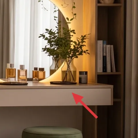
Layer 7 — decorative tray ($30) A base layer for candles, oils, and “everyday nice”
A decorative tray is the quiet organizer behind the shelf’s “collected” feel. It groups small items—candles, bottles, and little ceramics—so the surface doesn’t look scattered when you only have five minutes to tidy. Put the tray on the console credenza where you’d normally set clutter, then style it in a simple rhythm: one taller object, one mid-height object, and one small accent. The trade-off is that you’ll need to resist adding random extras once it looks good. A tray makes those extras look like clutter, which is exactly what keeps the room calm.
Use height steps, not more objects
If the tray feels too empty, add a taller candle holder before buying a second set of knickknacks.
The cost, layer by layer
| Layer | Item | Cost |
|---|---|---|
| 1 | area rug | $200 |
| 2 | curtain panels | $80 |
| 3 | throw pillows | $30 |
| 4 | plug-in table lamp | $60 |
| 5 | framed art print | $80 |
| 6 | decorative jar labels | $45 |
| 7 | decorative tray | $30 |
| Total | $525 | |
If $200 for the rug feels steep, swap to a smaller patterned 5×4 or a budget runner that still goes under the bed front edge. Keep the same olive-and-beige palette in pillows and curtains so the room keeps its japandi calm.
What worked, what didn't (across the whole room)
This bed nook succeeds because the styling is built in layers: grounded textiles first, then controlled highlights (lamp glow, one framed print, and grouped shelf objects). The olive-and-warm-beige palette stays cohesive without relying on matching furniture pieces. The biggest downside risk is over-adding decor once the shelf looks “almost right.”
What worked
- The patterned area rug keeps the bed zone visually anchored on a wood floor.
- Floor-length curtain panels make the ceiling feel higher and soften the bed’s silhouette.
- Olive-and-cream throw pillows add contrast without adding clutter.
- The plug-in table lamp creates warm, flattering light across textiles and glass.
- The framed art print adds calm geometry so the shelf styling feels edited.
- Jar labels and a decorative tray turn small items into a deliberate collection.
What didn't
- Too many pillow covers at once make the bed look busy instead of intentional.
- Using cool-white bulbs shifts olive tones toward gray and flattens the mood.
- Adding extra shelf objects after the tray is styled breaks the clean japandi rhythm.
- Short curtains that don’t reach the floor make the whole bed arrangement feel heavier.
- Labels that don’t match the warm beige palette can look random against the shelf background.
What we'd skip if we did it again
Skip swapping in a plain solid rug if the goal is the finished, textured look. A flat rug can feel temporary in photos because the bed cover already brings a lot of texture; the rug needs pattern depth to balance it.
Skip buying “matching” storage jars in a hurry. Decorative jar labels do more for the aesthetic than identical containers, and you can reuse whatever jars you already have.
Skip cool lighting experiments. If the only change is a bulb swap, warm-toned light keeps olive green flattering and makes the lamp glow feel intentional instead of yellow or harsh.
Frequently asked
Is this renter-friendly if my bedroom is small?
Yes—start with the rug and curtains. For a smaller bed nook, choose the largest rug size your floor allows and keep curtain panels to the floor so the vertical lines still lift the space. Use fewer pillow covers (one olive tone, one cream tone) and keep shelf styling to a tray plus one framed art print. The plug-in table lamp also helps because you can position it for the best light without changing hard fixtures.
How long does it take to get this look?
Plan on one day for the textiles (rug placement, curtain hanging, pillow styling) and a second shorter session for shelf and surface details (framed art print placement, jar labels, and tray grouping). If you already have jars and only need labels, the “shelf moment” takes under an hour. Budget extra time if you’re measuring curtain height and want them to hit the same floor line on both sides.
What if I can’t reach the outlet near the bedside table?
The workaround is using a location that already has a nearby plug, then shifting the bedside table to match. If your outlet placement is awkward, use a longer plug-in lamp cord only if it doesn’t create a trip hazard. The look still works because the key factor is warm light near eye level—not specifically the exact lamp position from the photo.
Where should I shop for these pieces without making it expensive?
For the rug and curtain panels, look for sales first (or use a budget-friendly pattern that matches olive and warm beige). For the framed art print, choose a single larger print over multiple tiny pieces. The decorative tray and jar labels can come from home goods aisles, craft stores, or online—these are easy to bundle and return if the tone isn’t right once it’s in your space.
What’s the biggest mistake people make with this style?
Over-styling the shelf after everything else is in place. Japandi stays calm when items share a simple rhythm: one taller object, one mid-height object, and one small accent, all within the same decorative tray footprint. The second biggest mistake is using cool-white bulbs; olive green shifts toward gray and the whole palette loses its warmth.
More in Bedroom
7 renter-friendly swaps for a $600 bed nook refresh
A bed-nook refresh in warm beige and olive green—built for renters with no-drill updates. This look comes together with seven budget-friend…
6 no-drill updates for a bed nook with warm neutrals, $400
A bed nook refresh that reads japandi and warm-minimal: olive pillow, green throw, and a custom framed abstract print—without drilling or p…
A bed-nook glow-up for $400: no-drill gold-and-cream bedroom styling
A $400 bed-nook refresh that reads bright, elegant, and move-friendly: a jute-style rug, gold-framed botanical prints, and layered white be…