- Best for
- white bed nooks with gold accents
- Time
- 2–4 hours total
- Total cost
- $400
- Renter-safe
- Yes (no drilling; all removable)
Why gold-and-cream bedroom is the bed nook of 2026
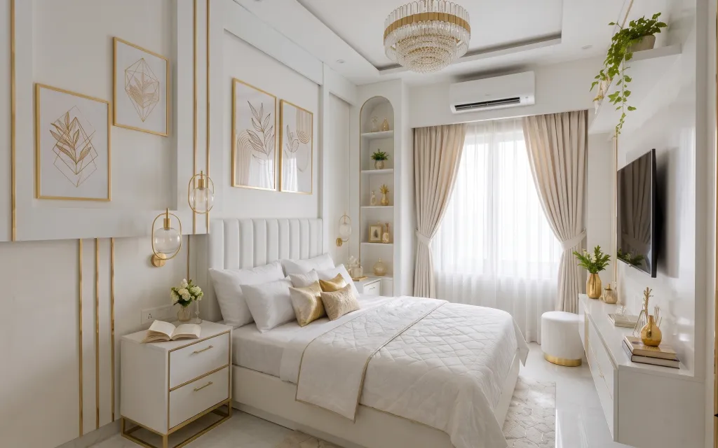
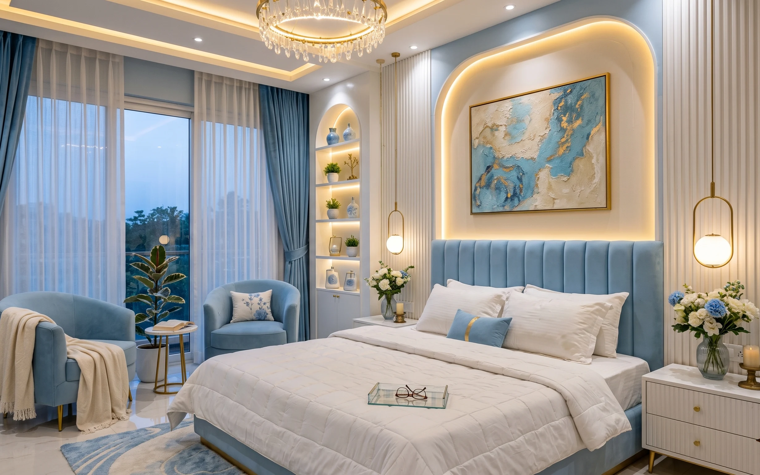
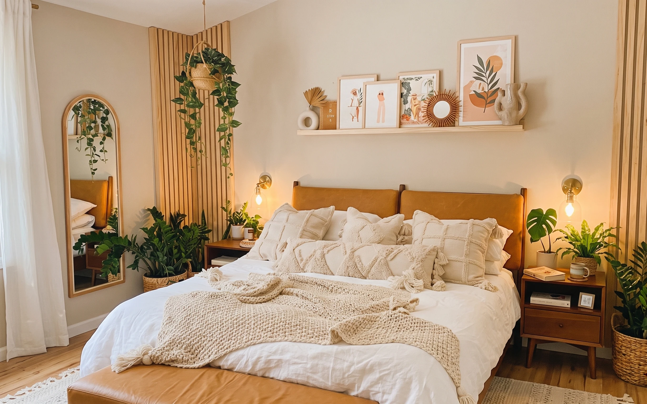
This look lives in the details: the white quilted bedspread, the warm metallic gold accents, and those botanical line-art prints that feel graphic instead of busy. You can also see how the textures do the heavy lifting—smooth satin, woven rug fibers, and the soft volume of the bedding. I’m borrowing the “editorial layering” idea from Apartment Therapy styling spreads, but keeping it renter-safe. With Command hooks, textiles you can pack up, and freestanding decor, the result still photographs like a designer room without needing landlord buy-in.
The first time I tried to copy this vibe, I made the mistake of choosing “pretty” decor that didn’t share a material story. The gold looked accidental next to the wrong shade of white, and the whole corner felt flat. What changed my mind was matching warm metallic finishes and staying disciplined with one botanical motif. Once the colors and textures match, the room feels intentional even when everything is moveable.
Layer 1 — 5×7 jute-style area rug ($120) A softer landing that hides wear
A jute-style area rug anchors the bed nook the way these light gray marble floors never do on their own. The rug in the photo sits right in the walking zone in front of the bed, so it visually “grounds” the white bedding and keeps the space from feeling too slick. I’d choose a 5×7 size here because it reaches far enough to connect the bed and console area, not just frame the bed legs. The trade-off is that natural-fiber textures show lint faster than low-pile synthetics, but it’s worth it for the warm, woven look.
Pick a rug with a flat or low-shed weave
For bedrooms, low-pile jute looks authentic while still being easier to vacuum around bed edges.
Layer 2 — gold-framed botanical print set ($90) Line-art over “busy” florals
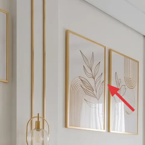
The gold-framed botanical print set is what turns a basic white bed nook into something that reads curated. In the photo, the prints are slim, vertical, and gold-outlined, which helps the wall feel taller and keeps the palette cohesive with the metallic hardware tones. I’d go with a coordinated set instead of mixing random frames, because the goal is rhythm—not variety. The trade-off is that matching frame colors can feel restrictive, but it prevents the “why doesn’t this look together?” moment when you add other decor.
Use Command hooks for the gold frames
Clips and hooks keep the frames removable at lease end.
Layer 3 — white quilted bedspread ($60) Structure that reads elevated
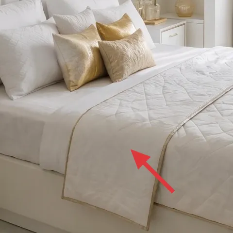
This white quilted bedspread adds shape even when the room is mostly neutrals. The photo’s texture shows up under daylight: the quilting catches light, so the bed doesn’t look like one flat rectangle. If you skip it and rely only on a sheet set, the corner can feel unfinished. I like choosing a machine-washable quilt or coverlet-style piece because it keeps the look crisp without “dry-clean only” stress. The trade-off is that white shows shadows and lint, but the visual brightness is the whole point of the style.
Keep the quilting visible
Drape it so the top edge and stitching lines show, not tucked away under pillows.
Layer 4 — gold satin accent pillow set ($30) A small metallic hit, not a theme
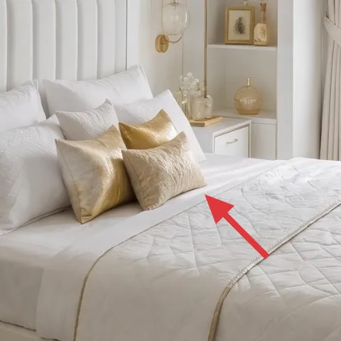
The gold satin accent pillows give you that warm glow without turning the bed into a full-on “gold room.” They also echo other gold tones—like the vase finishes—so everything feels connected. I’d pick one to two pillows in a sheen fabric (satin or silk-look) and keep the rest of the bedding in matte whites. The alternative is adding a patterned pillow, but patterns compete with the botanical prints. The trade-off with satin is that it can show creasing, so it helps to fluff and lightly smooth before photos or guests.
Match the finish to your decor
If your tray or frame is warm gold, satin reads more cohesive than cool-brassy tones.
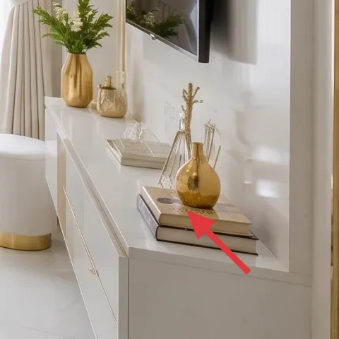
Layer 5 — gold decorative tray on console ($35) Instant styling order
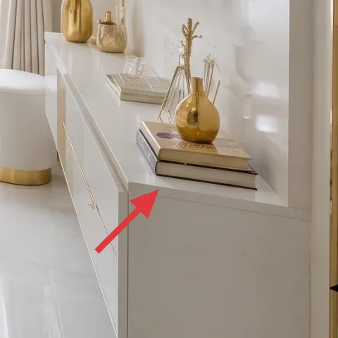
A gold decorative tray is the fastest way to make the console area feel styled instead of scattered. In the photo, the tray gives a “base” for small objects—books, a bottle-like vessel, and a warm-toned vase—so the cluster looks intentional. I’d choose a tray with crisp edges and a reflective-but-warm finish, then group three items: one tall, one medium, one small. The trade-off is that trays reduce visual chaos, so you’ll want to be selective—if you add too many objects, it stops feeling edited.
Don’t overload the tray
If every inch is filled, the gold stops reading luxe and starts reading clutter.
Layer 6 — small potted plant on built-in shelf ($30) Green that softens the white
That small potted plant on the built-in shelf is the calming counterpoint to all the white surfaces. Green also gives your gold-and-cream palette somewhere to “rest,” especially when the wall art is line-art and neutral. I’d keep the plant compact (something you can move with one hand) and choose leaves that don’t look overly spiky or bright. The trade-off is that small plants can dry out quickly on shelves, but it’s easier to keep them looking fresh than a larger centerpiece that becomes harder to relocate.
Angle the leaves toward the bed
Turning the pot slightly makes the plant read as a natural part of the bed nook’s composition.
Layer 7 — dried floral arrangement in gold vase ($35) Keeps the look “fresh” longer
Make it instead of buying it
DIY a dried floral arrangement in the same gold vase shape so the bed nook stays polished longer than fresh bouquets.
Materials
- Foraged dried stems (2–3 bunches) — small bundles — $10
- Florist tape (green) — 1 roll — $8
- Twine or raffia — 1 spool — $6
- Thin wire (for shaping stems) — 1 small pack — $4
- Optional ribbon tie — 1 small piece — $2
Steps
- Collect stems at different heights so you can build a layered, full silhouette.
- Sort stems into tall, medium, and small clusters and remove any damaged pieces.
- Secure a tall “spine” bundle with florist tape, wrapping from top to stems base.
- Bundle medium stems around the spine and tape again to lock the shape.
- Fill gaps with the smaller stems, adjusting angles until the bouquet looks even.
- Wrap twine lightly around the taped bundle and twist to tighten.
- Trim ends so the stems sit at a comfortable height inside the vase.
- Place into the vase and use thin wire to nudge any stems that tilt.
Total DIY cost: $30 — saves about $5 over buying.
In this bed nook, dried stems keep the gold-vase centerpiece looking styled without daily maintenance. The photo’s vase-and-bouquet moment is doing more than decoration—it adds softness against the crisp whites and graphic prints. Buying pre-made dried arrangements can get pricey fast, so making your own lets you match height and color to the rest of the palette. The main trade-off is that drying and sorting takes a little patience, but once it’s built, it holds shape for weeks (sometimes months) with minimal changes.
Choose muted, warm-toned stems
Warm creams and soft greens sit better with gold frames than bright, high-contrast florals.
The cost, layer by layer
| Layer | Item | Cost |
|---|---|---|
| 1 | 5×7 jute-style area rug | $120 |
| 2 | Gold-framed botanical print set | $90 |
| 3 | White quilted bedspread | $60 |
| 4 | Gold satin accent pillow set | $30 |
| 5 | Gold decorative tray for console styling | $35 |
| 6 | Small potted plant for built-in shelf | $30 |
| 7 | Dried floral arrangement in gold vase (DIY equivalent) | $35 |
| Total | $400 | |
If you want it cheaper, swap the framed botanical set for a single larger print and put the budget into the rug plus one satin pillow. A simpler tray (one vase + one book stack) still reads polished when the bedding and rug stay consistent.
What worked, what didn't (across the whole room)
This bed nook comes together because the materials repeat: white textiles, warm gold accents, and one botanical motif. The styling is also balanced—soft bedding volume plus structured frames and a grounded rug.
What worked
- The jute-style rug warms the space and makes the white bed area feel grounded on marble flooring.
- The gold-framed botanicals add vertical structure without cluttering the wall.
- Quilting texture in the bedspread keeps the bed from looking flat even in bright daylight.
- Gold satin pillows add sheen only where it counts—near the center of the bed.
- A gold tray organizes small objects into a tight, editorial cluster.
- A compact potted plant softens the palette and prevents the corner from reading sterile.
What didn't
- If the botanical frames aren’t the same gold tone, the wall can feel mismatched even with good placement.
- Too many items on the console tray makes the gold look busy instead of styled.
- White textiles show lint and shadowing, so the bed needs quick smoothing before guests.
- Satin pillows crease easily, so they can look less crisp if they’re not fluffed regularly.
- Small plants can dry out faster on shelves, especially near bright windows.
What we'd skip if we did it again
Skip adding more than one “hero” material. When the bedding is bright white and the frames are gold, the best move is to keep other items matte or neutral rather than piling on extra shine.
Skip replacing every textile at once. It’s smarter to refresh the bedspread texture and add the satin accent pillow; the rug and artwork do the heavy visual lifting so the rest can stay simpler.
Skip buying pre-made dried florals that don’t match your vase height. A DIY dried bundle built to the same silhouette makes the centerpiece look intentional, and it survives long after fresh bouquets would.
Frequently asked
How long does this bed-nook refresh take?
If the rug, bedspread, pillows, tray, and plant are already in hand, the styling part takes about 45–90 minutes: place the rug, hang or set the botanical prints, arrange the console objects, and build the bed layers. The DIY dried stems add time depending on how quickly you source materials, usually another 30–60 minutes.
Is this renter-friendly if my lease doesn’t allow wall hooks?
Yes, as long as you use removable hanging methods. For the botanical prints, Command strips and picture-rail hooks work when installed correctly and removed cleanly at lease end. Everything else here is freestanding or textile-based: rug, bedspread, pillows, plant, and console styling.
What if my bedroom is smaller than the photo?
In a smaller room, keep the same palette but scale down the footprint. Choose the smallest rug size that still extends beyond the bed edge, and reduce the print set to two or three vertical frames instead of a larger group. The gold tray can also hold fewer objects—three items max reads tidy.
What if my room is larger and feels empty?
Add “structure,” not more clutter. Go slightly larger with the rug coverage in front of the bed and keep the vertical rhythm with more frames (or a taller single print). You can also add one more matching botanical print on the console side while keeping the tray styling the same size.
Where should I shop for these pieces if I want the gold-and-cream look?
Look for gold frames and botanical line-art at home decor retailers and print shops that offer sets, then match the finish tone by eye. For textiles, focus on texture (quilted or woven) rather than exact fabric names. Rug stores and major retailers often carry jute-style rugs that look similar on camera.
Biggest mistake to avoid in a look like this?
Mixing too many finishes. If the gold frames, tray, and vases are different undertones (cool brass vs warm gold), the room can feel “almost right” instead of cohesive. It’s easier to keep everything in the same warm family than to fight the palette after everything is bought.
More in Bedroom

A bed-nook glow-up for $400: no-drill gold-and-cream bedroom styling
A $400 bed-nook refresh that reads bright, elegant, and move-friendly: a jute-style rug, gold-framed botanical prints, and layered white be…
7 upgrades for an upholstered bed nook, for $700
A modern glamour upholstered bed nook refresh: blue curtains, an abstract framed artwork focal point, warm-white paneled walls, and styled …
7 budget-friendly bedroom upgrades for a boho bed nook
A boho bed nook refresh that leans on warm textures: rug, a painted nightstand, and soft lighting. This weekend plan keeps the look cohesiv…