
- Best for
- Bedroom focal-point refresh
- Time
- 1–2 weekends
- Total cost
- $685
- Renter-safe
- Mostly
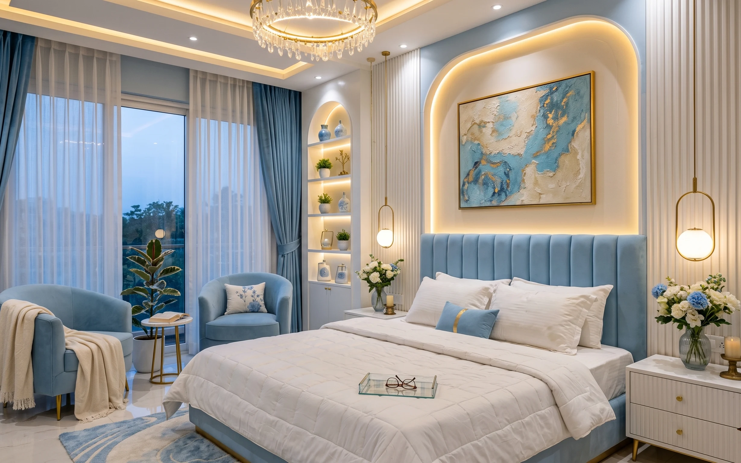
Why blue-and-brass glamour is the upholstered bed nook of 2026
What makes this look work is how the room handles softness and sparkle in the same breath. The blue curtains and white sheers create a gentle frame, while the upholstered bed frame adds that tailored, hotel-like structure. In the background, the warm-white paneled wall and the lit display shelves make the whole space feel intentional, not borrowed. Even the textures—velvet throw, crisp bedding comforter, and the glossy floor tiles—are all in the same calm palette. For US homeowners, it’s an achievable weekend refresh because you can pick your biggest-impact buy first and build from there.
I almost over-decorated this kind of room the first time I tried it. I packed in too many little things and the panels stopped reading as “designed.” The fix was simpler: one large framed artwork piece to anchor the eye, then fewer, more spaced objects on the shelves. That’s why the shelves here matter—each small plant and ceramic piece has room to breathe, so the glow stays the main event.
Layer 1 — Blue area rug 5×7 ($200) anchors the whole palette
This blue 5×7 rug sits near the bed and immediately gives the room a base that the crisp white bedding can “rest on.” It’s doing more than decoration: it softens the glossy floor tiles so the space doesn’t feel slippery or echo-y. The obvious alternative is choosing a neutral rug, but then the curtains and artwork lose their color momentum. The trade-off with going bold on color is that you have to keep everything else calmer—here, the white sheers and warm lighting keep the blue from getting too cold.
Use the rug to set your color temperature
If your curtains read cool, pick a rug that has either a slightly gray-blue or a warmer indigo so it plays nicely with brass lighting and candle glow.
Layer 2 — Blue curtain panel pair ($60) makes the window feel taller
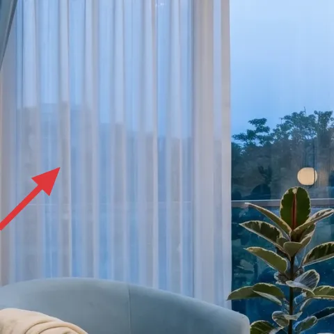
The blue curtain panel pair is the vertical “frame” that makes the bed nook feel pulled together. Hanging them with soft puddling in the lower half gives you that plush, high-end look, even without a full remodel. Blue panels also do a practical job: they calm down reflections from the glossy floor tiles and make the chandelier light feel warmer by comparison. The alternative—sheers only—looks airy, but it won’t give you that grounded structure. The trade-off here is maintenance: you’ll want to shake and spot-clean so the fabric stays crisp.
Let the sheer do the light work
Layer white sheers under blue panels so daytime light stays diffused instead of blocked.
Layer 3 — Large framed abstract wall art ($80) gives you one clear focal point
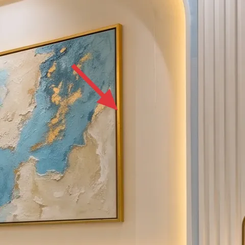
This large framed abstract wall art is positioned like a statement headliner—big enough to compete with the upholstered bed frame, not so busy that it becomes visual noise. The blue strokes echo the curtain color, while the beige and cream tones connect back to the warm-white paneled wall. If you went smaller with multiple prints, the eye would keep bouncing and the room would feel busier than it needs to be. The trade-off is scale: measure your wall and aim for a proportion that’s wide enough to read from the bed, not from across the room.
Match tones, not exact colors
Pick one “family” (blue) and let secondary tones (cream/beige) connect to your wall and bedding instead of chasing the same shade.
Layer 4 — warm-white paint for the paneled wall ($70) makes the glow believable
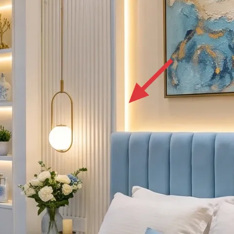
The warm-white paneled wall is the quiet engine of this look. When paint is slightly warm (not stark white), the chandelier and candle light read amber instead of icy, which matters in a bedroom with blue textiles. It also gives the vertical paneling sharper definition—light catches the ridges and turns “plain architecture” into texture. The alternative is a cooler white, but that often makes blue curtains feel colder and can make brass look more yellow. The trade-off is prep: paneled surfaces show roller marks, so a careful primer + smooth application is worth the extra hour.
Make it instead of buying it
DIY warm-white paint for the paneled wall so the whole bed nook reads softer under chandelier and candle light.
Materials
- Primer (interior) — 1 quart — local hardware — $12
- Warm-white interior paint — 1 quart — local hardware — $25
- Painters tape + edge pad — 1 set — big-box store — $8
Steps
- Protect the floor and tape panel edges with painters tape so ridges stay crisp.
- Roll a thin, even coat of primer on the paneled sections first.
- Allow primer to dry fully until it feels matte and doesn’t feel tacky.
- Cut in the panel edges with a small angled brush for clean lines.
- Roll paint across the panels in the same direction, then lightly tip-off to reduce streaks.
- Let the first paint coat dry, then apply a second coat if the panels still look uneven.
Total DIY cost: $45 — saves about $25 over buying.
Layer 5 — white display shelves niche unit with backlighting ($180) turns styling into architecture
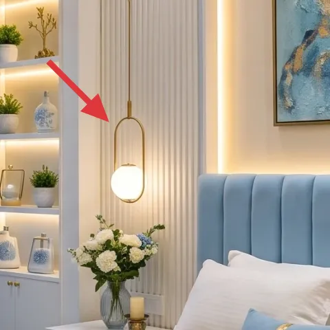
The white display shelves niche unit with backlighting is what makes this room feel “built,” even though it’s really staged. The shelves create vertical rhythm that matches the tall curtains, and the warm under-shelf glow makes small objects look curated instead of random. Styled decor also matters here: the small potted plant(s), decorative ceramic objects, and bottles are spaced so each one has a visual landing spot. If you skip shelves and go straight to a larger bedside surface, the room can feel flat and one-note. The trade-off is time spent styling—keep the object count limited so the light stays the focal point.
Don’t cram every shelf
Even with lighting, too many small objects makes the niche read cluttered instead of calm.
Layer 6 — blue velvet throw blanket ($60) adds the “hotel” softness layer
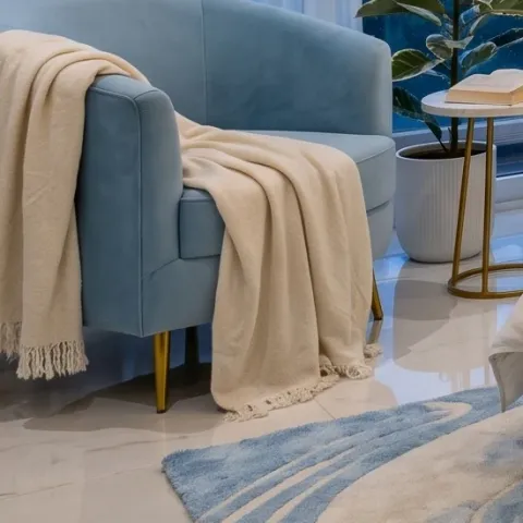
A blue velvet throw blanket folded over the chair is a small choice with outsized impact. Velvet reads richer than matte fabric, and it repeats the room’s blue tone without competing with the bigger focal pieces like the framed artwork. This is one of those details that makes the bedding look more styled—especially when your comforter is crisp and white. The alternative is a basic cotton throw, but it won’t catch the warm chandelier light the same way. The trade-off with velvet is that lint shows, so keep it on a quick rotation for a clean look.
Fold it like you mean it
One neat fold reads intentional; loose draping can make the chair look unfinished next to a structured bed nook.
Layer 7 — small table candle on nightstand ($35) finishes the scene after dark
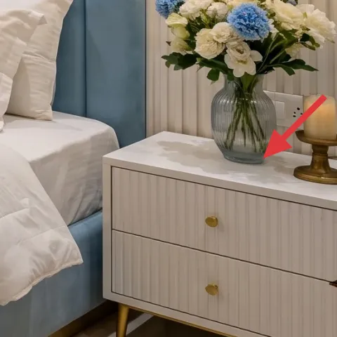
The small table candle on the nightstand adds a warm, human glow that no overhead light can replicate. With brass accents in the room, that gentle candlelight warms the tone of the paneled wall and makes the blue textiles look less cool and more inviting. It also pairs well with the decorative tray and the nightstand’s clean surfaces—everything stays minimal while the light changes throughout the evening. The alternative is extra lamps, but that can over-complicate the layout and compete with the chandelier. The trade-off is basic: candles need a safe, steady spot and regular trims for a clean burn.
Use a stable base
Center the candle on a tray or stable surface so the flame stays steady and the nightstand stays tidy.
The cost, layer by layer
| Layer | Item | Cost |
|---|---|---|
| 1 | Blue area rug 5×7 | $200 |
| 2 | Blue curtain panel pair | $60 |
| 3 | Large framed abstract wall art | $80 |
| 4 | Warm-white paint for paneled wall | $70 |
| 5 | White display shelves niche unit with backlighting | $180 |
| 6 | Blue velvet throw blanket | $60 |
| 7 | Small table candle | $35 |
| Total | $685 | |
If you want a cheaper version, swap the 5×7 blue rug for a smaller size or a thrifted runner, choose a lower-cost framed print, and paint only one accent panel band instead of repainting the full paneled section.
What worked, what didn't (across the whole room)
The overall formula works because the room has one big visual anchor (the framed abstract artwork) and then repeats a limited set of cues: blue, warm-white, and brass glow. The result is soft and layered without becoming cluttered.
What worked
- The blue rug reduced the shine from the glossy floor tiles and made the bed nook feel grounded.
- Blue-and-white curtain layering adds height and softness without blocking all daylight.
- Warm-white paneled wall paint makes chandelier and candle light look amber instead of sharp.
- The large framed abstract artwork sets one focal point so the shelves don’t compete.
- Backlit display shelves turn small decor into a deliberate visual “story.”
- The blue velvet throw adds texture that reads luxe against crisp white bedding.
What didn't
- Too many shelf objects at once made the niche feel busy, even with the warm backlighting.
- Using a cooler white paint (or touch-ups that don’t match) makes the brass feel more yellow.
- Skipping the curtain panels and going sheer-only left the room feeling unfinished.
- A small framed print size would have lost impact against the upholstered bed frame.
What we'd skip if we did it again
Skip the “everything matches exactly” approach. The room works because it matches tones (blue, warm white, brass) instead of chasing identical shades, so you can mix curtains, art, and pillows without it looking off.
Skip going bigger on lighting before you nail the wall color. When the paneled wall is warm and consistent, candle and overhead light both look better; add extra fixtures only after paint and window treatment are locked in.
Skip crowding the shelves. Keep a tight object count—plant(s), a couple ceramics, and a few decorative bottles—so the niche light reads as design, not storage.
Frequently asked
How long does this kind of bedroom refresh usually take?
If you’re doing a paint DIY and major textiles, plan on 1 weekend for prep and painting plus curtain hardware, then a second for artwork placement, rug positioning, and shelf styling. The non-paint layers are mostly set-and-style: hang curtains, set the rug, center the framed artwork, and build shelf vignettes. The only timeline wildcard is how many coats your paneled wall needs for even coverage.
What if I’m a renter—can I still get this look?
Yes, mostly. Renter-friendly wins are the blue curtain panels (with proper curtain rods), the rug, the framed abstract print, and shelf styling if you use an install-free setup where possible. If painting isn’t allowed, keep the warm-white effect by choosing warmer bulbs for any existing lighting and using warm-toned artwork and textiles. For shelves, focus on rearranging existing pieces rather than installing a new niche unit.
My room is smaller—should I downsize the rug or the wall art?
Downsize the rug first. For smaller rooms, a rug that reaches under the front legs of key furniture looks intentional without swallowing the space. For wall art, you can still keep one strong focal piece—just choose a slightly narrower frame rather than switching to a cluster. The big idea is the same: one anchor, then soft vertical rhythm from curtains and panel details.
My room has less natural light. Will the blue curtains still work?
They can, as long as the walls lean warm and you keep daylight diffused. Pair blue panels with sheer curtains so light filters in rather than getting blocked. Also, choose warm bulbs for overhead fixtures and let the candlelight moment stay. If your chandelier runs very bright, dimming or a lower wattage bulb makes the blue read cozier instead of flat.
Where should I shop differently for better results without spending more?
For this style, buy textiles locally or from a place with accurate fabric photos and good return policies—curtain weight changes the look a lot. For the framed artwork, consider art reproduction shops or reputable printmakers so the colors match the blue/cream palette. For the rug and niche unit, search for reputable discontinued or open-box listings; you’re trying to preserve the color temperature and scale more than the brand name.
What’s the biggest mistake people make in a bedroom like this?
Over-decorating the niche and bedside zone at the same time. It’s tempting to fill every shelf and top surface with matching items, but warm lighting plus many small objects quickly turns into visual clutter. Keep one strong focal element on the wall, add one or two texture layers (like a velvet throw), and then space out shelf objects so the glow highlights them.
More in Bedroom
7 upgrades for an upholstered bed nook, for $700
A modern glamour upholstered bed nook refresh: blue curtains, an abstract framed artwork focal point, warm-white paneled walls, and styled …
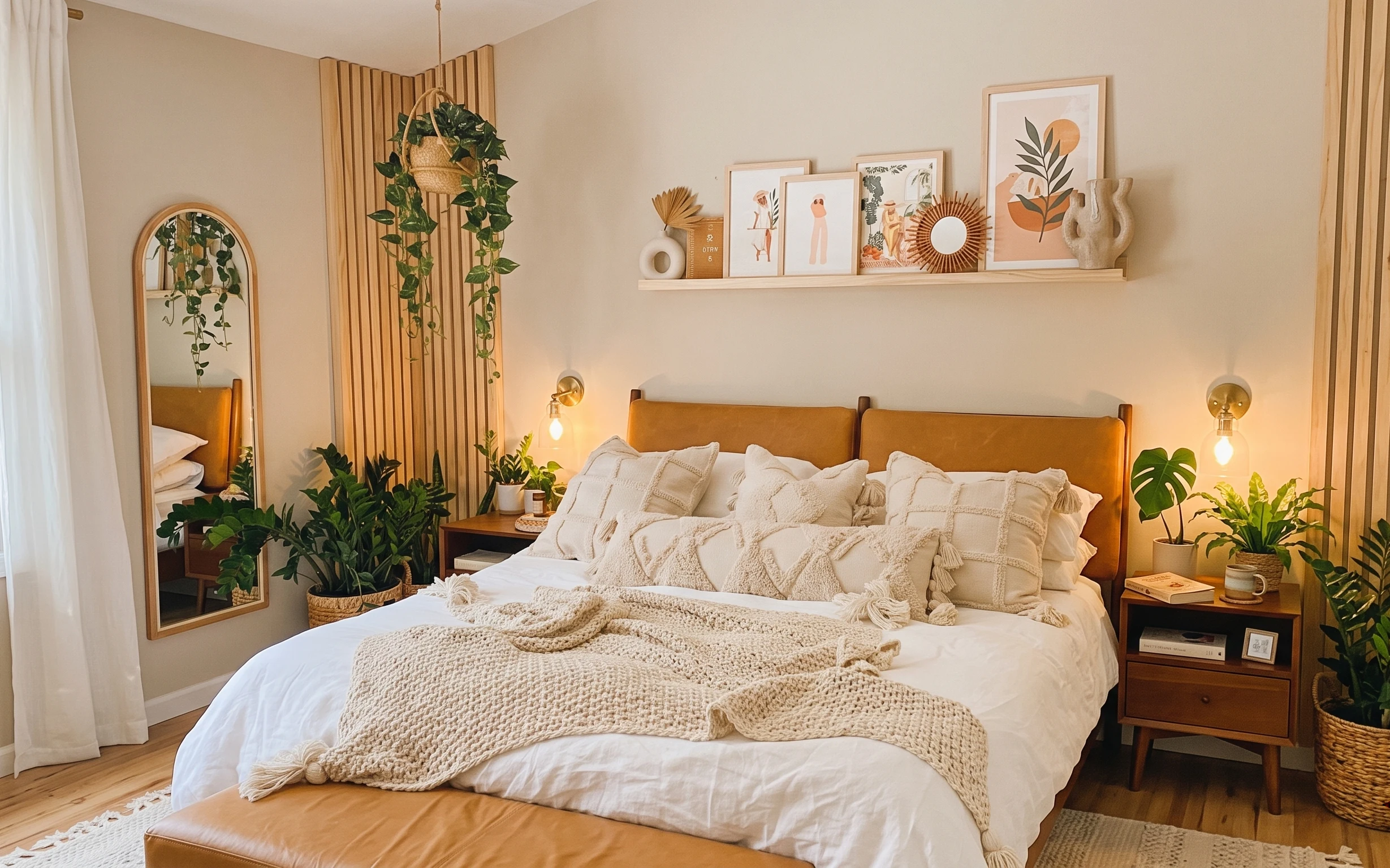
7 budget-friendly bedroom upgrades for a boho bed nook
A boho bed nook refresh that leans on warm textures: rug, a painted nightstand, and soft lighting. This weekend plan keeps the look cohesiv…
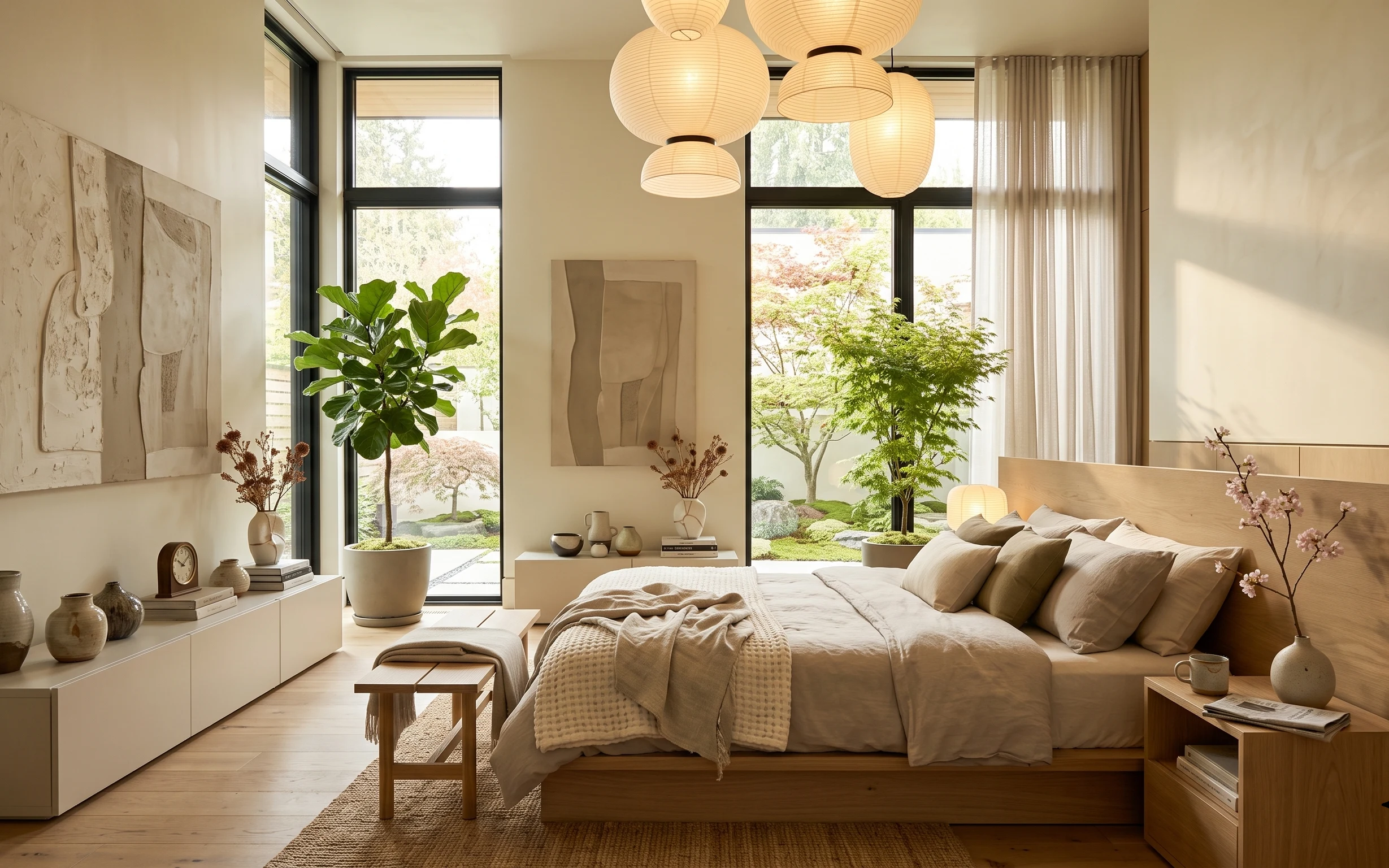
What $350 buys: a move-ready bedroom refresh
A warm japandi-style bedroom refresh that packs into boxes: rug, soft beige textiles, simple styling ceramics, and one statement abstract. …