
- Best for
- Bringing warmth to a marble-and-white island
- Time
- 1–2 weekends
- Difficulty
- Beginner-friendly paint and styling
- Cost
- $700 target budget
Why white-and-brass styling is the kitchen island of 2026
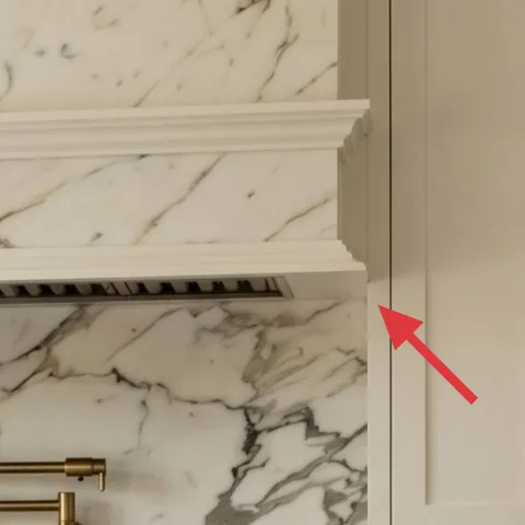
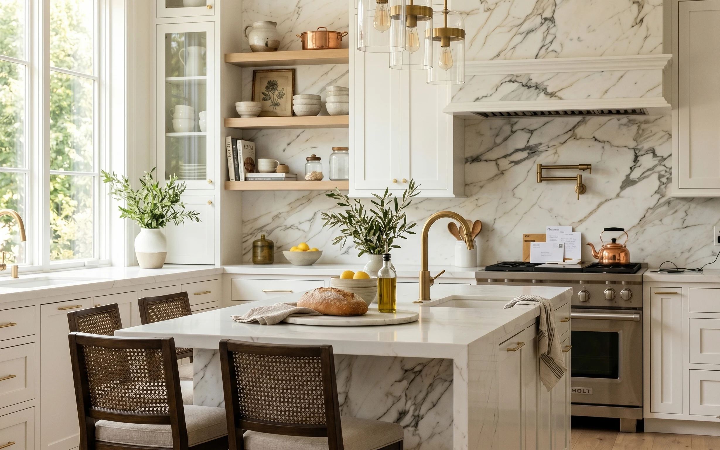
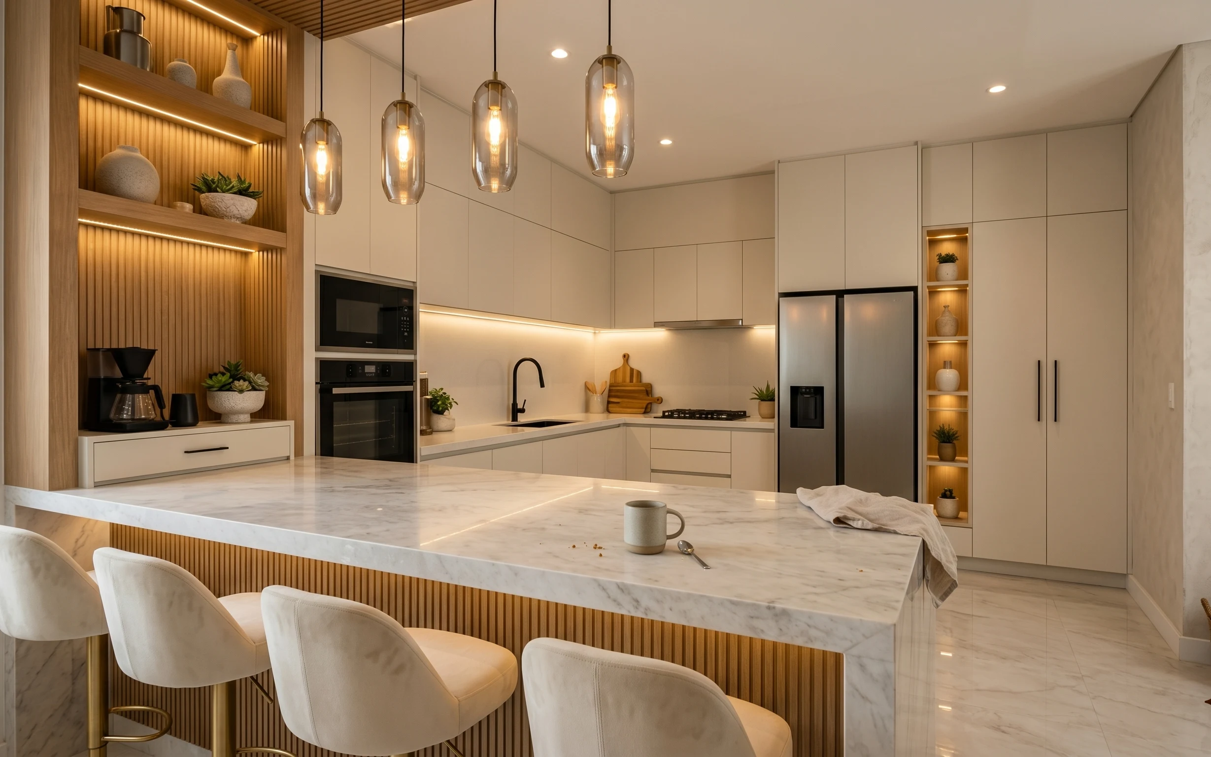
That bright marble-and-white kitchen already has the hard part: a crisp backdrop. What this setup adds is rhythm—warm brass from the pendant, green life from potted plants, and soft texture from a linen napkin and striped towel. If you’re doing this on a weekend, aim for materials you can actually see up close: wood-and-rattan chair backs, glossy glass shades, and matte framed paper. For a modern farmhouse lean, the best “extra” is usually one framed botanical print plus one statement light, not ten decor pieces.
The first time I styled my own kitchen, I over-corrected and crowded the island with things that looked good alone. The turning point was noticing how my eye kept returning to the brass fixtures and the vertical lines of the cabinets—everything else needed to support those shapes, not compete. Once I grouped items (one tray, two greenery moments, and textiles that read like linen), the whole counter felt calmer and more lived-in. That’s the same edit this photo makes obvious.
Layer 1 — framed botanical print ($80) Set a clear garden note against the marble
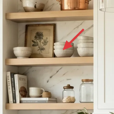
A framed botanical print on the open shelf area gives the backsplash a softer “story” than plain stone and tile alone. In a kitchen with bright windows and a white cabinet field, the print’s darker linework helps your eye land instead of drifting. The obvious alternative—another vase or small object—doesn’t add the same vertical structure. This choice trades a little shelf clutter for one intentional focal point. Look for matting that isn’t too creamy (avoid a yellow tint) so it stays crisp next to the cool marble veining.
Make it read from standing height
Frame size matters—aim for a proportion that looks balanced when you’re at the counter, not only when you bend toward the shelf.
Layer 2 — indoor plant in a white pot on the left counter ($40) Add green without overfilling the counter
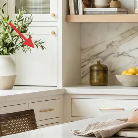
This white-pot plant works because it’s placed where daylight hits—near the left window—so the leaves look fresh instead of “staged.” It also mirrors the kitchen’s warm-white palette while adding a true organic texture. Buying a ready-made planter is nice, but you can keep the same look for less by painting a terracotta pot to read like the existing white. The trade-off: you’ll want to let paint fully cure so the finish stays smooth against splashes and cleaning. Use a plant that holds its shape, not one that spills everywhere.
Make it instead of buying it
Paint a terracotta pot to a clean white finish so the indoor plant reads like the countertop centerpiece without spending on an identical planter.
Materials
- Terracotta plant pot (medium) — 1 — hardware or garden store — $10
- Bonding primer for slick surfaces — 1 small can — hardware store — $12
- Interior/exterior matte white paint — 1 small can — hardware store — $5
- Clear water-based sealer — 1 small can — hardware store — $5
Steps
- Wash and dry the terracotta completely, then scuff lightly with fine sandpaper.
- Apply bonding primer with thin coats so the terracotta texture doesn’t bleed through.
- Let primer cure overnight before touching anything.
- Paint the pot with matte white, using 2–3 light coats for even coverage.
- Let paint cure fully for the recommended time on the can.
- Brush on a clear water-based sealer to protect against quick wipe-downs.
- Let the sealer cure before placing the plant back in the pot.
Total DIY cost: $32 — saves about $8 over buying.
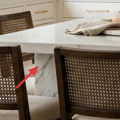
Layer 3 — decorative tray on the island ($35) Contain the “small stuff” so it looks intentional
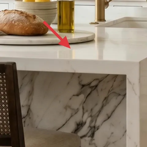
A tray is the difference between a counter that feels collected and one that feels accidental. In this photo, the island styling stacks—bread or a kitchen bread board, a few small accessories, and bottles—inside one defined footprint. That keeps the marble from feeling busy and makes the brass faucet feel more deliberate as a focal point. The alternative is scattering items directly on the countertop, which reads messier in bright daylight. The tray you choose should have a finish that plays nicely with brass (brushed metal, warm wood, or a gold-toned glaze) so the whole palette stays cohesive.
Match finish warmth, not color
Brass tone varies—stick to “warm metallic” rather than trying to find the exact same yellow.
Layer 4 — striped kitchen towel ($12) Add a small pattern that softens the marble
Kitchen towels are the fastest way to add texture without changing anything permanent. This striped towel works because the pattern is light enough to read as detail, not decoration, and it repeats the kitchen’s neutral rhythm. If you go with solid fabric, you risk the towel disappearing against marble and white cabinetry. The trade-off here is practical: towels get laundered often, so choose a fabric that holds shape and doesn’t wrinkle into something visually busy. Drape it where it’s easy to grab—near the sink or on the counter lip—so it still feels useful.
Skip tiny, high-contrast stripes
Very busy patterns can fight with the marble veining, making the whole island feel visually louder than it is.
Layer 5 — paint, 1 gallon (on the painted wall area) ($60) Refresh the background so brass reads warmer
When a kitchen already has bright windows, paint can either sharpen everything or soften it. A clean, slightly warm white on the painted wall areas around shelves and counters helps the brass pendant and faucet feel golden instead of flat. The obvious alternative—adding more decor—doesn’t fix how light bounces off the room. Paint is also the one weekend project that can make everything else look “new” at once. This layer assumes you’re only painting what’s already painted (no demolition), and you’ll use proper prep so the finish looks smooth next to the cabinet edges.
Pick a warm white with a subtle undertone
If it looks pink or too creamy beside marble, it’s probably too warm—aim for a neutral-warm white.
Layer 6 — woven dining chairs (rattan backs) ($100) Bring in texture that matches the pendant’s warmth
Rattan and woven chair backs are small, but they matter because they echo the warmth in the brass pendant and the wood trim by the windows. In a marble-and-white kitchen, chairs are one of the few elements that can add “handmade” texture without introducing clutter. The trade-off is maintenance: woven surfaces can pick up dust and need occasional vacuuming or a gentle brush. Still, the payoff is a more balanced palette—cool stone gets softened by natural weave. If you already have chairs, this layer still applies as a styling refresh: keep cushions light and neutral so the weave stays the hero.
Keep cushions in the same temperature family
Creamy off-white cushions look best when your wall paint reads warm-neutral.
Layer 7 — brass pendant light with clear glass shades ($280) Use one statement light to anchor the island
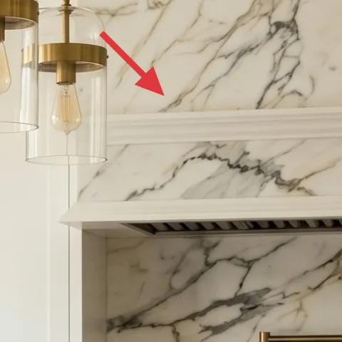
A brass pendant with clear glass shades turns the island into a natural gathering spot. It’s doing double duty here: it pulls warm tones through the room, and the glass keeps the lighting from feeling heavy against the white cabinetry. If you choose a simpler light, the kitchen can start to feel too “white on white,” especially when daylight is strong. The trade-off is installation—swapping a pendant can mean electrical work, so it’s worth confirming whether your setup needs an electrician. Styling-wise, the best pairing is exactly what’s in the photo: warm brass + one or two greenery hits so the light has something to complement.
Keep glass shades clean
Wipe glass regularly so the fixture stays bright; grime dulls the warm color.
The cost, layer by layer
| Layer | Item | Cost |
|---|---|---|
| 1 | Framed botanical print 16×20 | $80 |
| 2 | Indoor plant (4–6 ft) and white pot | $40 |
| 3 | Decorative tray for island styling | $35 |
| 4 | Striped kitchen towel | $12 |
| 5 | Paint, 1 gallon (homeowner) | $60 |
| 6 | Woven dining chair (each) | $100 |
| 7 | Brass pendant light with clear glass shades | $280 |
| Total | $607 | |
If you want a cheaper version, prioritize the framed print, the plant, and the towel (the most visible changes), then do paint only if your current walls look scuffed. For lighting and chairs, consider a thrifted or discounted find—quality matters more than the newest finish.
What worked, what didn't (across the whole room)
The overall look succeeds because warm brass and natural texture show up in multiple places without competing with the marble. The island stays readable thanks to one tray footprint and a couple of textiles that soften sharp edges.
What worked
- Green plants positioned near window light keep the island looking fresh instead of static.
- The framed botanical print adds vertical focus where marble would otherwise feel too continuous.
- A tray prevents small bottles and bread moments from scattering across the countertop.
- Striped towel detail adds pattern that plays well with veining rather than fighting it.
- Woven chair backs bring warmth that matches the brass fixture tones.
- One brass pendant anchors the island so the whole kitchen feels planned, not accidental.
What didn't
- If the plant is placed too far back, daylight won’t hit the leaves and the effect disappears.
- Using a cool, blue-white paint can make brass look yellow-gray instead of warm.
- Overdoing small objects on the island breaks the clean “tray zone” and reads crowded fast.
- Very high-contrast towels can clash with marble veining under bright daylight.
- Choosing a pendant with heavy opaque shades can darken the island even in a bright room.
What we'd skip if we did it again
Skip swapping multiple fixtures at once. Changing the pendant alone already shifts the island’s mood; adding more “newness” elsewhere often creates a mismatch in warm tones.
Skip a crowded shelf approach. Open shelves in bright kitchens look best with one anchor (like a framed print) and a few ceramics, not a full inventory of small items.
Skip cool-toned paint tests. Marble can pull undertones fast, so choose a warm-neutral white and confirm it in daylight before committing across large wall sections.
Frequently asked
How long does this kitchen island refresh take?
Plan for 1–2 weekends. Styling (tray, towel, plant placement, framed print) can be done in a few hours, while paint needs real curing time between coats. If you’re only refreshing the pendant (or swapping one light), factor in additional time for ladder setup and verifying wiring. Most homeowners can finish the whole look without rush.
What if I rent and can’t change the lighting or paint?
Keep the “system” and skip the permanent parts. Focus on the framed botanical print, the tray zone, the towel texture, and one plant near the window. For lighting, choose a plug-in option or use a bulb swap in the existing fixture for a warmer temperature. Renter-friendly styling gives the same visual order without affecting the ceiling or walls.
My kitchen is smaller—will this still work?
Yes, because the plan edits, not expands. In a smaller kitchen, keep only one plant moment and use a smaller tray footprint so the island doesn’t feel like it’s shrinking under objects. Choose a framed print size that matches the shelf width, and keep towels simple. The brass pendant should stay centered over the island if you can.
My kitchen is larger—how do I prevent it from feeling empty?
When the space feels too open, add repeat elements instead of more random pieces. In this palette, repeat warm brass once more (either through a small accessory or chair finish) and add a second greenery point. A second framed print is optional, but only if it matches the botanical style rather than introducing a new theme.
Where should I shop differently to stay on budget?
For the framed botanical print and towel, home decor retailers and craft stores are usually the best value. For the plant pot or any terracotta you’ll paint, a garden center or discount home store is often cheaper. If you’re upgrading lighting, watch for open-box or discounted fixtures from big-box retailers—clear glass + brass tones are widely available.
What’s the biggest mistake people make in kitchens like this?
Over-styling the island. Marble and white cabinetry make every object visible, so even small clutter reads as noise. The fix is the tray zone—keep items contained—and use one framed focal point plus one towel for texture. Leave breathing room so the plants and brass can do their jobs.
More in Kitchen & Dining
A calmer, brighter kitchen for $700
This kitchen island refresh leans into white-and-brass contrast: a framed botanical print, two greenery accents, and a small textile swap. …
7 kitchen island swaps for a $500 renter-friendly refresh
A warm, japandi kitchen island dining zone built from move-friendly swaps. With a $500 refresh budget, the look leans on soft countertop te…
7 renter-friendly swaps for a dark-blue kitchen
A dark-blue kitchen island refresh for renters using no-drill styling: 7 swaps totaling under $400. Focus: brass barstools, a framed botani…