
- Best for
- Calm, warm bedroom mood
- Time
- One weekend (about 6–10 hours)
- Total cost
- $680 (about $700 budget cap)
- Renter-safe
- Yes—most changes are swap + paint optional
Why warm-neutral textiles are the bedroom of 2026
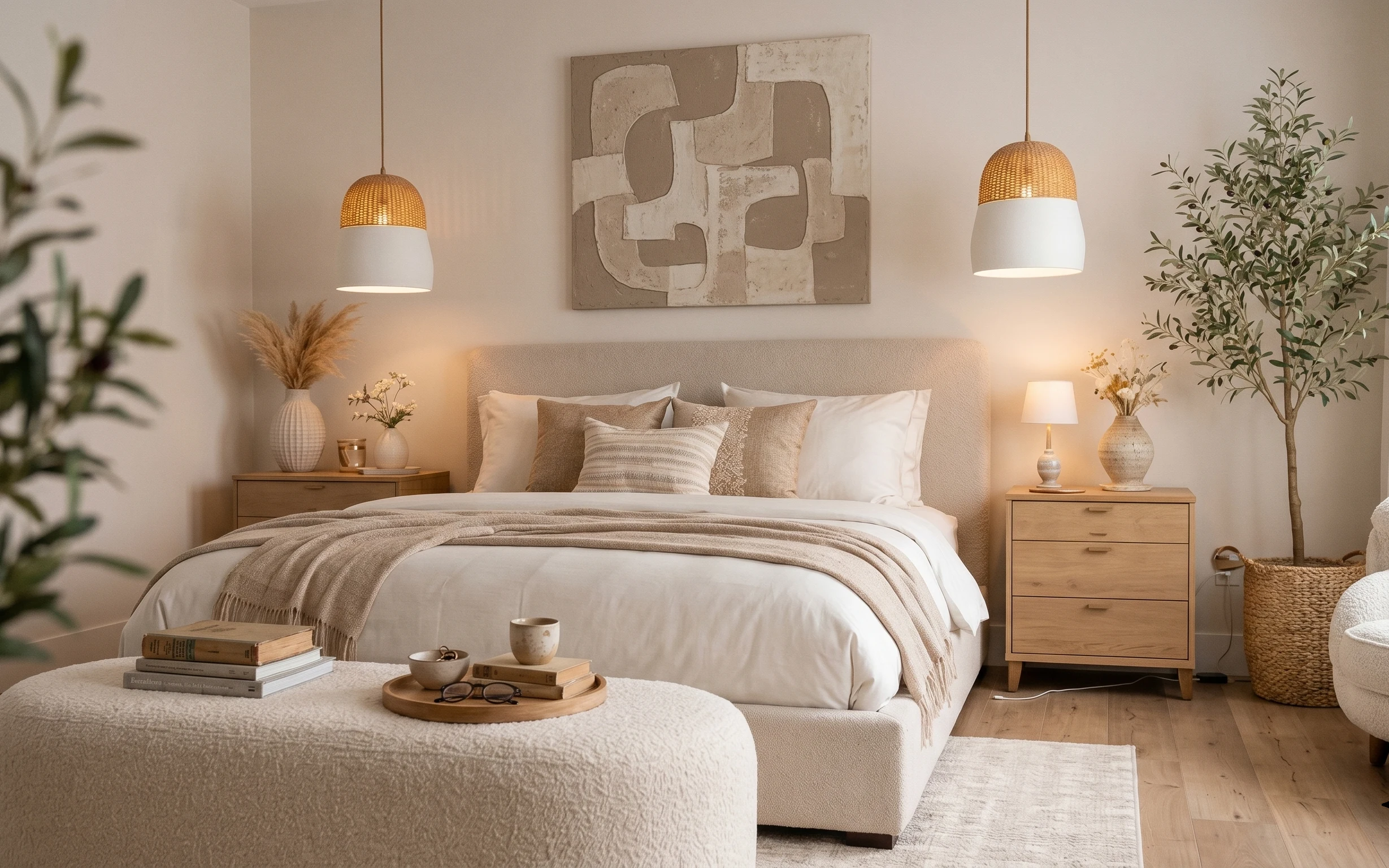
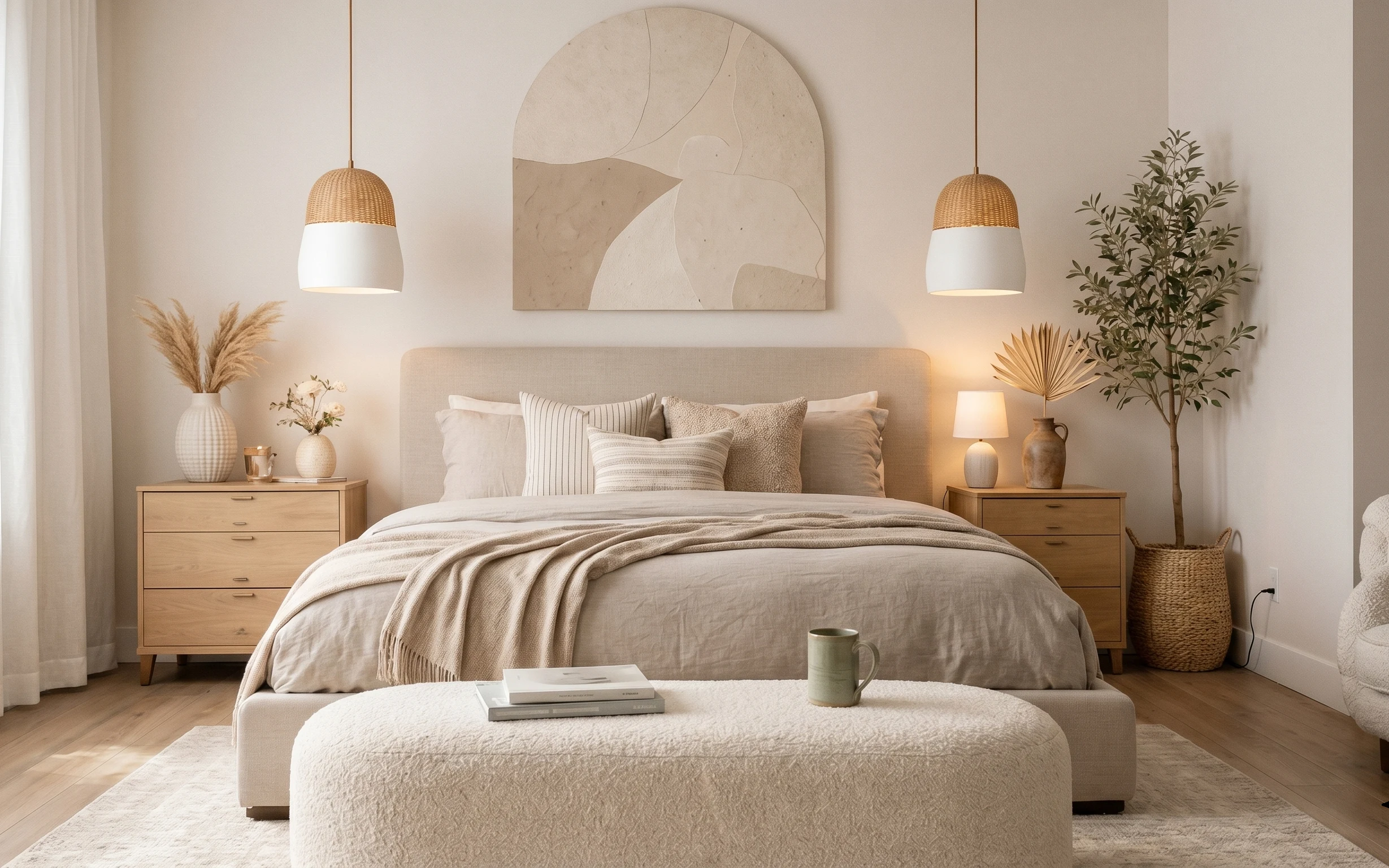
The fastest way to make a bedroom feel “finished” isn’t more decor—it’s texture in the right order. In this setup, cream-and-taupe bedding, a woven taupe throw, and a low pile area rug create that calm, tactile base. The rattan pendant lamps add a honeyed glow, while the large abstract wall art brings movement without clutter. Because you own the place, you can choose the most visual change first—like the rug and statement wall piece—then fine-tune with lighting and styling.
I once bought too many matching beige items at once, and the room ended up looking flat on both sides of the day. What fixed it for me was adding one real contrast: a warmer woven light and a bolder wall art scale. This photo gets that balance right—soft textiles below, warm light in the middle, and a big piece of art that holds the whole wall. The result reads curated, not careful.
Layer 1 — Area rug ($200) grounded 5×7-scale warmth
A rug that’s anchored under the bed changes the whole physics of the room: your eyes stop “floating” and start landing. In the photo, the light area rug sits underneath the front third of the bed and helps soften the wood floor, which is otherwise visually busy. I like this warm neutral tone because it works with both white bed cover and taupe throw—without forcing a new color story. The trade-off is that you’ll want a rug pad if yours feels thin; otherwise, the edges can look a little crisp instead of cozy.
Choose the rug by how far it reaches
For this look, aim for the rug to extend beyond the bed’s width so the front feet area feels intentional.
Layer 2 — Rattan pendant lamp ($120) woven glow over the bed
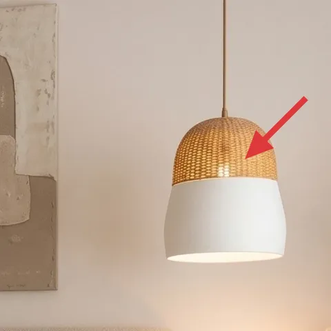
The rattan pendant lamps are doing two jobs at once: they bring warmth and they add texture at ceiling level, where bedrooms usually feel bare. Here, the woven shade casts a soft, diffused pool of light that makes the white bed cover look richer (not stark) and keeps the wall art from feeling isolated. I’d skip a sleek, glass-only pendant for this exact palette, because rattan echoes the organic shapes already in the taupe throw and plant. The trade-off is you’ll need to like that woven texture up close—if you prefer ultra-smooth surfaces, choose a more minimal shade.
Warm light matters more than bulb watts
If your bulbs run cool, the whole beige story turns gray fast—stick to warm tones.
Layer 3 — Large abstract wall art ($80) scaled to the bed wall
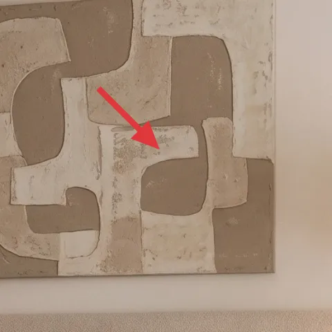
This is where the room gets “designed,” because scale pulls everything into alignment. The large abstract wall art sits centered above the bed and fills enough width that it feels like a focal point—not a leftover frame. The mix of light neutrals and soft block shapes also plays nicely with the taupe throw blanket and cream textiles, so nothing fights for attention. If you went smaller, you’d still get decoration, but you’d lose that calm dominance that makes bedrooms feel quieter. Consider hanging it at eye level for the seated position, not centered on the ceiling.
Match art scale to bed width
Choose artwork that covers a meaningful part of the bed wall, so the rug-and-bedding base and focal wall “agree.”
Layer 4 — Taupe throw blanket ($60) texture you can see from across the room
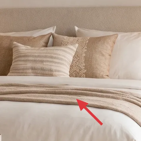
The taupe throw blanket on the bed does the styling work that a whole extra accessory budget can’t: it adds depth to the white bed cover without introducing a new pattern. The color also bridges warm wood tones (nightstands and tray) and the neutral wall palette, so the room looks cohesive even when different objects—like ceramic vases and a candle—sit nearby. I’d rather spend on a substantial throw with visible weave than add another small pillow in a similar beige. The trade-off is upkeep; textured throws collect lint, so a quick brush or lint roller keeps it looking crisp.
Lean into one warm fabric, not five
When blankets and pillows share a warm undertone, the room looks styled even with minimal extras.
Layer 5 — Wood bedside table ($80) brighter finish, same footprint
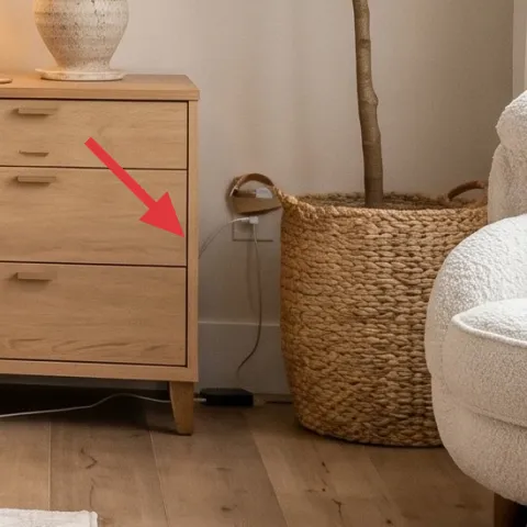
Make it instead of buying it
Paint your existing wood bedside table a warmer, lighter neutral so it matches the cream bed cover and keeps the room reading airy.
Materials
- Sandpaper/sanding sponge pack — 1 set — home improvement store — $6
- Bonding primer — 1 quart — paint store/home improvement store — $16
- Interior paint (warm neutral) — 1 quart — paint store/home improvement store — $22
- Foam roller + angled brush — 1 kit — home improvement store — $10
- Drop cloth/painters tape — 1 set — home improvement store — $5
Steps
- Clear the table and lightly scuff-sand glossy areas so paint grabs.
- Wipe dust off with a damp cloth and let it dry fully.
- Apply a bonding primer coat with steady, even strokes.
- Let primer cure according to the label, then scuff lightly for smoothness.
- Roll paint on the flat areas and use a brush for edges and drawer fronts.
- After the first coat cures, add a second coat for coverage and a uniform tone.
- Touch up corners, then remove tape carefully before the paint fully hardens.
- Let the table cure for at least a full day before adding lamp bases or styling objects.
Total DIY cost: $59 — saves about $21 over buying.
Don’t paint over sticky finish
If the old surface feels tacky or doesn’t scuff cleanly, strip or switch to a primer made for that condition—otherwise the new finish peels at the drawer edges.
Layer 6 — Table lamp with white shade ($60) bedside light that flatters the wall art
A table lamp with a white shade adds that second light layer that makes bedrooms feel lived-in after dark. In the photo, it sits on the right-side wood bedside table and softens the wall, so the large abstract wall art feels integrated with the bedding instead of “floating.” I like this choice over another pendant because you get two heights: ceiling-level texture above, and eye-level brightness near the nightstand. The trade-off is placement—too far from the bed edge and it won’t light your reading spot; too close and it can crowd the drawer area. Keep the cord tidy so the clean lines stay calm.
Match the lamp tone to the pendant warmth
Warm bulbs keep the rattan glow and the white shade from looking mismatched.
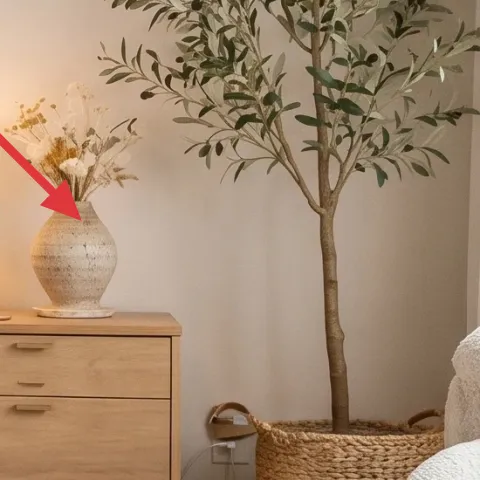
Layer 7 — Large potted plant tree ($80) organic vertical energy
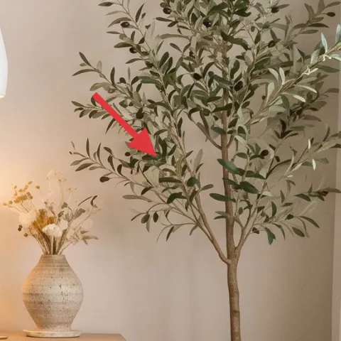
The large potted plant tree brings height and softness, which matters in a bedroom where most items are horizontal—bed cover, rug, and the art rectangle. Placed by the window side, it also adds visual interest when you’re lying down and looking toward the right wall. The leaves echo the natural textures already present: the taupe throw’s weave and the rattan pendant’s basket pattern. I’d rather buy one substantial plant than stack multiple small pieces because the silhouette reads clearly from across the room. The trade-off is scale management; if the pot is too heavy, plan where it will live before you unbox it.
Use the plant to “finish the corner”
When a corner feels empty, a vertical plant works better than adding another frame or small object.
The cost, layer by layer
| Layer | Item | Cost |
|---|---|---|
| 1 | Area rug (warm neutral, ~5×7) | $200 |
| 2 | Rattan pendant lamp | $120 |
| 3 | Large abstract wall art | $80 |
| 4 | Taupe throw blanket | $60 |
| 5 | Wood bedside table, painted to match | $80 |
| 6 | Table lamp with white shade | $60 |
| 7 | Large potted plant tree | $80 |
| Total | $680 | |
If you want the same look for less, pick a slightly smaller abstract print (still above-bed scale) and choose a microfiber or cotton throw blanket instead of a chunky weave. You can also downshift the plant to a similar silhouette in a smaller pot if your corner is tight.
What worked, what didn't (across the whole room)
This bedroom refresh works because it follows a clear hierarchy: grounded base (rug), warm texture (rattan), and a big focal moment (wall art). The lighting layers also keep the room soft instead of flat. The only downside is that natural textures show dust quickly, so weekly upkeep matters.
What worked
- The warm neutral rug makes the white bed cover look intentional instead of stark.
- Rattan pendant lamps add texture overhead and soften the entire palette with warm light.
- The large abstract wall art anchors the bed wall and sets scale for everything else.
- The taupe throw blanket adds visible depth without needing extra patterns.
- Bedside lighting at a second height keeps the room readable at night.
- The tall potted tree makes the corner feel finished and balances the bed’s horizontal lines.
What didn't
- If your pendant bulbs are cool-toned, the palette shifts from warm to gray.
- Very small wall art above a full bed can make the room feel unfinished.
- Textured throws and woven shades show lint and pet hair more quickly than smooth surfaces.
- Overcrowding the nightstand with decor makes the calm palette feel busy fast.
What we'd skip if we did it again
Skip adding more small decor first—this bedroom already has enough visual “noise” from texture and scale. Start with the rug and the large abstract wall art, then bring in light and plant only after those anchors are set.
Skip using cool white bulbs in any lamp. Even if everything matches on paper, cool lighting makes warm neutrals look washed out next to the rattan pendant and the taupe throw.
Skip painting the bedside table a drastically different color. This look depends on the bedside surface reading similar in warmth to the bed cover, so aim for a lighter neutral rather than a contrast shade.
Frequently asked
How long does this bedroom refresh take?
Plan for one weekend if the rug and wall art are ready to go. The paint work on the bedside table is the only part with real waiting time—primer and paint need cure time. If you keep your changes limited to the listed layers, you can usually be fully done (including styling) in 6–10 hours spread across two days.
What if I rent and can’t paint the bedside table?
Skip the DIY paint and keep your table finish as-is, then lean on the other layers: rug placement, pendant warmth, and the lamp. If you still want a similar effect, swap in a new lamp shade or use a washable neutral table cover on the nightstand surface. Large wall art and a rug are typically the biggest “permission-friendly” upgrades.
My bedroom is smaller—how do I adjust the proportions?
Use the same hierarchy, but scale down the rug so it still reaches past the bed front by a visible margin. Keep the large wall art as your focal point, just choose artwork that stays wide enough to sit comfortably above the bed. For lighting, one pendant is fine; add the table lamp for the second height.
Where should I shop for the rattan pendant look and wall art?
Search for rattan pendant lamps under “woven pendant” and filter for warm shade tones. For wall art, pick an abstract piece with neutrals and soft block shapes; you’re matching the wall’s role, not a specific artist. Local home goods stores can be a shortcut for rug textures and throws.
What’s the biggest mistake with warm-neutral bedroom styling?
The biggest mistake is relying on matching shades without enough texture and scale contrast. If everything is smooth beige at similar brightness, the room looks flat. Here, texture comes from the taupe throw, woven pendant, rug pile, and the leafy plant silhouette—scale contrast comes from the large wall art.
More in Bedroom
How to refresh a bedroom for under $700
A warm, japandi-style bedroom refresh on a $700 weekend budget. Swap in a rug, layered lighting, and statement wall art—then paint one wood…
How to refresh a bedroom for under $700
A light-beige bedroom refresh with curtains, a neutral rug, and warm wall art—done over a satisfying weekend. This $700 plan focuses on the…
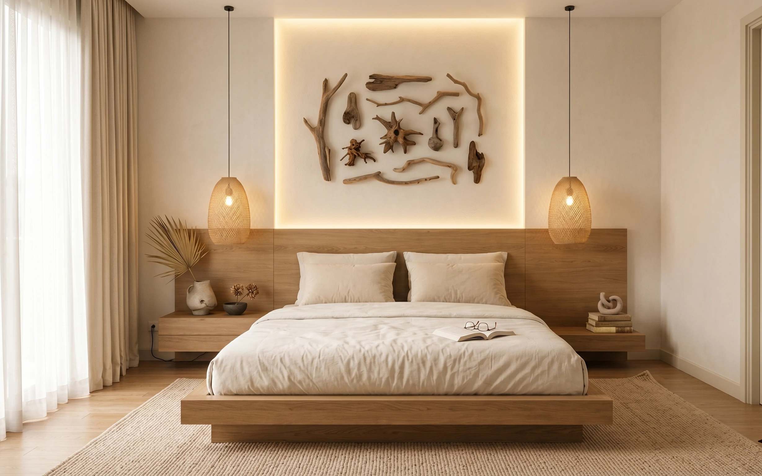
How to refresh a platform-bed bedroom for under $700
A platform-bed bedroom refresh for under $700: warm recessed wall paint, woven lighting, and a driftwood wall moment. This weekend set focu…