- Best for
- shared living rooms that must pack fast
- Cost
- $312 (under $400 total)
- Difficulty
- Easy (no-drill swaps, textiles first)
- Time
- 1 weekend
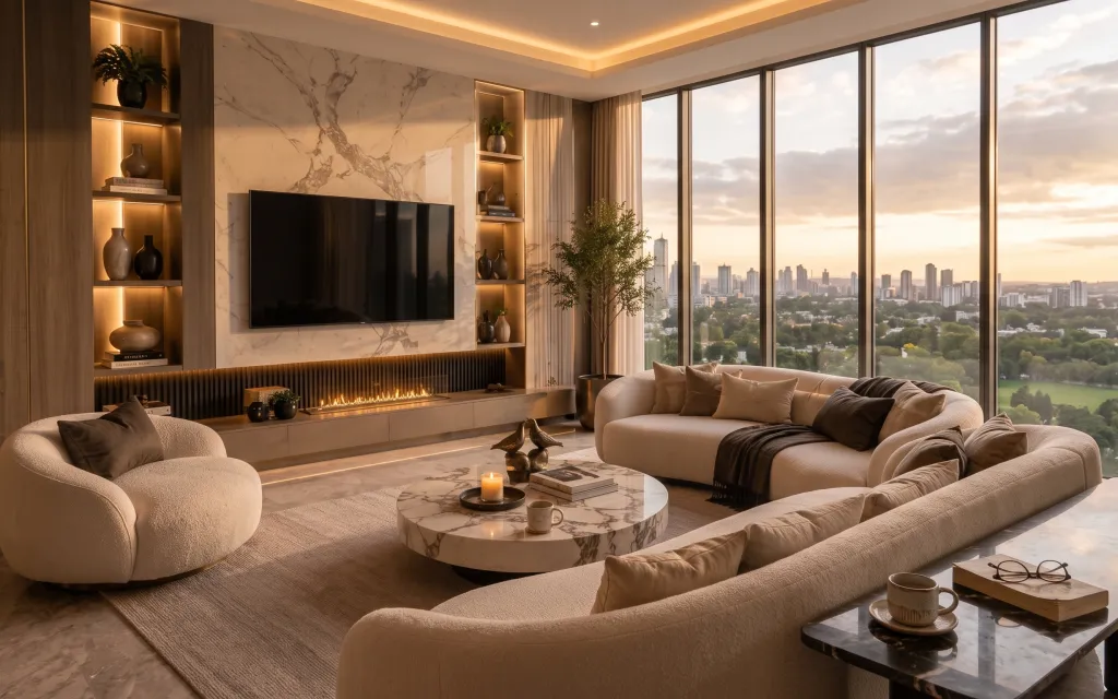
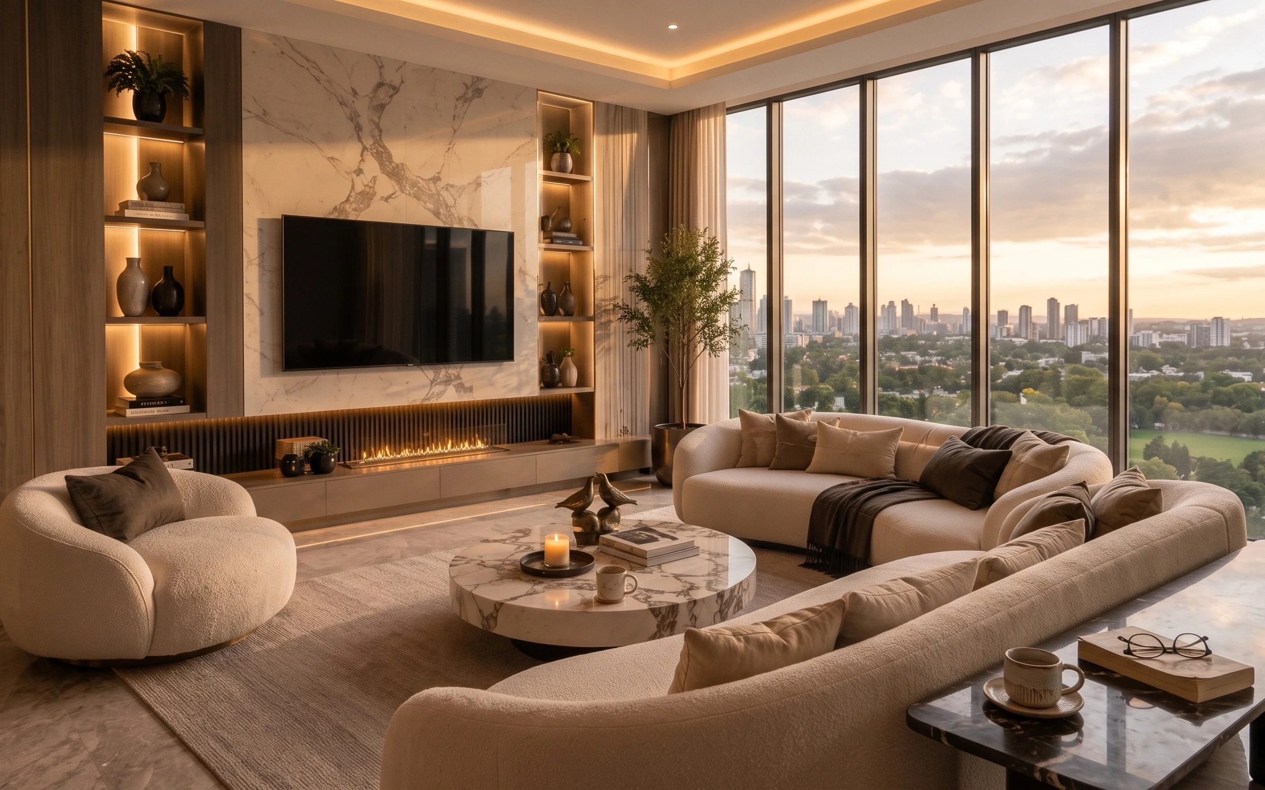
Why this marble-and-cream window lounge is the living room of 2026
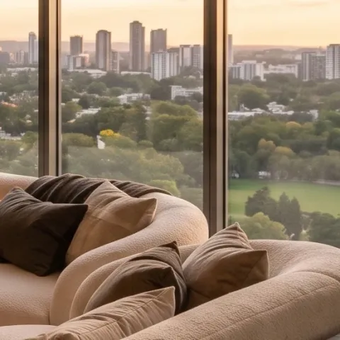
The layout here reads “quiet luxury,” but the recipe is actually pretty practical for shared housing: a grounding area rug, long curtain panels framing the windows, and soft throw pillows that make the whole seating zone feel finished. The surfaces are all in the warm neutrals family—marble-look tones plus bronze/gold warmth—so your props should stay similarly tonal, not high-contrast. That’s why a round coffee table and one candle on top matter: they give you a single visual “landing spot” without committing to anything permanent. Plus, when it’s time to move, rugs and curtains fold into boxes.
I almost went for matching sets (because it’s so tempting), but this photo convinced me the better route is “one hero shape, then texture.” The sofa and accent chair look plush and sculptural, while the styling stays restrained—mostly creams, beiges, and that bronzy glow. My mistake in earlier shared apartments was buying too many small decor objects and then having nowhere to pack them. Here, the grouping is bigger and fewer pieces do more.
Layer 1 — area rug ($80) anchors the seating zone
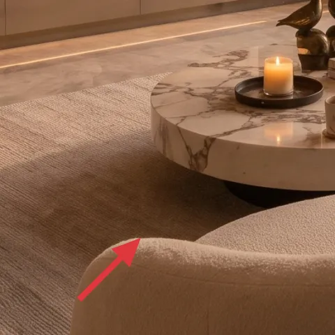
This area rug does the heavy lifting because it defines where the seating belongs—especially in a room with polished-looking flooring. When you match the rug to the palette (cream/beige), it keeps the whole scene calm instead of competing with the window view. I’d choose a medium-pile or low-shed texture so it reads cozy like the photo, not scratchy or flat. The trade-off is size: a rug that’s too small makes the sofa look “floating,” so aim for one that reaches under at least the front legs. For moving, it’s one of the easiest items to roll and box.
Go one size bigger than you think
With rounded seating, a larger rug reduces visual gaps at the edges.
Layer 2 — curtain panels ($30) soften the window line
These curtain panels create the elegant vertical frame you see beside the window and help the whole room feel taller. In a shared space, curtains are also the smartest “no-permission” upgrade because you can swap rods or clip-in solutions depending on what your place allows. The key detail is color temperature: warm beige reads like the photo’s golden-hour lighting, while bright white can look stark. The trade-off is that you’ll likely need a longer curtain length for the same drape effect, but that’s still portable and quick to pack. Keep folds relaxed rather than over-starched.
Sheer-to-opaque is about mood
If you want the window glow effect, choose panels that let daylight through.
Layer 3 — round coffee table ($120) makes the center feel intentional
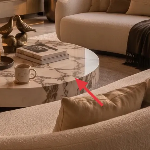
A round coffee table is a big part of why this room feels smooth and lounge-like. The shape plays nicely with curved seating, and the tabletop gives you a place to concentrate visual styling instead of scattering decor across the floor. Marble-look finishes (or laminate that reads similar) keep the vibe consistent with the room’s marble-look tones and reflect warm light. The trade-off is stability: round tables can tip more easily than you expect, so use felt pads and keep heavy items off the far edges. It’s also easy to disassemble into smaller parts (or pack as one unit if it’s lightweight enough for your van).
Don’t overstyle the top
One candle + a simple stack is enough; too many objects looks cluttered fast.
Layer 4 — throw blanket ($25) adds the dark-but-soft contrast
The throw blanket on the right-side seating arm brings contrast without breaking the neutral palette. In this photo, the darker textile reads like a gentle shadow across the lighter sofa upholstery, which is why it looks designed rather than accidental. For shared housing, this is a win because you can switch it seasonally and it packs flat. Choose a fabric with visible texture—knit or heavy woven—so it looks intentional from across the room. The trade-off is that throw blankets show lint and pet hair more than smooth surfaces, so keep a fabric roller handy.
Fold it like a “gesture,” not a blanket
Let one edge drape over the arm so it looks styled in real life.
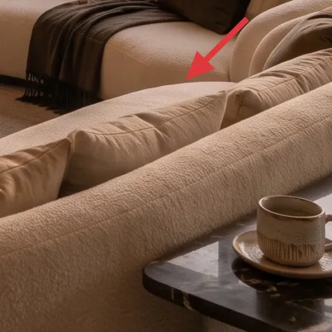
Layer 5 — throw pillows ($12) finishes the seating with scale
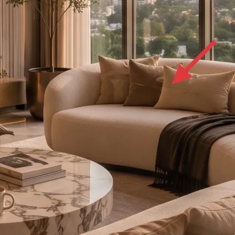
Throw pillows are the fastest way to make a sofa look finished, and the photo uses multiple sizes to keep the composition from flattening. If your sofa is a single color, pillows are where you can introduce a subtle variation—cream-on-cream texture or one slightly deeper neutral. I’d buy pillow covers you can swap because shared housing means you’ll move, and inserts don’t always travel well. The trade-off here is comfort versus bulk: more pillows look better in photos, but too many become a chore to store. Aim for a tight stack of 2–4 and stop there.
Texture beats pattern in warm neutrals
A boucle-like or ribbed cover looks richer than a loud print.
Layer 6 — candle ($15) adds the warm, low-effort glow
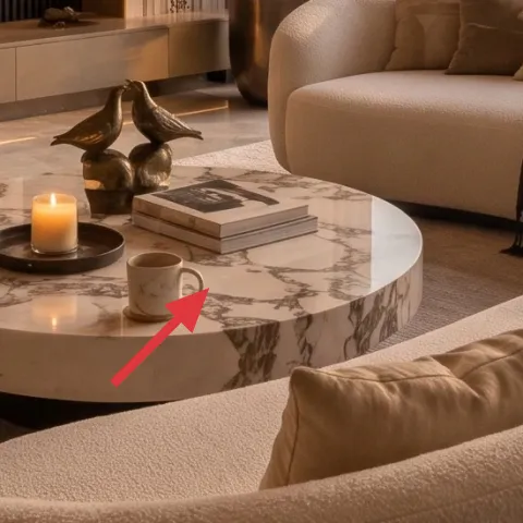
That candle is small, but it’s doing a lot of work: it pulls the eye to the coffee table and reinforces the room’s warm, golden lighting. In shared apartments, this is also one of the easiest decor “switches”—you can light it for guests or dinner and skip it on laundry nights. For the look, choose a candle in a neutral glass holder that won’t fight your palette. The trade-off is safety and logistics: don’t leave it unattended and keep it stable on a non-slippery surface. When it’s time to move, a candle holder and candle set are easy to pack in a single box.
Pair one candle with one small stack
A single book stack (or small object) makes the tabletop feel curated.
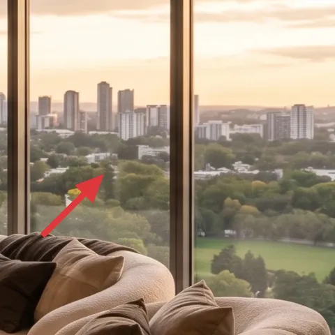
Layer 7 — tall indoor tree near the window ($30) brings life without changing walls
A tall indoor tree near the window adds height and makes the whole room feel less like “just furniture.” It also balances the strong lines of the window framing with softer organic shapes—exactly the kind of contrast modern interiors rely on. In a move-friendly setup, plants are portable if you plan: choose one in a pot you can carry and use a tray or wrap for transport. The trade-off is watering discipline; plants won’t survive neglect just because they look good. Position it where daylight hits (near the window, not across the room), and rotate it occasionally for even growth.
Use the pot as part of the palette
A neutral pot keeps the plant looking intentional, not random.
The cost, layer by layer
| Layer | Item | Cost |
|---|---|---|
| 1 | Area rug | $80 |
| 2 | Curtain panels | $30 |
| 3 | Round coffee table | $120 |
| 4 | Throw blanket | $25 |
| 5 | Throw pillow cover | $12 |
| 6 | Candle | $15 |
| 7 | Tall indoor tree | $30 |
| Total | $312 | |
A cheaper variant keeps the same “shape + softness” logic: pick a smaller rug size, choose lighter-weight curtain panels, and swap the round coffee table for a simpler tabletop style. You still get the look because the palette stays warm and the tabletop styling stays minimal.
What worked, what didn't (across the whole room)
The wins here are all about doing less, but doing it at the right scale: one grounding rug, long curtains, a round center surface, and a small warm glow. Where people usually stumble is adding too many competing decor objects or choosing high-contrast colors that fight the golden palette.
What worked
- The area rug frames the curved seating so the room feels intentional instead of floating.
- Curtain panels soften the window line and make daylight feel warmer.
- The round coffee table keeps the center visually calm and pairs naturally with curved sofas.
- The throw blanket adds depth through texture, not loud color.
- Throw pillows add scale—two to four pieces read fuller than a single large pillow.
- A candle concentrates the “evening” vibe on the one surface you’ll use most.
- The tall indoor tree brings height so the room doesn’t feel horizontally cramped.
What didn't
- Overstuffing the coffee table makes it look busy against the sleek marble-look surfaces.
- Choosing cool-white curtains can make the whole palette look grey, even in warm light.
- Rugs that are too small exaggerate the gap under the sofa and reduce the “lounge” effect.
- Buying patterned pillows when the rest is neutral usually reads harder than it looks.
- Skipping greenery can make the window area feel flat, especially in photos and at night.
What we'd skip if we did it again
Skip permanent upgrades like wall art installs or any drilled shelving and focus on removable texture: rug, curtains, and pillows. In shared housing, those soft goods are the easiest to pack and they still change the room dramatically.
Skip the “matchy” furniture set approach. The photo works because the shapes are coordinated (curves + one round center), while the materials and textures vary in small ways.
Skip piling lots of small decor objects on the coffee table. One candle and one simple stack reads calmer and more like a designed lounge, and it also saves you from the post-move sorting headache.
Frequently asked
How long does this living room refresh take in a shared apartment?
Plan for about a weekend. Rug unrolling and repositioning takes the most time, and curtains are usually next (measuring for length and adjusting folds). The tabletop styling is quick once you decide on one “center” candle moment. If you’re moving soon, do the biggest items first and keep a packing plan for each zone so you’re not scrambling later.
Is this renter-friendly if I can’t change hardware?
Yes—this look is built from textiles and freestanding swaps: an area rug, curtain panels, a round coffee table, and pillow/blanket styling. You can use whatever curtain solution your place allows (often the existing rod, tension setup, or clip-style options depending on what’s already there). The goal is to create warmth and softness without replacing fixed things.
What if my living room is smaller than the photo?
Go slightly smaller on the rug and keep the coffee table compact, but don’t change the “one hero shape” idea. In a tight space, fewer layers read clearer—use a single throw blanket and 2–3 throw pillows rather than lots of extras. Curtains can still do the visual work: aim for panels that hang long enough to reach near the floor so the room feels taller.
What if my living room is bigger and needs more presence?
Scale up one element at a time: either choose a wider rug or go with fuller curtain panels (more yardage per window). For the coffee table, don’t go too small—round shapes look best when there’s enough tabletop to place the candle and a small stack comfortably. Add greenery in one strong vertical form rather than many tiny plants.
Where should I shop differently to match this warm, marble-and-cream vibe?
Look for “warm neutral” textiles rather than trendy colors: search for cream/beige rug listings, curtain panels described as warm oatmeal or sand, and throw blankets with visible texture. For the coffee table, choose marble-look finishes or stone-effect tops that read similar in daylight. For styling, pick neutral candle holders so the tabletop doesn’t fight your palette.
What’s the biggest mistake people make with this style in shared housing?
Overbuying decor objects. The room photo feels luxe because it’s minimal at the tabletop and consistent in tone. In shared spaces, it’s easy to end up with too many small items that don’t photograph well and are a pain to pack. Stick to one coffee-table moment (candle + a small stack) and let the rug and curtains do most of the visual heavy lifting.
More in Living Room
How to refresh a living room for under $400
A renter-friendly living room look built from move-ready upgrades: a soft area rug, curtain panels, a round coffee table, and warm styling …
7 renter-friendly no-drill swaps for a $400 sofa seating area
A renter-friendly refresh for a warm beige sofa seating area built from curtains, a beige rug, and shelf-style styling—no drilling required…
What $700 buys: a sofa-and-console living room corner refresh
A warm neutral sofa-and-console living room corner refresh built around a new rug, layered textiles, and a pair of framed botanicals. For a…