- Best for
- renter-friendly bed refresh
- Cost
- $300 total
- Difficulty
- easy (mostly swap-ins)
- Renter-safe
- Yes — everything packs away
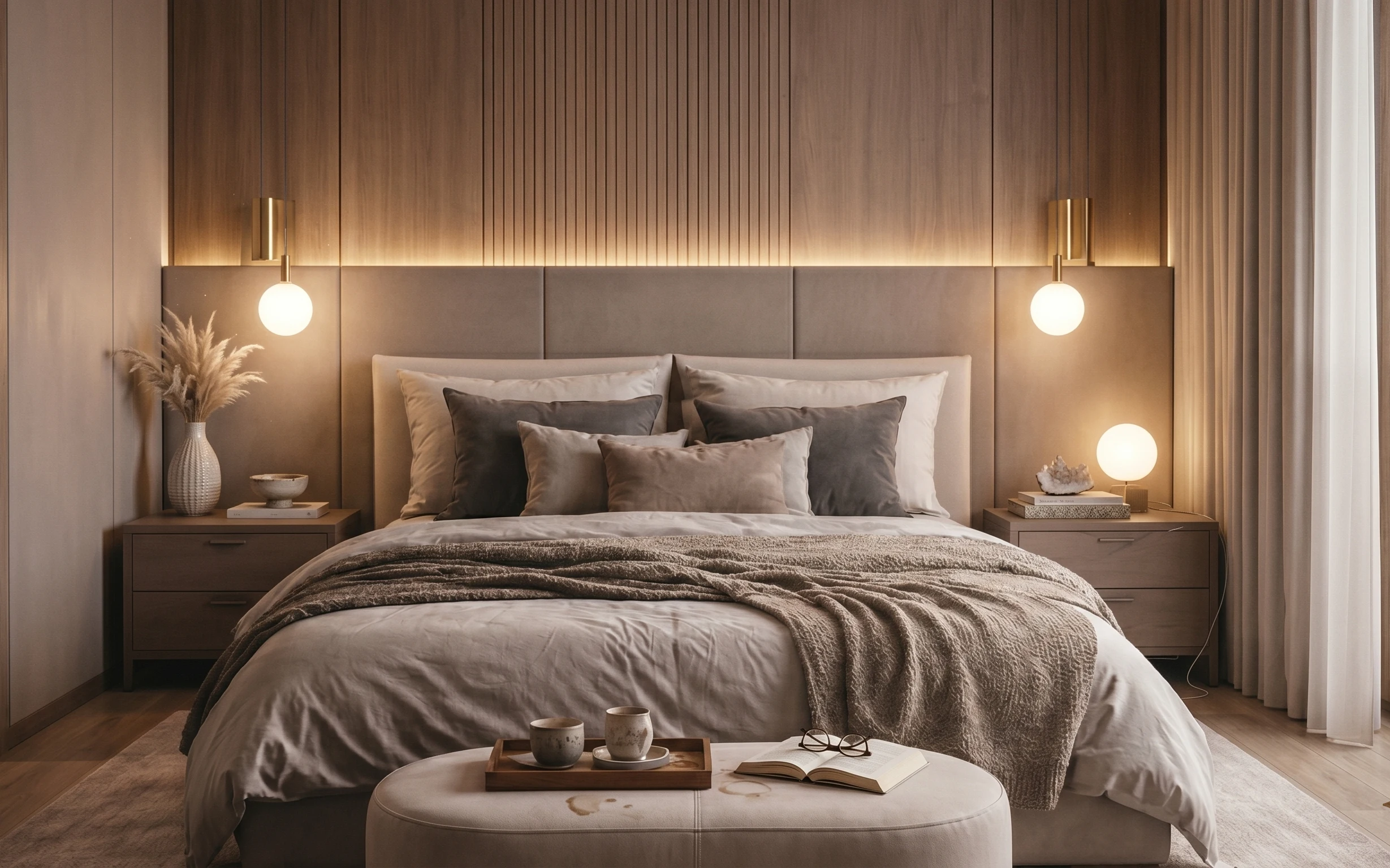
Why warm taupe-and-stone textiles are the bed nook of 2026
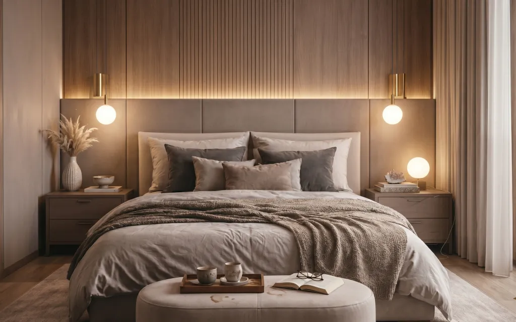
The first thing to notice here is the stacked neutrality: warm taupe wall panels, a soft white duvet, and a gray textured throw that looks almost tweed-like up close. There’s also that gentle “glow on demand” from a globe-shade lamp, plus dried stems in a ceramic vase that read organic against the clean lines. It reminds me of the calmer pages of Kinfolk—simple shapes, tactile materials, and lighting that flatters skin and fabric. For renters, this is achievable because every layer is either removable or designed for swapping at the end of your lease: rug, covers, a plug-in lamp, and peel-and-stick texture.
I almost overthought this the first time I tried to copy a similar look in my own place (I kept reaching for matching sets). What changed my mind was realizing the “match” is actually in the palette, not the brand: warm taupe plus stone gray, repeated across fabrics and objects. Once I stopped trying to make everything the exact same fabric family, the room looked more intentional and less costume-y—like it had been lived with for a while.
Layer 1 — large area rug ($80) Texture underfoot, even when your lease says “bare floor”
Choose a large, light-to-medium neutral rug—something that reads soft underfoot and anchors the bed so the whole wall doesn’t feel like it’s floating. In the photo, the rug’s color sits between warm taupe and pale gray, which helps the gray throw and pillows feel cohesive instead of separate. The practical win is coverage: it hides minor floor scuffs and makes the space feel finished without changing anything landlord-installed. The trade-off is sizing—this only works if the rug reaches far enough past the bed edge to frame the ottoman/bench area. Pick a 5×7 if you’re working with a typical renter bedroom footprint.
Choose a rug that matches the duvet’s “warm” tone
Look for a rug that carries taupe or greige, not cool gray—otherwise the bedding starts looking yellow or the lamp glow gets muddy.
Layer 2 — peel-and-stick wallpaper paneling (vertical stripes look) ($60) Adds the vertical calm you can remove later
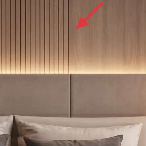
For the wall texture, use peel-and-stick wallpaper with a vertical stripe or paneling pattern in a warm neutral. In the hero photo, the upholstered wall panels create a subtle rhythm above the bed—repeating vertical lines that make the headboard area feel structured. Wallpaper can mimic that same “quiet architecture” without any painting. The trade-off is realism: pick a pattern with a soft, fabric-like print rather than high-contrast stripes, or it can look too graphic. Apply it only to the section you can see behind/around the bed line so the look stays intentional and doesn’t fight the room’s lighting.
One wall section is enough
Even a single panel area—roughly the width of the bed back—can carry the visual weight of the headboard wall.
Layer 3 — linen duvet cover (warm white) ($50) The base layer that keeps everything from looking “over-styled”
Swap in a warm white duvet cover that leans slightly creamy, not blue-white. The photo’s bedding reads crisp but soft, and it’s what makes the gray textiles look layered instead of flat. A linen or linen-blend fabric also brings that fine texture you can feel even from a distance, which is key when the rest of the room is smooth and structured. The trade-off is maintenance: linen shows wrinkles more readily than crisp sateen, but those wrinkles actually match the relaxed vibe here. Keep the duvet color close to the lamp glow so the bed looks consistent from day to evening.
Go “slightly warm,” not icy-white
Warm whites photograph better under globe lamps and keep taupe walls from reading dull.
Layer 4 — gray textured throw blanket ($30) Adds that lived-in middle layer
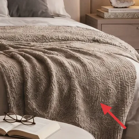
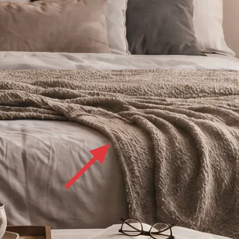
Add a gray textured throw over the front of the bed to create the same depth you see in the photo’s heavier fabric layer. The throw there has visible texture—almost boucle/tweed-like—which is what makes the bed feel styled without needing a headboard makeover. Choose a medium-to-dark gray to anchor the palette against warm taupe walls, but keep it in the same family as the pillow covers so the tones don’t clash. The trade-off is bulk: a heavier throw can crowd smaller bedrooms, so fold it into a clean drape rather than piling it too high. If it’s a bit too thick, place it lower and let the duvet do the height work.
Avoid a shiny, slippery throw
Glossy blankets reflect light differently than lamps do and can break the cozy, tactile look.
Layer 5 — gray pillow covers (set of 2) ($24) Repeat the gray so the bed reads intentional from every angle
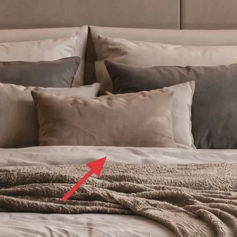
Use two gray pillow covers (coordinating shade with the throw) to build that stacked, soft depth at the center of the bed. In the hero image, the darker pillows sit in front of the lighter ones, which creates a gentle gradient rather than a flat block of color. Keeping the pillow covers separate from the duvet lets you change the palette seasonally without redoing the whole setup. The trade-off is that too many different grays start looking random—stick to one undertone (warm or cool) and match it across the throw and covers. Texture helps here: even a subtle weave or micro-rib adds dimension.
Match undertone, not just “gray”
If your throw is warm gray, choose pillow covers that don’t tip blue under lamp light.
Layer 6 — plug-in table lamp with white globe shade ($30) Warm glow without touching wiring
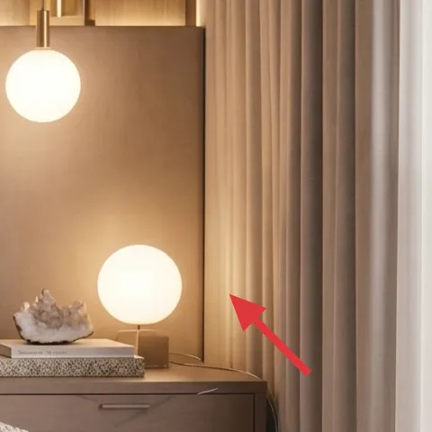
Pick a plug-in table lamp with a white globe shade for the right nightstand position, like the one in the photo. The globe shape does two things: it softens the light so the bed textiles look richer, and it keeps the lighting visually “round” to balance the straight lines in the wall paneling. This is the move-friendly swap—no hardwired work required, and you can switch it to a different room when you move. The trade-off is bulb choice: a cool white bulb will flatten the warm neutrals, so aim for a warm temperature and let the lamp do the mood work. Place it so the light spills toward the center of the bed rather than just the wall.
Warm bulbs make taupe look like taupe
When bulbs are too cool, the whole palette shifts; warm lighting keeps the room cohesive.
Layer 7 — foraged dried floral arrangement in the vase ($20) Organic texture that survives the seasons
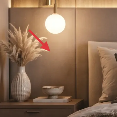
A dried arrangement in the same vase role as the pampas stems keeps this bed nook feeling fresh without daily watering. In the photo, the tall, airy stems add movement against the upholstered wall paneling, and the ceramic vase gives the stems a grounded base. For a renter budget, this is one of the easiest “life in the space” touches—you can reuse the same vase and rotate the stems whenever you want. The trade-off is that dried stems can shed, so handle gently and place them where they won’t get constantly bumped. For best results, keep the stems tall and clustered so they read as one sculptural mass.
Make it instead of buying it
This is a foraged dried floral arrangement in the existing vase role—choose tall, airy stems so the arrangement keeps the same sculptural silhouette.
Materials
- Foraged dried stems — 1 bundle — free (use what you find legally) — $0
- Natural twine — 1 spool — craft store — $10
- Paper towels or a small cloth — 1 pack — home supply — $5
Steps
- Gather 5–8 tall stems with similar thickness so the arrangement looks intentional.
- Wipe off dust with a dry cloth or paper towels (no water rinsing needed).
- Group stems into 2–3 clusters and wrap the bases loosely with twine.
- Trim ends gradually until the tallest cluster reaches the height you want.
- Set the cluster into the vase, then tuck smaller stems around the perimeter.
- Wrap one final band at the base to keep the silhouette from shifting when you move the vase.
Total DIY cost: $15 — saves about $5 over buying.
The cost, layer by layer
| Layer | Item | Cost |
|---|---|---|
| 1 | Large area rug | $80 |
| 2 | Peel-and-stick wallpaper paneling (vertical stripes look) | $60 |
| 3 | Linen duvet cover (warm white) | |
| $50 | ||
| 4 | Gray textured throw blanket | $30 |
| 5 | Gray pillow covers (set of 2) | $24 |
| 6 | Plug-in table lamp with white globe shade | $30 |
| 7 | Foraged dried floral arrangement in the vase | $20 |
| Total | $294 | |
If the rug is too much, swap to a smaller 5×7 or a flatweave in a similar taupe/greige—then spend that money on pillow covers with more texture instead.
What worked, what didn't (across the whole room)
The biggest wins were repeating warm neutrals across textiles and keeping lighting soft and centered on the bed. The vertical wall texture and the layered bedding made the space look styled even without any permanent changes. The only weak point was texture contrast when pieces drifted too cool-toned.
What worked
- The warm white duvet made the gray accents look intentional instead of separate.
- The gray textured throw brought tactile contrast against the smooth duvet and wall panels.
- Vertical wall texture added structure behind the bed without any painting or drilling.
- The globe lamp created soft, flattering light that held up after dark.
- The dried stems added movement and “lived-in” texture without daily maintenance.
- A large neutral rug anchored the bed nook so it didn’t feel like a floating vignette.
What didn't
- Cool gray pillow covers shifted the palette and made taupe walls look dull.
- A shiny throw reflected lamp light and flattened the layered look.
- Wallpaper applied too wide (beyond the bed area) started looking graphic instead of calm.
- Too-small rug sizes left visible floor around the bed, breaking the “set” feeling.
What we'd skip if we did it again
Skip matching a full set from one retailer. In this look, the cohesion comes from repeating warm taupe and stone gray across materials, not from buying every piece as a bundle.
Skip peel-and-stick everywhere. Limit the vertical paneling to the bed back zone so the pattern reads architectural rather than busy under lamp glow.
Skip cool-toned bulbs or icy-white textiles. If the lamp light and bedding disagree on undertone, the whole bed nook can feel washed-out instead of warm and calm.
Frequently asked
How long does this bed nook refresh take?
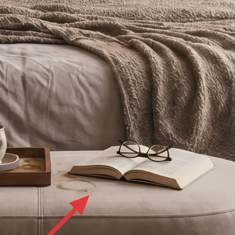
Plan for about 3–5 hours total. The rug swap and bedding refresh are quick, the wallpaper section takes the longest part (cleaning the wall, measuring, smoothing bubbles), and the lamp is instant plug-and-play. Styling the pillows and arranging the dried stems is the final 30–45 minutes, especially if you’re trimming stems to get the exact height.
What makes this work for renters specifically?
The approach relies on removable or exchangeable layers: a rug you can take with you, a duvet cover and pillow covers that are purely fabric, a plug-in table lamp that doesn’t touch wiring, and peel-and-stick wallpaper that can be removed at move-out. The dried arrangement uses your vase and can be rebuilt with new stems, so it’s not “one-and-done.”
If my bedroom is smaller, should I change the plan?
Yes—scale the rug and the pillow count first. A smaller room usually needs a slightly smaller rug (still choose the biggest size you can fit) and fewer pillows so the bed doesn’t feel crowded. Keep the same palette and texture rules: warm white duvet, one gray throw, and two gray pillow covers are enough for this look without adding bulky layers.
What if my bedroom has different lighting (no warm glow)?
If your bulbs run cool, swap bulbs rather than changing the whole palette. The goal is to keep taupe and warm neutrals from reading gray-blue. If you can’t adjust bulbs, choose a warmer-leaning rug and bedding (look for “cream” or “greige” descriptions) so the room still feels cohesive under less flattering light.
Where can I shop for the key pieces on this budget?
Start with basics you can compare easily: duvet covers, pillow covers, rugs, and plug-in lamps are widely available at major home retailers and resale-friendly marketplaces. For peel-and-stick vertical wallpaper, look for patterns described as “textured panel” or “vertical stripe” and test colors under the lighting you actually use. For dried stems, farmers’ markets and craft suppliers are more consistent than hunting—DIY just makes it cheaper.
What’s the biggest mistake people make copying this bed look?
Using too many different undertones in the gray family. If the throw and pillow covers don’t agree (warm vs cool), the bed stops feeling layered and starts feeling mismatched. Another common slip is a wallpaper pattern that’s too contrasty—keep stripes soft and fabric-like so the texture supports the room rather than turning it into a graphic focal wall.
More in Bedroom
What $300 buys: a bed nook refresh for rented bedrooms
A renter-friendly bed nook refresh built around warm taupe textiles and a clean lighting setup, all achievable for about $300. The look lea…
Under $500: japandi bedroom refresh with 7 no-drill swaps
A calm japandi bedroom refresh for renters with a neutral rug, olive throw, and swap-in wall art—no painting, no drilling, and everything p…
7 weekend wins for an olive-and-cream primary bedroom, $700
A soft-olive accent wall, taupe curtains, and a warm wood-and-cream bedding setup make this primary bedroom feel finished. This weekend pla…